


It has always surprised me that the mobile industry has not made better use of SVG. On the face of it, SVG is perfectly suited to publishing rich content on mobile devices for a number of reasons:
- It is a compact way of representing vector graphics
- SVG graphics (in keeping with the name) can be scaled to arbitrary sizes, removing some of issues with screen dimension proliferation on mobile devices
- It is an open standard
- Device support is better than you might think (more on this later)
- Because SVG is based on XML, many existing XML tools can be used to generate content
This article summarises the capabilities of SVG and how best to take advantage of it for mobile applications. I will not attempt to describe how to build SVG content since there are plenty of good tutorials elsewhere (see References & Links section below).
Description of SVG
First a quick recap on what exactly SVG is all about. From the Wikipedia:
Scalable Vector Graphics (SVG) is an XML specification and file format for describing two-dimensional vector graphics, both static and animated. SVG can be purely declarative or may include scripting. It is an open standard created by the World Wide Web Consortium's SVG Working Group.
So, SVG is essentially an open standard for an XML-based representation of vector graphics. It is the scalable aspect of SVG in particular that makes it so exciting since it means that the same graphic can look equally well on a large PC screen as it does on a small mobile screen, with no modifications whatsoever. The following image from WikiMedia demonstrates the principle perfectly. Bitmap graphics with inherently fixed resolutions don't scale up well; scalable graphics (which have no inherent pixel size) scale up very well indeed.

Vector graphics (though not SVG in particular) are already used extensively in computing. As an example, most operating system fonts are defined in a vector format so that they can be represented well at widely varying sizes. Flash objects often contain vector images too, since it means that same Flash object can work equally well regardless of browser size or screen resolution.
SVG has all of the advantages of other vector graphic formats with one key difference: it is based on a set of open standards from the W3C.
SVG Versions
SVG currently exists in a couple of different formats.
- SVG 1.1 became a W3C Recommendation (meaning essentially that it is finalised) in 2001
- SVG Tiny and SVG Basic (the Mobile SVG Profiles) became W3C Recommendations in 2003
SVG Tiny and Basic are the versions of most interest for mobile, since they have been specifically designed to work well on small devices and devices with limited resources. Of the two, SVG Tiny 1.1 is the version of SVG that is most widely adopted on mobile phones today. The main difference between SVG Tiny and SVG Basic is the lack of scripting and styling support in Tiny (to save memory overhead of maintaining a DOM tree).
Device Support for SVG
The best image format in the world is of no use if no device supports it, however, so it makes sense to survey how well current mobile devices support the standard. The situation is actually better than you might think. The following devices are known to support some variants of SVG:
- Nokia WebKit browser – included with all recent S60 (Symbian) handsets
- Most recent SonyEricsson handsets. According to SonyEricsson themselves, the following handsets have some form of support for SVG: F500, K300, K500, K700, S700, Z500, V800, Z800, K510, K530, 550, K600, K610, K750, K770, K790, K800, K810, S500, T650, V600, W200, W300, W550, W580, W600, W610, W660, W700, W710, W800, W810, W830, W850, W880, W900, Z520, Z525, Z530, Z550, Z558, Z610, Z710, K630, K660, K850, V640, W890, W910, Z750
- Adobe's Flashlite 1.1 and later
- … and many others. There is a fairly comprehensive list here: http://svg.org/special/svg_phones
Interestingly, on the desktop browser side, only Firefox 2.x and Opera support SVG natively — Internet Explorer does not, nor does Safari. Note that Internet Explorer users are not entirely stuck – Adobe have a plug-in viewer available here. If you can see the following image your browser has SVG support.
This leads to a rather interesting situation where handset support for this standard is arguably broader than desktop support (because Internet Explorer still has a huge market share). Furthermore, in my experience, not only is the support on mobile more widespread, it is better also: the mobile browsers all allow the user to zoom & pan the SVG image, where the desktop browsers do not, or at least not as well. The iPhone does not currentlly support SVG, which is a real shame.
SVG Capabilities
The capabilities available with SVG vary quite widely according to which version of the standard you work to. For the purposes of mobile, sticking with SVG Tiny is by far the safest option. Luckily, this version of the standard offers pleny of useful functionality and certainly more than enough for most purposes. The SVG specification divides the relevant functionality into some groups, called modules.
- Shape Module – this is the workhorse module of SVG and covers all of the basic drawing primitives that you would expect: circle, ellipse, line, path, polygon, polyline, rect
- Basic Text Module – this covers just one tag: text. The text attribute allows you to place text chunks in your diagram.
- Style Module – this allows you to syle SVG elements in much the same way that you style HTML using CSS
In addition to these basic drawing primitives, SVG-T also supports a number of other useful modules that allow you to add interactivity to your diagram. These include the Hyperlinking Module which allows you to add <a> hyperlinks and the Animation Module which allows you to make simple animations.
Rather than trying to cover the process of creating an SVG document from scratch I've linked to some good tutorials below.
Serving SVG to Mobile
Device Recognition
In order to decide whether or not it is appropriate to send SVG content to a phone that is accessing your site, you need some way to check the capabilities of the device. This leeds to the thorny problem of device detection and content adaptation. In my experience, the current de-facto device detection database WURFL has no useful data about devices support for SVG. In fact, many devices that I know to definately support SVG are listed in the WURFL database as not supporting it. The dotMobi Device Atlas product will try to solve this problem but in the meantime this needs to be treated as a special case. In my tjamm.mobi example site, I simply look for User Agent strings that correspond to the Nokia WebKit browser, and certain SonyEricsson phones; otherwise I fall back to a PNG representation of the same image.
Compression
One of the few drawbacks with SVG is that, as with many XML formats, it is very verbose and hence the file sizes tend to be large for even moderately complex images. Given the issues with data charges and slow wireless networks, to use SVG successfully with mobile devices, you really need to use GZIP compression. Thanks to XML's repeated tags, GZIP compression is very successful in reducing the size of SVG documents to an acceptable level. In practice, I found that documents will typically reduce to about 10% of their original size after being GZIPed, though your mileage may very depending on how repetitive your document are. Now that ZLIB compression is part of the HTTP 1.1 standard (Content-Encoding: gzip) most mobile browsers seem to support GZIP encoding. More to the point, the browsers that are advanced enought to support SVG also seem to support GZIP encoding with any trouble.
Most web servers can be configured to automatically compress certain document types on the fly but how to do so is outside the scope of this article.
Deciding when to use SVG
SVG is not the solution to all problems. There are many cases where an SVG representation is not the best way to serve an image. SVG makes most sense if you want to convey a lot of information in a single image, where you would otherwise have had to use multiple thumbnails linking to different sections of a larger bitmap. SVG also does not make much sense for photo-like images, but makes excellent sense for line-art such as maps, where zooming and panning are especially useful. Also, bear in mind that a GIF or PNG representation of an image will often be much more compact from a byte size point of view than the same thing represented in SVG.
Image Size
While SVG documents are scalable, they are normally served with a starting resolution in mind, to help the renderer decide how big to render them. The dotMobi logo above includes the following line:
|
1 |
<<span class="start-tag">svg</span><span class="attribute-name"> xmlns</span>=<span class="attribute-value">"http://www.w3.org/2000/svg" </span><span class="attribute-name">xmlns:xlink</span>=<span class="attribute-value">"http://www.w3.org/1999/xlink" </span><span class="attribute-name"><br />width</span>=<span class="attribute-value">"167pt" </span><span class="attribute-name">height</span>=<span class="attribute-value">"85pt" </span><span class="attribute-name">viewBox</span>=<span class="attribute-value">"0 0 167 85" </span><span class="attribute-name">version</span>=<span class="attribute-value">"1.1"</span>> |
This controls both the viewing box and the initial rendered size of the diagram.
Embedding SVG in XHTML
SVG documents should be embedded in XHTML/HTML using the <object> tag as follows:
|
1 |
<<span class="start-tag">object</span><span class="attribute-name"> data</span>=<span class="attribute-value">"img.svg" </span><span class="attribute-name">width</span>=<span class="attribute-value">"240" </span><span class="attribute-name">height</span>=<span class="attribute-value">"250" </span>>explanatory text</<span class="end-tag">object</span>> |
This way, if the browser does not support the SVG the user will see the "explantory text".
MIME Type
SVG should be served as MIME type
|
1 |
image/svg+xml |
Your web server may need to be configured to add this MIME type.
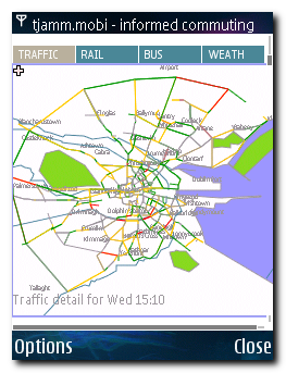
A Practical Example
In order to test SVG on real devices I created the testbed site tjamm.mobi. This site aggregates some useful information for commuters in Dublin. The main information source on this site is an SVG road map of central Dublin that shows live traffic information for most major routes (the source of this data is a public XML data feed that is derived from about several thousand under-road sensors around the city, updated every minute). The roads are coloured red / orange / green depending on the current flow of traffic, with unknown roads left as grey.
This application lends itself particularly well to SVG because the information is inherently more useful if it can be zoomed, panned and rotated. This is the same image zoomed in a little (traffic is looking pretty good near dotMobi HQ):
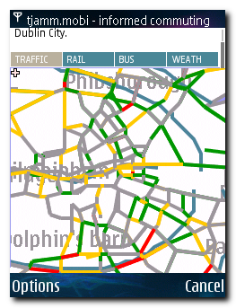
.. and rotated:
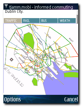
To represent this same information using PNG or JPEG images would have required a number of thumbnails and clicks, each adding a barrier to usability from both a time and data cost point of view. As it stands, the SVG image on this page is about 8Kb (compressed) and represents a very efficient use of mobile bandwidth. The raw SVG image can be viewed at this URL (use View Source in your browser to see the actual SVG source): http://tjamm.mobi/img/traffic.svg
Summary
SVG-T is a very useful tool in the mobile web designers toolbox. Device support is already quite widespread and getting better. While many older devices don't currently support SVG, the types of device that deliver a good enough mobile web experience that people actually use them are the very devices that do support SVG. So, with some exceptions (Opera Mini and the iPhone) the pioneers, taste-makers and early adopters are reasonably well covered. So go forth and experiment.
Reference and Links
- Mobile SVG Profiles – SVG Tiny and SVG Basic: http://www.w3.org/TR/SVGMobile/
- SVG Tutorial: http://developer.sonyericsson.com/site/global/newsandevents/latestnews/newsmay07/p_svgtiny_gettingstarted_tutorial.jsp
- SVG Tutorial: http://www.w3schools.com/svg/default.asp
- SVG Wiki: http://www.svg.org/
- Inkscape, an open source SVG authoring program: http://www.inkscape.org/
- VectorMagic, a free web service for converting bitmap images to SVG: http://vectormagic.stanford.edu/


