


Due to the multifarious nature of the mobile web, developers tend to spend a lot of time testing their work. If your site is designed to adapt to multiple different devices this effort is multiplied because you need to ensure that your detection is working correctly across multiple devices and that your response is appropriate in each case.
Many web developers use user agent switchers to address this issue. Safari has a built-in UA switcher; Firefox has Chris Pederick’s excellent User Agent Switcher add-on; Chrome has User-Agent Switcher for Chrome. These tools are very useful and should be considered essential items in the developer’s toolbox, but suffer from a common problem: they don’t let you simultaneously view sites through the lens of multiple user agents. This is a real loss because, apart from the tedium of changing UA between site loads, a side-by-side comparison of the same site offers a real insight into how a site is behaving:
- Differences between versions are immediately highlighted in a very visual way. This gives a very quick way to perform a quick check of a site’s functions.
- With the right visualisations, you can compare the page sizes and breakdowns across the different versions of given page.
Here in dotMobi we found ourselves repeatedly switching UAs and reloading pages in our testing of our own products. We also found it very difficult to show people how server-side device detection was being used around the web since there was no easy way to show at a glance how a site responds to multiple different devices. So, over the past few months we’ve been building an internal tool to help us with all of these problems and, now that it’s working reasonably well, we thought it would make sense to make it available externally.
How it works
Prism consists of a web front end to a web proxy server that mimics the HTTP headers sent by multiple different devices, simultaneously. The user can pick a URL from a drop-down menu or enter one of their choosing. This URL is then loaded as if requested from multiple different devices.
Each device is represented in an iframe whose source is the requested URL, but loaded via multiple different proxy servers, each one of which represents a different physical device. Each proxy host uses a different set of HTTP headers that mimic the device in question. Thus, from the web server point of view, the requests are coming from multiple different mobile devices and different content may be sent for each. Each iframe is sized to the pixel size of the device in question.
A side-effect of each URL being loaded in an appropriately sized iframe is that responsive web designs that use media queries will respond correctly also.
In order give more insight into what’s going on behind the scenes Prism keeps a running tally of the total page weight for each device, and a breakdown by content type. This view of multiple versions of the site at the same time can yield some real insight. As an example, check out how Google responds to the these three devices:
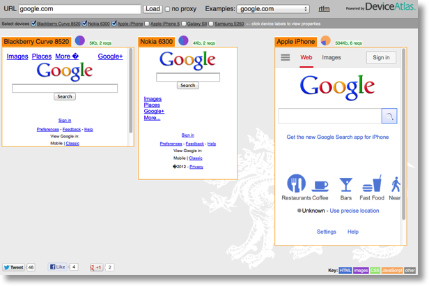
You can see that Google does a huge degree of adaptation between different devices, to the extent that there is a 100x difference between the smallest version of the page and the largest. The pie chart breakdown of the page payload shows you where the differences lie—Google uses no JavaScript on the lighter versions of the page, but uses 410KB of JavaScript on the iPhone version.
Now look at Facebook on the same set of devices:
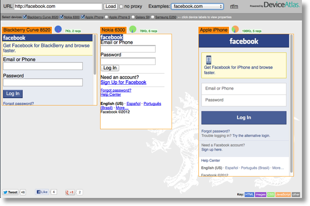
You can see that Facebook uses a similar approach to Google in that it jettisons JavaScript from lower-end devices, but appears to mistakenly send about 75KB of CSS to the poor Nokia 6300, a phone ill-equipped to handle it.
Discovery tool
A multi device proxy also acts as a useful discovery tool to investigate how the experts in the industry are building out their sites to support multiple devices. Some of the links in the Examples drop-down will help you get started.
What it isn’t
Prism should not be considered as a substitute for testing on real devices—that is not its purpose. Real mobile devices have restrictions that desktop browsers don’t have and use different fonts and rendering engines in their rendering of content. Additionally, JavaScript support varies widely across mobile devices and this can have big effects on the final rendered content.
Links
Prism is available at http://prism.mobiforge.com. You can link directly to a view of a URL using the format http://prism.mobiforge.com?url=http://site.com
Status
Prism is a beta service should be considered experimental. Please read the RTFM link on the top right of the page for more detailed information—it lists the various limitation of the proxy, both deliberate restrictions and features not yet implemented.