


For the third part of our m-commerce series (see part 1, part 2), we decided to look more closely at two websites that have chosen different approaches to mobile. One, Maplin, has chosen an adaptive approach without a unique mobile URL, while the other, Currys, went with an RWD approach. Both are electronics retailers based out of the United Kingdom. We chose Currys because it is frequently cited as an excellent example of an RWD retail site. Maplin, we felt, would make a good point of comparison, as, while not identical in its product range, it is largely similar to Currys in its focus on electronics.
How did we decide that one was adaptive and the other RWD?
- Size: Maplin.co.uk, when measured by Prism on 28 October, had a desktop page size on Chrome of 1950KB, compared with a homepage size of 806KB on both iPhone and Blackberry Curve. Currys.co.uk had the same homepage size of 1255KB across Chrome for desktop and iPhone and Blackberry Curve. Page size is a useful flag of server-side detection taking place in order to return different HTML per device – if a page has a significantly lower weight on mobile, this is an indication that server-side mobile optimisation is taking place.
- Layout: Changes in layout were analysed to yield clues as to how each site was built. The layout of maplin.co.uk on mobile differs in some important respects from its desktop cousin.
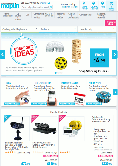
Maplin site on desktop (Google Chrome)Notice the absence of the ‘New’, ‘Home Automation’ etc. box that sits below the top slider on the mobile version (below) – the choice has been made to fill this section solely with ‘Popular Products’. Notice also that the ‘Challenge the Maplineers’, ‘Delivery and ‘Here to Help’ tabs visible on the desktop site have been removed from the top of the homepage on mobile.
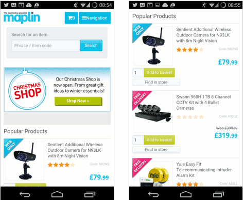
Maplin site on mobileThe navigation hierarchy has also been changed, interestingly, as can be seen below.
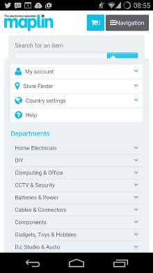
Maplin mobile navigation‘DJ, Studio & Audio’, given second billing on the desktop site, has moved down to ninth on mobile, presumably because research has suggested that this group of customers prefers to shop from their desktops, rather than on mobile.
The Currys desktop and mobile websites, on the other hand, are obviously making use of fluid grids, and the content on both is almost identical.
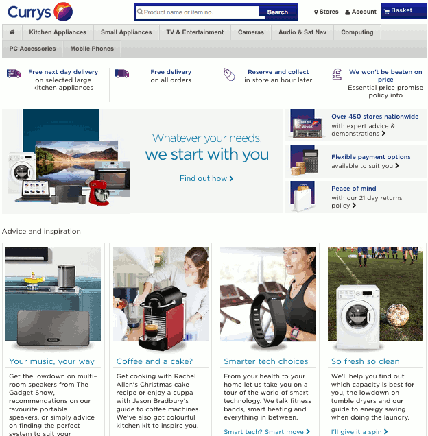
Currys homepage on desktop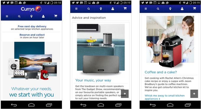
Currys homepage on mobile, above and below the foldThe layout hierarchy of the desktop site persists on mobile, with only one change – the right-hand column that begins with ‘Over 450 stores nationwide’ has been pushed to the bottom of the page on mobile, see below.
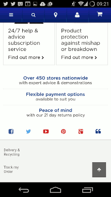
Currys mobile layout
The speed-tests
Talk about the ‘average’ speed of a webpage on mobile or on desktop can often seem rather abstract, which is why we decided to take a closer look at the actual relative speeds of these two websites, and to look at them through the eyes of a consumer with an intent to buy. These tests are not about the relative merits of the design choices (adaptive vs responsive) so much as the merits of speed and ease of use, whatever the design, when navigating webpages on mobile. Currys and Maplin were chosen because of their ostensible similarity; what we wanted to investigate was whether underlying these similarities, significant performance differences exist, and what these performance differences might have to teach us about optimising sites for mobile. This said, the tests amount to a case-study of two sites and the results should not be interpreted as being generalisable to other sites – they are purely illustrative and shouldn’t be taken as indicative of a broader comparison between RWD and adaptive sites in general.
We tested each site on two Android phones, one high-end, and one lower-end, using the stock browser on each. We ran each test a number of times, on different days, to account for possible network issues. The Android phones we used were an HTC Desire S and an HTC One (M7). The HTC Desire S dates from early 2011 and the HTC One from mid-2013. The HTC One is a high-end phone, while the Desire S is lower-end, with only 512MB of RAM. When optimising for mobile, it’s important that performance is not degraded on lower-end phones – in the same way as a supermarket wouldn’t turn away a customer for not wearing a tie, e-retailers should strive to allow all mobile users, regardless of phone spec, entry to, and an acceptable experience on, their mobile sites.
- Test One – Homepage load speed: A simple test – how long does the homepage of each site take to load on each phone?
- Test Two – Click to view product: How long, cumulatively, does it take to view a product, place it in your basket, and get to the checkout page?
- Test Three – Browsing products: Putting ourselves in the shoes of a customer browsing through a product category with an intent to buy, we clicked on the first eight listed products in that category in turn, and timed how long each one took to load. We pressed the back button each time to return us to the product list, then clicked the next one, loaded it, hit back, clicked the next one, and so on. Given the smaller memory and slower processing speed of lower-end phones, we were interested to see if repeated interaction with a site would cause any performance issues.
Results
Test One – Homepage load
The Maplin homepage was slightly faster to load than the Currys one on the HTC One; on the HTC Desire the Currys page was the faster of the two.
Test Two – Selecting a product and taking it to the checkout
The overall time taken to select a product, put it in a basket, and get it to the checkout was shorter on both phones on the Maplin website. The Maplin website was also faster on every stage, except the final one, where the Currys site edged it on the HTC One.
Test Three – Browsing products
Looking at the graph below, the Maplin site was consistently faster on both phones; it was also more consistent overall, as can be seen from the relatively flat line stretching between products 1 and 8, particularly on the high end phone. By contrast, the Currys website offered a more uncertain experience, sometimes faster, sometimes slower, on both phones. The experience on the HTC Desire was inconsistent, oscillating between 8.65 seconds and 19.55 seconds from product to product. More subjectively, lag became a serious issue on the Desire by product 7 on both tests, with the browser freezing briefly when we tried to return to the product list, and the links to individual products taking a few taps to work. Out of interest, on the second iteration of the test we kept going past product 8 on the Desire; the tenth product took a whopping 50 seconds to load. This lag wasn’t as obvious on the HTC One. The experience with the Maplin site was free of lag throughout.
Notes
Overall, the experience of navigating the Maplin site was the more relaxed and predictable, both because of its speed, and because of the easily hittable ‘touch targets’ when clicking on products and buttons. Particularly on the smaller-screened phone (the Desire) but to a degree on the larger screen, hitting the sweet spot to get a link to work was occasionally dicier on the Currys website. Whether this was because of lag or touch targets not being easy to hit, the net result was a degree of frustration. Where Currys has occasional link lists on the homepage that give rise to fat finger syndrome, the Maplin homepage is entirely made up of large, sectioned off product and category links which make it very easy for a user to hit. The lag problem with the Currys website precipitated some phone rage in our tester, particularly when the Desire’s browser froze and issued a ‘Browser isn’t responding’ warning on the attempt to return to the product list after Product 7 in the Browsing Products test.
Which is not to say that navigating the Currys site was all bad – the homepage loads relatively quickly, and going through the checkout process is by and large painless. Large ‘Add to basket’ and ‘Proceed to checkout’ buttons make easy touch targets, and there was no lag on even the lower-end Desire. Overall, however, the Maplin experience had a seamlessness that the Currys one lacked, as well as being, in general, much faster.
It’s worth pointing out though, that even if a site performs worse on a class of device, we may not have the full picture. It may well be that analytics indicated traffic from such devices was relatively insignificant. For any company it will come down to a cost-benefit trade-off based on the range of devices used by their customers and the degree to which they need to accommodate them.
Conclusions
Optimising a site’s layout and hierarchy for mobile will involve analysis of user intent and user context, and will differ from site to site. Different input methods, posture, navigation style, display, and affordances unique to mobile (fine-grained location information for example) will also play a role in decisions about what to optimise and how.
There is no one ‘right answer’ when it comes to mobile strategy, but a focus on what users want from an individual website is a good place to start – and something that, again, will differ from site to site. Choosing the right approach has to take as its starting point some understanding of what users want from your site, and making it as easy as possible for them to achieve that.


Leave a Reply