


In the previous article on Android UI you saw the components that make up the UI of an Android application. The basic unit of the Android UI is the View. A View represents a widget that has an appearance on the screen. In this article (and the next two), you will learn about the various common views that you would likely use in your journey of Android development. In particular, I have categorized the views in this series into the following group:
- Basic Views – commonly-used views such as TextView, EditText, and Button views
- Picker Views – views that allows users to select from, such as the TimePicker and DatePicker views
- List Views – views that display a long list of items, such as the ListView and the Spinner views
- Display Views – views that display images, such as the Gallery and ImageSwitcher views
- Menus – views that displays additional and context sensitive menu items
- Additional Views – interesting views such as the AnalogClock and DigitalClock views
In this article, I will cover the first group – Basic Views. The next article will cover the Picker Views and List Views. Lastly, the third article will cover the Menus and additional views.
For all the examples in this article, you shall create a new Android project using Eclipse. Name the project as shown in Figure 1.
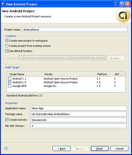
Figure 1 Naming your project
Basic Views
In this section, you will examine the basic views in Android that allow you to display text information as well as perform some basic selection. In particular, you will learn about the following views:
- TextView
- EditText
- Button
- ImageButton
- CheckBox
- ToggleButton
- RadioButton
- RadioGroup
TextView View
When you create a new Android project, Eclipse always creates the main.xml file (located in the res/layout folder) containing a <TextView> element:
<?xml version="1.0" encoding="utf-8"?>
<LinearLayout xmlns:android="http://schemas.android.com/apk/res/android"
    android:orientation="vertical"
    android:layout_width="fill_parent"
    android:layout_height="fill_parent"
    >

    <TextView
        android:layout_width="fill_parent"
        android:layout_height="wrap_content"
        android:text="@string/hello"
        />

</LinearLayout>
The TextView view is used to display text to the user. This is the most basic view that you will definitely come across when you develop Android applications. If you need to allow users to edit the text displayed, you should use the subclass of TextView – EditText, which is discussed in the next section.
Button, ImageButton, EditText, CheckBox, ToggleButton, RadioButton, and RadioGroup Views
Besides the TextView view, which you will come across the most often, there are some other basic controls that you will find yourself using very often. They are: Button, ImageButton, EditText, CheckBox, ToggleButton, RadioButton, and RadioGroup.
First, add a new file to the res/layout folder and name it as basicviews.xml. Populate it with the following elements:
<?xml version="1.0" encoding="utf-8"?>
<LinearLayout xmlns:android="http://schemas.android.com/apk/res/android"
    android:orientation="vertical"
    android:layout_width="fill_parent"
    android:layout_height="fill_parent"
    >

    <Button android:id="@+id/btnSave"
        android:layout_width="fill_parent"
        android:layout_height="wrap_content"
        android:text="Save"
        />
    <Button android:id="@+id/btnOpen"
        android:layout_width="wrap_content"
        android:layout_height="wrap_content"
        android:text="Open"
        />
    <ImageButton android:id="@+id/btnImg1"
        android:layout_width="fill_parent"
        android:layout_height="wrap_content"
        android:src="@drawable/icon"
        />
    <EditText android:id="@+id/txtName"
        android:layout_width="fill_parent"
        android:layout_height="wrap_content"
        />
    <CheckBox android:id="@+id/chkAutosave"
        android:layout_width="fill_parent"
        android:layout_height="wrap_content"
        android:text="Autosave"
        />
    <CheckBox android:id="@+id/star"
        style="?android:attr/starStyle"
        android:layout_width="wrap_content"
        android:layout_height="wrap_content"
        />

    <RadioGroup android:id="@+id/rdbGp1"
        android:layout_width="fill_parent"
        android:layout_height="wrap_content"
        android:orientation="vertical"
        >
        <RadioButton android:id="@+id/rdb1"
            android:layout_width="fill_parent"
            android:layout_height="wrap_content"
            android:text="Option 1"
            />
        <RadioButton android:id="@+id/rdb2"
            android:layout_width="fill_parent"
            android:layout_height="wrap_content"
            android:text="Option 2"
            />
    </RadioGroup>

    <ToggleButton android:id="@+id/toggle1"
        android:layout_width="wrap_content"
        android:layout_height="wrap_content"
        />

</LinearLayout>
Note that you use the id attribute to identify each view. The id of a view must start with the “@+id/” specifier followed by the name of the view.
The above XML file contains the following views:
- Button – represents a push-button widget
- ImageButton – similar to the Button view, except that it also displays an image
- EditText – a subclass of the TextView view, except that it allows users to edit its text content
- CheckBox – a special type of button that has two states – checked or unchecked
- RadioGroup and RadioButton – the RadioButton has two states – either checked or unchecked. Once a RadioButton is checked, it cannot be unchecked. A RadioGroup is used to group together one or more RadioButton views, thereby allowing only one RadioButton to be checked within the RadioGroup
- ToggleButton – displays checked/unchecked states using a light indicator
Figure 2 shows how the various views will look like in their various states. In particular, the right side of the figure shows the CheckBox, RadioButton, and ToggleButton views in their checked state.
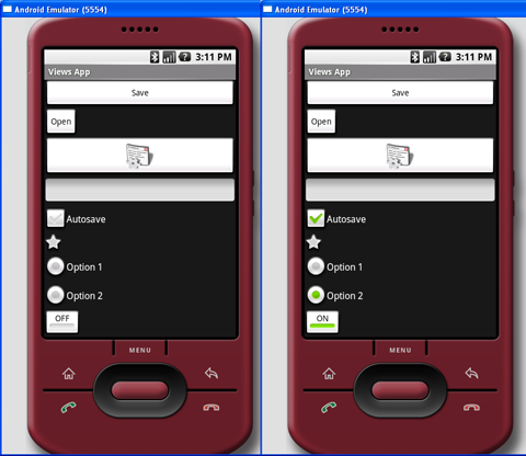
Figure 2 Various views in their various states
To handle the various common events associated with the various views, add a new class to the src/net.learn2develop.AndroidViews folder and name it as BasicViewsExample.java. Code its content as follows:
package net.learn2develop.AndroidViews;

import android.app.Activity;
import android.os.Bundle;
import android.view.View;
import android.widget.Button;
import android.widget.CheckBox;
import android.widget.RadioGroup;
import android.widget.Toast;
import android.widget.ToggleButton;
import android.widget.RadioGroup.OnCheckedChangeListener;

public class BasicViewsExample extends Activity
{
    @Override
    public void onCreate(Bundle savedInstanceState) {
        super.onCreate(savedInstanceState);
        setContentView(R.layout.basicviews);

        //---Button view---
        Button btnOpen = (Button) findViewById(R.id.btnOpen);
        btnOpen.setOnClickListener(new View.OnClickListener() {
            public void onClick(View v) {
                Toast.makeText(getBaseContext(),
                        "You have clicked the Open button",
                        Toast.LENGTH_SHORT).show();
            }
        });

        Button btnSave = (Button) findViewById(R.id.btnSave);
        btnSave.setOnClickListener(new View.OnClickListener()
        {
            public void onClick(View v) {
                DisplayToast("You have clicked the Save button");
            }
        });

        //---CheckBox---
        CheckBox checkBox = (CheckBox) findViewById(R.id.chkAutosave);
        checkBox.setOnClickListener(new View.OnClickListener()
        {
            public void onClick(View v) {
                if (((CheckBox)v).isChecked())
                    DisplayToast("CheckBox is checked");
                else
                    DisplayToast("CheckBox is unchecked");
            }
        });

        //---RadioButton---
        RadioGroup radioGroup = (RadioGroup) findViewById(R.id.rdbGp1);
        radioGroup.setOnCheckedChangeListener(new OnCheckedChangeListener()
        {
            public void onCheckedChanged(RadioGroup group, int checkedId) {
                //---displays the ID of the RadioButton that is checked---
                DisplayToast(Integer.toString(checkedId));
            }
        });

        //---ToggleButton---
        ToggleButton toggleButton = (ToggleButton) findViewById(R.id.toggle1);
        toggleButton.setOnClickListener(new View.OnClickListener()
        {
            public void onClick(View v) {
               if (((ToggleButton)v).isChecked())
                    DisplayToast("Toggle button is On");
               else
                   DisplayToast("Toggle button is Off");
            }
        });
    }

    private void DisplayToast(String msg)
    {
         Toast.makeText(getBaseContext(), msg,
                 Toast.LENGTH_SHORT).show();
    }
}
In particular, the above program displays a message (using the Toast class) when the various controls are clicked.
Add the following lines in bold to the AndroidManifest.xml file to register the new BasicViewsExample activity:
<?xml version="1.0" encoding="utf-8"?>
<manifest xmlns:android="http://schemas.android.com/apk/res/android"
      package="net.learn2develop.AndroidViews"
      android:versionCode="1"
      android:versionName="1.0.0">
    <application android:icon="@drawable/icon" android:label="@string/app_name">
        <activity android:name=".ViewsActivity"
                  android:label="@string/app_name">
            <intent-filter>
                <action android:name="android.intent.action.MAIN" />
                <category android:name="android.intent.category.LAUNCHER" />
            </intent-filter>
        </activity>

        <activity android:name=".BasicViewsExample"
                  android:label="@string/app_name" />

    </application>
</manifest>
To display the BasicViewsExample activity, insert the following statements in bold in the ViewsActivity.java file:
package net.learn2develop.AndroidViews;

import android.app.Activity;
import android.content.Intent;
import android.os.Bundle;

public class ViewsActivity extends Activity
{
    /** Called when the activity is first created. */
    @Override
    public void onCreate(Bundle savedInstanceState) {
        super.onCreate(savedInstanceState);
        setContentView(R.layout.main);

        //---load the BasicViewsExample activity---
        startActivity(new Intent(this, BasicViewsExample.class));

    }
}
To test the application, press F11 to debug the application on the Android emulator. Figure 3 shows the message displayed when the ToggleButton is clicked.
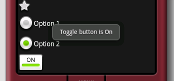
Figure 3 Message displayed when ToggleButton is clicked
For the EditText view, you can also set it to accept passwords by replacing each character with a “.”. This is done using the password attribute:
<EditText android:id="@+id/txtName"
        android:layout_width="fill_parent"
        android:layout_height="wrap_content"
        android:password = "true"
        />
Figure 4 shows that when you enter a string of text into the view, the character you enter always appears first and then changes into a “.” when you enter the next character (or after one second if you do nothing).
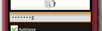
Figure 4 With android:password attribute set to true
ProgressBar View
The ProgressBar view provides visual feedback of some background tasks. For example, you might be downloading some data from the web and need to update the user of the status of the download. In this case, the ProgressBar view is a good choice for this task.
Using the same activity created in the previous section, insert the following element in the basicviews.xml file:
<?xml version="1.0" encoding="utf-8"?>
<LinearLayout xmlns:android="http://schemas.android.com/apk/res/android"
    android:orientation="vertical"
    android:layout_width="fill_parent"
    android:layout_height="fill_parent"
    >

    <ProgressBar android:id="@+id/progressbar"
        android:layout_width="wrap_content"
        android:layout_height="wrap_content"
        />

    <Button android:id="@+id/btnSave"
        android:layout_width="fill_parent"
        android:layout_height="wrap_content"
        android:text="Save"
        />
    <!-
        Other views omitted
    -->
</LinearLayout>
The default mode of the ProgressBar view is indeterminate – that is, it shows a cyclic animation. This mode is useful for tasks that do not have a clear indication of when they will be completed. For example, you are sending some data to a web service and waiting for the server to respond.
The following code shows how you can spin off a background thread to simulate performing some long lasting tasks. When the task is completed, you hide the ProgressBar view by setting its Visibility property to GONE (value 8).
import android.widget.ProgressBar;
import android.os.Handler;

public class BasicViewsExample extends Activity
{
    private static int progress = 0;
    private ProgressBar progressBar;
    private int progressStatus = 0;
    private Handler handler = new Handler();

    @Override
    public void onCreate(Bundle savedInstanceState)
    {
        super.onCreate(savedInstanceState);
        setContentView(R.layout.basicviews);

        progressBar = (ProgressBar) findViewById(R.id.progressbar);

        //---do some work in background thread---
        new Thread(new Runnable()
        {
            public void run()
            {
                //---do some work here---
                while (progressStatus < 10)
                {
                    progressStatus = doSomeWork();
                }

                //---hides the progress bar---
                handler.post(new Runnable()
                {
                    public void run()
                    {
                        //---0 - VISIBLE; 4 - INVISIBLE; 8 - GONE---
                        progressBar.setVisibility(8);
                    }
                });
            }

            //---do some long lasting work here---
            private int doSomeWork()
            {
                try {
                    //---simulate doing some work---
                    Thread.sleep(500);
                } catch (InterruptedException e)
                {
                    e.printStackTrace();
                }
                return ++progress;
            }

        }).start();

        //...
        //...
    }

    //...
}
The difference between the INVISIBLE and GONE constants is that the INVISIBLE constant simply hides the ProgressBar view. The GONE constant removes the ProgressBar view from the activity and does not take up any space on the activity.
The left of Figure 5 shows the ProgressBar view in action. When the background task is completed, the space taken by the view is given up when you set its Visibility property to GONE.
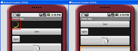
Figure 5 Progressbar view in action (left), disappears when the the background task is completed (right)
If you do not want to display the ProgressBar view in indeterminate mode, you can modify it to display as a horizontal bar. The following style attribute specifies the ProgressBar view to be displayed as a horizontal bar:
    <ProgressBar android:id="@+id/progressbar"
        android:layout_width="wrap_content"
        android:layout_height="wrap_content"
        style="?android:attr/progressBarStyleHorizontal"
        />
The following code causes the ProgressBar view to increment from 1 to 100 and then disappears off the screen (see also Figure 6):
public class BasicViewsExample extends Activity
{
    private static int progress = 0;
    private ProgressBar progressBar;
    private int progressStatus = 0;
    private Handler handler = new Handler();

    @Override
    public void onCreate(Bundle savedInstanceState) {
        super.onCreate(savedInstanceState);
        setContentView(R.layout.basicviews);

        progressBar = (ProgressBar) findViewById(R.id.progressbar);

        //---do some work in background thread---
        new Thread(new Runnable()
        {
            public void run()
            {
                while (progressStatus < 100)
                {
                    progressStatus = doSomeWork();

                    //---Update the progress bar---
                    handler.post(new Runnable()
                    {
                        public void run() {
                            progressBar.setProgress(progressStatus);
                        }
                    });

                }
                //---hides the progress bar---
                handler.post(new Runnable()
                {
                    public void run() {
                        //---0 - VISIBLE; 4 - INVISIBLE; 8 - GONE---
                        progressBar.setVisibility(8);
                    }
                });
            }

            private int doSomeWork()
            {
                try
                {
                    //---simulate doing some work---
                    Thread.sleep(500);
                } catch (InterruptedException e)
                {
                    e.printStackTrace();
                }
                return ++progress;
            }

        }).start();

        //...
        //...
    }
}
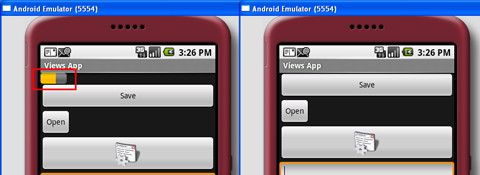
Figure 6 Horizontal Progressbar view in action (left), disappears when the the background task is completed (right)
AutoCompleteTextView View
The AutoCompleteTextView view is a view that is similar to the EditText view (in fact it is a subclass of the EditText view), except that it shows a list of completion suggestions automatically while the user is typing.
Add a new file to the res/layout folder and name it as autocomplete.xml and populate it with the following elements:
<?xml version="1.0" encoding="utf-8"?>
<LinearLayout xmlns:android="http://schemas.android.com/apk/res/android"
    android:orientation="vertical"
    android:layout_width="fill_parent"
    android:layout_height="fill_parent"
    >
    <AutoCompleteTextView android:id="@+id/txtCountries"
        android:layout_width="fill_parent"
        android:layout_height="wrap_content"
        />
</LinearLayout>
Add a new file to the src/net.learn2develop.AndroidViews folder and name it as AutoCompleteExample.java. Populate it as follows:
package net.learn2develop.AndroidViews;

import android.app.Activity;
import android.os.Bundle;
import android.widget.ArrayAdapter;
import android.widget.AutoCompleteTextView;

public class AutoCompleteExample extends Activity
{
    String[] presidents =
    {
            "Dwight D. Eisenhower",
            "John F. Kennedy",
            "Lyndon B. Johnson",
            "Richard Nixon",
            "Gerald Ford",
            "Jimmy Carter",
            "Ronald Reagan",
            "George H. W. Bush",
            "Bill Clinton",
            "George W. Bush",
            "Barack Obama"
    };

    @Override
    public void onCreate(Bundle savedInstanceState)
    {
        super.onCreate(savedInstanceState);
        setContentView(R.layout.autocomplete);

        ArrayAdapter<String> adapter = new ArrayAdapter<String>(this,
            android.R.layout.simple_dropdown_item_1line, presidents);

        AutoCompleteTextView textView = (AutoCompleteTextView)
                findViewById(R.id.txtCountries);
        textView.setThreshold(3);
        textView.setAdapter(adapter);
    }
}
Note that the list of suggestions is obtained from an ArrayAdapter object. The setThreshold() method sets the number of minimum number of characters the user must type before the suggestions appear as a drop-down menu.
Add the following lines in bold to the AndroidManifest.xml file to register the new AutoCompleteExample activity:
<?xml version="1.0" encoding="utf-8"?>
<manifest xmlns:android="http://schemas.android.com/apk/res/android"
      package="net.learn2develop.AndroidViews"
      android:versionCode="1"
      android:versionName="1.0.0">
    <application android:icon="@drawable/icon" android:label="@string/app_name">
        <activity android:name=".ViewsActivity"
                  android:label="@string/app_name">
            <intent-filter>
                <action android:name="android.intent.action.MAIN" />
                <category android:name="android.intent.category.LAUNCHER" />
            </intent-filter>
        </activity>

        <activity android:name=".AutoCompleteExample"
                  android:label="@string/app_name" />

    </application>
</manifest>
Modify the ViewsActivity.java file to start the AutoCompleteExample activity:
package net.learn2develop.AndroidViews;

import android.app.Activity;
import android.content.Intent;
import android.os.Bundle;

public class ViewsActivity extends Activity
{
    /** Called when the activity is first created. */
    @Override
    public void onCreate(Bundle savedInstanceState)
    {
        super.onCreate(savedInstanceState);
        setContentView(R.layout.main);

        startActivity(new Intent(this, AutoCompleteExample.class));

    }
}
Figure 7 shows the AutoCompleteTextView view in action when you enter some text into it.
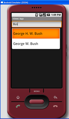
Figure 6 AutoCompleteTextView in action
Summary
In this article, you have seen some of the very common views that you will use in Android. In the next two articles, I will dive into more views that you can use in building your killer Android applications. Stay tuned for the next article, where I will discuss the various Picker and List views that you can use.


