


With the advent of the mobile internet web site designers face a new problem. They have to design sites which work well on the “normal” desktop system as well as on mobile devices. Mobile devices, typically handsets, smart phones, or PDAs, are not only restricted in their features, they also vary a lot in their individual capabilities as screen sizes, supported markup languages, etc. Another important fact is that mobile devices are used in other usage contexts than PCs. As their name says they are being used “mobile”, on the walk or in a commuter train. Thus the user may want to use the device single-handedly. He has no fine-grain control with the pointing device and so on. For the web site designer this poses the problem of how to give the user the best possible experience on his device without developing (and maintaining) a lot of independent web sites.
Nowadays (web) content management systems (CMS) are a common means to separate content from design. When deciding on the tools to use for a new multiclient web site, it is important to know how the CMS helps the designer in creating easy to maintain web sites for mobile as well as desktop clients.
In this article we study the features for multiclient support of the well-known Open Source CMS Typo3.
The Typo3 Content Management System
Typo3 is a free Open Source content management system for enterprise use. It offers great flexibility and expendability as well as a lot of ready-made modules for nearly every purpose you can think of. One could also view Typo3 as a framework for developing web applications. Nowadays it competes with full-grown commercial CMS. It is one of the fastest growing CMSes in the market.
The Typo3 project has been started by Kasper Skårhøj in 1997 and since then an active community has developed which gives it a lot of support and thrust.
Typo3 is written in PHP and uses a relational data base (typically MySQL) for the storage of its data. For a full list of its features look at http://typo3.com and http://typo3.org .
Typo3 is a complex system. Although one can easily create a simple web site with Typo3, the effort for learning the system in its full power is rather high. Do not expect to be a Typo3 expert in a few days. But it is rewarding!
The WURFL
One of the biggest stumbling blocks when developing a mobile web site is the question how to know the capabilities of the client browser. As usual the browser sends a HTTP header with its user-agent identification but this does not say anything about screen resolution, supported colour depth, etc. Surely, the manufacturers of mobile phones have data sheets of their products but there are thousands of devices and the number is growing daily. The Open Mobile Association (OMA), a consortium of companies active in the mobile phone business, has come up with the specification of the User Agent Profile (UAProf) to solve this problem. UAProf specifies an XML application to describe the features of mobile phones. The manufacturers of mobile phones have set up servers in the internet where the UAProfs of their products can be found.
But still, it is rather expensive (and time-consuming) for a web application to always fetch the UAProf of the current device. Luckily there also is the WURFL.
The WURFL (which means “Wireless Universal Resource File”) is an “XML configuration file which contains information about capabilities and features of several wireless devices” as the developers, Luca Passani and Andrea Trasatti, state on the WURFL home page. It is an Open Source project where the number of supported devices grows steadily. Today the mere size of the XML file is about 3.3 MB and it contains 9000+ devices. The WURFL employs a cute fallback mechanism so that even devices which are not contained can be mapped to something with similar capabilities. The WURFL is used by a lot of web sites including those of carriers around the world. The maintainers of the WURFL compile the information based on the UAProfs and by information sent to them by the developers of the devices and a lot of volunteers.
To access the WURFL there are several libraries available for the most popular programming languages, including Java, PHP, Perl, .Net, etc. These libraries all provide functionality to query the WURFL for specific capabilities based on the user-agent identification sent as HTTP header by the device. The libraries all employ caching strategies to speed up the search in the rather large (and growing) WURFL.
Typo3 and the WURFL
Typo3 is a very expendable CMS with an active community and thus it is not surprising that there is a WURFL extension available from the extension repository (TER). It has been written by Michael Perkhofer and been adapted to the current version of the WURFL PHP library by the author. The WURFL extension allows developers to transparently use the WURFL in their Typo3 templates. It integrates the WURFL querying engine with the built-in Typo3 mechanisms to distinguish user-agents in a template.
Basically the WURFL extension is a (rather thin) wrapper around the PHP library as provided by the WURFL team.
In the following we will develop a tiny multiclient web site supporting WAP 2.0 (mainly XHTML MP) compatible mobile phones and desktop browsers using Typo3 and the WURFL extension. We are going to use the current version of Typo3, which is 4.0.1. It should also work on its predecessor, 3.8.1. If you want to follow the example you should get a fresh installation of Typo3 using one of the installation packages for Windows or Linux available from the Typo3 site. Surely you also need a web server with PHP and a data base management system, e. g. MySQL, installed. You should also make sure that you have ImageMagick installed to make use of the built-in image processing features of Typo3. Follow the detailed installation instructions available from http://typo3.org.
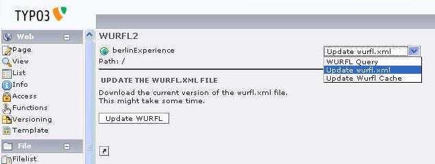
After you got the basic Typo3 installation running you should install the WURFL extension. First download the extension (the t3x file) from the Typo3 Extension Repository on typo3.org. Then log in to the backend of your Typo3 installation and go to the extension manager in the tools section. In the menu select “Import extensions” and look at the “Upload extension file directly (.t3x)” section in the main frame. Here you can select the downloaded .t3x file and store it to your local installation. Select “Local (../typo3conf/ext)” as location. Now you are ready to install the extension from the extension manager. There are two parameters to be supplied for installation (the extension manager presents them to you for editing): the path to the WURFL configuration file (you’ll have to change this to reflect your system) and the URL where the WURFL data file can be found (the default should be correct). When the extension is installed you must edit the WURFL configuration file. Follow the instructions in the given default file. After you did this you must download the current version of the WURFL into your defined DATADIR. You can either do this manually or use the function provided in the WURFL tool in your Typo3 backend.
Besides the WURFL file you can also download the wurfl_patch.xml file and put it at the place you configured in the WURFL configuration file. The patch file is a small XML file of the same format as the WURFL but used to keep local adjustments to the WURFL. The patch file downloadable from the WURFL home page contains the standard desktop web browsers and is a good start.
Now you are ready? Not quite. You should prebuild the cache used by the WURFL. You can either do this using the convenience function in the WURFL tool of the backend or manually call the script update_cache.php provided with the WURFL PHP library. Done!
By the way, it is important to say that the WURFL is changing constantly. So you have to keep your local installation current by downloading the latest WURFL regularly. The easiest – and most reliable – way to do this in a production environment is using a scheduler (e. g. cron in a UNIX/Linux environment) with a small script in your favourite scripting language. Do not forget to update the cache in the script!
Typo3 Templates
For many developers new to Typo3 its templating mechanism at first sight is a bit difficult to understand. It relies on a language called TypoScript to configure a powerful rendering engine. There are ways to use an ((X)HTML) file as a template (see the Modern Template Building tutorial (MTB) for details) or to use an XML-specification (see the Futuristic Template Building tutorial (FTB)) but at the core of it TypoScript is always used for configuration. We will rely on bare TypoScript templates for this example. For a production web site you should use one of the more advanced concepts (MTB, FTB).
Here we can only give a very brief description of the Typo3 concepts. For a detailed introduction we refer you to the Typo3 documentation, especially the TypoScript Syntax and In-depth Study as a starting point, and TypoScript By Example. TypoScript Reference (TSref) and TSconfig Reference are the main reference documents a Typo3 developer should always have available.
To understand how Typo3 templating works you must understand the main building blocks of a Typo3 web site. These are content elements, pages, and menus. A content element is a piece of information created by an editor, typically a text with perhaps an image and a headline. Each content element has an associated page, which represents in the end the HTML file sent to the browser. Menus are what you expect them to be: menus containing the links to the pages.
There are a lot of predefined types of content elements like textpic (text with picture), text (text without picture), bullet lists, mail forms, etc. You can also define your own content element types. Content elements not only have a page associated with them. There is a column field associated with each. The predefined columns are Left, Normal, Right, and Border. Originally these columns were introduced to support a column oriented web site design, but one can think of them as containers which group content elements of a page.
When a page is rendered by Typo3 for delivery to a client each content element is individually rendered by some PHP function and the blocks are glued together. This process is controlled by the TypoScript definitions in the template associated with the page. It is important to note that TypoScript is a declarative configuration language, not a scripting (or programming) language! You cannot set up loops or sequences of statements processed somehow. You just define a configuration of the rendering engine.
Using TypoScript one has a fine grain control about the rendering engine, one of the advantages of Typo3. But really defining everything down to the last element is quite cumbersome. Luckily Typo3 comes with a lot of predefined elements which can be used as a starting point. We will employ the elements as defined in the CSS Styled Content template. If you use a Typo3 version earlier than 4.0 you have to install it as a separate extension. It is bundled with 4.x.
There is a special construct in a TypoScript template called a condition. A condition controls a block of TypoScript configuration statements. Conditions are the main construct allowing us to build a multiclient site with Typo3. Conditions are written in brackets.
Example:
#TypoScript statements always employed
[device = wap]
#TypoScript statements employed, if condition is met
[end]
#TypoScript statements always employed
Now, let’s start!
Create a new Site
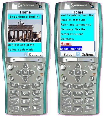
The example we are going to build is a tiny web site dealing with Berlin.
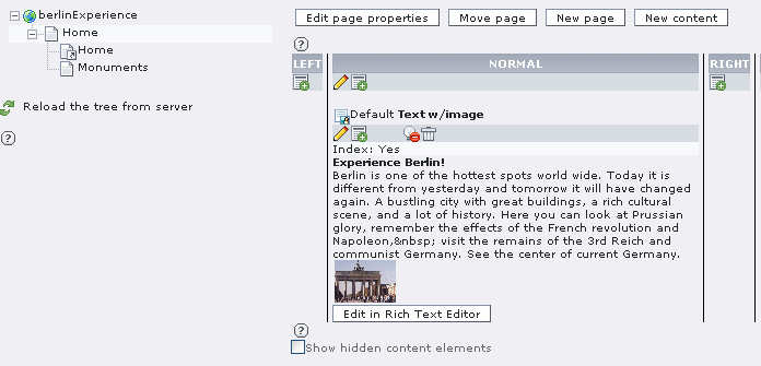
If you have installed Typo3 you will already have an empty site. The example site has the name berlinExperience. First we have to create the home page using the page module. We also create a content element of type textpic (Text w/image) in the Normal column on this page.
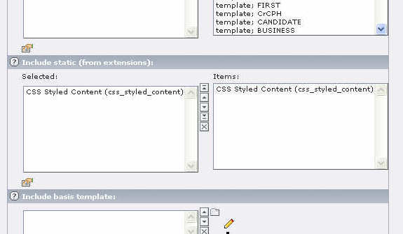
When you try to view the page in a browser you will get an error message: No template found! Thus we have to define a template in the template module. There we create a template for a new site and fill in the title. Now we have a default template for this site. If you open the home page you will see a friendly “HELLO WORLD!” This is not what we wanted to appear on this page. So we have to look a bit deeper in the template. We are going to make use of the CSS Styled Content static template which allows us to easily use CSS stylesheets for our site (at least for the desktop browsers). So, please open the whole template record in the template module of the Typo3 backend and scroll down to the section titled “Include static (from extensions)” and select the item “CSS Styled Content”.
Save the template record and open the Setup editor for this template. You’ll find a PAGE object being defined with a single element (called page.10) containing the mysterious “HELLO WORLD!”. Let us replace this with
page = PAGE
page.10 < styles.content.get
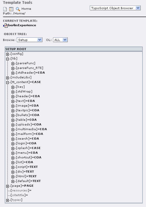
and view the page again. It will now show us magically the content element defined earlier. What has happened? The TypoScript statement page.10 < styles.content.get copied the TypoScript configuration found in styles.content.get (which had been defined in CSS Styled Content and happens to mean “get all content elements of the Normal column of this page”) to the element 10 of the page object. You can see this in detail in the template module using the TypoScript Object Browser.
The Template for “normal” browsers
Let’s get a big step further. The template will be changed to create the real page we want for the default case, i.e. the desktop browser. The following TypoScript code is entered into the Setup field of the template:
# Default PAGE object:
page = PAGE
page.typenum = 0
# configuration for "normal" browsers

config {
# output will be utf-8
renderCharset = utf-8
# doctype for normal browsers will be XHTML 1.0 Transitional
doctype = xhtml_trans
}
# stylesheet
page.stylesheet = fileadmin/template/res/dotmobi_pc.css
# menu
page.10 = HMENU
page.10.wrap =
page.10.1 = TMENU page.10.1.NO { allWrap = | } # the content page.20 < styles.content.get
At first the default page object of type PAGE is defined. This is always needed in Typo3. The page object has type 0 assigned, which is just the normal type. Then the general configuration options are set: use UTF-8 encoding and set the doctype to XHTML 1.0 Transitional. There are a lot more configuration options (see TSRef for details), but we use their default values. Then the stylesheet to be used is defined. It is located at the given path. This stylesheet will be used in addition to the standard styles used by Typo3 (or CSS Styled Content to be exact).
Next, the main menu is defined. It will be a very simple hierarchical text menu (HMENU/TMENU) which is set in a div whose style is defined in class dotmobi_menu. The line
page.10.1.NO {
allWrap = <span style="font-weight: bold;"> | </span>
}
specifies that each menu entry will be surrounded by nonbreaking spaces and set in a bold font.
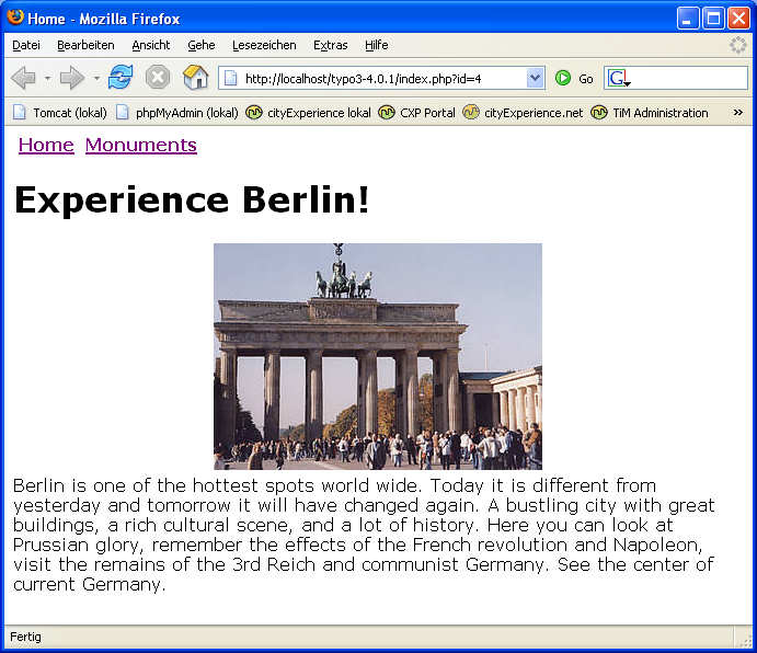
At last the content is included. The configuration of the rendering of the content elements is left as the default. The result looks like this (a second page has been defined also):
The Multiclient Template
Now we are going to add multiclient capabilities to the template. The template setup is changed to be:
# Default PAGE object:
page = PAGE
page.typenum = 0
# configuration for "normal" browsers
config {
# output will be utf-8
renderCharset = utf-8
# doctype for normal browsers will be XHTML 1.0 Transitional
doctype = xhtml_trans
}
# stylesheet
page.stylesheet = fileadmin/template/res/dotmobi_pc.css
# menu
page.10 = HMENU
page.10.wrap =
page.10.1 = TMENU page.10.1.NO { allWrap = | } # configuration for XHTML MP browsers (mobile devices) [userFunc = user_wurfl_getDeviceCapability(is_wireless_device)] # redefine global configuration config > config { # output will be utf-8 renderCharset = utf-8 # doctype for mobile devices will be XHTML MP 1.0 doctype ( ) # set namespace parameter in html tag htmlTag_setParams = xmlns=”http://www.w3.org/1999/xhtml” # save some space in rendered output removeDefaultJS = 1 disablePrefixComment = 1 inlineStyle2TempFile = 1 } # redefine content element rendering (example. only textpic) tt_content.textpic > tt_content.textpic = COA # first: the headline tt_content.textpic.10 = TEXT tt_content.textpic.10 { field = header wrap =
} # second: the image tt_content.textpic.20 = IMAGE tt_content.textpic.20 { # directory where source image is located # do not forget the trailing slash!! # define this as a constant in real life file.import = fileadmin/user_upload/ # get the first image (listNum = 0) from the current content element file.import.field = image file.import.listNum = 0 # set (maximal) image width to 120px file.width = 120 # wrap image in a div wrap =
} # third: the body tt_content.textpic.30 = TEXT tt_content.textpic.30 { field = bodytext wrap =
} # use another stylesheet page.stylesheet = fileadmin/template/res/dotmobi_mobile.css # redefine the menu (at the bottom of the page, one line per entry) page.10 > page.100 = HMENU page.100.wrap =
page.100.1 = TMENU page.100.1.NO { allWrap =
} [end] [global] # the content is the same for all variants page.20 < styles.content.get
The changes to the setup begin with the TypoScript condition
[userFunc = user_wurfl_getDeviceCapability(is_wireless_device)]
Here the WURFL is used. The function user_wurfl_getDeviceCapability(is_wireless_device) is defined in the WURFL extension and checks whether the current user agent supports the capability supplied as argument. The WURFL allows to check for numerous capabilities, but here we assume for simplicity that the capability “is_wireless_device” is sufficient to distinguish between desktop clients and mobile clients. This is surely not 100% correct, but has proved to be reliable enough to work. One could also check whether the user agent explicitly supports XHTML MP 1.0 by using the capability “html_wi_oma_xhtmlmp_1_0”, but there might be desktop web browsers which claim that too and then they would be sent the mobile rendering. It is important to note that the TypoScript condition mechanism does not allow having a strict if-then-else. A condition is checked and if it is applicable the following block of TypoScript statements will be applied. There is an [else]-condition which can be used for two cases, but the [else] only applies to the last condition. So, if you are using additional conditions to create variants of the mobile setup, e. g. to distinguish screen resolutions, the [else] might not do what you want. Therefore one should always be very careful about choosing the right capabilities. In a future version the WURFL extension might support Boolean expressions as capability argument which would make things a bit easier.
If the device supports the capability “is_wireless_device” in our case, the global configuration is unset (config >) as the default is tailored for the desktop case. Afterwards some of the config-values are set as appropriate in the XHTML MP case. Note the config.doctype value. As Typo3 does not support XHTML MP out of the box the full doctype header is defined here. It will be put as is on each page. XHTML MP is a variant of normal XHTML. Therefore we can rely on the XHTML conformant rendering of content elements provided by Typo3, if we are a bit careful. If it is necessary to deliver pages with major differences to (X)HTML, e. g. WML, Typo3 allows full control of the rendering by configuring disableAllHeaderCode = 1. Then everything (including all tags) can (and must) be explicitly defined in the template. The namespace attribute of the html-tag is configured to be set also. The last three TypoScript statements with regard to config are just there to suppress some unnecessary text otherwise rendered on each page.
The next part of the template setup is an example of how to redefine the rendering of content elements for use on a mobile device. All types of content elements which are used on the mobile web sites must be redefined. Here, only the textpic content element is redefined as an example. If you look at the default rendering of textpic in Typo3 (using CSS Styled content) you will find HTML code which is much too complex to be rendered efficiently by mobile browsers. Therefore the rendering is redefined.
With CSS Styled Content the rendering of content elements is controlled by the TypoScript object tt_content which you can inspect in the TypoScript Object Browser. It is a big CASE construct defining the configuration for each type of content element available.
For redefining the textpic it is first unset (tt_content.textpic >). For the mobile device a very simple rendering is needed:
Thus the new rendering configuration is defined as a COA (Content Object Array) which is just a list of several content objects to be rendered sequentially. The first of the content objects is the text taken from the header-field of the current content element wrapped in a div. The same is true for the last element, the bodytext. It is a bit more complicated to get the image of the current content element, but essentially the process is the same. The only thing to note is the specification of the image width. You may have seen that the width of the image of a content element can be defined in the page module.
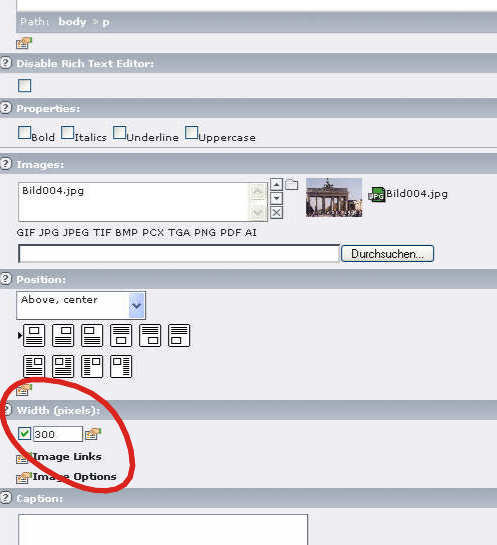
As the screens of mobile devices typically are much smaller than the big screens on the desktop a smaller image is needed in the mobile case. The configuration file.width = 120 in the setup above asks Typo3 to automatically create a scaled (new width: 120 pixels) version of the image of the content element. Here it would be easy to use the WURFL another time and configure various widths for different devices (say 120px for small screens, 240px for intermediate). One can also configure Typo3 to not scale up a small image.
After these general definitions have been made (the new textpic configuration will be used for all textpic content elements rendered on a mobile page) the more page specific configurations are defined. First another stylesheet is used. As the page.stylesheet property was set globally in the top section, it is simply overwritten for the mobile case.
For the mobile page the menu should not be horizontally rendered on top of the page but should appear at the bottom of each page with each menu entry in a new line. Therefore the menu as defined in the default case is unset (page.10 >) and a new one at the end of the page is defined (page.100), wrapping each menu item in a div.
This completes the setup for mobile devices. The condition is ended ([end]). At last the content elements are included at position 20. They are the same for all variants.
Template Modularization
Typo3 does not force you to define all variants in one big template setup as we have done for explanatory purposes here. The templates should always be broken up in smaller pieces. The Typo3 documentation shows the details. Also, for a production site one would surely employ one of the more advanced templating mechanisms Typo3 supports. But even then the selection mechanism will be done using TypoScript.
Conclusion
It has been shown how the free Open Source content management system Typo3 can be used to create multiclient sites using the WURFL extension. Although there are some inherent problems with the mechanics of the condition mechanism it is rather easy to achieve this.
References
- typo3.com
- Typo3 Homepage
- typo3.org
- Typo3 Developer Site
- WURFL Homepage
- Homepage of the WURFL
- Typo3 WURFL Extension
- the Typo3 WURFL extension in the TER
- Open Mobile Association Homepage
- Homepage of the OMA
- Openwave
- Developer site of Openwave, a major mobile browser supplier
- cityExperience.net
- site of the author, built with the technique described in this article
Author
Martin Kindler, cityExperience.net
Dipl. inf. Martin Kindler has been working for about 18 years with the internet. Currently he is owner and chairman of cityExperience.net, a company in Berlin, Germany which creates travel guides for mobile devices. His eMail address is [email protected].


Leave a Reply