


Before you ever begin testing your mobile site to determine how it looks on handsets, you should make sure the functionality of the site is working as you expect. This is not always straightforward, as you want to approximate the mobile environment as closely as possible. Fortunately, Mozilla Firefox supports some great extensions that can make testing your mobile sites a piece of cake. This article explains how to set Firefox up to act as a first pass test environment for your site.
A Testing Process
At some point, you have to test your Web site on actual mobile devices. There is no way around this; it’s the only sure way of knowing how the site will behave on mobile. But testing on mobiles is expensive. You have to have handsets to test on; you need sim cards with Web capability; you have to pay for data; and most expensively of all, it takes up a lot of time. The trick is to try to ensure that the time spent testing on mobiles is used to identify mobile-specific problems; any functionality issues with the site should be taken care of before the site even sniffs a real mobile device.
Probably the optimum testing method for a mobile site is:
- Test the site in a desktop browser first to ensure functionality behaves as expected
- Once the site is functionally complete, test using some device emulators
- When the site is working correctly across all emulators, begin testing on real handsets
This process is not flawless but, if used properly, it will save you lots of time. Many people begin testing on mobile devices and are constantly having to fix functionality bugs, republish, and retest. This is not a good use of your resources – don’t do it!
Configuring Firefox For Mobile Testing
Firefox is probably the best browser out there for mobile Web site testing. To make Firefox imitate a mobile device you need:
- The Firefox Web browser (obviously)
- The Modify Headers add-on
- The User Agent Switcher add-on
- At least one mobile device user agent
- A UA Profile HTTP Header
Every browser passes a set of HTTP Headers to the Web server. The extensions above allow you to manipulate these headers, making the Web server believe you are browsing on a mobile device. To configure Firefox:
- Download and install Firefox if you don’t already have it installed
- Download and install the Modify Headers add-on
- Download and install the User Agent Switcher add-on
After the add-ons have been installed, Firefox is ready to use for mobile site testing. Check out the Tools menu and you should see Default User Agent and Modify Headers.

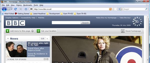
To illustrate what we are about to do, browse to http://www.bbc.co.uk/. The full desktop site appears:
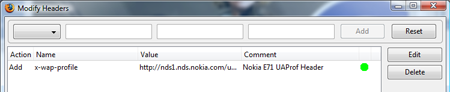
Now, we need to add a x-wap-profile HTTP Header. Most intelligent mobile Web sites look for this header to identify a mobile device. To my knowledge, only the iPhone doesn’t pass this HTTP Header. You can search around the Web to find UA Profile URLs (type “UAProf URL List” into a search engine). A good resource is Motorola’s repository.
Here’s the UA Profile URL for Nokia’s E71:
http://nds1.nds.nokia.com/uaprof/NE71-1r100.xml
In Firefox, click on the Tools menu, and choose Modify Headers. The Modify Headers dialog appears (it isn’t the most intuitive interface):
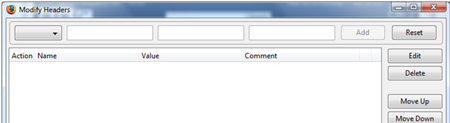
- In the drop-down list at the top-left of the screen, choose Add
- In the first text box, type x-wap-profile
- In the second box, paste in the UA Profile URL for the Nokia E71, or your own preferred URL
- Type an optional comment into the third box
- Click the Add button
- The header appears in the list with a green icon alongside it. This denotes the header is active; it can be disabled at any time by clicking the Enable/Disable button
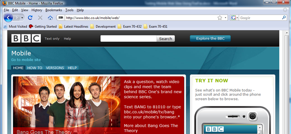
Close the Modify Headers dialog and return to the BBC Web site you had open earlier. Press F5. Hey presto! You are redirected to the BBC’s mobile site information page. This is actually a desktop page that allows you to go to the mobile version of the BBC Web site.
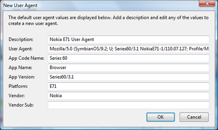
To achieve true mobile browsing in Firefox, we need to configure the user agent. To obtain a user agent, type “Nokia E71 user agent” or whatever device you are looking for into a search engine. This generally finds the user agent you are after. The user agent for the E71 is:
Mozilla/5.0 (SymbianOS/9.2; U; Series60/3.1 NokiaE71-1/110.07.127; Profile/MIDP-2.0 Configuration/CLDC-1.1 ) AppleWebKit/413 (KHTML, like Gecko) Safari/413
Most manufacturers change the user agent for a particular device model over the course of its life; values in the user agent change depending upon when a particular model is released, or if a software upgrade is applied to name two examples. But each individual device only ever passes one user agent.
To add the user agent to Firefox, go to Tools -> Default User Agent -> User Agent Switcher -> Options
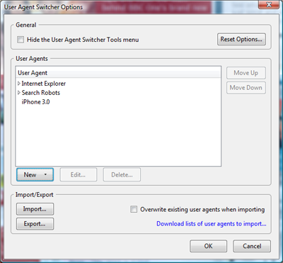
Click the New button, and choose New User Agent from the drop-down list. Fill in the boxes as required – you only really need to worry about the first two (copy and paste the user agent for the E71 above if you haven’t a user agent of your own). Click OK to save the user agent, and click OK again to return to Firefox.
Go to Tools -> Default User Agent. You will now see Nokia E71 User Agent in the list:
Click on Nokia E71 User Agent. Return to the menu and you should see it is highlighted as the user agent of choice. Now press F5 to refresh the browser again.
This time, the screen changes to the actual BBC Mobile Web site. The Firefox browser is now acting as a fully fledged Nokia E71. If your sites uses Device Atlas or some other device detection system, Device Atlas would return Nokia E71 values to your site.
You are now ready to test your mobile site via Firefox.
Summary
Thanks to add-ons written by some very clever people, a standard desktop Web browser can be enhanced to support testing of mobile Web sites. Using a desktop Web browser by itself is not enough; but considered use of mobile emulators and real devices along with desktop browsers gives a powerful and comprehensive testing environment. This can save you money and time and frees you up to do what you do best – develop.


9 Comments
Hi
As a quick and simple check of how your website looks on a smartphone you could use our free online checker – http://www.sayuconnect.com/mobile_check.php
It sometimes gets confused when users us the screen size to redirect, but mostly it gets it right
Tony