


IDC recently published research showing that more than 50% of the 418.6 million mobile phones shipped during the first quarter of the 2013 were smartphones. Back in December 2012, Forrester reported that in the USA, 19% of adults (34 million people) now own a tablet and that by 2016 that will rise to 113 million tablet owners. Generally speaking, all smartphones sold these days are touch screen as well as tablets and this feature is just as popular in emerging markets as evidenced by the launch of new Firefox OS phone and the many cheap Android handsets now available.
A few years ago there were 3 main types of touch screens: capacitive, resistive and infrared with some significant differences in their functioning. Today, capacitive touch screens are by far the most popular type in developed markets with resistive screens more ingrained in emerging markets due to lower production costs, and their hardiness in more challenging environmental conditions. By 2012, overall revenues from the touch screen market were estimated at about $14 billion.
To summarize, touch screen interfaces are here to stay. And while there may be some differences between touch technologies, there are many common aspects that designers need to consider in terms of designing a user experience.
While you should keep different types of devices, screen sizes, hardware and software platforms in mind when designing a mobile website or app for touch screen, it’s vital to consider user behaviour and interaction on touch screen smartphones as it has a direct impact on the design.
User Interaction on Touch Devices
Steven Hoober recently analyzed how people hold and interact with mobile phones when performing actions such as playing music, listening to music, and browsing. There were large differences in behaviour: 49% of people held their phones with one hand, 36% literally embrace the phone using one hand to perform an action and 15% held the phone with two hands (see image below).
While Steven Hoober doesn’t claim his study to be scientific, an interesting observation was that people often changed the way they held their phone according to the tasks they were performing. One-handed users only use their thumb to browse, those who hold the phone with two hands interact with the screen using the thumb or one of the fingers. In total, about 75% of people were interacting with the smartphone using a single thumb.

Figure 1: Stephen Hoober: Study on Touch Interaction
It would be interesting to see this research carried out on a more methodical basis. Do all users hold their phones in these ways? While this is certainly strong anecdotal evidence of primarily thumb-based interaction, Hoober has noted his observations did not include tablets (the largest device observed was a Samsung Galaxy Note 2). With more data on context, screen size, what activity or task people are performing there may be important variances in user interactions. Having researched the available material online, there appears to still be a lack of in-depth scientific studies analyzing interaction models.
What there is, however, is much research on the average size of the pointer finger (the most used after the thumb) with associated guidelines to help designers adopt a finger-friendly approach. For example, an interesting study by the research team at the MIT Touch Lab, reports the average width of the pointer finger as being 16 – 20 mm for adults which equates to a range between 45 – 57 pixels, a number which mobile designers can use as a guideline to providing a good experience on mobile.
Similar figures also crop up in the guidelines provided by some of the main device manufacturers. Apple precisely defines “the comfortable minimum size of a tappable UI element” in its Human Interface Guidelines for iOS as at least 44 pixels wide and tall. Microsoft for their part suggest 34 pixels while Nokia recommend a rather more slender minimum of 28 pixels. Because Android is a more open platform with lots of different devices, there are no official guidelines, and designers must determine the dimensions of touch targets according to the screen dimension. It’s worth noting that according to Wikipedia, the average width of the adult thumb is 25 mm (1 inch) which equates to 72 pixels.
An important caveat here, however is that a calculation of pixels per finger size should be used with caution: pixel density can change significantly from device to device. Consider for example, the pixels per inch (how many pixels fit in an inch of screen) of a HTC One versus say a Samsung Galaxy S3. The same pixel-sized feature on the HTC will be 1.5 times smaller than on the Samsung. The point here is that you need to design for the rendered size on the real device — targeting pixel sizes is no longer good enough.
In general, the smaller a touch target, the higher the risk of unintended results, poor quality of experience and excessive cognitive loading or user confusion.
Research by Microsoft bears this out, where behaviour of two groups was examined as they performed different touch actions on different sized buttons, measuring their success as a function of the size of the touch target: unsurprisingly, people are able to tap the target faster if the touch target is big enough. Consider the side-by-side images below, which are often seen in carousels. If the users’ fingers overlap neighbouring elements, unintended outcomes become more likely.

Figure 2: Importance of Size of buttons. Image: SmashingMagazine
Similar conclusions are reached here by Yong S. Park, Sung Ho Han, Jaehyun Park e Youngseok Cho. This study looks at 3 square-shaped touch key sizes (4mm, 7mm, 10mm) in various locations and highlights that in addition to the appropriateness of where the button is, the size of the touch button is positively correlated with positive outcomes for success rates, number of errors, and convenience.
Rule of thumb
Josh Clark’s aptly named rule of thumb uses the thumb’s radius of reach as a guideline for design. When holding a smartphone, the thumb generally operates in the lower left half of screen (for right handedness), which is why many of the primary controls are often organized into this bottom area of the screen.

Figure 3: Josh Clark’s Rule of Thumb
Of course, this is not an absolute rule, and the positioning of the primary controls ought to depend on ease of thumb use, which will change according to the size of the screen. Bigger touch screens, for example, may change the natural position of the thumb and the fingers which may present difficulties if they’re at the bottom of the screen.
There are other important differences to take into account. The below table, by Jakob Nielsen shows the main differences between mouse driven interaction common on desktop computers and finger interaction typical of touch devices. Note the differences in factors such as precision, number of controls, signal states and other variables.
| Mouse | Fingers | |
|---|---|---|
| Precision | High | Low |
| Number of points specified | 1 |
usually 1 2–3 with multi-touch |
| Number of controls | 3: left/right button, scroll wheel | 1 |
| Homing time? | Yes | No |
| Signal states | Hover, mouse-down, mouse-up | Finger-down, finger-up |
| Accelerated movements | Yes | No |
|
Suitable for use with big desktop monitors (30-inch or more) |
Yes, because of acceleration |
No: arm fatigue |
| Visible pointer/cursor | Yes | No |
| Obscures view of screen | No, thus allowing for continuous visual feedback | Yes |
| Suitable for mobile | No |
Yes: nothing extra to carry around |
| Ease of learning | Fairly easy | Virtually no learning time |
| Direct engagement with screen and “fun” to use | No: an indirect pointing device | Yes |
| Accessibility support | Yes | No |
Figure 4: Jakob Nielsen: Mouse vs Finger Interaction
Clearly touch design on smartphones represent a real challenge for designers. On mobile there is just less space than on tablets or desktop due to smaller screen dimensions. In terms of UX, as we describe here, it’s also important to factor in other considerations, such as minimizing action paths, prioritizing important features, ensuring users can easily navigate the site, as well as ensuring touch targets are sized correctly.
Emerging trends: What the Big Brands are doing
Many big brands are increasingly embracing touch gestures and finger sized design introducing new approaches, which point the way for future developments.
Ubuntu is working on Touch, a new mobile OS which bases interaction on gesture-based navigation rather than on the buttons: swiping from the left side of the screen with a finger opens or closes the unity-style list of applications. Swiping in the opposite direction switches between the applications in use. Swiping up and down allows users to perform different activities such as going to Settings or to Search.
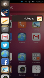
Figure 5: Ubuntu’s Touch OS
Google, for its part, has included finger gestures in the latest version of Maps for Android devices, intended to improve usability on an already impressive touch interface.
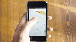
Figure 6: Gesture on Google Maps
Android has also implemented a fallback for the so called “fat finger syndrome” which zooms into the selection area if there is an inaccurate click.
The inexorable rise of touch screen devices, and the growing computing firepower of smartphones promises that there will be plenty more developments in touch design to come. Watch this space.


Leave a Reply