


This article will show you how to use a technique called RESS (Responsive design with Server Side components) to make significant performance and reach improvements to a website for both mobile and desktop alike. This technique requires just a few lines of code, some simple configuration and no ongoing maintenance. The site will change from one that works on desktops, tablets and smartphones to one that works on almost anything, anywhere and loads faster in all cases. It’s hard to over-emphasize the importance of this but if you need a good case study read what happened to YouTube when they lightened their pages (summary: entire new territories opened up to them).
The following 3 screen shots show the sample site with increasing levels of RESS optimization applied and the resulting overall page sizes.

|

|

|
|
Original 1,027 KB |
Partial optimization 253 KB |
Full optimization 153 KB |
The discerning reader will note that the screenshots all look the same, and that’s the whole point: the optimization procedure we’ll be applying ensures that the optics of the website remain intact, while improving the user experience significantly due to the smaller page size. In fact, the screenshots are not exactly the same, but the slight differences in the quality of the images tend to go unnoticed on phone screens.
Traditionally, language issues aside, there have been two problems with making a website that is truly accessible world wide:
- Device diversity. Remember what the first two W’s in WWW stand for? A truly global website should work on any device that your customer uses
- Constrained connectivity. Many places are not well connected to the internet, whether in terms of capacity or other issues such as data plans. This issue is just as relevant to people living in modern well-connected cities as it is to rural areas in less developed nations.
This article will help your website break through this glass ceiling (floor?) and allow anyone anywhere to reach your content with equal ease. Note that this article will use open source software in conjunction with a commercial offering (DeviceAtlas) to achieve this goal but other device detection solutions could be utilized in its place.
Three levels of optimization are demonstrated here, each of which builds on the previous optimization, but which can be implemented separately also.
- Image payload reduction (the biggest effect)
- JavaScript & CSS payload reduction
- Further optimizations based on bandwidth detection
Before we begin it’s worth checking why this is necessary.
Background to RWD and RESS
Responsive web design (RWD) is fast becoming the preferred method for making a website mobile-friendly, and with good reason. For many sites it achieves a good balance between an acceptable level of mobile-friendliness and reasonable ease of implementation.
But one of RWD’s great merits is also one of its fundamental flaws—the fact that all devices are sent the same payload means that devices with low resolution screens are sent the same images as those sent to high resolution devices, even though they can’t show them at their native resolution. This is inefficient at best and market-limiting at worse. The result is an “exclusive” web page rather than a world-wide web page, a page that really works well only on high end, well-connected devices with generous data plans.
There have been many attempts to solve this problem, with varying levels of effectiveness. Probably the most promising of these approaches is to solve it in the browser itself by allowing it to make the determination of the most appropriate image version to fetch. There is an ongoing initiative to standardize an approach in the W3C but this is unlikely to be commonplace in browsers anytime soon. The candidate solutions (the new <picture> element and new srcset attribute for the <img> element) both have their own issues, particularly when it comes to site updates. Rather than discussing this here I suggest you read Jason Grigsby‘s post on the subject. In the meantime there are polyfills such as Boris Smus’ srcset-polyfill that mimics some of the proposed attribute’s behaviour.
This article will describe a relatively straightforward approach to minimizing RWD page weight using a touch of server-side magic. We’ll be using device detection on the server to help optimize the images when they’re requested by the browsers by reducing their dimensions to the optimum size.
Some solutions have suggested using Sencha.io Src (neé TinySRC) or other image resizing libraries but it is just as easy to do this yourself, and then you get total control over the result. Yes, this does exchange one external dependancy for another, but it also gives you the ability to make optimizations that go far beyond just images. We’ll be using mod_pagespeed for this purpose, an open source project from Google.
This results in quite dramatic weight savings with very little work. If you follow the steps in this article you should be able to achieve a many-fold saving in image weight with 3 easy steps, only 4 lines of code and 1 line of configuration.
This article assumes that you are using the Apache web server and are comfortable with some light PHP coding but the techniques described will work with NGINX also, and any programming language.
The Site
My sample “site” is based on Twitter’s open source Bootstrap web framework in order to save the world from my design skills. I created a single page site for a fictional mobile phone store. I’ve deliberately created a visually rich page with an industry-average breakdown of HTML, images and JS. This page is based on a lightly modified version of the Bootstrap carousel template. Here is the page in its entirety, as you would see it on a desktop browser:
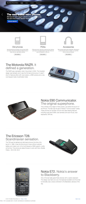
The site has an approximately industry-average payload breakdown as follows:
| Component | Size on disk |
|---|---|
| HTML | 12 KB |
| Image | 941 KB (73%) |
| JavaScript (mostly minified) | 159 KB |
| CSS | 170 KB |
| Total | 1,281 KB |
Step-by-step Instructions
Step 1
Install PageSpeed. This is best done by reading Google’s instructions here. The installation process usually activates the module for the default website but you might need to ensure that it works with your virtual hosts, if configured. You can read how to do this here. Basically you just have to add a line to each one, or get them all to inherit from the default configuration server-wide.
Next, restart your web server.
Step 2
Get a DeviceAtlas Cloud license (free trial available here, monthly cost $40) or other detection solution. If using DeviceAtlas you’ll need to enter your license key in the DeviceAtlasCloud/Client.php file after you unpack the ZIP file. DeviceAtlas will be used to decide the optimal size target for resizing images.
Step 3
Copy the DeviceAtlas PHP file to a directory where it is executable by the web server. In this case I’ve created a directory in the root of the site called DeviceAtlasCloud. Enter the following code at the top of your HTML file or site template to set up a couple of variables that we can use throughout the page. If you’re using a different solution the syntax will vary but the same properties should be available.
|
1 2 3 4 5 6 |
<?php include 'DeviceAtlasCloud/Client.php'; // instantiate client $results = DeviceAtlasCloudClient::getDeviceData(); // fetch properties for current device $props = $results['properties']; // store in $props $width = (isset($props['displayWidth'])) ? $props['displayWidth'] : ""; // set $width to correct width or "" if unknown ?> |
Step 4
The final step is to make sure that all of your images that may need resizing have a width attribute set to use the $width variable, as follows:
|
1 |
<img src="img/slide-01.jpg" width="<?php echo $width; ?>" alt="image description" /> |
The effect of this change is that images will now have their width attribute set from the $width variable, which is set automatically to the maximum display width for each device. Then, PageSpeed notices the width=”…” tag for each image and resizes it down if necessary, replacing the image source attribute with a reference to a resized version of the same thing. There is no need to set the height attribute because PageSpeed will automatically keep the aspect ratio intact. Resized images are cached so there isn’t really any significant impact on the server. Refer to the PageSpeed configuration notes below for more fine-grained control over this cache.
Note that you should only add this variable width tag to images that require resizing for each device—you probably don’t want to add it to images that are already small enough e.g. bullet icons etc. Also, you should be aware that setting the width attribute for each image will need to play nicely with any CSS that you define for image display. Those using CMSes to manage their web sitesmay have to use a different technique for this depending on what access the CMS gives you to the underlying HTML.
Background images may require a different approach, depending on how they are utilized on the site but PageSpeed will read inline style=”…” tags.
Result 1
With those changes made to the site it’s time to see how we’re doing. To measure the impact of this step I tested download speed of this test site for different devices and network speeds, using the ever-useful Charles Proxy and real devices forced into various network configurations to reduce available bandwidth.
Before making the changes the overall page size was 1,027 KB, regardless of device i.e. a dynamic range of exactly 1.0. The breakdown is as follows:
| Component | Size on disk | Size over network |
|---|---|---|
| HTML | 12 KB | 3 KB |
| Images | 941 KB | 941 KB (73%) |
| JavaScript | 159 KB | 55 KB |
| CSS | 170 KB | 27 KB |
| Total | 1,281 KB | 1,027 KB |
This is the over-the-network size of the page thanks to GZIP compression from Apache. The RWD design means that it looked OK on small screens, but wasn’t an efficient use of network resources because the original images are about five times wider (in pixel terms) than the average phone display and hence impossible to display at full resolution without panning. In fact, the sheer size of the page meant that it didn’t even finish loading on some devices.
After following the above steps the payload breakdown for an iPhone is as follows:
| Component | Size over network |
|---|---|
| HTML | 3 KB |
| Images | 177 KB |
| JavaScript | 51 KB |
| CSS | 21 KB |
| Total | 253 KB (75% lighter) |
So the overall page size has dropped to 1/4 of its original size, with the reduction in image sizes accounting for the majority of this. On devices with lower resolutions screens further gains are possible—the same page on a Nokia feature phone (6230) now has a total image weight of just 89 KB, a large saving compared to the original. Importantly, there is no user-perceptible difference between the site before and after: the image data that was removed could not easily have been seen by person holding the phone.
After following the 4 steps outlined the page weight now varies between 1,027 KB and about 164 KB. In other words, the page has gone from having a dynamic range factor of 1 to 6.8, with the image payload shrinking from 941 KB to just 80 KB. This has a huge impact on real world customers:
- Much faster page load times → better engagement, fewer drop-offs
- Lower data plan impact → more return visits
- Wider device and network compatibility → improved reach
Here’s the loading time effect on an retina iPhone using 3G and 2.5G networks:
| Device / network | Before | After |
|---|---|---|
| iPhone 3G | 14s | 6s (2.3× faster) |
| iPhone GPRS | 2m 30s | 35s (4.3× faster) |
Results on Android devices are similar. On lower-end devices more dramatic improvements are experienced because the image resizing gains are larger.
Going Further, Part #1: JavaScript & CSS
So far we’ve looked only at the main source of bloat on pages: bitmap images. But screen size shouldn’t be the sole factor in our methods — user contexts and constraints demand more of a multi-device publishing strategy because many additional optimizations are to be made. For example, if you know that the requesting device doesn’t support JavaScript or rich CSS, then ditching them might make sense. This is quite straightforward to accomplish.
If we add another line of PHP to the top of our HTML file we can do a little more.
|
1 |
$highEndDevice = (isset($properties['browserRenderingEngine']) && in_array($properties['browserRenderingEngine'], array('Gecko', 'Trident', 'WebKit', 'Presto'))); |
We are making the determination of a low-end device based on its rendering engine. This is a crude rule but good enough to demonstrate a point. Based on this variable we can now selectively include some resources only if they’re beneficial. In this case, if the device appears to be a low-end device we’ll jettison the CSS and JavaScript because low-end phones have issues with both the file size and the rendering of this CSS, and usually won’t run the JS:
|
1 2 3 4 5 |
<?php if ($highEndDevice): ?> <link href="css/bootstrap.css" rel="stylesheet"> <link href="css/bootstrap-responsive.css" rel="stylesheet"> <link href="css/additional.css" rel="stylesheet"> <?php endif; ?> |
And now the JavaScript:
|
1 2 3 4 5 6 7 8 |
<?php if ($highEndDevice): ?> <!-- Le javascript ================================================== --> <!-- Placed at the end of the document so the pages load faster --> <script src="js/jquery.js"></script> . . <?php endif; ?> |
This saves a further 72KB (quite a reduction from 253 KB!) and actually makes the page look better on low-end devices (see screen shot at end of article), in addition to being quicker to render. Now, when viewed on a low-end device the page weight is as follows:
| Component | Size over network |
|---|---|
| HTML | 3 KB |
| Images | 50 KB |
| JavaScript | 0 KB |
| CSS | 0 KB |
| Total | 53 KB |
This means that our simple RWD page has now gone from a fixed size of about 1 MB to a highly varying one that goes as low as about 50 KB, 20x smaller than the initial page. Not a bad result for less than 10 lines of code. The net result is that our page is now viewable on almost anything, anywhere …quickly, from television to feature phone. You may not be targetting TVs and feature phones, but now they will come to you.
Note: In testing this approach on real devices the HTML5 doctype tag did not cause problems—the page loaded on pretty much every device I tried.
Going Further, Part #2: Connectivity Detection
Most of the weight savings so far hinge on the fact that certain low-end mobile devices don’t need full resolution images, rich styling and JavaScript. This technique is highly effective, but we can do more to cater to our users and extend our reach. Desktop devices sometimes need help, too. Anybody who has used their laptop over airport Wi-Fi, conference Wi-Fi, or from a poorly connected country knows just how frustrating it is to use the web when pages are large.
Connectivity detection can come to the rescue here. The idea is that, if you can detect the current connectivity available to the requesting browser, you can apply similar image compression techniques dynamically depending on the client’s available bandwidth. This can make a huge difference to the browsing experience, at some cost to page fidelity: if we detect a poor connection, images can be aggressively compressed without reducing their pixel size. The result is a page that loads much faster with only a slight impact on the experience—the page layout and overall appearance are preserved. Depending on the compression levels chosen many people won’t even notice.
Making bandwidth information available to the browser is something that the W3C are working on but the Network Information API is still in draft status so it’s not going to be widely deployed in the near future.
In the meantime we can utilize some server-side capabilities. DeviceAtlas incorporates a very useful feature to do exactly this, allowing the developer to make some useful choices about what to send the client when bandwidth is limited. For this example we’ll do something quite simple, yet very effective: if the detected bandwidth available to the device falls below a certain threshold we will redirect the browser to a different virtual host. This virtual host is served by the same web server and serves the exact same page, but triggers a different set of options for mod_pagespeed. In this case we’ll change the image compression level from its default to something much lower, say 20%. At this level images are still very much recognizable and will fit in the page’s layout, but will be many times smaller in bytes.
What follows is a simple way to achieve this, shown here merely as a quick example of what is possible rather than a definitive technique. First, add a new vhost to your server config and configure PageSpeed to use different settings for this. Then restart your web server. In my case I am using site.com and lo.site.com as my vhosts. Note that the DocumentRoot is the same in each case—the exact same HTML is being served for both vhosts.
    ServerAdmin webmaster@localhost

    ServerName site.com

    DocumentRoot /var/www/site.com
ModPagespeed on
ServerAdmin webmaster@localhost
ServerName lo.site.com
DocumentRoot /var/www/site.com
ModPagespeed on
ModPagespeedImageRecompressionQuality 20
Next you need to add the connectivity checking code to your site template. This switches virtual host if connectivity looks to be poor:
|
1 2 3 4 5 6 7 8 9 10 11 12 13 14 15 16 17 18 19 20 21 22 23 24 |
require_once 'DeviceAtlasNPC.php'; // Include network performance checker session_start(); $deviceAtlasNPC = new DeviceAtlasNPC(); // instantiate network performance checker $quality = $deviceAtlasNPC->getQuality(); // test network performance for current user $path = $_SERVER['SCRIPT_NAME']; switch($quality) { case DeviceAtlasNPC::HIGH_QUALITY: if ($_SERVER['HTTP_HOST'] == 'lo.site.com') { header("Location: http://site.com/".$path); } break; case DeviceAtlasNPC::MEDIUM_QUALITY: if ($_SERVER['HTTP_HOST'] == 'lo.site.com') { header("Location: http://site.com/".$path); } break; case DeviceAtlasNPC::LOW_QUALITY: if ($_SERVER['HTTP_HOST'] == 'site.com') { header("Location: http://lo.site.com/".$path); } break; default: } |
Yes, the initial redirect to the lower bandwidth site does impact the load time, but this penalty is far outweighed by the net savings in doing so, particularly for those with constrained bandwidth; high bandwidth customers should be almost unaffected. The cost of this redirect step on a slow GPRS connection is approximately 1s, but the resulting savings can add up to minutes.
Overall Results
So let’s have a look at how it all comes together, with the various optimisations, device types and connectivity options. The following table sums it all up.
| Original site | Add image resizing | Adaptive JS & CSS | Adapt to connectivity | |||||
|---|---|---|---|---|---|---|---|---|
| Page size | Load time | Page size | Load time | Page size | Load time | Page size | Load time | |
| Desktop (high speed) | 1027 KB | 3s | 921 KB | 3s | 921 KB | 3s | 921 KB | 3s |
| Desktop (56K modem) | 1027 KB | 3m 27s | 921 KB | 3m 14s | 921 KB | 3m 15s | 227 KB | 40s |
| iPhone 3G | 1027 KB | 14s | 253 KB | 7s | 253 KB | 6s | 153 KB | 5s |
| iPhone GPRS | 1027 KB | 2m 30s | 253 KB | 40s | 253 KB | 40s | 153 KB | 25s |
| Feature phone (2G) | 1027 KB | ∞ | 203 KB | 35s | 87 KB | 25s | 25 KB | 12s |
These loading times are all worst-case scenarios tested with an empty cache. Subsequent page loads as you traverse the site will feel much faster.
With all of these optimizations in place, we now have a page that scales dynamically in richness and size, from about 1 MB all the way down to 25 KB, all in. The page incorporates the best of RWD and server-side optimizations to yield a dynamic range factor of over 40.
The website is now responsive to multiple factors, not just one: screen size, device capabilities and network performance. As a result, the “reach” of this page has been extended from desktop and smart devices in well-connected locations to almost anything, anywhere, regardless of connection type. Apart from making sure that your image size tags are populated dynamically there wasn’t much work to do to make this happen.
Site before optimization on different devices

|

|

|
|
Desktop
1360 x 768 1,027 KB |
iPhone
320 x 480 1,027 KB |
Nokia 6300
240 x 320 1,027 KB |
Site after optimization on different devices

|

|

|
|
Desktop
1360 x 768 1,027 KB |
iPhone
320 x 480 153 KB |
Nokia 6300
240 x 320 25 KB |
Circling back to the page linked at the top of this article, Chris Zacharias, speaking of his experience optimizing YouTube’s page weight, said:
…[Previously] entire populations of people simply could not use YouTube because it took too long to see anything.
By keeping your code small and lightweight, you can literally open your product up to new markets.
By using some of the techniques outlined in this article you may be able to achieve similar results for your website.
Notes
mod_pagespeed has a couple of other useful tricks up its sleeve. You can find some additional options that might be useful described here.
Many thanks to @jonathanheron of McCannBlue for reviewing this article.


Leave a Reply