In this article we take a look at some of the new form enhancements available in HTML5, and look at how they contribute to an improved user experience for mobile forms. In particular we will see how forms can be enhanced with the additional input types offered by HTML5, and show what you can expect across various classes of mobile browser.
HTML5 Input Types
HTML5 has a bunch of new input types for forms. These input types allow better input control and validation, some of which are particularly useful for mobile users, where input is often more cumbersome than on desktop. The full list of input types is included below:
| color | date | datetime |
| datetime-local | month | |
| number | range | search |
| tel | time | url |
| week |
In the following sections, we take a look at some of the more interesting ones, such as color, date, email, range, tel, which have fairly obvious application to mobile devices. For demonstration purposes, we provide screenshots on a number of mobile browsers, as well as embedding live examples throughout the article.
Input type color
When supported, using this input type will trigger a colour-picker on the client device. The chosen colour will be submitted as the corresponding RGB hex value.
Usage:
<input type="color" />
Try it:
Depending on your browser, a text field, or a colour-input field may be displayed below. If it is a colour-input, click it to trigger the colour picker.
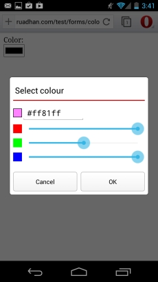
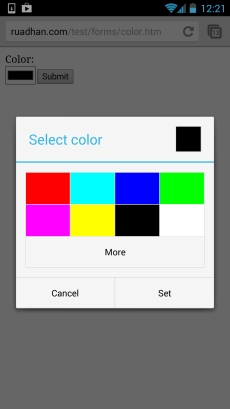
Color input as implemented on Opera Mobile, and Chrome browsers on Android
Browser support and fallbacks
| Android | iOS | IE Mobile | Opera Mobile | Opera Classic | Opera Mini | Firefox Mobile | Chrome for Android | |
|---|---|---|---|---|---|---|---|---|
| color | ||||||||
| (Sources: caniuse.com, DeviceAtlas, mobilehtml5.org) | ||||||||
When not supported, a simple text field is displayed. Since most users won’t know the RGB hex value of a colour, it’s definitely worth having a fallback in place. Based on the table above you can decide to display a JavaScript colour picker for high-end devices, and implement a simple server-side choice for low-end devices.
Input type date
When supported, interacting with a field using this input type will display a native-like date picker widget.
Usage:
<input type="date" />
Try it:
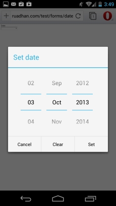
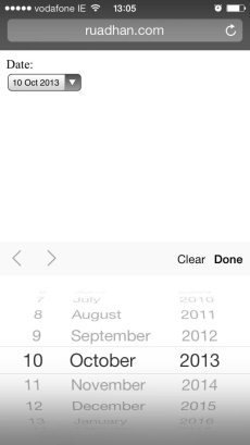
Date input type as implemented on Opera Mobile for Android, and iOS 7
Note that the date input type, as well as variants datetime and datetime-local offer useful attributes, such as min and max that can restrict and validate the user input data. We take a closer look at this in the section below on form validation.
Browser support and fallbacks
| Android | iOS | IE Mobile | Opera Mobile | Opera Classic | Opera Mini | Firefox Mobile | Chrome for Android | |
|---|---|---|---|---|---|---|---|---|
| date | ||||||||
| (Sources: caniuse.com, DeviceAtlas, mobilehtml5.org) | ||||||||
Although the implementations are different across the various mobile OS platforms, support is quite widespread, with the exception of the stock Android browser.
For this browser and for low-end devices a simple text field will be displayed. This is not very user-friendly for date input. A JavaScript datepicker can be implemented for high-end devices which do not support this field. A good server-side fallback for low-end devices is to build three dropdowns, for year, month, and day.
On desktop browsers too, this input type is widely supported, with the exception of Safari, Internet Explorer and Firefox. However, IE Edge does support date input types, and it’s under development in Firefox (and available in Firefox Nightly builds).
Input type datetime, and datetime-local
These input types allow the user to enter both time and date information. When supported, interacting with a field using this input type will display a native-like date picker widget, and a time widget below the date. The difference between datetime and datetime-local is that the former is with respect to UTC time, but the latter does not carry any timezone information at all.
Usage:
<input type="datetime-local" />
Try it:
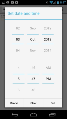
Datetime-local input as implemented on Chrome for Android browser
Browser support and fallbacks
| Android | iOS | IE Mobile | Opera Mobile | Opera Classic | Opera Mini | Firefox Mobile | Chrome for Android | |
|---|---|---|---|---|---|---|---|---|
| Datetime/ datetime-local |
||||||||
| (Sources: caniuse.com, DeviceAtlas, mobilehtml5.org) | ||||||||
At the time of writing, there is more support across mobile browsers for datetime-local than there is for datetime. For instance, Chrome and Firefox for Android both support datetime-local but not datetime. In fact selecting datetime field in Firefox (v24.0) crashed the browser in our testing. So, unless there is a specific requirement to include the timezone information with the form submission, it’s probably safer to stick with datetime-local.
For unsupported browsers and low-end devices a simple text field will be displayed. As mentioned for the date field above, for low-end devices a user-friendly server-side fallback is to build three dropdowns for day, month, and year. For high end devices which don’t support this input type, a JavaScript datetime picker can be implemented as a fallback.
Input type email
This one doesn’t need much discussion. Where supported, the input will be restricted to valid email addresses by the browser. When an invalid email address is submitted, the browser will display an error message, as illustrated in the image below. The browser may also display a modified keyboard to include the ‘@’ symbol, to make inputting an email address that little bit easier.
Usage:
<input type="email" />
Try it:
On desktop browsers, this field will look like a normal text field; on mobile browsers a keyboard optimised for email address input may be displayed.
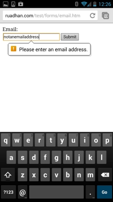
Email input type on Chrome for Android browser, showing message – note the promotion of the ‘@’ symbol required for email input
Browser support and fallbacks
The email input type is well supported across mobile browsers. There is no real need for a fallback (except for where client-side validation is desired, of course) as a text field will used anyway where it is not supported.
Input type number
This is another one that doesn’t need much discussion. Where supported, the input will be restricted to valid numbers by the browser. The browser may also display a numeric keypad, to make numeric input easier. On desktop browsers, increment and decrement controls are displayed beside the field.
Usage:
<input type="number" />
Try it:
On mobile browsers, when supported, if you click on the input field below, you will get a numeric keypad. On desktop browsers, you may be presented with increment and decrement controls to the side of the input field.
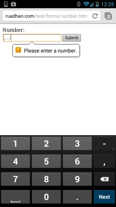
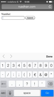
Number input type, rendered on Chrome for Android (left) and iOS 7 (right). Note the numeric keypad on both
Browser support and fallbacks
| Android | iOS | IE Mobile | Opera Mobile | Opera Classic | Opera Mini | Firefox Mobile | Chrome for Android | |
|---|---|---|---|---|---|---|---|---|
| number | ||||||||
| (Sources: caniuse.com, DeviceAtlas, mobilehtml5.org) | ||||||||
While quite widely supported superficially in displaying a numeric keyboard, there is mixed support for actual numeric validation, so any desired validation should be implemented by some other means (JavaScript/server-side for high-end, and server-side for low-end devices). Increment and decrement controls are generally only displayed on desktop browsers. There is mixed support for min and max attributes, with Firefox, Chrome, and Opera supporting, while stock Android does not. Therefore most of the mobile browsers are listed as having only partial support in the table above.
Input type tel
The tel input type is very similar to the number input type. The main difference is in the numeric keypad that is displayed on some browsers. For number a simple numeric keypad is shown, but for tel the user is presented with a virtual telephone keypad, complete with alphanumeric keys.
Usage:
<input type="tel" />
Try it:
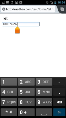
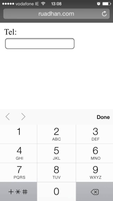
Tel input type, rendered on Firefox for Android (left) and iOS7 (right). Note the alphanumeric phone dialler keypad in both
Browser support and fallbacks
| Android | iOS | IE Mobile | Opera Mobile | Opera Classic | Opera Mini | Firefox Mobile | Chrome for Android | |
|---|---|---|---|---|---|---|---|---|
| tel | ||||||||
| (Sources: caniuse.com, DeviceAtlas, mobilehtml5.org) | ||||||||
As outlined in the table above, this input type is quite widely supported, at least in terms of providing the contextualised virtual keypad. No real fallback is necessary here; if client-side validation is required, then this will have to be implemented by the developer for all devices.
Input type search
The purpose of this type is to denote that the field is a search field. On the face of it, it is not that much different from text input type, at the time of writing. For most browsers, a field of this type is indistinguishable from the text input type. However, with a little digging, there are some subtleties to it. For example, if a results attribute is added (i.e. something like
<input type="search" results="10" />
), then at least some webkit browsers (for example Chrome mobile & desktop, but not stock Android) will display a small magnifying glass icon in the search box, as illustrated below.
In addition, once you begin typing, many browsers will display a small ‘x’ at the right side of the text box, to easily remove any typed text. And a contextualised keyboard is displayed in most supporting browsers too: the iOS keyboard shows a Search instead of the usual Go; similarly, Android displays a magnifying glass icon on the submit button of the virtual keyboard.
Usage:
<input type="search" />
Try it:
Depending on your browser, you may notice a small magnifying glass in the textfield below, and you may see a small ‘x’ on the right of the field once you start typing. No special restrictions or validations are performed.
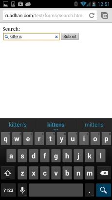
Input type search rendered on Chrome for Android browser
Browser support and fallbacks
| Android | iOS | IE Mobile | Opera Mobile | Opera Classic | Opera Mini | Firefox Mobile | Chrome for Android | |
|---|---|---|---|---|---|---|---|---|
| search | ||||||||
| (Sources: caniuse.com, DeviceAtlas, mobilehtml5.org) | ||||||||
This field is indistinguishable from a text field with respect to the values it submits. However, implementations across mobile browsers differ in terms of how the field is styled by the browser. It has also been reported that styling this field can be problematic when the browser does interpret this field as a search field. See this discussion on styling limitations for more details. While most mobile browsers will present an optimised keyboard (the action button shows a magnifying glass, or is labeled Search), there are differences between browsers in terms of the visual candy shown, such as the magnifying glass in the field itself.
Input type range
An input field using the range input type is generally rendered as a slider. It is very well supported across mobile browsers. Values submitted are numeric.
Usage:
<input type="range" />
The default range on most browsers is between 0 and 100. That is, the leftmost position on the slider corresponds to 0, and the rightmost to 100. It is possible to modify the range using the min and max attributes. We can also specify a step value, using the step attribute. So, to specify a range between 5 and 50, with a step size of 5, we would use:
<input type="range" min="5" max="50" step="5"/>
Try it:
On most mobile and desktop browsers, a range slider should be displayed below.
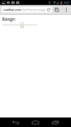
Range input type as rendered on Chrome for Android browser
| Android | iOS | IE Mobile | Opera Mobile | Opera Classic | Opera Mini | Firefox Mobile | Chrome for Android | |
|---|---|---|---|---|---|---|---|---|
| range | ||||||||
| (Sources: caniuse.com, DeviceAtlas, mobilehtml5.org) | ||||||||
Form validation
Client side validation is simple to set up in HTML5. Various attributes can be applied to restrict the user input in various ways.
Required attribute
Requiring a field be completed before submission is as simple as adding a required attribute:
<input type="text" required />
Then, on supported devices, the browser will not permit the form to be submitted without completing the field. Usually some notification is displayed in this situation, see for example Chrome on Android and Safari on iOS pictured below:
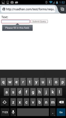
Required input field on Firefox for Android
Try it:
In the form below, input is required. Try to submit without any input to see an HTML5 error message.
Min, Max, and Step Attributes
Min and max attributes are mainly for use with numeric input types, such as number and range. We saw them briefly when discussing the range input type above. The min and max attributes have the effect one might expect of them, restricting the input to minimum and maximum values. If a value falls outside the specified band, then the browser will pop up an error message. The step attribute causes the input to be restricted to only certain values in the range. For example, step 5 means that only every fifth value in the actual range is acceptable.
Try it:
The form below accepts values between 5 and 50, in steps of five – enter a value outside these values to see a validation error.
Interestingly, these attributes can be applied to date inputs too, so that, for example, you could specify that a date input value must correspond to a future date if you set the min attribute to today’s date. So, the input field
<input type="date" min="2013-10-01">
would accept only dates after 2013-10-01.
Regular Expressions
Regular expressions can be applied to any field simply by adding the pattern attribute. This offers great flexibility to restrict the input to anything you can think of that might not already be offered through the out-of-the-box types such as number and email. Knowledge of regular expressions is required, but as a relatively easy example, you can use something like the following to restrict the input to only alphabetic characters:
<input type="text" pattern="[a-zA-Z]*" />
Try it:
No validation
If you don’t want any client side form validation at all – say you just want the optimised keyboard for a particular input type, but you don’t want the validation that comes with it, then this can be achieved with the novalidate attribute. This attribute is applied to the form element, not to an individual input field, so the validation is an all or nothing affair using this attribute. The form below will not validate email address entry, but will display the email optimised virtual keyboard on supported devices.
  <form novalidate>
    <input type="email" id="useremail" />
  </form>
Custom Validation Messages
In the last section we saw how we can trigger client side validation through various new attributes that can be applied to input elements. In some cases however, we may well want to tweak the validation message displayed by the browser. For instance, if we have a complex regular expression to validate or restrict an input, then we might want to instruct the user in a natural language as to what input is expected, rather than displaying the regular expression and hoping that they will know how to interpret and satisfy it.
Conveniently, custom validation messages are possible via the HTML5 JavaScript method setCustomValidity. We saw an example above where an email field was required, and Chrome on Android displayed the message Please enter an email address. Let’s see how we would change this message to Email, yo!.
First we’ll start off with a simple form with the email field as above:
  <form>
    Email:<br/>
    <input type="email" name="email" id="email" required/>
  </form>
Note that we have added the required attribute, and given it an id of email.
Next we need to find the input field in the DOM that we are interested in. In this case, it’s the element with id email. We can get a reference to this element with
var email = document.getElementById("email");
.
We can now attach an event handler to this element in which we set a new invalid message, so that whenever the invalid state is detected our new message is displayed instead of the default.
  email.oninvalid = function(e) {
    e.target.setCustomValidity("");
    if (!e.target.validity.valid) {
      e.target.setCustomValidity("Email, yo!");
    }
  }
In the handler function we check the validity of the element using the
validity.valid
property, and when it’s not valid, we use the
setCustomValidity
method to apply our custom message.
Finally, we can add a little panache using the CSS :valid pseudo class to apply a visual cue to the validity of the input as it is being entered. Here we set a green background for valid input:
  :valid {
    background: #98FB98;
  }
Try it:
A live example is displayed below – enter an valid email address below to see the custom styling, and enter an invalid email address to see the custom validity message.
Form validation browser support
HTML5 form validation is widely supported across desktop and mobile browsers alike. Few exceptions exist. Before version 10.1, Safari desktop only delivered partial support in that WebKit did not support HTML interactive form validation, which occurs when a form is submitted. This is coming in version 10.1, although there is no ETA for Safari Mobile.
| Android | iOS | IE Mobile | Opera Mobile | Opera Classic | Opera Mini | Firefox Mobile | Chrome for Android | |
|---|---|---|---|---|---|---|---|---|
| Form validation |
||||||||
| (Sources: caniuse.com, DeviceAtlas, mobilehtml5.org) | ||||||||
Browser compatibility & Fallbacks
Mobile browser support for the new input types is not widely consistent. The examples throughout this article illustrate the differences across a small sample of current mobile browsers. Input type range appears to be both the most widely, and the most consistently supported.
At worst, any unsupported type will be implemented as a text field, so this can serve as the ultimate fallback, requiring those less motivated among us to do absolutely nothing for unsupported browsers. However, you can usually do a little bit better by making broad device categories and sending different markup to each device category.
Given the generally higher user effort involved in providing input on a mobile device, it’s definitely worth exploiting these new input types where possible.
References
- HTML5 reference http://www.w3.org/TR/html5/
- Discussion on styling input type search http://css-tricks.com/webkit-html5-search-inputs
Updated: 08/02/2017 Updated to note improved Safari support for form validation, and advances in date format support
Published: 10/10/2013
Thanks to Paddy O’Reilly @paddy2k for helping out with some of the screenshots


