


This article discusses the role of color in mobile web design. Color used effectively allows for visually communicating information about a page without having to take up additional space within the page. As everyone learns, whether a mobile web user, or a mobile web designer or developer, screen real estate is at a premium in the mobile web environment. Therefore, finding ways to leverage something like color to communicate such things as page structure and site context is a boon to the mobile web developer. This article is adapted from the book “Building Mobile Websites” by Richard Yates – see end for more details.
Always remember that mobile web design and development implies in many contexts that you are designing and developing a page for someone who is walking around on a hot summer day with the sun shining brightly. Or someone who is driving in the car with a glare on the screen from the sun coming in through the car window. In a nutshell, make sure that the colors used are able to be easily viewed in these and any other type of situation.
I do recognize that while ascribing such importance to the use of color one should be mindful of the W3C Mobile Web Best Practice USE_OF_COLOR. This best practice states that you should make sure that information conveyed with color is also available without color. Many of the devices being sold today and certainly most if not all of those in the future support color. Where color is used to provide a richer experience for the user, you should try follow this best practice where possible. I believe that designing with color in mind is a part of the mobile web developer’s responsibility.
Contrasting Foreground and Background Colors
Simply speaking, contrasting foreground and background colors means that you have to have a readable page that does not use colors for the background color and the text color that are too similar. Figure 1 below shows the markup and Figure 2 shows the style sheet that we use to understand this concept.
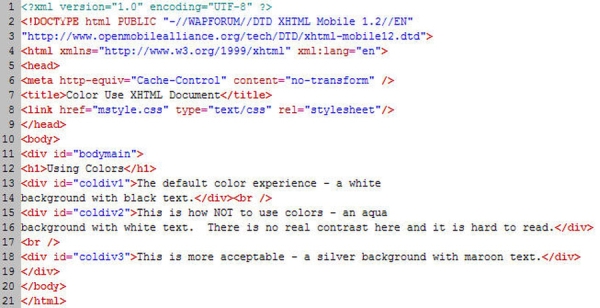
Figure 1 Color Use Page XHTML Markup
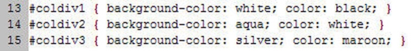
Figure 2 Color Use CSS Page
Figures 3 and 4 show what this combination of markup and the style information from Figure 2 look like in a mobile browser. Notice that the first paragraph simply uses what would normally be the default settings for a mobile browser – black text on a white background. The second paragraph is an example of what not to do. Here the background color (aqua) and the text color (white) are not sufficiently different to be readable. While this example would seem to be common sense since it’s really not readable on a PC monitor either, it very clearly demonstrates what the problem is. The third paragraph shows a more acceptable use of color where there is sufficient contrast to understand the content.
As an aside, let me give you an additional suggestion on how to test sufficient contrast when developing your mobile web page on a desktop PC or laptop. Find a way to angle your monitor in the direction of sunlight coming in through a window in such a way that you can create a glare on your PC monitor. Yes, this may sound silly, however, you will find that it works and is actually quite easy (assuming, of course, that you have sunlight and a window).
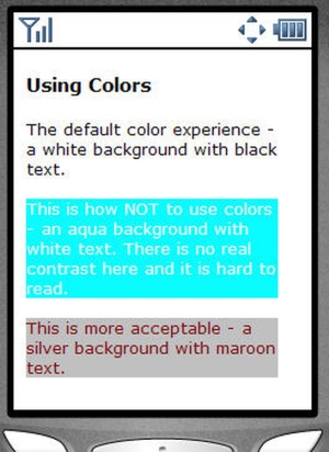
Figure 3 Color Use Page viewed in a NetFront Mobile Browser
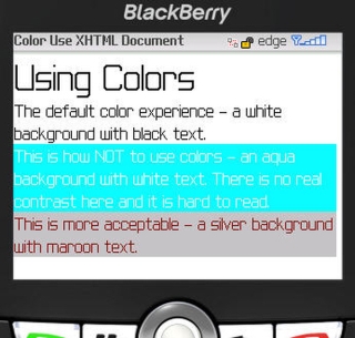
Figure 4 Color Use Page viewed in a Blackberry Mobile Browser
Using Color to Communicate Structure
This section will show you a particular style that I believe can be very effective in the mobile context. Continuing the same theme of attempting to visually communicate as much information as possible, we are going to use a XHTML table coupled with different colored cells to present financial market information without having to have column labels. Figure 5 below shows the XHTML markup for our page while Figure 6 shows the portion of the CSS style sheet applicable to this XHTML markup. Figures 7 and 8 show the markup as rendered in the mobile browser.
The goal is to be able to have a mobile user understand the different values in the table cells without having to explicitly label each value. Furthermore, once a user becomes comfortable with what specific cells mean he or she should then be able to very naturally immediately seek out a specific value based on color and location without having to work very hard. Also, we want to be able to show multiple companies along with the desired financial market information without there being any confusion in the mind of the mobile user regarding when one company’s information stops and another’s begins.
The yellow colored cell in our example along with the bold font indicates that this begins a company’s financial market information. Therefore, each time you see this you visually know that everything up to the next yellow colored, bolded cell is associated with the specific company. The gray colored cell is the latest price. This would make sense as we want to give the highest priority to the most pertinent information. The second line contains the price change since the last closing price along with the percentage change (in this case both are negative) from the last closing price and the total volume for the day. If there is a commonly accepted standard such as red being negative in the financial community you would generally want to adopt and follow that same standard since it conveys information visually. The last line for a specific company has the open, high and low prices for the company’s stock for that particular day. This line could be more confusing for the first time user which is why you want to have a help link that allows the mobile user to get a description of what information each cell holds.
While I do recommend using color to visually communicate information I believe there is an upward limit on how much information you can communicate using this technique. For example, if you have more than ten (10) pieces of information or if the information you have does not lend itself well to easy visual understanding then I would recommend a more traditional name / value pairing.
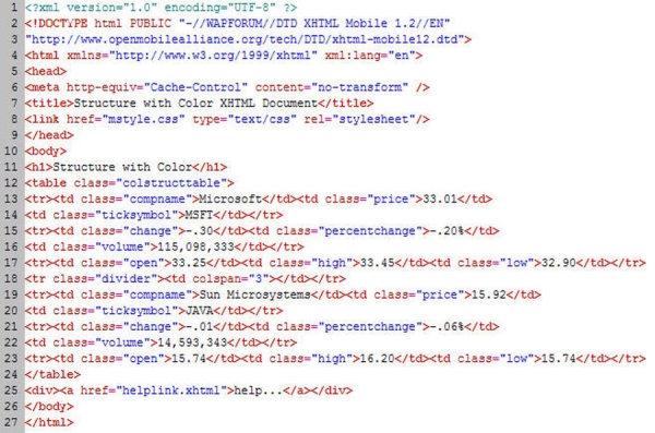
Figure 5 Structure with Color Page XHTML Markup
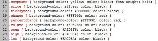
Figure 6 Structure with Color Page CSS Properties
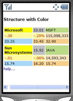
Figure 7 Structure with Color Page viewed in a NetFront Mobile Browser
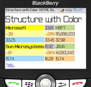
Figure 8 Structure with Color Page viewed in a Blackberry Mobile Browser
Using Color to Define Site Context
Following the previous discussion about “Structure with Color” I want to give you a technique that extends this concept throughout an entire mobile web site. What this section shows is how to effectively use color in communicating to the mobile user what a particular section of a mobile web site means. For example, if I always have the bottom navigation of my site a particular color then at a glance, regardless of the page the user is on, if he or she sees that color he or she will know that it means navigation. Furthermore, if I have a certain color in any situation where the user is offered the ability to filter information, then the same principle of immediately knowing that color x means filter should help with site usability. It is the same idea as above – use color to convey information visually without having to take up additional screen real estate. However, in this sense the idea is slightly nuanced – use color to enhance site usability and seek to allow the user to more quickly understand all of your mobile site. Never forget that the user is in the “mobile context” which generally implies that the quicker someone can understand something the better. That is what this idea seeks to do.
Figure 9 below shows the XHTML markup for a page that uses this concept while Figure 10 shows the portion of the CSS style sheet applicable to the page. Figures 11 and 12 show the markup as rendered in the mobile browser. Notice specifically how the page is divided into three sections using div tags – a top navigation section, the main body content and a bottom footer. I do this so that styling information including color can easily be applied to an entire section. This styling information is shown in the CSS fragment in Figure 10. The background-color property is the more important of the two properties. It is used to convey the visual information. The top navigation section has a gray color, the main content has a cream color and the bottom footer has an orange-like color. Now, I would not necessarily say that you have to have your main content background colored. However, by extending this across all of the pages in your mobile web site or mobile application you are definitely helping your users in understanding your site. Finally, note that the white color that you see between the top navigation and main body content and between the main body content and footer in the NetFront view and also between the main body content and footer in the Blackberry view is a byproduct of how each micro-browser handles spacing between block level elements such as paragraphs and div tags. You could control this with additional style properties if you wish.
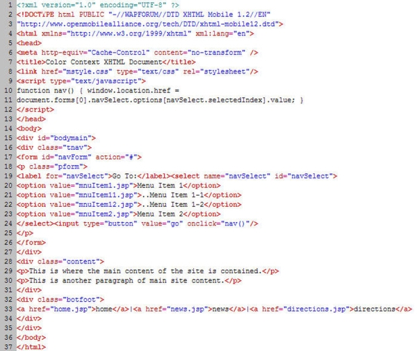
Figure 9 Site Context with Color XHTML Markup
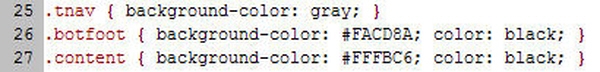
Figure 10 Site Context with Color CSS Properties
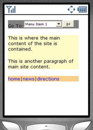
Figure 11 Site Context with Color Page viewed in a NetFront Mobile Browser
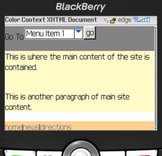
Figure 12 Site Context with Color Page viewed in a Blackberry Mobile Browser
This article is adapted from chapter 3 of the book “Building Mobile Websites” by Richard Yates. To learn more, visit the author’s website at aryates.mobi or get your copy at amazon.com.


Leave a Reply