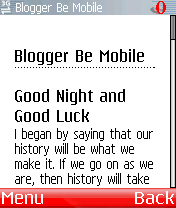
Do you use Blogger? Need a mobile template? We recently had a request in our forums for a mobile template for Blogger, and a few searches later ('blogger mobile template' etc.) and I knew how to post to a Blogger blog from my phone, but not how to make it accessible to mobile users…
Blogger uses a template system which allows users to create and customise their own templates. I decided to try my hand at producing a mobile template – requirements were that it should be mobi compliant, and should score 5 on ready.mobi.
Mobile template
 So, starting with the default template, the plan was to whittle it down. I immediately ran into a problem: the blogger NavBar. This is automatically inserted by the Blogger engine, in an iframe, at the top of every blog. Frames are a big no-no! Even in the desktop world they are shunned for accessibility, and in the mobile world its even worse – some phones will degrade gracefully, but others will explode, harming their owners. (Of course, mobile browsers are becoming more tolerant…) So it was absolutely necessary to get rid of this NavBar. Its not configurable (at least I couldn't see that it was)and it looked like it was a blocker.

However, it turned out to be a little easier than expected. There is a weakness in the Blogger template parsing engine. To insert the NavBar, Blogger simply searches for the first occurence of the <body> tag in the template. However, it doesn't check for validity, and more importantly, it doesn't ignore comments (in the way that they should be ignored) – it *appears* to simply look for the first occurence of the string '<body>'.
So the solution:
Include the following line:
<!--<body></body>-->
before our 'real' <body> tag.
And Blogger magically turns this into:
<!--<body><iframe src="http://www.blogger.com/navbar.g?targetBlogID=24625078&blogName=Blogger+be+mobile&publishMode=PUBLISH_MODE_BLOGSPOT&navbarType=BLUE&layoutType=CLASSIC&homepageUrl=http%3A%2F%2Fbloggerbemobile.blogspot.com%2F&searchRoot=http%3A%2F%2Fbloggerbemobile.blogspot.com%2Fsearch" marginwidth="0" marginheight="0" scrolling="no" frameborder="0" height="30px" width="100%" id="navbar-iframe"></iframe> <div id="space-for-ie"></div></body>-->
Ok, so there is going to be some dead weight in this markup, but this is a far lesser evil than the iframe.
Valid Markup
The other main requirement was Valid XHTML Mobile Profile – so we score a 5 in ready.mobi
First thing to do here is ensure we are using the correct DOCTYPE. This is the easy part – just include the following DOCTYPE at the top of the template:
<!DOCTYPE html PUBLIC "-//WAPFORUM//DTD XHTML Mobile 1.0//EN" "http://www.wapforum.org/DTD/xhtml-mobile10.dtd">
Of course there is a bit more to it than just adding a DOCTYPE. We need to make sure that we are only using XHTML MP tags, and that we are using them correctly, only using permitted attributes etc. So to ensure that our template was Valid XHTML MP, I fixed everything I could by hand, and then iteratively tested in ready.mobi to check for validation errors. The Blogger engine inserts snippets of markup here and there, so some things are beyond our control – if it couldn't be fixed it I dumped it. As a result there are probably some things (e.g. comments) which could go back into the template if some more time was spent on it.

The Template
So at the end of this, we have a mobile template. Its of the one-size-fits-all variety in that there is no device detection, or adaptation. You will get the same thing whether you visit on your desktop, your iphone, or your wristwatch. It relies on a hack, which Google/Blogger could fix at anytime. And there is no image processing/adaptation to ensure only smallish images are published. But, we have met our main requirement, that it is mobi-compliant and scores 5 in ready.mobi.
Now to a question that might make this template useful – is content adaptation possible?
Well, there is the Blogger API, which allows you to do all kinds of interesting interesting dynamic things with your template. Maybe there is something that would let us do adaptation. It turns out there are conditional constructs, but sadly, though not wholly unexpected, there was nothing that would help us identify the client, such as providing access to HTTP headers, (which would have pretty much solved the problem). So it seems that device detection wouldn't be possible at the server.
Another way to acheive this would be through the use of CSS media types to give a different exeperience to desktop and handheld devices (watch this space)

Does Blogger need mobile template support?
So back to the original question – what are Blogger users doing for their mobile audience? Does Blogger need device detection?
You decide.
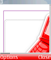
The image on the right is a screenshot from a big name blogger site, and one that really should know better: at a whopping 402KB, I don't think this is what I wanted on my phone… can you guess who it is? Free mobile template for anyone who can identify it 😉
Template markup is included below. To install login to your Blogger account, click the 'Template' tab, and then click the 'Edit HTML' tab. Replace the current template with the markup below. (You should probably back up your old template)
<!DOCTYPE html PUBLIC "-//WAPFORUM//DTD XHTML Mobile 1.0//EN" "http://www.wapforum.org/DTD/xhtml-mobile10.dtd">
<html xmlns="http://www.w3.org/1999/xhtml">
<head>
<title><$BlogPageTitle$></title>
<meta http-equiv="Cache-Control" content="max-age=200" />
<style type="text/css" media="all">
h1 {border-bottom:dotted 1px #000000;margin-bottom:0px;}
h2 {margin-bottom:0px;}
h2#archives { padding-top:10px;margin-top:10px;border-top:dotted 1px #999999;}
h3 {padding-top:30px;color:#555555;padding-bottom:0px;margin-bottom:0px;}
body {font-family:Georgia,Serif;font-size:1em;margin:1%;padding:0px;background:#ffffff;color:#000000;}
div.blogPost {padding-left:0;padding-right:0;}
div.byline {color:#555555;}
p#bloggerBug {padding-top:20px;}
.blogComments {padding-top:30px;color:#555555;padding-bottom:0px;margin-bottom:0px;font-weight:bold}
.blogComments .byline {font-size:1em;font-weight:normal;color:#555555;margin-right:1px;display:inline}
.blogComment {font-size:1em;margin:1%;color:#000000;font-weight:normal}
.deleted-comment {font-style:italic;color:gray;}
#blogfeeds { }
#postfeeds { }
</style>
<$BlogMetaData$>
</head>
<!--<body></body>-->
<body><!-- To aid with the Blogger NavBar -->
<div id="wrap4">
<!-- Header -->
<h1><$BlogTitle$></h1>
<$BlogDescription$>
<!-- Blog Posts -->
<Blogger>
<BlogItemTitle><h2><BlogItemURL><a href="<$BlogItemURL$>"></BlogItemURL>
<$BlogItemTitle$><BlogItemURL></a></BlogItemURL></h2></BlogItemTitle>
<div class="blogPost">
<$BlogItemBody$><br />
<div class="byline"><$I18NPostedByAuthorNickname$> # <a href="<$BlogItemPermalinkURL$>" title="permanent link"><$BlogItemDateTime$></a> </div>
</div>
</Blogger>
<!-- In accordance to the Blogger terms of service, please leave this button somewhere on your blogger-powered page. Thanks! -->
<p id="bloggerBug"><a href="http://www.blogger.com"><img width="88" height="31" src="https://buttons.blogger.com/bloggerbutton1.gif" alt="This page is powered by Blogger. Isn't yours?" /></a></p>
</div></body>
</html>


