


There are already countless reviews of the newly announced Palm Pre available online. Rather than write another one, we instead are going to focus on what we, and we hope, our readers, are most interested in: how does the Pre fare as a web browsing device. In particular, we’re going to test how well it does against its arch-rival, the iPhone. Can the Pre out-iPhone the iPhone? We’re going to ignore the app store, the widgets, the battery life, the media player and instead focus on web browsing.
The Palm Pre may mark a watershed in the evolution of mobile devices: never before has there been a device that features the web as such an integral part of its existance. Given this, the Palm Pre is an especially interesting device for mobilists worldwide. That said, the Pre’s reliance on an Internet connection may not be quite as redeeming a factor as we first thought. A few quick tests in airplane mode revealed the fact that all help documentation is actually stored and accessed online.
Viewable screen area
Given the severe limitations on screen size, making the best use of the available pixels is critical for a useful mobile web device.
Both the iPhone and the Pre use a similar approach to maximizing the screen real estate that can be used to render web content – both devices allow the address entry pane to scroll out of the way. I had hoped that the Pre would dispense with the thick navigation bar that the iPhone keeps at the bottom of every page, and it does, but in its place the Pre reserves a thinish bar for notifications from other running apps. The net effect is that both devices have approximately the same vertical space to render content (they have the same physical screen resolution of 320 x 480 pixels).
The Pre’s curved screen borders feel a little intrusive and over-done. Note how they sometimes obscure the page title.
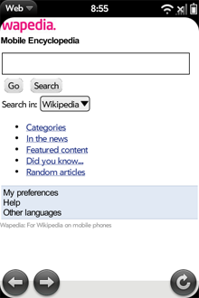
Wapedia.mobi rendered in the Pre browser. Note how the curved corners obscure the logo
Device Detection/Adapation
The Pre is a very new device and hence is not present in many device databases. The fact that sites don’t detect it well means that the experience is often not as good as it could be on some sites.
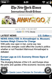
Nytimes rendered in the Pre browser
There are some sites that at least take a stab at it though. Gmail.com, for example, presents a large white page with login fields placed in a small area at the top left. Once logged in, however, you’ll find the the ever so pleasant iPhone UI, which works very well despite its lack of a floating bar, allowing for quick and easy archival and deletion of messages.
In some cases, sites that didn’t recognise the device defaulted to serving a WML page, which doesn’t work at all on the Pre, given its Webkit core.
It’s good to see that Admob image ads worked fine.
Fonts
Interestingly, while the iPhone defaults to a serif font (something like Times Roman) the Pre opts for sans-serif font that looks cleaner, but is actually slightly harder to read for large sections of text.
Scrolling Speed
Despite its much-touted faster processor, the Pre seems slightly less smooth in scrolling than the iPhone, and is missing an easy way to quickly jump to the top (or bottom, for that matter) of a web page.
Bookmarks
Both the iPhone and the Pre allow you to store bookmarks on the desktop. This is a useful convenience feature, specially when the devices make the desktop easily accessible and easy to browse
Navigation and Page Interaction
Both the iPhone and the Pre use the hugely useful and intuitive pinch and pan gestures. The Pre takes these gestures one step further by using the section just below the screen as an additional active area, allowing a whole range of additional gestures to be used.
The additional gestures do actually help with browsing (indeed they are somewhat like Apple’s MacBook gestures). In particular, swiping back and forth feels like a natural way to navigate through page history.
In general, we thought that the iPhones scaling algorithms worked slightly better and picked the appropriate zoom level more often. We found ourselves having to pinch & pan a lot more on the Pre than the iPhone. Typical examples are shown in the following screen shots.
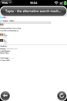
Default zoom level for taptu webpage
Now compare how the Pre and the iPhone render the same BBC page:
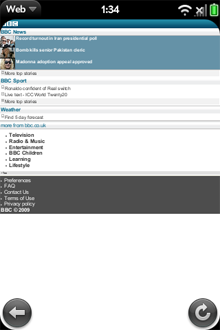
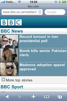
Note the differences in default zoom level when the iPhone and Pre render the same BBC page
As you can imagine, we have quite a number of iPhones on various desks in here in dotMobi, and we all agree that the Pre’s clicking (or tapping) does not feel quite as precise as we would have expected. When a tap is made, there is a visual clue (in the form of a small dark ripple/circle) showing you where you tapped, but when browsing it quickly became apparent that this wasn’t quite enough. Visual feedback for links that get selected during a tap would make for a much more enjoyable browsing experience – as it stands right now, we found ourselves tap-tap-tapping a few times just to make sure that the link we wanted to click was actually clicked.
Something worth noting, however, is the ever so slight delay (much less than a second) between when a screen tap is noticed by the device, and actually processed by it. While it’s easy to dismiss this as OS lag, one plausible opinion in here is that the device is actually waiting for a split second to see if you wish to make another tap to form some sort of tap combination. The reason is for the apparant lag isn’t immediately clear, but hopefully it will be addressed in upcoming software upgrades to the device.
We also miss the ability to jump to the top of a page just by tapping in the top area of the display, as supported by the iPhone.
Multiple Browser Windows
Both the iPhone and the Pre allow you to open multiple browser sessions at the same time, but take different approachs to it. As befits the multitasking nature of the Pre, it allows you to instantiate the browser application as many times as you wish, memory allowing. The iPhone on the other hand keeps everything within one application. While the Pre’s approach is a lot more flexible, it also makes switching windows slightly slower.
List of Supported Web Features
| Feature | Pre | iPhone |
|---|---|---|
| Flash | no | no |
| SVG | no | yes |
| RSS | no | yes |
| Advanced Javascript (JQuery) | yes | yes |
| WML | no | no |
| Access Keys | no | no |
| vCard | no | no |
Overall, we were surprised to find that the Pre lacks quite a few features that the iPhone supports, since they are both based on the same Webkit core. Full details of both of these devices can be found on DeviceAtlas: Palm Pre, Apple iPhone
Standards Tests
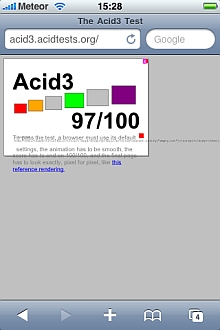
We ran the two browsers through some standards tests. While most deskstop browsers will pass the ACID 2 test now, as of the time of writing of this article, only Safari 4 beta passes the ACID 3 test. So we were not expecting miracles when we ran them through these tests. In both cases the iPhone appears to perform better than the Pre.
In the ACID2 test the iPhone produced an imperfect image, while the Pre did not produce any image at all. In the ACID3 test, the iPhone again appeared to do better, as the Pre seemed to get stuck in a reload loop, and the best screen grab we could get is included below.
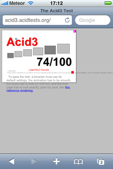
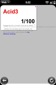
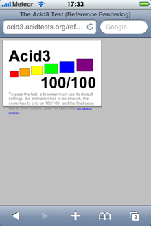
ACID3 Test results: iPhone (left), Pre (middle), Reference (right).
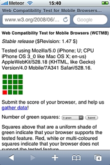
Since these are mobile browsers, we also ran them through the W3C Web Compatibility Test for Mobile Browsers (WCTMB). Again, mobile Safari browser performed better than the Pre, though not by much. They both failed on the Dynamic SVG, and DOM mutation events, and additionally the Pre failed on the Static SVG test.
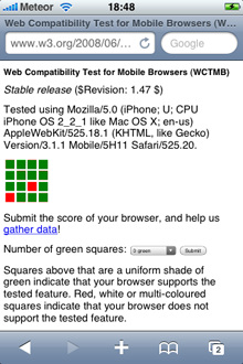
Results of Web Compatibility Test for Mobile Browsers: iPhone (left), Pre (right)
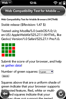
UPDATE (26th June 2009): We’ve run the new iPhone firmware through the WCTMB and ACID3 tests. In the WCTMB test this version of Mobile Safari additionally passes the Dynamic SVG test. Results are also better for ACID3 tests (see images below)
Results of WCTMB (left) and ACID3 (right) tests for iPhone (OS 3.0)
It is also worth noting that better performance in these tests does not necessarily indicate that a better browser experience will be enjoyed. Afterall, some of the technologies in these tests are aspirational, in that they are not widely used in the web since they are not widely supported in many browsers yet.
Other Notes
We were somewhat taken aback to find the following data gathering setting in the control panel for the Pre, set to On by default:
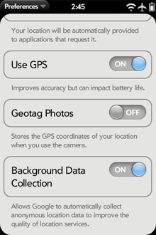
Pre gathers location data for Google
Privacy zealots, take note!
Summary
Overall, despite the fact that both devices have very similar technical capabilites, in our opinion the iPhone provides a slightly smoother web user experience than the Pre. This is mostly down to slightly more intelligent defaults on initial page load. The Pre required manual zooming a lot more often.
That said, every issue we had with the Pre can be fixed with software updates. The Pre also has the tremendous advantage of being built on a more flexible multitasking base that can open up new use cases. In particular, not having to exit and reload applications makes the browser feel a lot more useful.
Finally, to forestall complaints that the Pre makes applications easier to develop (by offering the ability to build them with HTML and Javascript) and that this trumps everything else: yes, sure, this is a really interesting feature, and a very valuable one. But an application/widget is a little bit like public transport: public transport is fantastic if it is available where you are, and goes where you need to get to. But for ultimate flexibility you need the open web.
Note: since the Pre is currently a CDMA-only phone, all tests were carried out over a WiFi network rather than a cellular network.


