


There has been a lot written recently about Google’s mobile-friendly search algorithm update, starting first with SEO expert blogs, and ending up being covered by mainstream media sites. The update promised to penalise sites for not being mobile-friendly.
Google announced the change, along with advice about how to check the status of your site with respect to how it will hold up against these new updates. One of the tools recommended to check your site on is the Mobile-Friendly Test. The advice seems to be if your site passes this test, then it’s mobile-friendly, and you don’t need to worry.
A responsive solution
I came across a tweet offering a solution to Google’s mobile-friendliness update; the solution was simply responsive design. I thought to myself, that’s not a proper solution to this problem, since responsive design in itself does not equate to mobile-friendliness, not necessarily anyway. And responsive design shouldn’t be your goal—if anything it should be the means to your goal, and your goal should be a fast, efficient website. Anybody doubting this, have a read of Firtman’s article on responsive design and mobile strategy. This is not a rant against responsive techniques; if responsive design is used properly, then it can be an extremely useful tool. But it is just a tool, a technique, and shouldn’t be an end in itself; rather, it should be a means to an end.
With everyone’s mobile search rankings allegedly at stake, it’s worth taking a closer look at the prescription from Google.
Crafting a non mobile-friendly page
I wanted to verify Google’s Mobile-Friendly Test, and determine whether it was good enough for Google just to be responsive, without worrying about being mobile-friendly. Can I make a non mobile-friendly responsive page? Of course the answer is ‘yes’. You can make a non mobile-friendly page regardless of the design technique pretty easily. Simply adding a giant image is a convenient way to push up the byte count so that the page is slow and expensive to load.
The page is here. It’s a simple responsive Twitter Bootstrap page, with a 50MB 65MB 100MB image included. (I made a few versions, starting at 50MB, and working up to 100MB). Bootstrap was chosen because it’s a common responsive framework, with large install base.
I fed this page to the Mobile-Friendly Test, and it informed me that the page was not mobile-friendly, because resources were wider than the screen. Fair enough, the 100MB image was 24000px wide.
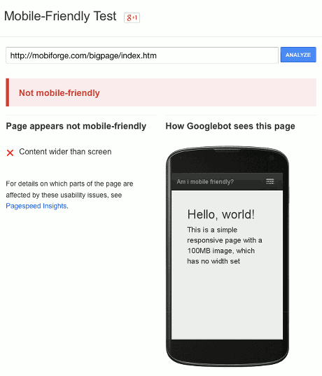
But I thought it interesting that the reason it failed was because of the width, rather than the onslought of bytes I’d just unleashed on it.
So, one more quick test: I added width="100%" to the img element and tested again. This time, the page was reported as mobile-friendly.
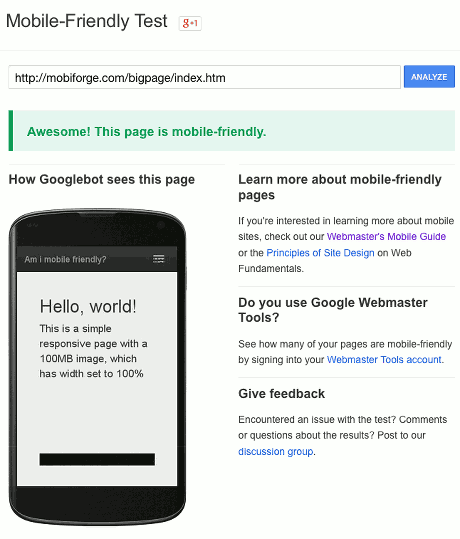
After trying with a 50MB image, I tried again with a 65MB image–this size matches the size of a webpage cost experiment previously described on mobiForge, in which a 65MB ‘mobile’ page was downloaded at a (roaming) cost of €369, or $480! And just for the heck of it, and because round numbers are nice, I tried a 100MB image. All with the same results: mobile-friendly when the width was set to 100%, and not mobile-friendly otherwise.
And just to come at it from the other direction, I created another page that was tiny by comparison, weighing in at just 280KB. It was a similar page, with a big difference: a small image with fixed width of 421 pixels. (After a little experimenting, 420 pixels was found to be the maximum width the Mobile-Friendly Test would accept)
I ran the test a couple of times more, changing the width of the image from 420px to 421px. When set to 421px, it failed. When set to 420px it passed.
Time for a quick recap
According to this test a 100MB page, which could take in excess of 10 minutes to load on a mobile network, if it even loads, with a potential cost of over €600 to download, is considered mobile-friendly. And a page of 280KB, with an image a couple of pixels wider than the average mobile phone screen, is considered not mobile-friendly.
Let’s be clear:
- 100MB is not mobile-friendly
- 10 minute+ load times are not mobile-friendly; 5 minutes, even 1 minute, is not mobile-friendly
- Squeezing pixels onto a screen does not make them mobile-friendly
Why big is bad
-
Big is slow Here’s a video of the page loading on a desktop machine over a 50Mbs DSL connection. If you don’t like watching boring videos (SPOILER ALERT FOLLOWS) I’ll save you the trouble, and tell you that it took around one and a half minutes to load; again, this on a high-spec desktop computer with a reliable DSL connection.
And here’s a video of the page loading on a mobile device over an LTE network connectionI attempted a few times to record a video of the page loading over an LTE cell connection. But it turned out to be a pretty boring video, and after five minutes the browser crashed anyway. Mobile-friendly? I think not!

-
Big is expensive As mentioned earlier, one of the tests I tried was with a 65MB page; a page of that size was previously shown to cost $369 to load. A 100MB page could cost even more.

So, big is slow, and big is expensive—big is definitely bad. Big is also hard to render. The test page above caused lag and jerk on a desktop computer with an i7 processor and 16GB of RAM. It was a contrived example of course, but who amongst us hasn’t experienced lag on a mobile-browser due to bloated pages? People will use whatever device is to hand. Brad Frost points to one user with the low-powered e-ink Kindle as her main browsing device. Separately he mentions that your webpages are going to be rendered on devices that don’t even exist yet. This idea is echoed elsewhere too. In his article Zen and the Art of Wearable Markup Jeffrey Zeldman mentions “how a site created in 2015 can deliver content and experiences to a Palm Pilot, a feature phone, a game console, or, dare we dream, a wearable”. Low-powered devices will be used. Small screens will be used. While you can’t optimise for everything, you can try to support as many devices as you can. Awareness of page weight is just one of the things that will help you achieve this.
If you need further convincing have a read of any of the numerous studies linking increases in page load time to decreases in conversions. While there might be some desktop web apps where such large pages might be appropriate—high resolution photography for example—generally it’s safe to say 100MB page is way over the top, even on desktop, and especially on mobile. You can learn all about understanding web page weight here.
What have we learned?
The most obvious thing here is that the test is broken, or wrong. 100MB is not mobile-friendly. We should be aiming for KBs in the low hundreds, if not lower, not MBs; and less than 1 second to first render, not minutes.
The next lesson is that Google is (probably unwittingly) misleading its users with this test. On its mobile-friendly update announcement page, it says:
If you’re a webmaster, you can get ready for this change by using the following tools to see how Googlebot views your pages:
If you want to test a few pages, you can use the Mobile-Friendly Test.
This suggests that this test uses the same algorithm that its search uses to make adjustments to its ranking based on mobile-friendliness, or at least it feeds into it: if you pass this test, then you have nothing to worry about. If this is the case, then it’s pretty reckless. A page of 65MB, costing €369/$480, is considered mobile friendly now. And even worse, so too is a 100MB page!
And if this algorithm is not the one feeding into the ranking algorithm, then Google is still misleading users, telling them that their pages are mobile-friendly and not to worry, when really they will be penalised, whether by Google, for having slow pages, or by users who won’t wait for their pages to finish loading.
The next point worth noting follows on from the last: because of its dominant position in search—being judge, jury and executioner for issues like this—Google is able to publish such a tool, and have the whole web jump through hoops, which might not be the right hoops, and this is a dangerous thing.
The main point to take home here though is not that Google’s Mobile-Friendly Test tool is wrong. This, in fairness, is probably an oversight on Google’s part anyway, since nobody in their right mind would agree that a 100MB page is mobile-friendly. The lesson here rather should be that taking a simple squeeze-pixels-to-fit-screen approach to mobile simply isn’t right: being mobile-friendly is about more than just screen width. And if you take this approach you might end up with a nice, pretty site, but if you’re not careful about the implementation, your pretty site might also end up a pixel-pressed Spruce Goose, an unwieldy beast that will never fly. Whether it’s Google that penalises you, or impatient users, doesn’t really matter; what matters is that page-weight matters, and excessive page-weight will be penalised.


Leave a Reply