


Mobile is becoming more important by the day and the figures speak for themselves: about 1 page out of every 8 was viewed using a mobile device (including tablets and phones) according to recent comScore research and last month Google released a study which showed that 77% of mobile searches were performed at home or at work even if a desktop PC was available. Therefore, the importance of understanding and analysing what users are doing and looking for on mobile cannot be underestimated.
Google Analytics offers a good (if incomplete) tool, which with the appropriate settings, can be used to determine if a website is useful for mobile visitors and what mobile users are looking for when they search via their mobile devices.
Before going any further, we should note that Google Analytics default functionality doesn’t work on devices that don’t support JavaScript (have a look at this in depth article published by Yahoo). For this reason, the best way to track mobile visits to your website with Google Analytics is to implement Google’s server-side tracking option (as Ruadhan wrote a few years ago). Not implementing server-side tracking means you will miss the vast majority of traffic coming from low end devices and from browsers with JavaScript turned off.
Aside from these issues, there are some other scenarios which Google Analytics doesn’t handle well:
- It only tracks visits made via
hrefattributes (form submit buttons or play buttons, for example are not tracked) - It doesn’t track pages in Flash
- It doesn’t separate clicks from different links that lead to the same location (you don’t always know the click paths which can be important for tracking social media)
- It doesn’t track visitors unless they accept a cookie.
Notwithstanding these limitations, Google Analytics can be used to track habits, visits and conversions. The metrics to be considered are visitors, bounce rate, keywords and sources as well as any other metrics specific to your business goals.
Building a customized mobile report helps to better understand crucial questions about a mobile strategy:
- Who is my audience?
- What are my mobile users looking for?
- Are they behaving differently on mobile?
- What am I doing to help my mobile users to find what they want?
- Am I providing a mobile-friendly website using all the tools that I have?
- Should I optimize my website for different keywords according to mobile users’ needs?
All these questions can be answered with Google Analytics if the report is customized to meet your needs. One of the limits of Google’s default mobile report is that it groups smartphone and tablet users together. What’s more, by default, visits graphed in the mobile report are not only ones coming from mobile but all visits, mobile or not.
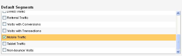
You need to customize the Mobile Traffic segment to view mobile traffic with and without tablets. To view mobile traffic without tablets use Regular Expressions in Analytics to decide which kind of devices you want to include according to their screen resolution.
Unless you implement Regular Expressions, all data you get from Google Analytics will include tablet traffic.
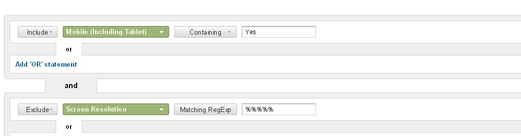
From within Mobile Traffic, name the segment and then ask the Report to do the following:
INCLUDE Mobile (Including Tablet) CONTAINING Yes
and
EXCLUDE Screen Resolution MATCHING REGEXP +Regular Expression (have a look here and here for the specs).
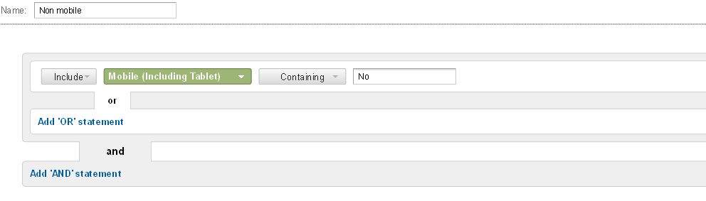
Once you’ve done this, you can add another segment to compare mobile and desktop users. The way to do this is really simple:
Give a name to the new segment and then ask the Report to do the following:
INCLUDE Mobile (Including Tablet) CONTAINING No.
These 3 reports will allow you to have a quick look at the number of visits coming from mobile devices without including tablets and non mobile traffic. By comparing the 3 metrics you will have a full overview of your mobile and non-mobile traffic, a solid basis for your mobile strategy and where to put your development efforts if you decide your approach.
You can create the same Advanced Segments for each metric you want to analyze by simply copying the parameters supplied below.
One of the most important reports tracks the keywords people use to find the mobile site and the keywords you want to optimize for. You many remember what we wrote about SEO and Responsive Design. Keyword analysis shows exactly how important the keywords are for a mobile site. Just go to Traffic Sources > Sources > Search > Organic report and add the same parameters we added in Mobile Traffic to obtain information about the most important keywords for each of our three segments; mobile users without tablets, tablet users and non mobile users.
To better understand the differences between desktop and mobile visitors, we need to look at the bounce rate. This data is shown in Traffic Sources > Overview Report. Here, we need to add the same parameters used above to segment the traffic between mobile (with and without tablets) and non-mobile users.
If your website has a lot of landing pages it’s good to know how they perform on desktop and on mobile by creating a full report using Advanced Segments in the Reverse Goal Path in Conversions. This allows you to check which landing pages have high conversion rates on mobile and to decide which strategy to adopt.
Because mobile users value site speed, it’s worth looking at the Site Speed Report under Content > Site Speed. However, this metric can be easily distorted by a particularly slow page. It’s advisable to check which page is slow and fix it. Unfortunately, the Site Speed report does not give users reasons why the page is the speed it is. If the problem is bigger than expected, it’s best to test your site using the Google PageSpeed Insight Tool which helps to cut down load times giving useful information from a developer point of view on how to minimize load time.
Last but not least, if you need to track the differences between desktop and mobile traffic sources use the Traffic Sources > All Traffic report. It gives information about the differences between mobile and desktop by setting Medium as the dimension to track everything after having created a customized mobile report as for above.
These reports are important both for single URL mobile sites (either fully responsive sites or sites which adapt based using device detection) and for mobile sites with a different URL. In this second case, it is necessary to implement Google Analytics tracking code for the mobile site and to create a separate profile capable of tracking traffic related to the mobile subdomain.
In addition to the above metrics, if you’re dealing with a separate mobile site with a different URL, redirects are critical. If they don’t work properly you will lose a lot of traffic and users: to check redirects go to Audience > Mobile > Overview.
So, is Google Analytics a good tool to analyze the impact of mobile on a site and to inform your strategy? Well yes, if you recognize the limits of the platform and deal with them by combining Google Analytics with more customized and appropriate tools such as Adobe Analytics, CoreMetrics, [url=http://www.webtrends.com]Webtrends[/url], or other such solutions.


Leave a Reply