


One of the overlooked heroes of the web is the Content Management System, or CMS.
The very early days of web authoring produced the concept of the CMS. A new application type used to curate online information in powerful and intuitive ways. From the blogging ease of WordPress to the power of Drupal, CMSes quickly became, and have since remained, a central tool for the creation and management of web content. This very site, for instance, runs a customized CMS – a common component now-a-days of made-to-measure websites.
There are a large number of CMS solutions available with the most popular being common industry short-hand for the service they provide. Drupal, one of the industry standard bearers, suggests on its website that it can be used “to build everything”. Joomla lays claim to being the “CMS trusted by millions”. And TYPO3, a popular yet questionably named choice, touts it’s “enterprise level” features.

Venture any distance online and you are sure to come into contact with the output of a CMS. The concept of what exactly a CMS does and what sorts of data it can manage varies but they are an inescapable facet of modern web design and content distribution.
But how well is the CMS industry dealing with the new landscape of device types? From low-tier mobile phones to modern tablets, there is no doubt that the targets of content delivery have come on a long way and in this article we’ll see if the platforms for content creation have evolved in step with the changing platforms for content consumption.
Empowering the User
At a high level, the core concept of a Content Management System is to provide web authoring abilities to a user who’s knowledge of the underlying technology may be weak, perhaps even non-existent. Editing HTML markup by hand is tiresome even for those who know how. A mouse and a keyboard are all the typical CMS asks of an administrator, the ability to code HTML or edit graphics are not required. This layer of abstraction separates the user from the mechanics of publishing on the web, and allows for a streamlined process of idea germinating, drafting and publication.
At a fundamental level a CMSes role is to facilitate the easy and intuitive handling of content. Some provide powerful developer access points in the form of software API’s, which make the customization of the CMS possible through code. Others offer managed marketplaces with extensive collections of downloadable plugins and themes which can be installed and customized through administrative GUI control panels. But while the environment of different CMSess vary, they provide a core functionality promise – using the web as a platform to create content for the web.
So given that CMSes exist at a high level to save their users from the drudgery of marking up webpages by hand, and that they tend to operate through the browser, how well can the CMS concept protect it’s users while still supporting the ever growing range of internet-enabled devices? This question will be fundamental to determining how well they continue to serve us in the future.
Is the CMS dead?
It may be tempting to consider the concept of a single CMS architecture obsolete. Indeed, with content so diversely spread across different platforms – is it time for the CMS to evolve to focus on aggregation more than then creation?
Facebook, Twitter, Tumblr and a slew of other pre-packaged personal content creation apps battle for user’s updates. Yet there still exists a growing segment of personal blogs that vary widely in creativity and customization.
Tumblr allows for custom domain names, but the sites themselves look homogeneous and bland to the heavy web user. Facebook and Twitter make it easy to publish short snappy updates but don’t provide any structure for pensive, well-formulated writings. These services make it trivially easy to publish but lack the power of the true CMSes.
The others options are self-hosted CMS packages and the hybrid hosted solutions like WordPress.com which are hosted but provide near complete access to the level of customization usually only available with self-hosting.
Self-hosted CMS packages provide the level of customization that a managed solution usually can’t. They provide the security that a company may need, not to mention the audit trail which can in the worst scenarios be vitally important. Self-hosted CMSes also give access to serious power-user functionality like MVT testing and real-time analytics. And the chance to pivot as quickly as possible in reaction to any new trend or need.
Managed solutions like Tumblr are easy to setup, easy to manage and easier still to abandon. Google results are littered with Tumblr blogs with their last update posted years ago. They are the dumping grounds for half-baked ideas. They provide the short-term satisfaction of publishing but completely lack the long term gratification of content building.
For the time being the CMS market will likely remain split between those who snap-caption-publish and those who prefer to think-edit-polish. For the former, the mobile device in their pocket is the ideal authoring platform as it excels at capturing daily thoughts and experiences. For the later, who hope to build a lasting body of creative content, there will always be the CMS with options to edit and revise, to publish and to monitor.
Talk of CMSes demise is most likely premature. There is, however, much work to be done.
Keeping Pace
Unfortunately the CMSes of note have adapted to the new mobile era only in superficial ways. This is likely due to their legacy of being conceived at a time when common screen widths was the deciding factor in web design decisions. When the desktop was the only conceivable platform for web content to be viewed on. And when the concept of mobile web consumption was limited to niche WAP interfaces typically delivering narrow ranges of information.
In their recent efforts to deal with the new audience of mobile internet users, most CMSes have adopted similar tactics. The standard approach is to do some light device detection and serve content using an appropriate template – desktop, tablet, mobile, etc. There exist, in the WordPress theme marketplace alone, dozens of mobile-friendly blog themes.
The device detection in place is called “light” with good reason. It focuses almost entirely on keyword detection in the browsers useragent and rarely incorporates the real device detection capabilities that are now possible. The extent of false positives, and even false negatives, in this light detection isn’t known but can be assumed to be high.
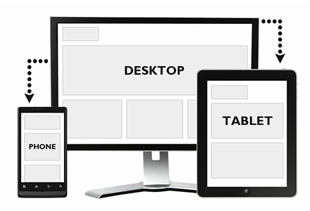
Responsive web design adapting to different display types
The template switching mechanism is also a poor solution to the problem. When template switching is not used, sites often opt instead for templates which use responsive web design (RWD) techniques. These try to redraw themselves given the screen dimensions they end up rendering on. And while RWD is a good stop-gap measure, and the savior of the garage web developer, it fails to actually adapt the web content served to suit the platform being using. It fails to deliver content differently or make alternative choices possible. The same website, in essence, is delivered to each and every user with different device types seeing only a varied rendering style.
Going further, WordPress, and others, provide native mobile apps (that is Android and iOS apps) for administrators, allowing them to manage and edit content on the go. And while this shows an acceptance of the need for mobile support on one end of the CMS spectrum, it also demonstrates that mobile is being handled as a complete after-thought. Admins are given native apps which are rich and designed correctly for the medium, while users are expected to tolerate template switching based on best-guess approaches.
Admins are favored in this equation because they control the choice of CMS, unlike the end-user. Admins are coddled while users are left in the cold. This is a complete reversal of the tried and tested web mantra – to focus on the user first and foremost.
And the problem extends past tablets and mobile phones. We are rapidly approaching an era of smart watches, internet enabled cars, Augmented Reality products like Google Glass and even internet capable fridges. How is the CMS paradigm going to shift to accommodate these distinctly unique use cases?

Looking Ahead
There is much that can be done to adapt the CMS concept for mobile devices.
Not all content is created equally, especially when screen space is at a premium. Navigation links for investors, copyright notices and other page detritus can be removed from smaller views to free up the UI and to keep focus maintained on the core content. Actually removing the content, rather that just hiding it, will speed up the page delivery and help it render faster.
Clipart pictures of smiling happy people can be dropped in favor of thumbnail head-and-shoulder images of authors, or other imagery that is actually relevant. Text can be formulated to keep the most meaningful items above the fold. These are the low hanging fruit of redesign. Don’t force a template to adapt, load a different template that by its nature removes the clutter and the unnecessary.

Better art direction cropping an image for different viewports
The precision of a mouse click is lost on the majority of web devices now, a fact that many websites have still failed to accept. When the pudgiest of index fingers have to be catered for, the design and formation of a page must adapt or risk being abandoned prematurely. Template switching is a start, but a modern CMS should recognize how content can change around the user and their needs.
Mobile templates should adopt finer pagination of content, given that time-to-load is a critical factor for mobile web users and that loading entire long-form articles on a mobile device often leads to a poor user experience.
Allowing the user to skim a webpage’s table of contents is an ideal way to allow them to decide for themselves which sections are most relevant. This is a practice that works well on large screen devices but poorly elsewhere. When the user can’t scroll as easily, can’t see as much in one scroll and can’t easily tell how far they have scrolled, then the only sane solution is to limit the amount of scrolling they must endure.
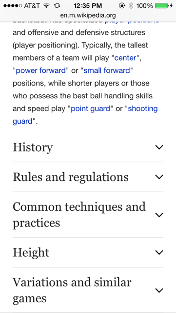
Wikipedia mobile collapsed section headers
CMSes don’t natively provide any support for responsive images – serving different files to different device types. While most do cleverly handle the reformatting of uploaded images which are too large or in need of cropping, none go the extra step of producing various resampled versions of the image in a range of sizes and then supplying the appropriate size to the user’s device.
Going further, the text content itself could be authored in a divergent way. The make-your-own-article approach could allow users to pick the path they take through the content, rather than proscribing a one-size-for-all approach. Mobile users may not wish to read a detailed history of the topic, for instance, they may be more interested in jumping to the summarized conclusion.
Clipart imagery, while a nice touch on larger screens, are a speed hindrance and could be marked for exemption on smaller screen displays. Navigation should adopt a simpler approach – header navigation links should be mirrored at the end of an article, to save the user having to scroll unnecessarily back to the top. Lazy loading, when done right, can drastically improve the perceived speed of a site. Common website dead-weight like share icons and comment forms can be removed if analytic data show no engagement with mobile users.
So far we’ve covered the reductive changes that could be adopted to improve the state of mobile CMS but there are also areas where mobile views could directly add to the user experience.
Mobile CMS views should make use of telephone dial tags on telephone numbers. This simple addition gives the user a direct call to action that should not be underestimated for its utility and practicality.
Mobile views can also be augmented with location aware services. HTML5 supports geolocation which provides for content tailored to a user’s specific location. “Find your nearest …” is perhaps the most commonly seen variant of this used by banks, clothing stores and restaurant chains.
Some content-heavy sites now provide a gauge of how long a piece will take to read or even how far through the content the user has progressed. Medium.com puts a short message, “5 minutes to read”, at the top of the page. Other sites display a simple progress bar highlighting how far into a piece the user has progressed. For the desktop user this is a perk, for the mobile user it is a god-send.
Conclusion
The new CMS needs to take the new web into consideration. Mobile-first design practices should become the norm to allow webpages to scale up to suit desktop browsing, rather than “squish” down to become tolerable on mobile devices. And mobile-first content creation should embrace the idea that not every article will be consumed in its entirety, that certain content can be trimmed to provide a better range of user experiences.
The humble CMS has come a long way and has proven itself as an important behind-the-scenes element of modern web design. But there is a power vacuum at the moment, whichever CMS properly adjusts to handle the new spectrum of web traffic will be in a powerful position to gain market share.
It’s time the design of the CMS evolved. Which platform will be the first to really capture the flavor of the new web?


Leave a Reply