


The dotMobi WordPress Mobile Pack is a complete toolkit from dotMobi to help mobilize your WordPress site and blog.
It includes a mobile switcher to select themes based on the type of user that is visiting the site, a selection of mobile themes, extra widgets, device adaptation and a mobile administration panel to allow users to edit the site or write new posts when out and about.
The pack has been tested on WordPress 2.5, 2.6, and 2.7. It is also compatible with WordPress MU 2.6 in the ‘plugins’ mode. The download itself (and the very simple installation instructions) are available at the end of this article.
The pack contains the following functionality:
- Mobile switcher to detect mobile visitors and provide an appropriate experience
- Base mobile theme for quick-and-easy XHTML-MP compliance
- Extended mobile themes so you can unleash your mobile creativity
- Transcoding and device adaptation to optimise the mobile experience
- DeviceAtlas integration for world-class adaptation
- Mobile admin panel for when posts can’t wait
- Mobile ad widget to make you some money
- Barcode widget to help users bookmark your blog
Let’s look at each of these in turn…
Mobile switcher
The mobile switcher identifies whether the visitor to the site is mobile or not, and switches between the primary WordPress theme (for desktop users) and a mobile theme (of the site owner’s choice) accordingly.
It can use two approaches to identify the user as mobile. Firstly, it can try to identify if they have a mobile device based on the headers sent when a page is requested. Alternatively, it can identify whether the user has requested the site on a ‘desktop domain’ (such as yoursite.com) or a ‘mobile domain’ (such as yoursite.mobi) and deduce their intent from that.

The recommended approach is a third, combined, approach that uses both techniques, and also allows users to switch between sites if the choice is not appropriate by providing a link in the themes’ footers or a widget.
In this combined mode, the switcher will provide interstitial warning pages if a mobile user accesses the desktop domain or vice-versa. It will also remember their choice of preferred site through the use of a cookie.
Settings for the switcher are found under the ‘Mobile Switcher’ admin page, and are self-explanatory.
More detail on these switching algorithms is available in a series of articles on this site.
Base mobile theme

The pack contains an extensible theme that is ready for display on mobile devices. The theme is XHTML-MP compliant and scores highly on dotMobi’s ready.mobi site tester.
The base theme supports all standard WordPress content, including indexes, posts, pages, archives, search results, comments and widgets. If configured, it also invokes the device adaptation process (detailed below) that ensures the posts themselves are formatted suitable for mobile devices.
There are a number of simple settings that can be used to adapt the way in which lists of posts appear on the mobile theme. These are found under the ‘Mobile Theme’ admin page, which appears when the switcher component is installed (or when the mobile theme is selected as the main WordPress theme). It is possible to set how many posts appear on the home page and in archives, and how verbosely they display.

Away from the posts themselves, the theme does not provide a ‘hard-coded’ sidebar and relies wholly on the WordPress widget framework. Widgets that are selected in the WordPress admin pages (and then selected to show for the mobile theme) will appear in a ‘sidebar’ below the main part of the mobile page.
Since each widget adds size to the overall page, it is recommended that no more than 5 desktop widgets are enabled for the mobile theme. The ‘Mobile Widgets’ admin page also appears when the switcher component is installed (or when the mobile theme is selected as the main WordPress theme).
Any standard WordPress widgets that are known not to be XHTML-compliant are slightly rewritten by the theme to make them so. However, the theme does not currently correct arbitrary widget content and the use of third-party widgets (that were designed for desktop use) may easily push the overall page out of XHTML-MP compliance and affect the user’s experience.
Large widgets are not currently split or paged for small mobile devices. This may increase the load time, cost to the user, or even make the page unreadable on a limited capability device. Be aware of this when enabling large widgets on the mobile theme.
Extended mobile themes
Simply by extending the base theme, it is very easy and quick to customise the mobile theme to fit existing requirements or brand.
The easiest way to do this is to re-tint the theme’s colour scheme. The colour specifications for the base theme are all defined at the top of its stylesheet. Site owners can override this palette with their own colours, named DARKEST, DARK, MID, LIGHT, LIGHTEST and so on.
To demonstrate, three extended themes are available within this pack: blue, green and red. Note how they use the ‘Template:’ directive at the top of the stylesheet (and the CSS @import statement) to indicate that they extend the base theme.
Of course it is also easy to extend the theme in other, more structural ways, and even adapt the template’s PHP files. However, if such changes should be done carefully to preserve XHTML-MP compliance within the markup.
Transcoding and device adaptation
When the base theme, or a theme that extends it, it used, the pack provides some features to adapt the content of the posts and pages of the blog to make them more suitable for mobile use.
There are four major stages to this process, and each may be enabled or disabled independently on the ‘Mobile Theme’ admin page. These are:
-
Remove media
This will remove interactivity and media elements (such as script, Flash, movies, and embedded frames) from the posts and pages. Unless it is certain that users have high-capability handsets, these types of content will stretch the abilities of their mobile devices. The HTML tags removed are object, embed, marquee, script, frame and iframe. This process also removes any event attributes (such as onClick) from the page. -
Partition large pages
This will break large blog posts or pages into smaller pieces more suitable for mobile devices. The length of each piece depends on the known memory limitations of the visitor’s device (if DeviceAtlas integration is enabled), or will default to approximately 5K in size. Contiguous sections such as lists will not be broken, and a pager will appear at the bottom of each post to allow the user to page through the post. -
Shrink images
This will shrink large images within posts or pages to fit on smaller screens. The width or height constraints of the device (if DeviceAtlas integration is enabled) are used to determine the new dimensions, or they will default to 124 pixels. This functionality relies on the server having the PHP graphics library LibGD installed (as it will be for PHP 4.3 or greater). Both the original and resized images are cached locally for performance, and site owners have an option to clear this cache on the admin page. -
Simplify styling
This will remove styling elements from the posts and pages to ensure mobile compatibility. The HTML attributes removed are: align, background, bgcolor, border, cellpadding, cellspacing, class, color, height, style and width. It removes the following tags: center, font, and span (although note that the inner content of those tags remains). Finally it removes any empty, non-singleton tags that do not have attributes.
DeviceAtlas integration

If enabled, the mobile pack can invoke dotMobi’s DeviceAtlas API to provide information about the device currently accessing the site. This is used in a number of ways:
- The device adaptation (above) uses DeviceAtlas to provide information about screen-size and page-size in order to change the content of the pages and posts.
- A DeviceAtlas widget can be placed on the site to display the name, screen size (and optionally, user-agent) of the device, if known. This is useful for testing the site on different handsets
- Programmatically, theme designers can use DeviceAtlas data to adapt the way the theme displays. Using the wpmp_deviceatlas_property($property_name) function will return a single property directly from the API, and wpmp_deviceatlas_device() will provide a reference to all the device’s characteristics data. For example, site owners could use the following in a theme to provide a full-screen image:
<?php $d = wpmp_deviceatlas_device(); ?>
  <img src='...'
     width='<?php print $d->usableScreenWidth;  ?>'
    height='<?php print $d->usableScreenHeight; ?>'
  />
The mobile pack does not ship with the DeviceAtlas API or data file. Site owners should sign up for a DeviceAtlas licence on the site itself, and contact dotMobi to enable it for the WordPress plugin. Having done so, site owners can enter the licence key into the ‘DeviceAtlas’ admin panel, and easily trigger the update process for the local data.
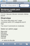
Mobile admin panel
A user identified as mobile by the switcher will receive a mobilised version of the WordPress administration interface. The link to the dashboard is available in the standard ‘Meta’ widget, or it can be reached directly at http://your.site/wp-admin
Only users with administrator status are allowed to access the mobile administration pages. Note this makes it more restrictive than the desktop dashboard, but this prevents less-authorised users from accessing it and making changes to important site settings.
The following pages are available in the mobile administration interface:
-
Overview
Like the desktop dashboard, this details how many pages, posts, categories and tags site owners have on the site. It also highlights how many comments currently await moderation. -
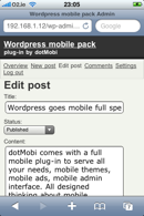
New post
Administrators may write a new post to appear on the site. They can specify the title and the body of the post, and whether they want it to remain draft, pending review, or published. It is not currently possible to specify tags, categories or other advanced properties of the post in the mobile interface. -
Edit post
This page lists all of the current posts and allows administrators to edit them. As for the ‘New post’ page, they can edit title, status, and body. It is not possible to edit the categories or tags and so on, although existing values for such properties of the post will remain set after editing in the mobile interface. Depending on the theme, a link to this edit panel may also be available on the site itself when administrators are logged in. -
Comments
This page lists extracts of all of the comments awaiting moderation on the site. From this list, administrators can click on the commentator’s name to see the whole comment, and, by clicking the appropriate links, set the comment to be published or marked as spam. Editing, de-approving or deleting a comment cannot be performed in this interface. -
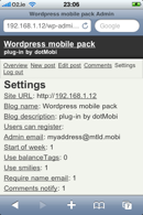
Settings
This page lists all the settings for the site which are simple enough to edit with this mobile interface. Complex settings, such as which plugins are installed, are not available. However, text- and number-based settings can be easily edited. Note that no descriptions are available for each setting and the meanings of the values, so it is advisable to only edit them cautiously
It is also possible to log-out of the admin panel. Since the login is stored persistently on the mobile device, this is advisable if the site is sensitive and administrators want to protect against the impact of handset theft.
The mobile administration panel uses the same URL structure as the desktop version, so in most cases, the administration links sent to administrators in emails (such as when a comment needs moderation) can be followed regardless of whether they are using a mobile device or a desktop.
Mobile ad widget

This provides the ability to place a new widget into the site containing either AdMob or Google mobile ads. Administrators will see the ‘Mobile Ads’ in the ‘Widget’ admin page, and it allows them to specify which provider to use, and the publisher ID.
The widget can also be configured to attempt to disable itself when shown on a desktop theme. This is recommended, since the quality of mobile ads presented in response to a desktop user context is lower, and relevant conversion rates may be negatively affected.
Google supports both single-ad and double-ad modes. Administrators can select which to use from the same publisher dropdown.
Barcode widget

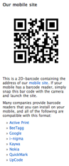
Site owners can place a two-dimensional QR-code widget on the desktop site that users can use to quickly navigate to the mobile version of the site. If their phones have a camera and QR-code reader capabilities, they can simply snap the barcode off their desktop screen and navigate directly to the mobile equivalent.
Within the widget site owners can specify the link to provide, and the size of the square barcode to show. Site owners should ensure it fits well into the desktop theme.
Site owners can also indicate whether they want the widget to show some instructions to the users about the purpose of the barcode, as well as a list of well-known readers they can download for their devices if they are not already installed.
Installation for WordPress v2.7 and later
On WordPress v2.7 and later, the installation is as follows:
- Go to the ‘Plugins’ / ‘Add new’ menu
- Upload wordpress_mobile_pack.1.0.8223.zip then press ‘Install now’.
- Activate the switcher plugin. Change its settings as required.
- Select which desktop widgets are to appear on the mobile theme.
- Enjoy.
Installation on WordPress v2.6 and earlier
On WordPress v2.5 and v2.6, the installation is very slightly different:
- Locate your WordPress install on the file system
- Extract the contents of wordpress_mobile_pack.1.0.8223.zip into wp-content/plugins
- Activate the switcher plugin. Change its settings as required.
- Select which desktop widgets are to appear on the mobile theme.
- Enjoy.
More detailed instructions for installation and configuration are provided within the pack itself. There is also a readme file that identifies known limitations. The pack is distributed under the Apache 2 license.
Let’s Go!
We hope you enjoy using the WordPress Mobile Pack. Please let us know how we can improve it by contacting us or by using the comment form below. We’re committed to working hard on developing it, addressing issues, and learning how it gets deployed.
The author would like to thank Andrea Trasatti for moral support, relentless sanity checking and screenshot duty, Dennis Bournique for excellent feedback and patience in the face of constant iteration, Ronan Cremin and everyone else who has helped to test and review the plugin – and last but not least of course, Ribot for the beautiful mobile themes.
Download
Download the WordPress mobile pack from wordpress.org


61 Comments
The ZIP file appears to be corrupted. WordPress is unable to open/install the archive after uploading it, and opening it on my computer (Mac or pc) is also unsuccessful.
I’ve updated the download file – please could you try again?
[quote=macbort]The ZIP file appears to be corrupted. WordPress is unable to open/install the archive after uploading it, and opening it on my computer (Mac or pc) is also unsuccessful.[/quote]
Ruadhan has fixed the download, but anyway you may also get the file from the official plug-in site, [url=http://wordpress.org/extend/plugins/wordpress-mobile-pack/]WordPress Mobile Pack[/url] or install it directly from the WordPress admin interface via the “Add New” menu in WordPress 2.7.
Wanted to check your plugin out, but got this error while trying to activate in 2.7.1, downloaded using the Admin interface.
Parse error: syntax error, unexpected ‘&’, expecting T_VARIABLE or ‘$’ in /home/domain/public_html/wp-content/plugins/wordpress-mobile-pack/plugins/wpmp_switcher/wpmp_switcher.php on line 300
[quote=froman118]Wanted to check your plugin out, but got this error while trying to activate in 2.7.1, downloaded using the Admin interface.
Parse error: syntax error, unexpected ‘&’, expecting T_VARIABLE or ‘$’ in /home/domain/public_html/wp-content/plugins/wordpress-mobile-pack/plugins/wpmp_switcher/wpmp_switcher.php on line 300[/quote]
Froman, PHP 5 is required for the plug-in to work properly. We had another user reporting the same issue and we have a more detailed explanation in our [url=http://mobiforge.com/forum/dotmobi/wordpress/fatal-error-when-trying-activate-mobile-pack]WordPress forum[/url]. You might want to fix it, but the plug-in has NOT been tested with PHP 4.
Andrea / James / Team,
Hey thank you all so much for this wonderful plugin. I was thinking of this a while back and you peeps made it come true! Awesome, you all ROCK!! I’ll be sure to tweet this many times. Welcome to the mainstream [your blog is awesome and should have thousands of comments]
Point is that there is a HUGE GAP between (1) Telcoms (2) the web as we know it and you all have started to bridge that GAP with WP(of course!). As they say slowly, slowly catch the monkey. When i get the time will be testing this little babe out!
If we use browser detection and domain mapping…. when visitors access mobile domain (i.e: m.domain.com) for the first time via desktop browser, they will see a page:
[quote]Select site
You’ve requested the mobile site, but you appear to have a desktop browser.
Revert to the desktop site
Continue to our mobile site[/quote]
…before they can access mobile site.
How can I disable that page, so first-time visitors can access mobile site (via desktop browser) immediately without choose those options above?
Thanks. 🙂
This is a sensational plugin, well done James, Andrea and team.
Thanks for all the great comments everyone!
[quote=froman118]Wanted to check your plugin out, but got this error while trying to activate in 2.7.1, downloaded using the Admin interface.
Parse error: syntax error, unexpected ‘&’, expecting T_VARIABLE or ‘$’ in /home/domain/public_html/wp-content/plugins/wordpress-mobile-pack/plugins/wpmp_switcher/wpmp_switcher.php on line 300[/quote]
I had the same problem … To fix it, I had an .htacess file in the root folder of Worpress and the install rocks ! In the .htaccess file I only write “SetEnv PHP_VER 5” on the first line.
Hope it helps !
Excellent plugin! I have it up and running on MobilityNigeria.com, and I am loving it.
The mobile admin feature now means that I can administer the site from more basic mobile browsers such as that on the LG KS360.
Thanks to everyone who contributed to putting this together.
[b]MobilityNigeria[/b]
[i]Everything mobile in Nigeria – accessible via PC and mobile[/i]
[url=http://www.mobilitynigeria.com]http://www.mobilitynigeria.com[/url]
I have run into what looks like an issue. Here’s a brief description:
In mobile admin interface, if I select an existing post to edit, the title field displays the title, but the content field is blank. Note that I already had text (and sometimes images) in the post, but the mobile edit interface displays a blank field.
Can this be addressed please? Or am I doing something wrong?
MobilityNigeria – http://www.mobilitynigeria.com
hey guys i’m having a problem on blackberry browsers the font is coming up yellow with a white background and it not allowing users to make comments.. It’s also showing a looong link under each post title on the main page.. can you guys help me with this? the problem is only with standared (up to date) blackberry browsers and opera mini? do you gu have any ideas that will help?
my web site is http://www.YaBoyMartell.com
Hi
Thanks for WordPress Mobile Pack !
There is just one thing I would like to be sure of.
The Adsense code we are supposed to copy and paste is not necessary with your plugin ? Publisher ID is enough ? Or should I paste the Adsense code somewhere ?
Thank you
Raphael
[quote=rudolfgunawan]If we use browser detection and domain mapping…. when visitors access mobile domain (i.e: m.domain.com) for the first time via desktop browser, they will see a page:
[quote]Select site
You’ve requested the mobile site, but you appear to have a desktop browser.
Revert to the desktop site
Continue to our mobile site[/quote]
…before they can access mobile site.
How can I disable that page, so first-time visitors can access mobile site (via desktop browser) immediately without choose those options above?[/quote]
That’s the “Mobile Switcher Link”, if you want to remove it completely, just go to your “Widgets” menu and disable it, if you want to keep it for your desktop site and remove it for the mobile site, look in the “Mobile Widgets” menu and uncheck “Mobile Switch Link”.
[quote=yomi]I have run into what looks like an issue. Here’s a brief description:
In mobile admin interface, if I select an existing post to edit, the title field displays the title, but the content field is blank. Note that I already had text (and sometimes images) in the post, but the mobile edit interface displays a blank field.
Can this be addressed please? Or am I doing something wrong?
[/quote]
Hi Yomi,
sorry for the slow reply, we will look into your issue as soon as possible. Did you try with a different device? Which device were you using?
[quote=YaBoyMartell]hey guys i’m having a problem on blackberry browsers the font is coming up yellow with a white background and it not allowing users to make comments.. It’s also showing a looong link under each post title on the main page.. can you guys help me with this? the problem is only with standared (up to date) blackberry browsers and opera mini? do you gu have any ideas that will help?
my web site is http://www.YaBoyMartell.com[/quote%5D
This sounds like an issue with CSS, could you please check the preferences of your blackberry and make sure it has enabled support for CSS or stylesheets?
I will also check with the designers to see if they are aware of this issue.
[quote=raphael_ber]The Adsense code we are supposed to copy and paste is not necessary with your plugin ? Publisher ID is enough ? Or should I paste the Adsense code somewhere ?
[/quote]
The publisher ID is enough we have already pasted the code for you.
Hi,
just two questions.
Can you add the brwoser detection for android smartphones ?
Can you add a function to turn off the comment-rows only for mobile site?
Thanks for this great plugin
What’s the Android useragent that the plugin isn’t detecting?
Im not sure, that snot my job or issnt it?
Looks like:
http://www.infinitezest.com/articles/which-web-browser-is-used-in-android.aspx
http://paste.lisp.org/display/51128
http://www.infinitezest.com/UserAgents/UserAgentResults.aspx?Category=Safari%20Android
Found my answer.
Hello James and Others:
Has anyone tested this pack with the new version of MU 2.7.1?
I see it has been tested with MU 2.6 – any compatibility issues with MU version 2.7.1?
Thanks in advance for your response.
spicer23
Andrea,
That incidence happened on an LG KS360. I just tried editing a post on a T-mobile G1 and it worked fine – the text was there.
Another issue: My site http://www.mobilitynigeria.com, is not set to use ‘BOTH browser and domain’ switcher mode, yet I would like to implement a link on the desktop version to force the mobile version to load. How do i go about this?
Thanks!
Yomi
[quote=Hexxe]Im not sure, that snot my job or issnt it?
Looks like:
http://www.infinitezest.com/articles/which-web-browser-is-used-in-android.aspx
http://paste.lisp.org/display/51128
http://www.infinitezest.com/UserAgents/UserAgentResults.aspx?Category=Safari%20Android
[/quote]
Cooperation is always welcome, Hexxe, this is free and Open Source software, so let’s work together.
I asked you for your User-Agent because we DO have detection for Android in the code and is working for other users, so I thought you might have a different variant.