


This article follows on from last month’s Part I, where we discussed some of the principles of handling mobile users and switching their experiences. If you haven’t read it yet please do so before we dive into some of the technical ideas and implementation details.
By the end of this article, I’ll be assuming you’ve got some programming skills and know fairly clearly what we are trying to achieve!
If you recall, we’ve chosen a blended approach of a two-site configuration (one each for mobile and desktop users), browser detection (to spot if the user has likely visited the right one), and user choice (allowing them to override our judgement for whatever reason).
Although I didn’t mention it in the body of the article itself, one of my follow-up comments drew the direct analogy with country-code domain switching. Many international services use your desktop’s IP address to detect whether you’ve likely visited the right country-specific site or not. The left-hand image shows what you see when you visit http://expedia.com (by implication, the US service) from Ireland, for example:
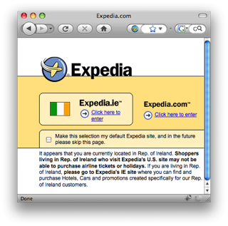
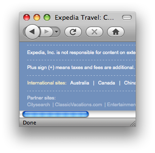
Notice how you have the chance to override their judgement – you may be checking flight domestic US flight prices for a friend, for example – and your choice can be remembered by the service. The right-hand image shows the links (which Expedia place at the bottom of the .com site) that let you switch back to the other countries’ sites.
Here, we are going to do exactly the same thing for mobile, with one exception: we won’t be giving the user an option as to whether to have their choice remembered. Since this decision will be stored in a cookie (which is bound to the desktop or mobile browsers separately anyway), they will rarely need to change their choice, and we may as well make it persist by default.
The algorithm state machine
Part I of this article described how the switcher algorithm behaves from a user’s point of view. Essentially we can display desktop pages, mobile pages, interstitials, or provide a redirect from one domain to the other. I recommend you remind yourself of the nature of the two interstitial pages and the experience we are trying to achieve.
From the serving application’s point of view summary, we want our algorithm to broadly behave like this:
- If the user has a desktop browser, has requested a desktop page, and hasn’t previously expressed a desire to have the mobile experience on this browser, give them that desktop page. If they have, redirect them to the corresponding mobile page.
- If the user has a mobile browser, has requested a mobile page, and hasn’t previously expressed a desire to have the desktop experience on this browser, give them that mobile page. If they have, redirect them to the corresponding desktop page.
- If the user has a desktop browser, has requested a mobile page, and hasn’t previously expressed a desire to have the mobile experience on this browser, give them the desktop interstitial to confirm their desire.
- If the user has a mobile browser, has requested a desktop page, and hasn’t previously expressed a desire to have the desktop experience on this browser, give them the mobile interstitial to confirm their desire.
- If the user has either browser, is on either page, but wants to switch to the other experience, let them click a link that explicitly takes them there (and register that desire).
- Ensure that users can’t get into an infinite redirect loop between the two sites.
In the hope that a picture tells a thousand words (although I’m slightly dubious), we can model these flows visually. On the left we have a desktop user, and on the right, a mobile user. At the top, we indicate the desktop domain, and at the bottom, the mobile domain. The legend for each of the connecting lines is below the diagram.
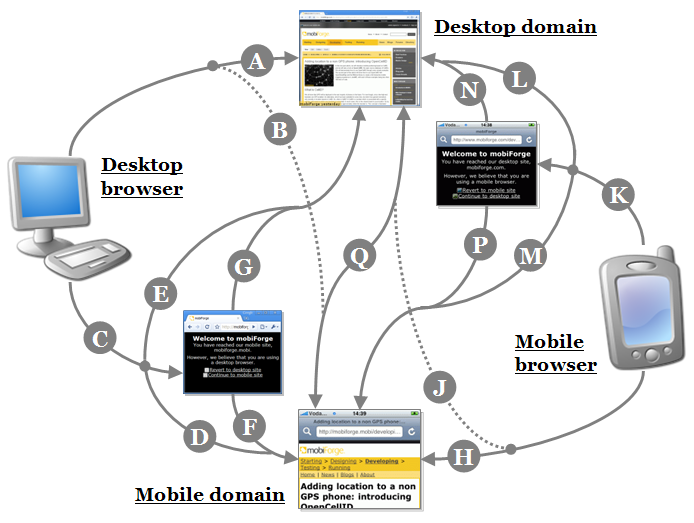
- A: Desktop browser, desktop domain, no cookie to indicate mobile preference. Gets desktop site.
- B: Desktop browser, desktop domain, cookie to indicate mobile preference. Redirects to mobile site.
- C: Desktop browser, mobile site. Interstitial to confirm choice:
– (unless D: cookie to indicate mobile preference. Gets mobile site.)
– (unless E: cookie to indicate desktop preference. Gets desktop site.)
– followed by F: choice confirmed for mobile. Gets mobile site.
– followed by G: choice confirmed for desktop. Mobile domain cookie set if possible*. Redirects to desktop site. - H: Mobile browser, mobile domain, no cookie to indicate desktop preference. Gets mobile site.
- J: Mobile browser, mobile domain, cookie to indicate desktop preference. Redirects to desktop site.
- K: Mobile browser, desktop site. Interstitial to confirm choice:
– (unless L: cookie to indicate desktop preference. Gets desktop site.)
– (unless M: cookie to indicate mobile preference. Gets mobile site.)
– followed by N: choice confirmed for desktop. Gets desktop site.
– followed by P: choice confirmed for mobile. Desktop domain cookie set if possible*. Redirects to mobile site. - Q: Either browser on either site, changes choice. Current domain cookie set if possible*. Links to other site.
* NB, if we are providing a link to go from one domain to the other, we have to use client-side Javascript to set a cookie on the domain we are leaving, since there will be no further HTTP responses from that domain, and cookies are domain-scoped. However, this fails relatively elegantly for non-supporting devices and search crawlers: it merely means the interstitial will appear again upon re-visiting the original domain.
Although this may seem very complex, in fact, when deciding which actual response and markup to deliver to the client according to these rules, the serving application only has four variables available to help make that choice:
- The domain requested by the client: example.com or example.mobi
- Certain headers sent by the client: to be identified as either a desktop or a mobile browser
- A cookie to indicate which experience the user has previously preferred, if any
- A particular magic CGI parameter: to indicate that the user is transitioning from one site to the other
Detecting the domain that was requested by the user is very straightforward in most server-side environments. It can be taken straight from the HTTP “Host” header that appears in each request from the client. And the user-agent (amongst other headers used for recognition) is extremely easy to determine too. Figuring out whether it is a mobile or desktop browser is slightly harder, but still straightforward (as we will see).
Cookies also occur in HTTP headers sent by the client, and CGI parameters occur at the end of a URL (?like=this). Both are easy to access, and your server-side environment probably provides convenient ways to access their values directly.
Incidentally, each of the four variables listed above take either a binary or tri-state value: “mobile” or “desktop” – or not present at all, in the case of the last two. Don’t forget that there are two cookies in play here. Since cookies are scoped to a domain, there is one associated with the mobile domain, and one associated with the desktop domain, each of which may take the values ‘mobile’ or ‘desktop’.
It may not yet be clear to you why we need the magic CGI parameter too. Let’s take a few minutes to think about that. As you might have noticed, there’s an unpleasant condition that might occur if the two cookies contradict each other. If the desktop domain cookie indicates that a mobile experience is preferred, and the mobile domain cookie indicates that a desktop experience is preferred, the user will go around in an infinite loop. Not good.
So what we do is place an extra parameter on the URL when redirecting or linking the user from one domain into the other. This basically is the first domain’s way of saying to the other “the user really wants to come back to your site: ignore their previous choice to switch away from you”. This CGI parameter therefore needs to take priority over cookies.
The truth is in the tables
So let’s consider the logic of actually serving up a page. For simplicity in this article, let’s assume that both domains are actually resolving and being served by the same web application. (This means we can do everything in one piece of code too). When a user requests a page, and in response to the four variables above, the web application will execute one of six possible outcomes:
- R1: a desktop page on the desktop domain
- R2: a mobile page on the mobile domain
- R3: a redirect to a mobile domain URL corresponding to the requested desktop page
- R4: a redirect to a desktop domain URL corresponding to the requested mobile page
- R5: a mobile interstitial prompt page
- R6: a desktop interstitial prompt page
For all of the four variables, we need to list their possible values, and map them to the six possible outcomes. This is the essence of coding the algorithm, and it’s time for some good old-fashioned truth tables: just like your electronics teacher used to love.
For four variables, with two or three relevant states each, there are theoretically 36 possible combinations. Fortunately, it turns out that only 16 of these are actually distinct and relevant for the purposes of this algorithm. You can confirm this as ‘an exercise for the reader’ if you like – but we’ll cut straight to the critical combinations in the table below.
| Variables | Outcome | |||||
|---|---|---|---|---|---|---|
| Scenario | Domain | Browser | Cookie* | CGI parameter | Response | |
| S1 | desktop | desktop | not present | present or not present | R1 | desktop page |
| S2 | desktop | desktop | desktop | present or not present | R1 | desktop page |
| S3 | desktop | desktop | mobile | present | R1 | desktop page |
| S4 | desktop | desktop | mobile | not present | R3 | redirect to mobile page |
| S5 | desktop | not desktop | any | present | R1 | desktop page |
| S6 | desktop | not desktop | none | not present | R5 | mobile interstitial |
| S7 | desktop | not desktop | mobile | not present | R3 | redirect to mobile page |
| S8 | desktop | not desktop | desktop | not present | R1 | desktop page |
| S9 | mobile | mobile | not present | present or not present | R2 | mobile page |
| S10 | mobile | mobile | mobile | present or not present | R2 | mobile page |
| S11 | mobile | mobile | desktop | present | R2 | mobile page |
| S12 | mobile | mobile | desktop | not present | R4 | redirect to desktop page |
| S13 | mobile | not mobile | any | present | R2 | mobile page |
| S14 | mobile | not mobile | none | not present | R6 | desktop interstitial |
| S15 | mobile | not mobile | desktop | not present | R4 | redirect to desktop page |
| S16 | mobile | not mobile | mobile | not present | R2 | mobile page |
* NB, remember we can only consider the cookie relevant to this domain
Take some time to think through a few of the rows above. You ought also to be able to see some comforting symmetry. I’ve spent some time trying to reduce this truth table to a series of simpler conditions, but sadly, the best efforts of Boole and De Morgan have proven fruitless: you’ll see the table above appearing fairly unchanged in the final code. Another experiment for the reader: to try and do better!
Anyway, phew… I hope you’re still with us. Don’t worry, it gets (a little) more straightforward from here on.
Pseudo-code
As I mentioned, it’s simplest to consider a single application with both the desktop and mobile domain resolving to the same scripts. Of course you can separate them out if you want. But in the approach below, we will need a check to determine the domain that the client browser has requested.
Let’s first articulate the logic from the above section into some simple code. We’ll assume that the logic is run with the following variables set:
desktopDomain;  // (boolean) whether the user has requested the desktop domain
mobileDomain;   // (boolean) whether the user has requested the mobile domain
desktopBrowser; // (boolean) whether the user has a desktop client
mobileBrowser;  // (boolean) whether the user has a mobile client
desktopCookie;  // (boolean) whether the cookie on this domain equals 'desktop'
mobileCookie;   // (boolean) whether the cookie on this domain equals 'mobile'
cgi;            // (boolean) whether the magic CGI parameter is present
These aren’t always each other’s complement. If desktopDomain is true, then mobileDomain is theoretically false (and vice versa), but if desktopCookie is true, then mobileCookie isn’t necessarily false (since neither may be present). We can also hedge our bets slightly with the browser recognition (which is never quite the exact science it should be). There may be circumstances – thanks to troublesome user-agents – where we are fairly sure that a browser can be treated as a desktop, even if we are not completely sure that it is not mobile.
Armed with these variables, let’s launch into the logic with some pseudo-code – to be read in conjunction with the table above. The return value from this function is R1, R2, etc (as listed in the table) indicating the correct response to return to the user.
switcherOutcome(
  desktopDomain, mobileDomain,
  desktopBrowser, mobileBrowser,
  desktopCookie, mobileCookie,
  cgi
) {
  if (desktopDomain) {
    if (desktopBrowser) { // scenarios S1-S4
      if (mobileCookie && !cgi) { // scenario S4
        return R3; // redirect to mobile page
      } else { // scenarios S1-S3
        return R1; // desktop page
      }
    } else { // scenarios S5-S8
      if (cgi || desktopCookie) { // scenarios S5 & S8
        return R1; // desktop page
      } else {
        if (mobileCookie) { // scenario S7
          return R3; // redirect to mobile page
        } else { // scenario S6
          return R5; // mobile interstitial
        }
      }
    }
  } else {
    if (mobileBrowser) { // scenarios S9-S12
      if (desktopCookie && !cgi) { // scenario S12
        return R4; // redirect to desktop page
      } else { // scenarios S9-S11
        return R2; // mobile page
      }
    } else { // scenarios S13-S16
      if (cgi || mobileCookie) { // scenarios S13 & S16
        return R2; // mobile page
      } else {
        if (desktopCookie) { // scenario 15
          return R4; // redirect to desktop page
        } else { // scenario 14
          return R6; // desktop interstitial
        }
      }
    }
  }
}
Using the return value, the code that calls this function will then decide what to display or render.
Setting up an environment
We’re getting close to the point at which we can start building our own switchr. In theory, we have discussed enough of the switcher approach for you to implement it in entirely your own way – with a pattern appropriate to your language and platform of choice – and in a way which is sympathetic to your application design.
Nevertheless, we’ll go ahead and build one as part of the remainder of this article. I guess you could take this code verbatim if you want – it comes with no warranties! – but more importantly, we’re doing this to make sure you understand how one can put the theory above in to practice.
A word on setting up the environment for running this sample implementation. I’m assuming you know how to get a web server (in this case, Apache) up. We basically want two complementary domains pointing through to the same application code. We’re going to have a single file called index.php: you should place this in a directory somewhere:
$ ls -al /Users/James/prototypes/switcher_demo/
total 0
drwxr-xr-x  3 James  staff  102  1 Dec 17:15 .
drwxr-xr-x  7 James  staff  238  1 Dec 17:15 ..
-rw-r--r--  1 James  staff    0  1 Dec 17:15 index.php
… and configure the Apache server to serve up that file or directory for two vhosts. In your configuration file, you should have something like:
DirectoryIndex index.php
NameVirtualHost *:80
<VirtualHost *:80>
  ServerName example.com
  DocumentRoot /Users/James/prototypes/switcher_demo/
</VirtualHost>
<VirtualHost *:80>
  ServerName example.mobi
  DocumentRoot /Users/James/prototypes/switcher_demo/
</VirtualHost>
Note that this is not intended to be a replacement guide for configuring your web server! There’s plenty out there to help you get started with such matters.
Both domains’ DNS entries need to resolve to this server. It’s unlikely that you own the root domain records for example.com and example.mobi, so if you want to use those two, you’ll need to override the DNS entries for them on the system you’re testing this out with. You can do this in your /etc/hosts file (also available, but deeper down under ..windows/system32/drivers/ on a Windows machine). Assuming your browser will be on the same machine as the web server, something like this should do it:
 ##
 # Host Database
 ##
 127.0.0.1       example.com
 127.0.0.1       example.mobi
Alternatively, simply replace the domains in the code below with two that you do have proper registry/hosting control over. That will be important if you’re planning to test this out with a real phone coming in from an external network.
Finally… some code!
The moment you’ve all been waiting for… You’re probably ready to see some real code. As I’ve said, this is a sample implementation. But feel free to drag, drop, copy or paste portions into your own applications. I’ve chosen to use PHP since it’s relatively easy to understand for most developers – and a little bit of find and replace should see it quickly working in Java or C# environments.
Firstly, let’s implement the switcher logic from above as real code. We start off by defining some constants representing the various responses that the switcher can return.
/**
 * Constants for indicating switcher outcome
 */
define("SWITCHER_DESKTOP_PAGE", 1);
define("SWITCHER_MOBILE_PAGE", 2);
define("SWITCHER_REDIRECT_TO_MOBILE", 3);
define("SWITCHER_REDIRECT_TO_DESKTOP", 4);
define("SWITCHER_MOBILE_INTERSTITIAL", 5);
define("SWITCHER_DESKTOP_INTERSTITIAL", 6);

/**
 * Main switcher algorithm
 * @return integer the switcher outcome
 */
function _switcher_outcome(
  $desktop_domain, $mobile_domain,
  $desktop_browser, $mobile_browser,
  $desktop_cookie, $mobile_cookie,
  $cgi
) {

  if ($desktop_domain) {
    if ($desktop_browser) {
      if ($mobile_cookie && !$cgi) {
        return SWITCHER_REDIRECT_TO_MOBILE;
      } else {
        return SWITCHER_DESKTOP_PAGE;
      }
    } else {
      if ($cgi || $desktop_cookie) {
        return SWITCHER_DESKTOP_PAGE;
      } else {
        if ($mobile_cookie) {
          return SWITCHER_REDIRECT_TO_MOBILE;
        } else {
          return SWITCHER_MOBILE_INTERSTITIAL;
        }
      }
    }
  } else {
    if ($mobile_browser) {
      if ($desktop_cookie && !$cgi) {
        return SWITCHER_REDIRECT_TO_DESKTOP;
      } else {
        return SWITCHER_MOBILE_PAGE;
      }
    } else {
      if ($cgi || $mobile_cookie) {
        return SWITCHER_MOBILE_PAGE;
      } else {
        if ($desktop_cookie) {
          return SWITCHER_REDIRECT_TO_DESKTOP;
        } else {
          return SWITCHER_DESKTOP_INTERSTITIAL;
        }
      }
    }
  }
}
Secondly, let’s provide some settings, an entry point the switcher as a whole, and some code that will call functions to actually populate the incoming variables:
/**
 * Constants for domains being used by application. Change these for your site.
 */
define("SWITCHER_DESKTOP_DOMAIN", "example.com");
define("SWITCHER_MOBILE_DOMAIN", "example.mobi");

/**
 * Constants for cookie and CGI flags.
 * Change only if in conflict with your application.
 */
define("SWITCHER_COOKIE_VAR", "switcher");
define("SWITCHER_CGI_VAR", "switcher");

/**
 * Main entry point
 */
switcher();

/**
 * Harness for the switcher algorithm behaviour
 */
function switcher() {
  $desktop_domain = _switcher_is_domain(SWITCHER_DESKTOP_DOMAIN);
  $mobile_domain = _switcher_is_domain(SWITCHER_MOBILE_DOMAIN);
  $desktop_browser = _switcher_is_desktop_browser();
  $mobile_browser = _switcher_is_mobile_browser();
  $desktop_cookie = _switcher_is_desktop_cookie();
  $mobile_cookie = _switcher_is_mobile_cookie();
  $cgi = _switcher_is_cgi_parameter_present();

  $outcome = _switcher_outcome(
    $desktop_domain, $mobile_domain,
    $desktop_browser, $mobile_browser,
    $desktop_cookie, $mobile_cookie,
    $cgi
  );

  _switcher_handle_outcome($outcome);
}
Having retrieved values for the main variables, we then retrieve the outcome from the switcher algorithm, and pass it on to a handler that will return a suitable response. (We’ll come back to that function itself at the end of the article).
The first two constants at the top of this portion of code should be changed to map to the domains you are using in your application. The second two are the names of the cookie and CGI parameter respectively. You don’t have to change these unless you happen to use cookies or parameters named “switcher” in your application for some other reason.
The function to identify which domain has been used to reach this application needs simply to check whether the HTTP “Host” header finishes with a sufficiently-qualified portion to distinguish one domain from the other:
/**
 * Identifies whether user is on a certain domain
 * @param string $domain suitably-qualified domain suffix
 */
function _switcher_is_domain($domain) {
  $host = $_SERVER['HTTP_HOST'];
  return (substr($host, -strlen($domain)) == $domain);
}
Moving on to the recognition, there are a number of ways to identify whether a browser is a desktop or a mobile client. For example, dotMobi’s DeviceAtlas database contains two relevant properties: “isBrowser” and “mobileDevice”.
For the purposes of keeping this implementation self-contained, we are going to use a derivation of Andy Moore’s mobile detection code (as introduced here), and simply use its inverse as the desktop detection rule.
Since this is therefore being called twice, we put a global variable at the top to act as a cache for performance purposes. If you’re building your switcher in an OO-way, you’d make this field static: it won’t change during the lifetime of a page (or indeed during the lifetime of the session, but that’s another topic).
/**
 * Is user's a desktop browser?
 * @returns boolean true if using desktop browser
 */
function _switcher_is_desktop_browser() {
  return !_switcher_is_mobile_browser();
}

/**
 * Is user's a mobile browser?
 * @returns boolean true if using mobile browser
 */
function _switcher_is_mobile_browser() {
  global $_switcher_is_mobile_browser;
  if (isset($_switcher_is_mobile_browser)) {
    return $_switcher_is_mobile_browser;
  }

  $ua = strtolower($_SERVER['HTTP_USER_AGENT']);
  $mobile_browser = '0';
  if (preg_match('/(up.browser|up.link|mmp|symbian|smartphone|midp|wap|phone)/i', $ua)) {
    $mobile_browser++;
  }
  if (stripos($_SERVER['HTTP_ACCEPT'], 'application/vnd.wap.xhtml+xml') !== false ||
      isset($_SERVER['HTTP_X_WAP_PROFILE']) ||
      isset($_SERVER['HTTP_PROFILE'])) {
    $mobile_browser++;
  }
  $mobile_ua = substr($ua, 0, 4);
  $mobile_agents = array(
    'w3c ', 'acs-', 'alav', 'alca', 'amoi', 'audi', 'avan', 'benq', 'bird', 'blac',
    'blaz', 'brew', 'cell', 'cldc', 'cmd-', 'dang', 'doco', 'eric', 'hipt', 'inno',
    'ipaq', 'java', 'jigs', 'kddi', 'keji', 'leno', 'lg-c', 'lg-d', 'lg-g', 'lge-',
    'maui', 'maxo', 'midp', 'mits', 'mmef', 'mobi', 'mot-', 'moto', 'mwbp', 'nec-',
    'newt', 'noki', 'oper', 'palm', 'pana', 'pant', 'phil', 'play', 'port', 'prox',
    'qwap', 'sage', 'sams', 'sany', 'sch-', 'sec-', 'send', 'seri', 'sgh-', 'shar',
    'sie-', 'siem', 'smal', 'smar', 'sony', 'sph-', 'symb', 't-mo', 'teli', 'tim-',
    'tosh', 'tsm-', 'upg1', 'upsi', 'vk-v', 'voda', 'wap-', 'wapa', 'wapi', 'wapp',
    'wapr', 'webc', 'winw', 'winw', 'xda ', 'xda-');
  if (in_array($mobile_ua, $mobile_agents)) {
    $mobile_browser++;
  }

  if (isset($_SERVER['ALL_HTTP']) && stripos($_SERVER['ALL_HTTP'], 'operamini') !== false) {
    $mobile_browser++;
  }
  if (strpos($ua, 'windows') > 0) {
    $mobile_browser = 0;
  }
  $_switcher_is_mobile_browser = ($mobile_browser > 0);
  return $_switcher_is_mobile_browser;
}
Finally, we need to be able to access cookie values, and whether the magic CGI parameter has been set. PHP makes both very easy:
/**
 * Is the 'desktop cookie' set?
 * @returns boolean true if a cookie exists indicating desktop preference
 */
function _switcher_is_desktop_cookie() {
  return (
    isset($_COOKIE[SWITCHER_COOKIE_VAR])
    && $_COOKIE[SWITCHER_COOKIE_VAR] == "desktop"
  );
}

/**
 * Is the 'mobile cookie' set?
 * @returns boolean true if a cookie exists indicating mobile preference
 */
function _switcher_is_mobile_cookie() {
  return (
    isset($_COOKIE[SWITCHER_COOKIE_VAR])
    && $_COOKIE[SWITCHER_COOKIE_VAR] == "mobile"
  );
}

/**
 * Is the switcher's CGI parameter set?
 * @returns boolean true if the magic parameter exists to override a cookie's preference
 */
function _switcher_is_cgi_parameter_present() {
  return (
    isset($_GET[SWITCHER_CGI_VAR])
  );
}
This, collectively, is enough code for the switcher to decide what to do. But of course that’s not the whole story: we need to actually act upon that decision. The way in which the interstitial pages are displayed – and especially the pages of you sites themselves! – will be up to you. But we’ll run through some placeholder examples here, if only because we need to show how the cookies and CGI parameter get set.
Firstly, let’s have a function that renders a link to switch to a given one of the two domains:
/**
 * Create an anchor link to switch between sites
 * @param int $target either SWITCHER_DESKTOP_DOMAIN or SWITCHER_MOBILE_DOMAIN
 * @param string $label descriptive text to go in the link
 */
function _switcher_link($target, $label) {
  switch ($target) {
    case SWITCHER_DESKTOP_DOMAIN:
      $cookie = SWITCHER_COOKIE_VAR . "=desktop;path=/;expires=Tue, 01-01-2030 00:00:00 GMT";
      $target_url = "http://" . SWITCHER_DESKTOP_DOMAIN . _switcher_current_path_plus_cgi();
      break;
    case SWITCHER_MOBILE_DOMAIN:
      $cookie = SWITCHER_COOKIE_VAR . "=mobile;path=/;expires=Tue, 01-01-2030 00:00:00 GMT";
      $target_url = "http://" . SWITCHER_MOBILE_DOMAIN . _switcher_current_path_plus_cgi();
      break;
  }
  if ($target_url) {
    return "<a onclick = 'document.cookie = "$cookie";' href = '$target_url'>$label</a>";
  }
}

/**
 * Returns the portion of the URL path with the magic CGI parameter set
 * @returns string the URL path and query string with the CGI parameter set
 */
function _switcher_current_path_plus_cgi() {
  $path = $_SERVER['REQUEST_URI'];
  if (stripos($path, SWITCHER_CGI_VAR . "=true") !== false) {
    return $path;
  }
  if (stripos($path, "?") === false) {
    return $path . "?" . SWITCHER_CGI_VAR . "=true";
  }
  return $path . "&" . SWITCHER_CGI_VAR . "=true";
}

/**
 * Sets a cookie on the current domain to indicate user preference
 * @param int $preference either SWITCHER_DESKTOP_DOMAIN or SWITCHER_MOBILE_DOMAIN
 */
function _switcher_set_cookie($preference) {
  switch ($preference) {
    case SWITCHER_DESKTOP_DOMAIN:
      setcookie(SWITCHER_COOKIE_VAR, "desktop", time()+60*60*24*365, '/');
      break;
    case SWITCHER_MOBILE_DOMAIN:
      setcookie(SWITCHER_COOKIE_VAR, "mobile", time()+60*60*24*365, '/');
      break;
  }
}
This section of code has two noteworthy aspects. Firstly, note how we use Javascript to attempt to set the preference cookie on the domain we are just about to leave. This is great if it works, but degrades gracefully – as we mention above – if it does not.
The second function is responsible for placing the magic CGI parameter into links to the other site. It may seem a little verbose, but that’s because we would like the same URL path to be present when the user arrives at the other site (rather than merely taking them to the top of it). Since your application may already use CGI parameters, our code is making sure we’re not destroying parameters that already there – and that it isn’t in the query string already.
Remember that the presence of this CGI parameter is used to overrule any previous cookie preference on the destination site. It only needs to be present on that first request (because the cookie will get changed to update your new desire) and need not be preserved whilst moving around inside the application subsequently.
The third function here is convenience to set a cookie value for the user’s preference in a response from the server.
Emitting some markup
Now we are in a good position to prepare a response to the user. Let’s start by creating two interstitial page templates. Now, it’s certainly a bit crude to place HTML as literally as this into the middle of a script, but of course you’ll be able to adapt these as much as you wish in your own applications.
You can actually make one interstitial page plain enough to work on both desktop and mobile browsers: no device adaptation is particularly required for a page as simple as this. But feel free if you’d like to have them separate. I’ve done so here to make it clearer what’s going on.
/**
 * Outputs the desktop interstitial page
 */
function _switcher_desktop_interstitial() {
  print "<html>
    <head>
      <title> dotMobi switcher demo</title>
    </head>
    <body>
      <h1>Welcome to the dotMobi switcher demo</h1>
      <p>You've requested the mobile site, but you appear to have a desktop browser.</p>
      <p>" . _switcher_link(SWITCHER_DESKTOP_DOMAIN, "Revert to the desktop site") . "</p>
      <p>" . _switcher_link(SWITCHER_MOBILE_DOMAIN, "Continue to our mobile site") . "</p>
    </body>
  </html>";
}

/**
 * Outputs the mobile interstitial page
 */
function _switcher_mobile_interstitial() {
  print "<" .
  "?xml version='1.0' encoding='UTF-8'?>
  <!DOCTYPE html PUBLIC '-//WAPFORUM//DTD XHTML Mobile 1.0//EN'
   'http://www.wapforum.org/DTD/xhtml-mobile10.dtd'>
  <html xmlns='http://www.w3.org/1999/xhtml'>
    <head>
      <meta http-equiv='Content-type' content='text/html; charset=utf-8' />
      <meta http-equiv='Content-language' content='en-gb' />
      <title> dotMobi switcher demo</title>
    </head>
    <body>
      <h1>Welcome to the dotMobi switcher demo</h1>
      <p>You've requested the desktop site, but you appear to have a mobile browser.</p>
      <p>" . _switcher_link(SWITCHER_MOBILE_DOMAIN, "Revert to the mobile site") . "</p>
      <p>" . _switcher_link(SWITCHER_DESKTOP_DOMAIN, "Continue to our desktop site") . "</p>
    </body>
  </html>";
}
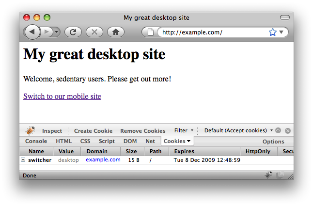
Let’s also write a couple of simple “Hello world” pages that represent the mobile and desktop variants of your site. Of course this is merely for demonstration: you’ll need to figure out how to best wire this into your own application. But look carefully: they show at least how you’ll want to use the link function to place a link from each site to allow users to switch to the other.
/**
 * Outputs a placeholder desktop page solely for the purposes of demonstrating the switcher
 */
function _switcher_desktop_page() {
  print "<html>
    <head>
      <title>My great desktop site</title>
    </head>
    <body>
      <h1>My great desktop site</h1>
      <p>Welcome, sedentary users. Please get out more!</p>
      <p>" . _switcher_link(SWITCHER_MOBILE_DOMAIN, "Switch to our mobile site") . "</p>
    </body>
  </html>";
}

/**
 * Outputs a placeholder mobile page solely for the purposes of demonstrating the switcher
 */
function _switcher_mobile_page() {
  print "<" .
  "?xml version='1.0' encoding='UTF-8'?>
  <!DOCTYPE html PUBLIC '-//WAPFORUM//DTD XHTML Mobile 1.0//EN'
   'http://www.wapforum.org/DTD/xhtml-mobile10.dtd'>
  <html xmlns='http://www.w3.org/1999/xhtml'>
    <head>
      <meta http-equiv='Content-type' content='text/html; charset=utf-8' />
      <meta http-equiv='Content-language' content='en-gb' />
      <title>My great mobile site</title>
    </head>
    <body>
      <h1>My great mobile site</h1>
      <p>Welcome, mobile users. Enjoy the fresh air!</p>
      <p>" . _switcher_link(SWITCHER_DESKTOP_DOMAIN, "Switch to our desktop site") . "</p>
    </body>
  </html>";
}
Integrating it all together
We now have all the pieces of the jigsaw. Just to summarise, we have:
- Functions that provide us with the clues as to what the user is requesting (e.g. _switcher_is_desktop_browser)
- The main decision tree of the algorithm (_switcher_outcome)
- Functions for creating links between sites (_switcher_link and _switcher_current_path_plus_cgi)
- Two interstitial page functions (e.g. _switcher_mobile_interstitial)
- Two placeholder page functions (e.g. _switcher_mobile_page)
The only logic we are now missing is that which takes the outcome of the switcher and dispatches the correct response. That’s fairly simple:
/**
 * Main switcher handler, based on previously-determined outcome
 * @param integer $outcome the switcher outcome
 */
function _switcher_handle_outcome($outcome) {
  switch ($outcome) {

    case SWITCHER_DESKTOP_PAGE:
      _switcher_set_cookie(SWITCHER_DESKTOP_DOMAIN);
      _switcher_desktop_page();
      exit;

    case SWITCHER_MOBILE_PAGE:
      _switcher_set_cookie(SWITCHER_MOBILE_DOMAIN);
      _switcher_mobile_page();
      exit;

    case SWITCHER_REDIRECT_TO_MOBILE:
      $target_url = "http://" . SWITCHER_MOBILE_DOMAIN . _switcher_current_path_plus_cgi();
      header("Location: $target_url");
      exit;

    case SWITCHER_REDIRECT_TO_DESKTOP:
      $target_url = "http://" . SWITCHER_DESKTOP_DOMAIN . _switcher_current_path_plus_cgi();
      header("Location: $target_url");
      exit;

    case SWITCHER_DESKTOP_INTERSTITIAL:
      _switcher_desktop_interstitial();
      exit;

    case SWITCHER_MOBILE_INTERSTITIAL:
      _switcher_mobile_interstitial();
      exit;

    default:
      die("Switcher error");
  }
}
Note how we use the PHP header() function to change the Location: header and create a redirect. Specifically we’re looking for a temporary HTTP “302” response code here (rather than a permanent “301” which might prevent a browser from ever revisiting the original site.)
The proof of the pudding
And there, folks, we have it. Our simple implementation!
Let’s put all that code into a single file, our index.php that’s sitting at the top of the web server. (I’ve created a complete index.php from all the fragments above and peppered it with a few comments. Download it here, unzip it, and save it in the web server directory we discussed above.)
Then pull up a web browser on a machine that can resolve the two domains. It’s very helpful if you’ve got something like the Firefox User Agent Switcher to check this out – with a few mobile user-agents in your list already.
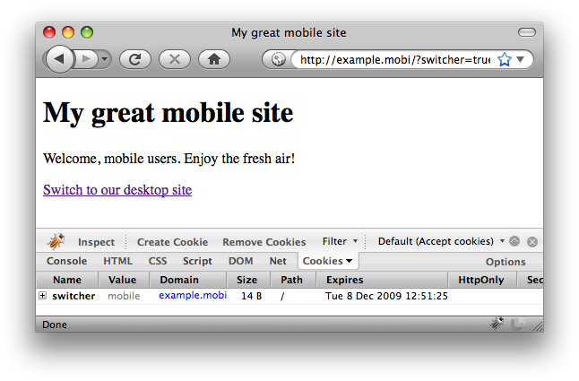
Firstly, leave your browser’s user-agent set as the default desktop browser. Visit the desktop domain. Fingers crossed, you should see:
It’s detected us correctly as a desktop user, and given us the desktop page on the desktop domain. I’ve opened up Firecookie to be able to show you that the server has also set a cookie on this domain to suggest our satisfaction with this choice.
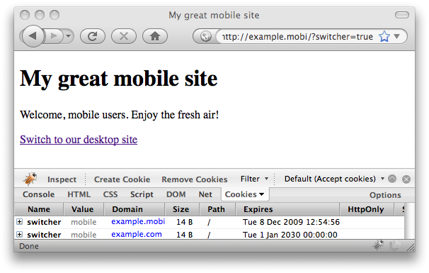
Now, imagine that you would like to see the mobile site despite your browser’s abilities. Click the switch link in the page. You’ll get the mobile site:
No surprises here – but notice how the URL contains the magic CGI parameter. If we’d followed the link to get here without it, there might have been a previously-set cookie to send us straight back again.
Now, let’s say you type in the desktop domain address again, directly. Don’t click the link in the page: simply type in http://example.com to your browser address bar again.
You should now find yourself looking at the mobile page again. This is because you’d previously expressed a preference not to have the desktop experience, so it sent you straight back here. In my installation of Firecookie, (I think it might be a bug in their plugin!) I’m even able to see the cookie that is set back on the desktop domain – with the value ‘mobile’ – which provoked this behaviour.
Next, remove your cookies (with Firecookie or by clearing your browser’s temporary files). Change your browser’s user agent to a mobile device – say, the Nokia N73 – and type in the desktop domain, http://example.com, again. You should find yourself looking at the interstitial page:
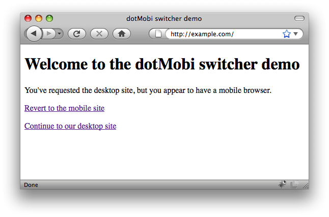
From here, you can either proceed to the mobile site (as appropriate to your user agent) or continue to the desktop site (as indicated by the address you typed in). Exactly what we wanted!
Finally, to give you some confidence that this will work for any page within your site, add an arbitrary CGI parameter onto the end of the address in your browser bar, such as …/?a=1.
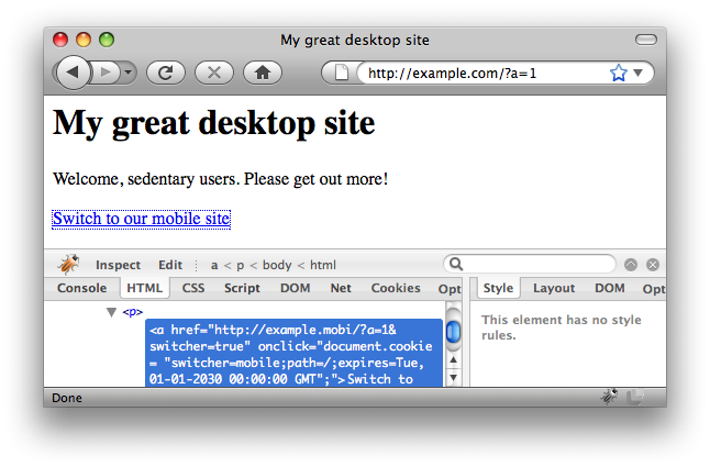
You’ll notice that this gets preserved as we move around between the sites and interstitials. This allows people to share bookmarks and not have to worry about which type of browser their friends are using!
The End
Well, thank you for making it through to the end of this epic article. I hope you think the effort was worth it.
I am convinced that the key to a successful mobile web for today and the future is being able to cater for a range of different experiences whilst retaining user choice. This switcher represents a very flexible way to do that.
If you’d like to take the switcher algorithm and the code further, please do so: the code comes with no warranty, but feel free to take it, use it, extend it, and publish it as you wish. There are also some pretty icons you can decorate your links with.
Otherwise, have fun. Please share your experiences back with us in the comments below – and let us know how you get on. Good luck!


11 Comments
@robman & @james: You’re both saying the same thing 🙂
@james I do think all diagrams / tables / scenarios make this solution seem more complicated than it is:
[quote]Send a mobile user to the mobile view – unless they want the desktop view. Send a desktop user to the desktop view – unless they want the mobile view.[/quote]
But some might find this in depth explanation helpful!
At [url=http://www.mobify.me]Mobify[/url] we use an approach similar to what Rob described in his [url=http://smartmobtoolkit.wordpress.com/2009/01/25/not-device-detection-example-code/]post[/url] to detect the presence of a mobile device.
I’ve uploaded a short explanation, Python code example and demo to AppEngine, it’s available here:
[url=http://notnotmobile.appspot.com]http://notnotmobile.appspot.com[/url]
Cheers,
John
Hi,
it seems your switching algorithm doesn’t recognize Googlebot-Mobile.
Mozilla/5.0 (compatible; Googlebot-Mobile/2.1; +http://www.google.com/bot.html)