
Tag Archives: deviceatlas

The DeviceAtlas Guide to Device Detection for Video Advertising
May 29, 2019, by James Kielty
Video as an online trend is nothing new, but there’s no doubt that video consumption on the web has skyrocketed – time spent watching video is growing rapidly. Consider the following numbers to get an idea of just how big video has become: 75% of mobile traffic will be video by 2020 –... Read More


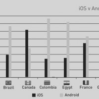
OS landscape shifts as Google & Apple bet on emerging markets
September 27, 2018, by James Kielty
The latest DeviceAtlas Mobile Web Intelligence report shows a resurgence in the use of feature phones, which have eaten into smartphone share in some markets. The report also revealed the popularity of dual SIM phones with rumors of support for this in new versions of iOS. There’s still life in older feature phones With Android... Read More

ZTE market share – how much “suspect tech” is out there?
May 16, 2018, by Martin Clancy
Updated: On the back of ZTE’s announcement that “the major operating activities of the company have ceased”, many are wondering just how much of the market ZTE commands. We looked the data for the answers... Read More

JavaScript server-side rendering with device detection
April 13, 2017, by Ruadhán O'Donoghue
React and other JavaScript frameworks have frequently come under fire for not being suited to mobile. Hence mobile-first was a cornerstone of the Angular 2 rewrite. And despite React’s popularity, it still attracts the wrong kind of attention regarding mobile. To my friends on the React team: you are on the hook until there's a... Read More

Mobile browser stats by country
July 13, 2015, by Ruadhán O'Donoghue
Below you can explore web usage broken down by mobile browser and country. Select a country to see the browser stats for that country. DeviceAtlas allows you to access mobile traffic data sourced from thousands of websites from all over the world. You can browse many kinds of stats across over 70 countries. Each data point shows the percentage of traffic generated by a certain kind of device. Visit DeviceAtlas to access more data... Read More


