


With Black Friday fast approaching, and this year’s predicted to be the busiest since 2006, we thought it an opportune time to take an in-depth look at e-commerce – specifically, at mobile e-commerce (m-commerce). M-commerce is a strand of online retail that’s nudging close to taking up 20% of total annual online sales; appreciating its business significance, and coming up with a viable mobile retail strategy, is, thus, crucial.
In this first part we look at recent research into the effect of web performance on m-commerce. In the following parts, we take a look at how some individual sites adapt the experience for the mobile context, and we try to assess how different mobile strategy decisions affect the user.
Mobile commerce and online retail
M-commerce is taking up a progressively bigger chunk of the online retail space. One out of four people now own a smartphone, and 55% of all time spent on retail sites takes place on a mobile device. In the US, according to eMarketer, mobile retail sales increased by 70% to reach $42.13 billion in 2013. They estimate that, ‘In 2014 that figure will increase another 37.2% to total $57.79 billion, or about one-fifth of all retail e-commerce sales and 1.2% of total retail sales.’ Tablet sales, they say, will account for nearly two-thirds of m-commerce sales in 2014. In the UK, meanwhile, the Interactive Media in Retail Group and Capgemini report that m-commerce traffic overtook desktop commerce traffic in the UK in Q2 2014.
Increasingly demanding mobile users
Mobile users are demanding, and won’t make allowances for degraded performance simply ‘because it’s on mobile’:
- 85% of users expect pages to load on mobile as fast as or faster than they load on desktop.
- 83% expect pages to load in 4 seconds or less on mobile, while 47% expect them to load in half that time.
(See here, and here – slide 14.)
Another survey of mobile users, by Equation Research, found that 35% expected pages to load on mobile in ‘2 seconds or less’. While it may certainly be plausible that those surveyed are over-estimating how long two seconds take to pass (sit down with a stopwatch and hit ‘go’ as you load a page: two seconds is shorter than you think), what all of these figures add up to is: ‘Fast. And the faster the better.’ And users’ expectations are growing with every year that passes – a page that took 6 seconds to load in 2010 suffered a -40% conversion hit; by 2012, a 6-second page took a -50% hit.
However, Radware’s most recent State of the Union: Mobile e-commerce Performance report found that:
- Full site (non m-dot) page load times over LTE of the Alexa top 100 e-commerce websites on the iPhone 5s averaged 11 seconds
- The same pages took an average of 15.2 seconds to load on the iPhone 4s.
By constrast, m-dot sites took 4.8 seconds (iPhone 5s) and 7 seconds (iPhone 4s) respectively.
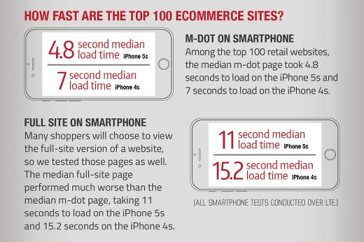
Infographic from Radware
Site speed and conversions
Online, time costs money, and the link between speed and conversion rates for pages loaded on both desktop and mobile has been well-established over the years. On smartphones, a one second delay in loading a page can result in a 3.5% percent drop in conversions.
Strangeloop networks conducted a study for an e-commerce website in which they split mobile traffic into four groups: fully optimised, 200ms delay, 500ms delay, and 1000ms delay. They found that in the 1000ms delay condition, the bounce rate was 8.3% higher than for the fully optimised site; the conversion rate was 3.5% lower; cart size 2.1% smaller; and there were 9.4% fewer page views. Importantly, even after the experiment was over and the shoppers in the 500ms and 1000ms group were served the same site as the baseline group, they were significantly less likely to return to the site. A bad experience with speed can have a persistent effect on customer behaviour, in other words.
A study carried out by Equation Research on behalf of Compuware found something similar – with 46% of mobile web users unlikely to return to a website they had trouble accessing in the past. (See here, slide 6.) Another Compuware survey, this time of tablet users, found that 33% of them are less likely to purchase from a company online if they experience site poor performance and 46% will go to competitor websites. Even more troubling, 35% are less likely to visit the problematic website on any platform. 66% described ‘poor performance’ as ‘slow load time’.
In a 2012 analysis Walmart found that when load times go from 1 second to 4 seconds, conversion rates decline sharply. For every 1 second improvement in page load time, they saw a 2% conversion increase.
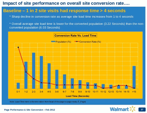
Walmart conversion performance
In 2009, Shopzilla cut its load time from 7 seconds to 2 seconds, and saw its conversion rate rise from 7% to 12%.
More recently, eBay looked at the correlation between site speed and what they call ‘buyer purchases per week (PPW, a business metric related to conversion of traffic to purchases)’. They concluded: ‘a small change in page speed might not have much impact, but a large page speed change can have a noticeable effect on end users; for example, a large reduction in site speed can cause user activity to drop, or even abandonment of the site, thus affecting conversions.’ As a result of this testing, now ‘the engineering culture at eBay is that site speed and optimization are part of the design, implementation, and rollout of features.’
If you’re interested, Guy Podjarny has a great selection of examples of the importance of performance and speed for conversions, beyond just e-commerce, here.
Retail’s big-hitters optimising for mobile performance
With all of that in mind, we can readily conclude that speed and performance concerns are an important factor in the decision of the majority of retail’s big-hitters to vigorously optimise their sites for mobile. A study conducted by Radware found that 81% of the top 100 retail sites as rated by Alexa.com automatically serve an m-dot version of the home page to smartphones. This bears out our own findings from three years ago that 82% of the Alexa 100 top sites use some form of server-side device detection to serve optimised content on their main website entry point.
Page weight, and page speed
Despite the business case for speed, websites in general are getting bigger, and slower. The median top 500 e-commerce websites took 9.3s to load in 2014 vs 7.7s in 2013, while the median page size of these top 500 sites was 1,436KB in 2014, as against 1,094KB in 2013 (See here.)
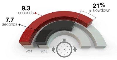
Websites are getting slower! (Source: webperformancetoday.com)
Bigger pages on desktop can too often mean much slower pages on mobile, if the page rendered hasn’t been optimised for the smaller memory and processing capacity of smartphones, or for the network latency issues that are also a feature of the mobile use case. Complicating the issue is RWD – while the page rendered will gracefully adapt to the smaller mobile viewport, the processing needed to do this can make RWD sites on mobile even slower than non-responsive desktop sites. A 2013 study by the Search Agency found that RWD sites were the slowest, on average, to load on mobile – 8.4 seconds – while dedicated mobile sites loaded fastest – in 2.9 seconds. Non-responsive desktop sites took 6.57 seconds to load. RWD sites are also among some of the biggest of the lot when it comes to page weight with an average size of 1.7MB, and a median weight of 1.2MB.
M-dot qualms?
There have been grumblings over the years that having a separate m-dot or dot-mobi domain is either unnecessary, or actively harmful – in the latter case, the usual complaint is that separate mobile domains hurt SEO (which is very questionable) and create a frustrating user experience when users share links from the mobile site with desktop users (which is nothing more than poor implementation).
Regardless of the questionable veracity of the qualms associated with separate mobile domains, sometimes companies might just like to have the same URL across all devices, mobile or otherwise. Adaptive Delivery will achieve this, by dynamically serving different HTML to different devices, but over the same URL. Many companies, including Google, Facebook, and some of the world’s top e-retailers (see below) use this approach. The use of a single URL, according to Guy Podjarny ‘alleviates some of the issues with dedicated websites, such as improving link sharing, removing redirects, and improving SEO.’ (Again, it should be emphasised at this point that the SEO ‘problem’ of m-dot sites is more often than not wildly overstated – see here for an good explanation of why Google doesn’t, in fact, penalise m-dot sites because they’re m-dot sites.)
An additional advantage of Adaptive Delivery, is that, again according to Podjarny: ‘Like an mdot site, Adaptive Delivery benefits from the simplicity and lightweight nature of a website that holds only what a small screen needs. Like a responsive site, it doesn’t suffer the slowdown penalty of being redirected to a different website. While there are many ways to make a website fast or slow, regardless of design, Adaptive Delivery makes it easier to be fast.’
Which is probably why, of the top 25 e-commerce sites as rated by Alexa.com the top five all appear to implement some kind of server-side device detection to dynamically serve different HTML and a lighter site over the same URL – they use Adaptive Delivery, in other words. Across the top 25, 15 have a unique mobile URL; 8 use dynamic serving of a lighter site without a separate mobile URL; and only 2 don’t have any detectable server-side device detection or a mobile URL. Of the two without server-side device detection, only one, Netflix, appears to have chosen an RWD approach.* (See images below.)
As Ronan Cremin wrote on this site in early 2013: ‘Visually squishy layouts are not sufficient and the top sites know this; they cater to the lumpy, uneven web, the realistic web of mixed devices, poor bandwidth and mobile-only nations.‘
| Retailer | Server-side detection? | M-dot site? |
|---|---|---|
| Amazon.com | Yes | No |
| eBay.com | Yes | No |
| Netflix.com | No | No |
| Amazon.co.uk | Yes | No |
| Etsy.com | Yes | No |
| Walmart.com | Yes | Yes |
| Ikea.com | Yes | Yes |
| Bestbuy.com | Yes | No |
| Target.com | Yes | Yes |
| Groupon.com | Yes | Yes |
| Newegg.com | Yes** | Yes** |
| Homedepot.com | Yes | Yes |
| Gap.com | Yes | Yes |
| Store.steampowered.com | Yes | No |
| Macys.com | Yes | Yes |
| Nordstrom.com | Yes** | Yes** |
| Hm.com | Yes | Yes |
| Kohls.com | Yes | Yes |
| Sears.com | Yes | Yes |
| 6pm.com | No | No |
| Overstock.com | Yes*** | No |
| Zappos.com | Yes | Yes |
| Bodybuilding.com | Yes | No |
| Lowes.com | Yes | Yes |
| Staples.com | Yes | Yes |
* We inputted each site’s desktop URL into Prism, which simulates requests from a variety of mobile devices as well as a desktop browser. Prism allows us to see what a page looks like on selected mobile devices, as well as giving us an idea of the page’s weight, the number of requests involved in returning it, and the URL returned. Cross-referencing relative size of desktop and mobile site with a visual inspection of the sites and their URLs on mobile, we rated them as being Adaptive, RWD, or m-dot sites.
** Not on BB Curve or Nokia 6300
*** Appears to be a mix of RWD and some server-side work – the page is 2.6MB on desktop and 1.2MB on Chrome for Android, but a comparison of the page on mobile and desktop suggests a primarily Responsive approach
Conclusions
As we noted at the outset, mobile commerce is becoming more and more important, and users’ speed and performance expectations are ever-increasing. And as we have seen throughout this piece, there are compelling business reasons for online retailers to make their sites as fast as possible on mobile. We have seen that many top online retailers use Adaptive Delivery (server-side adaptation) to help make their sites faster; with their broad and differentiated consumer bases, they’ve gone for the approach that ‘makes it easier to be fast‘, while also adequately catering to a wide range of devices, from very high to very low end.
Adaptive Delivery, as used by these retailers, involves some or all of the following elements:
- Serving lighter pages on mobile to speed up page load times, and performing the adaptations that lighten the load of these pages on the server, rather than the client side, to make page load times even shorter.
- Serving pages on mobile that have a different layout and hierarchy to the desktop site, based on analysis of mobile users’ ‘top tasks’ on the mobile site.
- Serving different pages depending on device, or device class, and optimising those pages for different device capabilities.
Choosing an adaptive approach to mobile web design can mean having a unique m-dot domain, or it can mean serving up a mobile-adapted site without a unique domain – as Amazon, eBay, Etsy, Bestbuy, Google, Facebook, and more have chosen to do. The key point is that the server does a chunk of the heavy lifting in responding to the type of device a page is accessed from. This speeds up load times, and enhances user experience across different device classes with different capabilities. And faster load times mean, as we have seen, increased conversions. Server-side adaptation isn’t the only choice for mobile – as we’ve written about before – but it does have the advantage of being inclusive; offering performance advantages across a spectrum of networks and devices.
Next week we’ll continue to look at m-commerce: we’ll take a look at the mobile context, and dive into some of the adaptations made by retailers that take advantage of the particularities and peculiarities of the mobile use case.


Leave a Reply