


In a recent blog post that I did here on mobiForge (Server-side device detection used by 82% of Alexa top 100 sites) some people expressed surprise that a 47 byte difference in the HTML payload delivered by Google to different devices constituted a significant level of server-side adaptation. On checking my results, it turned out that this minor 47 byte file size difference actually masks an entirely different HTML document served to different devices—an approach that Google use extensively in its mobile presences.
This discussion led us to understand that people probably don’t realise just how extensively server-side adaptation is used by the major internet brands in order to fine-tune the user experience for each platform. To help shine a light on this I’m going to look at the approaches that some major brands use in delivering their mobile web experiences. First up, it’s Google.
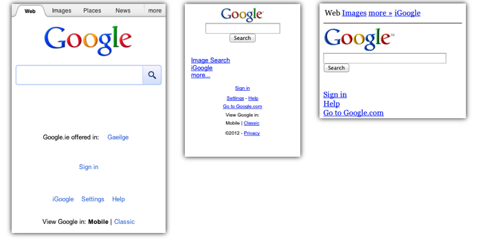
These following screenshots, taken at the approximate resolution of the real device, show how google.com looks on three popular phones. You can browse the device properties on DeviceAtlas here: iPhone, BlackBerry Curve, Nokia 6300.
For convenience I’m using the 320×480 resolution of the first 3 generations of iPhone here, not the 640×960 screen of the iPhone 4 and 4s.
The following table shows some of the key differences between the different versions of the same page served up to different devices on visiting google.com. In my particular case I get redirected to google.ie since I’m based in Ireland but the same approach is used across all of the Google entry points for each geographic region.
| iPhone | BlackBerry Curve | Nokia 6300 | |
| HTML size (Kb) | 25 | 2 | 4 |
| Images size (Kb) | 11 | 3 | 2 |
| JavaScript size (Kb) | 79 | – | – |
| Total page weight (Kb) | 115 | 4 | 6 |
| No. of HTTP requests | 9 | 2 | 2 |
| GZIP utilized | ✔ | ✗ | ✗ |
| Doctype served | HTML5 | HTML 4.01 | XHTML Mobile |
| JavaScript usage | extensive, 81 functions | none | none |
| Data URIs | ✔ | ✗ | ✗ |
| CSS usage | extensive | none | minimal |
| Media queries utilized | ✗ | ✗ | ✗ |
Analysis
The first point to note here is that Google serves an entirely different HTML document to each device that I emulated—the superficially similar pages that we see on google.com are in fact radically altered depending on the device you’re holding. Google changes essentially every aspect of the HTML and its delivery to ensure a good experience. At a very basic level, the pages are cosmetically altered (logo resizing etc.) to fit the device perfectly but in fact the adaptation goes much deeper than that: Google change the very document type delivered, whether or not compression is utilized in its delivery, the extent to which CSS and JavaScript are utilized, CSS vendor prefixes and so on. The range of adaption is impressive in its scope—Google go far beyond merely fitting everything onto the screen. The iPhone version of their homepage is about 30 times heavier than the version they serve to lower devices, even with GZIP compression. On iOS and Android extensive JavaScript is utilized to give type-ahead searching, CSS is used to make things look pretty. On lower end versions of the same page all of this is jettisoned to ensure that the page is delivered sufficiently quickly, but the core functionality and basic look and feel are retained.
This extensive server-side adaptation continues once you are served a set of search results, though at this point some of the differences become more visible. Google presents a much richer set of results for iOS and Android phones than it does for the Nokia 6300 and BlackBerry. Disappointingly, Google chooses not to include a tel: link for the Nokia and Blackberry, even though both devices support this feature just as well as Android and iOS.

|

|
So what are the lessons to be learned here? The first point is that delivering an optimum mobile experience to a wide range of devices requires some tuning to match the document served with the device making the request—cosmetic rearrangements of elements on the page alone does not pass muster.
Secondly, this level of device adaptation is impossible to achieve after the fact on the client side, with the same base HTML document presented to each device—many of the decisions that Google have made here require server-side adaptation. This ability to cater for a much wider range of devices is unique to server-side adaptation, because only what is strictly needed for each type of device need be sent.
Finally, in keeping with Google’s philosophy of delivering experiences as fast as possible, all of the heavy lifting for this adaptation is done server-side before anything is delivered to the client—no additional client-side code or queries are required to run before the user sees the rendered page.
Testing Notes
In order to probe a website to see if it delivers different user experiences for different mobile devices you need to replicate the HTTP headers sent by the real device as far as possible. These headers are used by sites to determine the best content to return in response to the device’s request. The most important of these headers is the User-Agent header but to fully replicate a real device you need to send other headers also, since sites may have adaptation logic that triggers on these too. Apart from the User-Agent header, the most significant headers are the Accept and x-wap-profile. For other X headers see the Useful “X headers” blog post here on mobiForge.
For this article I used the headers from an iPhone, a BlackBerry Curve and a Nokia 6300, since these devices are all very popular and represent a wide spread of device capabilities.
In all cases I was not logged into Google and I stripped all cookies to ensure each device was treated individually.


