For some digital experts RWD seems like an approach that automagically addresses all mobile-related pain points but the truth is a little more complicated. RWD can be really beneficial for your website but only if you manage to keep the site lightweight and fast. And thus the majority of top Alexa companies use Adaptive Web Design to provide mobile visitors with optimal viewing experience.
RWD is not easy to get right
Some RWD pages are extremely slow to load on mobile devices especially when WiFi or LTE are not available. In many cases this due to the fact that the same, bloated website content is executed on every device and connectivity level. And this is basically what makes the mobile web suck, as The Verge put it.
But even if you manage to make your website fast and lightweight, RWD may not be flexible enough for addressing mobile visitors in a different way. This is one of the main reasons why most visited websites today don’t use the one-size-fits-all approach but instead they utilize Adaptive Web Design (content adaptation) either by applying separate URLs or dynamic serving.
Here is a quick overview of different ways to address visitors on a wide range of devices used by some of the top Alexa websites.
1. Google – dynamic serving
While people may think there’s just one Google on every device, it’s not true given that the search giant doesn’t use RWD. Google uses dynamic serving, meaning that different devices get a different version of Google (even though the URL stays unchanged), and this includes a different search results pages.
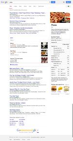
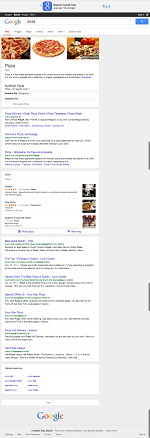
Here’s a quick comparison of the three search results pages for the term ‘pizza’ googled on a laptop, iPad and iPhone. The iPhone search results page includes a map and addresses of different pizzerias, while desktop search results shows a box in the right columns listing some facts related to pizza.
Click the images to view full size screenshots.
2. Facebook – separate URLs
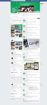
While most users choose the Facebook app to access the biggest social site on mobile devices, it is also possible to log in directly from a smartphone browser. To allow this, Facebook applied a separate URL mobile setup – mobile users are redirected to a lighter Facebook available at m.facebook.com.
3. Baidu – dynamic serving
The leading Chinese search engine uses dynamic serving to provide its users with lightweight search experience on any device. The search results pages vary according to the type of device used.
4. Yahoo – dynamic serving
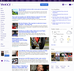
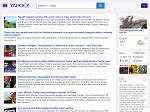
Yahoo serves a mobile optimized version of its website to mobile users on smartphones and tablets. This happens without changing the URLs. Mobile users get a clean list of the latest articles with a hamburger menu in top left corner that loads blazingly fast and is extremely lightweight.
5. Amazon – dynamic serving
Amazon also uses dynamic serving which adapts the content without changing the URL. There’s only a slight difference between the iPad and desktop Amazon, while the mobile version is completely different which is particularly apparent in the stripped-down top menu that includes just 3 elements instead of 10.
6. Twitter – separate URLs
Similarly to Facebook, Twitter also allows its users to log in using a mobile browser even though it offers apps for all major mobile operating systems. Twitter redirects its mobile visitors to a lightweight site at mobile.twitter.com.
Other Alexa Top 10 companies using Adaptive Web Design:
- Taobao – separate URLs
- Wikipedia – dynamic serving
- QQ – separate URLs
- Live.com – dynamic serving
The following table compares our findings including some indicative page weight and loading speed scores as measured by Chrome Developer Tools (these figures are just for comparison).
| Website | Mobile Setup | Page weight (iPhone 6) | Load speed (iPhone 6 on 3G) |
|---|---|---|---|
| Google (search results) | Dynamic serving | 246KB | 2.24s |
| Facebook (log in page) | Separate URLs | 186KB | 1.76s |
| Baidu | Dynamic serving | 79.2KB | 3.67s |
| Yahoo | Dynamic serving | 664KB | 5.81s |
| Amazon | Dynamic serving | 2.1MB | 28.28s |
| Twitter (log in page) | Separate URLs | 329KB | 7.47s |
| Taobao | Separate URLs | 2MB | 11.34s |
| Wikipedia | Dynamic serving | 257KB | 2.04s |
| Separate URLs | 558KB | 16.34 | |
| Live.com | Dynamic serving | 47.5KB | 1.03s |
Our previous top 100 Alexa research
Interestingly, back in 2012 we also investigated top Alexa websites in terms of mobile setups: “About 82% of the Alexa 100 top sites use some form of server-side device detection to serve content on their main website entry point. As you descend from the top 10 to the top 25 and top 100 sites the percentage of sites using server-side detection falls from 100% to 96% to 82%.”
Read more on our 2012 findings in this article.
How to test mobile setups
You can test mobile setups in a desktop browser. Read this article on mobiForge to learn more.
Over to you
What are your experiences with mobile optimization? Don’t hesitate to share your thoughts in the comment section.
Originally posted at DeviceAtlas blog.




 >
>







Leave a Reply