There are various techniques for building mobile websites. Previously we wrote this article which covers some of these techniques, and which gives an overview to help developers to decide which approach to adopt.
An important and widely adopted approach when it comes to building a website is the responsive one, that is, being able to scale and function well on different devices such as desktop, tablet and mobile devices: a responsive website is automatically able to adapt to the user’s device.
There are different tools to use and to make a site responsive so that according to the device the content shifts and changes. We’ve picked 10 useful tools to be combined or used as stand-alone that can help designers and developers to build a usable responsive website; this list is not exhaustive so if there are recommendations of others, please don’t hesitate to share.
1. Responsive Wireframe
Responsive Wireframes (free tool) can be considered a sort of Lab where designers and developers can easily decide to have a look and see how, given a certain page and certain content, the visualization in page will look. It’s a very simple and basic mockup of different kind of pages but it is, as the author admits, a good start for a visual look at a future responsive websites.
2. Wirefy
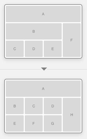
The free Wirefy helps high skilled as well as light developers and designers to structure content to place in page using a responsive approach. Combining knowledge of HTML and CSS, Wirefy is a ready made solution to structure content, mockup pages and show the results to the world before designing and developing the final website. Build on a 16-column base grid, it uses CSS media queries, it is not static and it’s really focused on the end-user more than on the fancy elements involved in designing a site. That’s the reason why the guys behind Wirefy call the product “device agnostic”.
3. Bootstrap
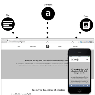
With its 12-column base responsive grid, Bootstrap now on version 3 (free of charge) allows developers and designers to add components and build a proper responsive user experience. Once picked up all the components to add, it is possible to download the last version of the site with plugins, jQuery modules, CSS and other features to simplify the job and have a fully usable responsive site. To enable the responsive features it’s necessary include the proper meta tag and stylesheet within the head of the document in this way:
<meta name="viewport" content="width=device-width, initial-scale=1.0">
<link href="assets/css/bootstrap-responsive.css" rel="stylesheet">
More responsive features, e.g. the supported devices, are available on the site together with the tab Customize, the one to start from to develop a proper site able to resize according to the device in use.
4. Gridset
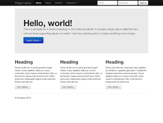
Gridset allows to build responsive prototypes but also full responsive sites with the customized grids, the libraries and the components. One of the features of Gridset is that it allows simply to add an existing markup and, given measurements and tools to add, build a complete prototype/site. Every project can be shared so that the different phases of building a site can be followed by every component of the team. It works well with all the different CMS and all the most popular graphics software as well. Based on a 30-day free trial then to be purchased.
5. Adaptive Images
Adaptive Images, a free tool allows to make the images of a website responsive without acting on the HTML for example rewriting the “src” attribute. Using this code, with an htaccess file, a php file and a line of JavaScript it is possible to detect the visitors’ screen size and rescales the images according to the device. It can be customized and it can be added using libraries; it works properly with Apache 2, PHP 5.x and GD lib. It also detects Retina displays simply using an alternate line of JavaScript.
6. Retina Images
Exclusively born to detect images on retina displays, the free Retina Images displays high resolution images on devices that support them. It can be easily configured as a plug-in and used together with other responsive tools. One of the features allow to serve regular images if high-resolution images aren’t available on enabled devices.
7. Fit Text
This jQuery plugin (free of charge), which only works on headlines, avoids that text will break up all the container if viewed on small, big or simply different mobile devices and not through the desktop version. Fit Text auto-updates the font size according to the width of the element wrapping it and in this way the layout will not break up and the users will view the content without any problem. To avoid the fact that Fit Text ignores the font size specified in the CSS file, it’s good to set a fallback in case something will be missed.
8. Responsive Tables
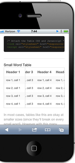
The Responsive Tables combination of JavaScript and CSS allows to this free tool to create tables which will fit into the layout without breaking it and able to adapting themselves to small and big devices and to tablets as well. The two files responsive-tables.js and responsive-tables.css are combined and work well if attached to a class of .responsive.
9. Matt Kersley Tester
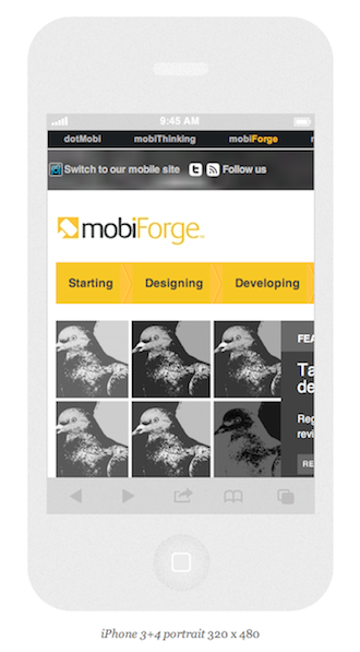
Matt Kersley’s Tester is one of the most popular and free of charge tools for testing a responsive design. Easy and simple to use, the only thing to do is enter an URL into the bar at the top of the page and see how it looks on different devices with a different screen size but if a site contains frame they will not be analyzed. Note that our own Prism tool performs a similar function but can also simulate the user-agent header sent by different devices, thus fully simulating the device in question rather than just simulating the screen size.
10. Responsinator
Responsinator is another free of charge online tool which allows to test how a website is viewed on different devices. Simply enter the address of a site into the bar on the left side of the screen to have a full view of how it looks on different devices with a different screen resolution
A Note about Responsive Design
We have talked about RWD quite a bit in the past year or two. While the tools listed in this article simplify the life of the developers and the designers it is worth keeping an eye on the overall weight of the page.
Even if the images are resized and scaled to fit all the different devices, that doesn’t mean that the pages will load faster (have a look at these results by Guy Podjarny). Today smartphone and mobile Internet is still slow and browsing the Web via desktop is approximately 28.7% faster than browsing via mobile.
A dedicated mobile solution can sometimes be better if well implemented and can usually deliver better optimization if compared with the responsive approach; clearly the solutions to optimize correctly RWD sites are available but it’s always better to think to the constraints of these techniques if compared to developing mobile-specific websites.
Last but not least, there are also limitations in terms of user experience when it comes to responsive and all the tools we’ve talked in this article cannot solve the problem: different devices match with different users’ behaviours and to recreate a good user experience for all the different kind of users is difficult and often not possible or risky. You can deal with these limitations by choosing Adaptive Web Design (AWD) which makes it possible to address users differently depending on their devices.
All these tools (and others similar) are good for websites with limited user interaction but in thinking about how a site interacts with users the following quote from Brian Fling, author of the book Mobile Design and Development, is worth keeping in mind:
“Take an airline website, for example. Simply taking the web experience and trying to put it on a small screen doesn’t help the user at all; in fact, it has the opposite effect. If the user is on the way to the airport and needs to check whether a flight is delayed, the last thing your user has time to do is scroll around to find where to check flight times. If you’ve found yourself racing to make a flight and needing to find your flight information, such as times, gate, etc., you need that information quickly.”


