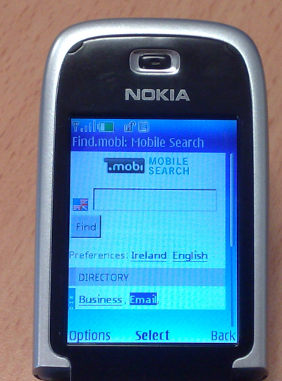
Is it any wonder that users of low-end phones don't browse the web that much? Take a look at this photo of a Nokia 6131 in the default web browser. By my very crude calculations, the percentage of the overall screen area actually used by the browser to display useful content is a mere 65%. Why the gaping void between the bottom of the viewport and the menu? Why throw away so many pixels for the scrollbar? By the way, the browser was configured to use "Full" screen size.
By comparison, Opera Mini and the iPhone browser ditch all the cruft and use the vast majority of the screen to display actual content. Edward Tufte has an interesting review of the iPhone's interface here: http://www.edwardtufte.com/bboard/q-and-a-fetch-msg?msg_id=00036T&topic_id=1


Leave a Reply