


Fixed navigation bars, or “sticky” navbars, are a very common design pattern. They allow the visitor to access the main site features very quickly since they are always visible, wherever the user is on the site or page. On the other hand, some would argue that they can take up too much space unnecessarily on already space-challenged mobile screens. But we’re not here today to discuss the right or wrong of it—you can read about the pros and cons of fixed navbars elsewhere. If you’re reading this, you’ve probably already decided that you want it, so let’s see how to do it!
What exactly are we trying to achieve?
We simply want a navigation bar that is always visible, stuck to either the top or the bottom of the viewport.
HTML for fixed navigation bar
For our fixed navbar, the HTML is pretty simple:
<nav class="navbar">
  This is the fixed navbar!
</nav>
We could also use a <div> or other block element, but we might as well use the HTML5 semantically appropriate element!
CSS
Next we need a little CSS:
.fixed-nav {
  position: fixed;
  top: 0;
  left: 0;
  width: 100%;
  background-color: #ddd;
}

.fixed-nav ul, .fixed-nav li {
  display:inline;
}
This gives us a very basic fixed navigation bar. The position:fixed CSS rule is doing the real work. This allows the navbar element to remain fixed on the screen, even during scrolling.
The top and left rules define where the navbar will be positioned, in this case 0 pixels from the top of the viewport, and 0 pixels from the left, and the width set to 100% of its container.
But there are a number of problems with this simple fixed navbar. First, it looks pretty awful! We’ll come back to this. Another problem becomes apparent when we view it on mobile: it looks tiny.
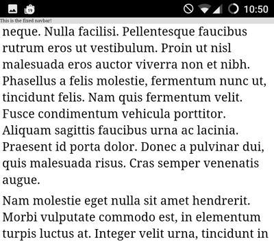
Let’s deal with the issue on mobile first. If we use the viewport meta tag, with width=device-width we can tell the page to display at the screen width, so it will adapt to different devices. Using initial-scale=1 means that the page will be displayed at a scale of 1:1, without any zooming. This will solve the tininess issue. Read more about the viewport meta tag here.
<meta name="viewport" content="width=device-width, initial-scale=1">
Now, the size looks ok.
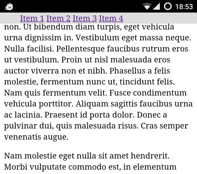
Typically we would want to include a set of navigation links. We could use <ul> and <li> tags for the navigation items:
<nav class="navbar">
  <ul>
    <li><a href="#">Item 1</a></li>
    <li><a href="#">Item 2</a></li>
    <li><a href="#">Item 3</a></li>
    <li><a href="#">Item 4</a></li>
  </ul>
</nav>
Since we are using li elements for our menu items, and these default to a vertical listing, we need to add a bit of styling to display them horizontally:
.fixed-nav li {
  display:inline-block;
}
That gets us to here:
Now let’s try to improve the overall look of it. We’ll set a height for the navbar, and improve the look of the nav item links:
.fixed-nav a {
  text-decoration: none;
  text-transform: uppercase;
  padding: 17px;
  color: #333;
  font-family: arial;
}

.fixed-nav a:hover {
  background-color: #000;
  color: #eee;
}
We’ll also update the fixed-nav rules to include a drop shadow and some padding:
.fixed-nav {
  position: fixed;
  top: 0;
  left: 0;
  width: 100%;
  background-color: #ddd;

  height: 50px;
  box-sizing: border-box;
  padding: 10px;
  box-shadow: 0px 3px 6px rgba(0,0,0,0.16),0px 3px 6px rgba(0,0,0,0.23);
}
Since the navbar itself has a height of 50px, we need to make sure that it does not obscure the main content. So we’ll add a margin to the main content that matches the height of the navbar:
main {
  margin-top:50px;
}
And we can remove the unnecessary padding on the ul list:
.fixed-nav ul {
  padding:0;
}
Finally, it’s common to include a logo in the navbar. We just include the logo image in the HTML…
  <nav class="navbar">
    <img src="mf-logo.svg" height="30" />
    <ul>
      <li><a href="#">Item 1</a></li>
      <li><a href="#">Item 2</a></li>
      <li><a href="#">Item 3</a></li>
      <li><a href="#">Item 4</a></li>
    </ul>
  </nav>
… and we apply an appropriate vertical alignment:
.fixed-nav img {
  vertical-align:middle;
}
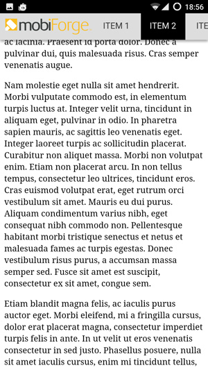
Much better! However, while this is fine for wide viewports, on narrow viewports such as mobile phone screens, there might not be enough space for a horizontal set of navigation links.
In this case, we’ll need to collapse the list at a certain breakpoint, to create what is essentially a responsive menu. Since we want to keep this article focused just on a fixed navigation bar, we’ll cover the responsive hamburger menu in a separate article.
Bottom fixed navigation bars
To create a fixed bottom navbar, we just need to make a minor change to anchor the navbar to the bottom of the page rather than the top, and add a margin to the bottom of the main content:
.navbar {
  position: fixed;
  bottom: 0;
  left: 0;
  z-index: 9999;
  width: 100%;
  height: 50px;
  background-color: #ccc;
}

main {
  margin-bottom:50px;
}
Note that we also need to adjust the drop shadow:
box-shadow: 0px -3px 6px rgba(0,0,0,0.16),0px -3px 6px rgba(0,0,0,0.23);
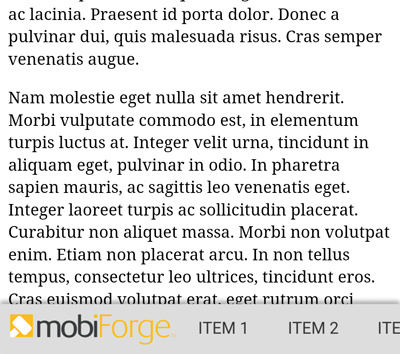
It’s less common to include a logo in a fixed bottom navbar, so you might want to remove that.
Showing and hiding the navbar on scroll
Earlier we mentioned that one of the criticisms of this approach was that the navbar will always take up valuable screen space all the time. Maybe there’s something we can do about this!
A common pattern you might have seen when browsing the web, is a variation on the fixed nav theme. The navigation bar is hidden as the user scrolls down the page. However, it is then shown again if the user scrolls upwards. Some would argue that this represents the best of both worlds, having a fixed navigation bar available when it’s needed, but hidden when it’s not. This is sometimes known as a pit navigation bar (from pit-stop: it’s there when you need it).
The approach is as follows:
- Show the navigation bar initially. We’ll just use the fixed navbar code from earlier for this.
- When the user scrolls down, hide the navbar
- When the user scrolls up again, show the navbar
A simple approach to achieve this is to attach a handler to the scroll event. In the handler we check ow much we scrolled and in which direction, and then decide to show or hide the navbar. (Note that it can be a bad idea to attach handlers to the scroll event unless you are doing very simple computations in the handler).
The example will use plain JavaScript. It should be easy to adapt for a library such as jQuery if you are already using it.
So, first we find the navbar element and define some variables that we will use later:
  var nav   = document.querySelector('.fixed-nav');
  if(!nav) return true;

  var navHeight   = 0,
      navTop      = 0,
      scrollCurr  = 0,
      scrollPrev  = 0,
      scrollDiff  = 0;
Then we attach the handler, and work out how much was scrolled, and where that would leave the navbar:
  window.addEventListener('scroll', function() {
    navHeight = nav.offsetHeight;
    scrollCurr = window.pageYOffset;
    scrollDiff = scrollPrev - scrollCurr;
    navTop = parseInt(window.getComputedStyle(nav).getPropertyValue('top')) + scrollDiff;
And now we check if we have scrolled to top, or if we have scrolled up, or down. Based on this, we work out where the top of the navbar should be: is it fixed to the top, sliding out, or sliding in?
    // Scroll to top: fix navbar to top
    if(scrollCurr <= 0)
      nav.style.top = '0px';

    // Scroll up: show navbar
    else if(scrollDiff > 0)
      nav.style.top = (navTop > 0 ? 0 : navTop) + 'px';

    // Scroll down: hide navbar
    else if(scrollDiff < 0) {
      nav.style.top = (Math.abs(navTop) > navHeight ? - navHeight : navTop) + 'px';
    }
And finally, we just save the last scroll position so we can work out what way the user scrolled, and by how much, when the next scroll event comes in:
    // Note last scroll position
    scrollPrev = scrollCurr;
  });
And that’s it!
The full code listing for completed fixed top navbar is given below:
<html>
  <head>
    <meta name="viewport" content="width=device-width, initial-scale=1">
  </head>
  <body>
    <nav class="fixed-nav">
      <img src="mf-logo.svg" height="30" />
    <ul>
        <li><a href="#">Item 1</a></li>
        <li><a href="#">Item 2</a></li>
        <li><a href="#">Item 3</a></li>
        <li><a href="#">Item 4</a></li>
    </ul>

    </nav>
    <main>
      <!-- Some dummy content so we can see the fixed navbar staying fixed when we scroll -->
      <p>Lorem ipsum dolor sit amet, consectetur adipiscing elit. Aenean rutrum dapibus erat eget sodales. Quisque at maximus tellus. Duis tristique mi magna, ut efficitur lectus porttitor non. Ut bibendum diam turpis, eget vehicula urna dignissim in. Vestibulum eget massa neque. Nulla facilisi. Pellentesque faucibus rutrum eros ut vestibulum. Proin ut nisl malesuada eros auctor viverra non et nibh. Phasellus a felis molestie, fermentum nunc ut, tincidunt felis. Nam quis fermentum velit. Fusce condimentum vehicula porttitor. Aliquam sagittis faucibus urna ac lacinia. Praesent id porta dolor. Donec a pulvinar dui, quis malesuada risus. Cras semper venenatis augue.</p>

      <p>Nam molestie eget nulla sit amet hendrerit. Morbi vulputate commodo est, in elementum turpis luctus at. Integer velit urna, tincidunt in aliquam eget, pulvinar in odio. In pharetra sapien mauris, ac sagittis leo venenatis eget. Integer laoreet turpis ac sollicitudin placerat. Curabitur non aliquet massa. Morbi non volutpat enim. Etiam non placerat arcu. In non tellus tempus, consectetur leo ultrices, tincidunt eros. Cras euismod volutpat erat, eget rutrum orci vestibulum sit amet. Mauris eu dui purus. Aliquam condimentum varius nibh, eget consequat nibh commodo non. Pellentesque habitant morbi tristique senectus et netus et malesuada fames ac turpis egestas. Donec vestibulum risus purus, a accumsan massa semper sed. Fusce sit amet est suscipit, consectetur ex sit amet, congue sem.</p>

      <p>Etiam blandit magna felis, ac iaculis purus auctor eget. Morbi eleifend, mi a fringilla cursus, dolor erat placerat magna, consectetur imperdiet turpis felis in ante. In ut velit ut eros venenatis consectetur in sed justo. Phasellus posuere, nulla sit amet iaculis cursus, enim mi tincidunt tellus, id auctor eros velit id massa. Suspendisse rutrum vel magna at gravida. Nulla commodo hendrerit lorem, sit amet volutpat massa tristique nec. In accumsan diam ac risus luctus varius. Etiam aliquet, quam eu efficitur eleifend, mi lacus tincidunt neque, at egestas lacus felis quis purus. Aenean lobortis nisi a finibus eleifend. Suspendisse euismod, sapien at viverra aliquam, mauris tortor blandit tortor, fringilla tempor eros urna vitae ligula. Aliquam erat volutpat.</p>

      <p>Donec vulputate ex ut risus ullamcorper molestie. Proin interdum, augue ut gravida placerat, quam ipsum maximus neque, pretium semper tellus eros vitae leo. Donec eu eleifend metus. In et urna lacinia urna vulputate faucibus ullamcorper vel erat. Duis vehicula aliquet libero, non convallis erat hendrerit et. Proin ornare pretium pulvinar. Suspendisse potenti. Vestibulum varius magna id lectus finibus mattis. Quisque nulla eros, elementum a dictum quis, tempor et libero. Aenean sollicitudin tellus elit, at lobortis ex tempor ut. Maecenas ac tincidunt enim, vitae tempor nibh. Maecenas malesuada egestas orci, facilisis malesuada metus bibendum a. Aliquam erat volutpat.</p>

      <p>Fusce tempor eu quam non rutrum. Donec at nibh erat. Integer congue nisl a aliquet porttitor. Aliquam luctus rutrum metus vitae iaculis. Maecenas rhoncus feugiat massa vel commodo. Aliquam dignissim consectetur lacinia. Quisque finibus nibh nec est lobortis hendrerit. Vivamus ut ex id metus pellentesque lacinia non id ligula. Maecenas non tortor lobortis, fringilla velit sed, lobortis leo. </p>
    </main>

    <style>
      .fixed-nav {
        position: fixed;
        top: 0;
        left: 0;
        width: 100%;
        background-color: #ddd;

        white-space: nowrap;
        height: 50px;
        box-sizing: border-box;
        padding: 10px;
        box-shadow: 0px 3px 6px rgba(0,0,0,0.16),0px 3px 6px rgba(0,0,0,0.23);
      }

      .fixed-nav ul, .fixed-nav li {
        display:inline;
      }

      .fixed-nav a {
        text-decoration: none;
        text-transform: uppercase;
        padding: 17px 10px;
        color: #333;
        font-family: arial;
      }

      .fixed-nav a:hover {
        background-color: #000;
        color: #eee;
      }

      .fixed-nav ul {
        padding:0;
      }
      .fixed-nav img {
        vertical-align: middle;
      }
      main {margin-top:55px;}
    </style>
    <script>
      (function() {
        'use strict';

        var nav   = document.querySelector('.fixed-nav');
        if(!nav) return true;

        var navHeight   = 0,
            navTop      = 0,
            scrollCurr  = 0,
            scrollPrev  = 0,
            scrollDiff  = 0;

        window.addEventListener('scroll', function() {
          navHeight = nav.offsetHeight;
          scrollCurr = window.pageYOffset;
          scrollDiff = scrollPrev - scrollCurr;
          navTop = parseInt(window.getComputedStyle(nav).getPropertyValue('top')) + scrollDiff;

          // Scroll to top: fix navbar to top
          if(scrollCurr <= 0)
            nav.style.top = '0px';

          // Scroll up: show navbar
          else if(scrollDiff > 0)
            nav.style.top = (navTop > 0 ? 0 : navTop) + 'px';

          // Scroll down: hide navbar
          else if(scrollDiff < 0) {
            nav.style.top = (Math.abs(navTop) > navHeight ? - navHeight : navTop) + 'px';
          }

          // Note last scroll position
          scrollPrev = scrollCurr;
        });

      }());
    </script>
  </body>
</html>
And that’s it! In future articles we’ll look at some other navigation design patterns, such as responsive hamburger menus, and animated side navigation menus.


Leave a Reply