Part of my job is to know what is going on in the mobile space. With this in mind, I swop phones constantly—from low-end feature phones to the flagship devices for each smartphone OS.
It’s been a while since I tried a Windows Phone (most recently a Lumia 510) so I decided it was high time to look again. Having experienced the lower end of this platform this time I tried out a Lumia 1020, the current Nokia flagship.
General OS Comments
The most impactful aspect of the Windows Phone experience is the new design language introduced by Microsoft. This was quite fairly praised at the time by the press and blogosphere as being a fresh new approach. While I wholeheartedly agree with this and believe that Microsoft deserves huge praise for taking a new approach to a phone UI, in daily use the aesthetics of the OS are somewhat uncomfortable.
First of all, from a purely visual point of view, the design is almost ascetic in taking flat design to its logical conclusion. It feels too rational, too austere, to the point that it is hard to warm to the device. It ends up feeling a bit like an ultra-modern designer house replete with chrome and leather, designed to the last detail, but not a place you want to flop down in an couch in and call home. Perfection can be taken too far.
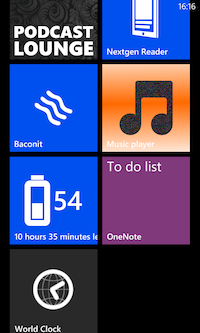
Further, the overall consistent look and feel envisioned by Microsoft quickly falls into cacophonous disarray once you load a few third party apps, many of which don’t toe the Windows Phone line on look and feel. The home screen ends up looking quite the mess.

Clean consistent design undermined by inconsistent third-party app icons
The Live Tiles, a nice idea in principle, are rarely used for anything truly useful beyond unread message counts, a feature already used extensively in iOS. To be fair to Microsoft this is more a failure of imagination on the part of app developers than anything else. This extends even to Microsoft: their own apps barely use the Live Tiles concept at all. An especially poor example is their World Clock app which is crying out for a Live Tile view. If Windows Phone was doing better as a platform we would see more ideas surfacing here, but it doesn’t help when Microsoft themselves don’t lead by example.
The tiles were presumably designed to obviate the need for a notifications centre but in fact they don’t really, and modal dialogs are used throughout.
One of the fresher aspects of Windows Phone was its heavy use of typeography in place of tabs, icons and other organisational metaphors. This still looks quite fresh to my eye but has a few significant downsides.
Firstly, the information density of some screens is really poor thanks to the very large headers.

33% of the screen area goes to navigation cues and buttons
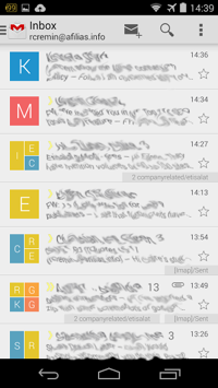
This really hurts when scanning email inboxes, tweets etc. Approximately 33% of the screen area is given over to the navigation header and button bar in the default Windows Phone view, used by many apps. The difference between Android and Windows Phone is quite striking when you see the same inbox on two devices:


Same inbox, different data density (Lumia 1020 vs. Nexus 5)
The second downside is more fundamental: it is significantly slower to scan a list of plain words than it is to scan a list of icons. It still takes me a while to find the flight mode setting in the settings app; a little airplane icon would really speed things up.
Maddeningly, like iOS, Windows Phone allows no direct access to file system on the device. This has far-reaching implications across the whole experience. As an example, you can download an MP3 file with browser, and play it there and then, but there is no way to save it so that you can get back to it again. Truly exasperating stuff, specially when you have no official Dropbox client to work around it.
The task switcher feels like an afterthought.
No Windows Phone music or podcast player that I could find has the ability to scrub to an arbitrary location in a track, a truly bizarre limitation in this day and age. This sounds minor but actually proved extremely frustrating for podcasts.
Another strange omission: Windows Phone has no built-in clock app, and hence no timezones, timers or stopwatches.
One unexpected pleasure of working with Windows Phone was the lack of Google pestering to integrate with G+ across the whole experience. While Microsoft does push you to use Live and Skydrive etc. it does so in a much more restrained and quiet way. The net effect is that the user doesn’t feel pressured into adopting the service, a far more acceptable way to conduct business.
Performance
Windows Phone consistently feels calm and collected, unflappable. Unlike Android, which seems to take the approach of driving devices to the ragged edge of their capability, it never feels flustered or pressured, a really nice point in its favour.
Hardware
While this article is more about the Windows Phone experience than any hardware in particular, it’s hard not to comment on the hardware, specially given that this is Nokia’s current flagship device.
The Nokia Lumia hardware is pretty much faultless. The fit and finish is excellent. That said, this crop of hardware is looking less and less up to date every day. The phones are on the thick side and are also very heavy; screen resolutions are are way off par at this point.
The camera on the Lumia 1020 is shockingly good. It’s really hard to believe that you can get such good photos out of such a small lens. Examples here and here.
Apps
The situation here really is as bad as people have been complaining about. I use very few apps on Android and iOS but even still I was frustrated. No Dropbox, terrible official Twitter client, very limited browser choice and no Instapaper. The apps that are there tend to be sorry imitations of their iOS or Android equivalents. I don’t know of any particular app where the Windows Phone version is the best implementation.
Browser
Here at dotMobi we’re more web than app so I was working on the assumption that the poorly stocked app store would not be a problem. That turned out to be a poor assumption for a three reasons.
Firstly, IE is tolerable but doesn’t really shine in any particular area. Overall it doesn’t feel like a first class citizen of the OS, more of a necessary addition. Bizarrely, there is no forward button in the browser. It’s surprising how much you notice this when it’s gone. The browser history lets you do this but it’s an additional tap away.
You can pin bookmarks to the homescreen but there is no concept of a web app. I really hoped that Microsoft would work hard at supporting webapps to help ease the dearth of native apps, but alas no.
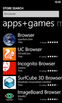
The second problem with the browser is that you’re more or less stuck with the default one. There is really only one credible alternative available in the app store, UC Web. There is no Firefox, Chrome or Opera to save the day.

This is the tear-inducing third-party browser choice in the Windows Phone store
Finally, nobody seems to test for IE on Windows Phone. I had significant problems even on major sites. As an example, Facebook loads and renders but then inexplicably freezes up and stops scrolling from time to time, until you reload.
Summary
Overall I could live with this OS, but would do so reluctantly, knowing that there are others out there that are better in most respects.
Windows Phone would be a lot easier to live with if it was just a touch more human and engaging. Instead it feels cold and aloof, disparaging of the very idea that a phone could be a fun object to use and interact with.
Many of these issues would be forgivable if the pace of OS updates was snappy, but it hasn’t been so far; tectonic plates seem to slide around our globe faster than Microsoft is getting compelling OS updates out. The recent “Black” update contained scarcely any useful or interesting functionality apart from a couple of unread message counts on the Glance screen, hardly a feature worth shouting about.
Right now Windows Phone is in a distant third place behind Android and iOS, and falling further behind rather than catching up. I have high hopes for this platform but Microsoft really needs to up its game to stay in the race.


Leave a Reply