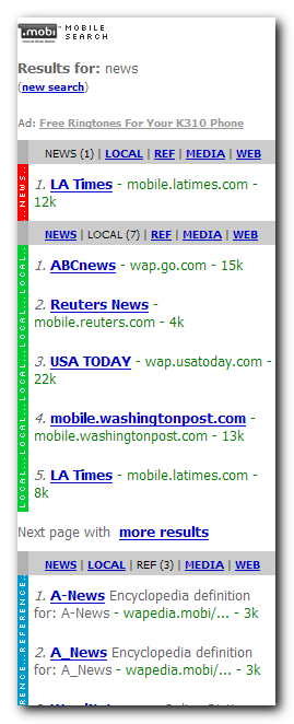
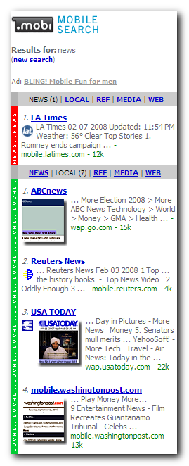
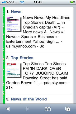
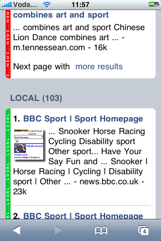
 We've been putting some more features into find.mobi recently. One of these features is a new skin designed specially for the iPhone. It may seem strange to have an interface that has a version tailored to one particular device but when you think about it makes sense. Our find.mobi interface already had 3 different versions, for high, medium and low resolution phones. These versions of the interface scale both the richness of the interface and the verbosity of the results presentation: scrolling through long pages is very tedious on a low end phone, but fast and easy on an S60 Webkit browser. The following screenshots show the different experiences of find.mobi from a low end phone to a high end one (SE K310 and S60 Webkit respectively):


So, given that the iPhone seems to account for such a large volume of browsing from mobile devices (see this NY Times report ), it makes sense to extend our templates to support it specifically. We took the some of the iPhone design patterns made available by Apple and applied our own customisation to them to make them fit into our faceted results paradigm.
We think it turned out quite well. It still has the clean Apple look, but the colour bands help identify the panels.


We'd love to hear your feedback.


Leave a Reply