So you’re a designer and have been tasked with the design of a mobile web site. Chances are, unless you’re designing for only one device you’re quickly going to be faced with a common problem experienced by designers who work with mobile devices; figuring out what screen size to actually design for.
For instance:
- The iPhone is 320 pixels wide by 480 pixels high.
- Many Nokia N-Series devices are 240 pixels wide by 320 pixels high.
- Newer devices often support a landscape mode where the width and height are spontaneously reversed.
- Older (yet still popular) Nokia devices have displays ranging from 176 by 208 pixels up to 352 by 416 pixels.
- Blackberry screen resolutions range anywhere from 160 x 160 pixels all the way up to 324 x 352 pixels.
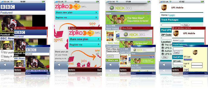
This article is intended to help you develop effective design strategies to target a diverse range of mobile devices and screen sizes. To this end, we begin with an outline of two key issues you will encounter when designing for small screens—the diversity in screen and pixel size.
Expect and manage diversity
At this point you’re probably asking yourself “…is it really necessary to design for all of these difference screen sizes?” or “…do I really need to create a separate design for each variant?” Depending on the business requirements of your project, it may be completely feasible to design only for one screen size—or in fact one device. However, if requirements dictate that the application (or web site) be usable by a majority of devices, you’re going to have to find some way to deal with this diversity.
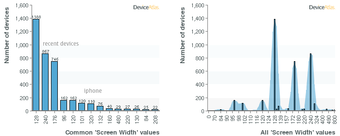
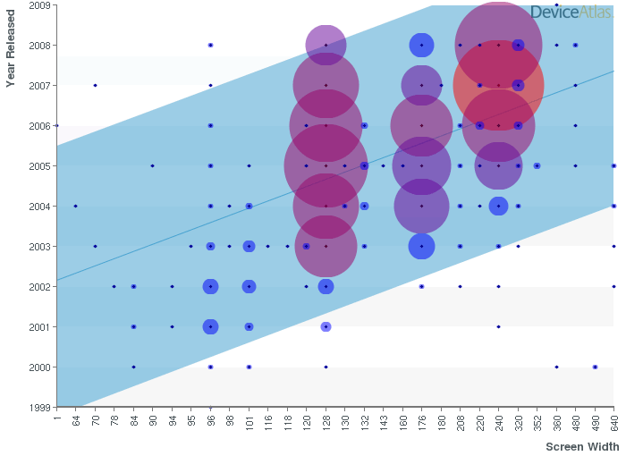
But wait, things may not be as bad as they first appear. When designing for the mobile web we can assume that pages will scroll up and down—as they do within desktop browsers. This somewhat removes the need to worry about the height of the screen, allowing us to primarily focus our efforts on dealing with the diversity found in device screen widths. Fortunately DeviceAtlas Explorer provides us a means to quickly visualize how the screen width property actually breaks down across the thousands of known devices.
As the graphs above indicate, the vast majority of devices share just three screen widths; 128, 240 and 176 pixels—with many of the remaining values; 120, 130, 160, 208 and 220 pixels—not diverging too far from these three core values. That leaves us with a few devices at both the high and low ends of the spectrum with a width of 96, 101, 320 and 320+ pixels. While devices with screen widths of less than 128 pixels may seem a small percentage of the whole, when combined (96, 120, 101 and 84 pixels) they add up to 469 devices! Over half the number of 240 pixel devices—or about 10% of all known devices!

It’s probably also worth noting that at this time, less than 5% of devices have resolutions greater than 320 pixels wide. Expect this to change over the next few years as we’re now seeing smaller screen resolutions (128, 176, etc) give way to the larger (240+); as illustrated in the following chart.
Considering screen size is important but there is one additional parameter to consider—the physical dimension of the screen.
The ‘Problem With Pixels’
For years, designers have primarily been creating visuals for large desktop devices. Screen sizes averaging 1024 x 768 pixels have become the norm and although physical display sizes vary; the overall dimensions typically result in a pixel density of about 85 ppi (pixels-per-inch). Lately however, the display landscape has begun to change;
- ‘Netbooks’ such as the Asus Eee PC 900 have displays in the range of 9″ diagonal with a resolutions around 1024 x 600 pixels giving them pixel densities of about 133 ppi.
- The Apple iPhone has a screen resolution of 320 x 480 pixels which when combined with its 3.6″ diagonal display results in a pixel density of 160 ppi.
- The E60 from Nokia has a screen resolution of 416 x352 pixels packed into a tiny 2.2″ diagonal display giving it a whopping pixel density of over 240 ppi!
When combined with the need to support many devices, this wide variance in pixel density introduces a new problem; the impact of pixel size on design.
The following illustration simulates the same 100 x 100 pixel image on devices with pixel densities of 72, 144 and 240 pixels-per-inch. Notice how type and fine details are lost as the image is rendered smaller and smaller.
![]()
Fortunately the race for “most pixels ever” has slowed and we’re not seeing too many devices with pixel densities over 200 ppi. From a practical point of view, this means that it is unlikely you will have to support the very wide range of pixel densities illustrated above. It is however important keep in mind that not all pixels are created equal, and where possible:
- Determine the full range of pixel densities you will need to support.
- Review your designs on these devices to ensure critical detail is not lost.
- Design and define layout elements based on relative units such as ems and percentages. This will provide the team with a truer indication of the size and relationships between layout elements.
This ‘problem with pixels’ is sure to become more widely discussed in the coming years as handset vendors seek to build new levels of flexibility into their operating systems. In fact, Google’s Android has already implemented a potentially interesting solution to the problem of pixels. The Android operating system is based on abstract ‘dp’ (density-independent pixel) units which are completely relative based on a 160 ppi screen density. This allows designers to specify fonts and a host of other interface elements in a relative manner with the knowledge that they will naturally adjust to suit the device.
With an understanding of the diversity in screen size and pixel density, we now outline strategies you can implement today to build scaleable mobile web sites.
Strategy 1: Define device groups
As we discovered earlier, while there may be thousands of device models, the diversity isn’t as bad as it may have first appeared. In fact, it’s entirely possible to group many devices with similar screen widths together and to end up with five distinct device screen width groupings:
- tiny: 84, 96, 101, 128, 130, 132
- small: 160, 176
- medium: 208, 220, 240
- large: 320, 360, 480+
- desktop: 800+
These groupings are of course, entirely arbitrary and your project’s requirements may dictate a different set entirely. For example; 320 pixels for the iphone and above, 240 pixels for more recent mobile browsers, and 128 pixels for older devices. In the end, defining device groupings really comes down to the goals and audience of the project. To this end, it’s a good idea to visit DeviceAtlas on a regular basis in order to survey the device property landscape and reassess the relevance of your groupings.
You may also find that the development team will choose to create their own groupings based primarily on device capabilities. These are often described in a class based system where technical features (or limitations) are graded into categories that enable developers to only deliver a given functionality to devices that are capable of supporting it. For instance a ‘Class A’ device might be capable of supporting an advanced CSS spec, DOM manipulation and Javascript—while a ‘Class C’ device might only be capable of rendering basic XHTML-MP and rudimentary CSS. Be sure to consult regularly with the developers on a project to ensure that your assumptions and device groupings are compatible with theirs.
Strategy 2: Create a default reference design
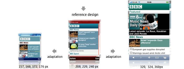
After you’ve defined your device groups (and consulted with your developers) you’re probably in a good position to select your reference device. This is the device that will serve as default during the design process and will ultimately lead to the creation of a reference design. Depending upon your business requirements you may wish to design reference versions for a medium (240px) screen size. This keeps the design simple enough to adapt to smaller screens, while allowing for a little more creative freedom on devices with larger displays. It’s also not uncommon to choose more than one reference device and consequently, create more than one reference design (often based in some way on the device groupings described earlier.) This allows you to:
- progressively enhance the design for more advanced devices (ex: to take advantage of GPS, an accelerometer or CSS3 support),
- deal gracefully with devices that support differing models of manipulation (ex: touch devices), or
- adjust the design to compensate for severe limitations present on more restricted devices.
Strategy 3: Define rules for content and design adaptation
Once you’ve completed a reference design you should also provide specific direction for adaptation of this design to other screen sizes. Similar to the contents of a visual design document, these rules and guidelines should assist the development team in actually implementing the design in code. For example;
- The site logo should be replaced (or adapted) for each device grouping to ensure image clarity.
- Headers should stretch to 100% of the screen width using the supplied background image where possible.
- Content images should be no larger than 200px wide for the ‘default grouping’ (or 80% of the device’s screen width).
- Content images should be automatically scaled and optimized to screen width if an alternate does not exit.
- List icons are not to be used on displays smaller than the ‘default grouping’ in order to make as much space available for the actual content.
- A dynamic style sheet is to be used in order to set many values on-the-fly for each device, and cached appropriately.
While not a formal recommendation, the above outlines common strategies to adapt and enhance design while keeping file sizes to a minimum. Always make design decisions based on the unique audience, goals (and challenges) of your project.

Strategy 4: Opt for web standards and a flexible layout
With the reference design and adaptation rules in place, the final strategy builds flexibility into the markup itself through the use of generic, standards based XHTML and CSS. In practice, this means creating markup that uses the tags and structures inherent in HTML (i.e. headers, paragraphs, lists and divs) to define the structure of your page. The immediate benefit—any browser that can read HTML will be able to display your content and will assign it an (albeit rudimentary) visual style. Given the vast number of mobile devices, this benefit cannot be underestimated as it ensures your content will be accessible to a large number of users without too much higgery-jiggery on the part of developers. You will then be in a great position to progressively enhance the design for different device groupings through the use of browser and/or device-specific CSS, graphics and scripting.
As described in the previous section, the content and design adaptations you choose to implement will vary depending on the project. Actual page width however, is one aspect that will typically not require formal adaptation. The issue of fixed versus fluid (or flexible) width designs has long been a topic for debate with web designers. The arguments tend to revolve around optimal text line lengths, wanting (or not wanting) the browser to fill the entire screen, and rendering issues related to large window width variances.
With the mobile web, these concerns don’t weight in nearly as heavily. Line lengths are often too short regardless, there simply isn’t enough screen real estate to have more than one useable browser window open at a time, and there isn’t likely to be the extreme changes in width that might be possible with a desktop browser window. In fact, fluid designs lend themselves really well to mobile devices as they work beautifully with low-bandwidth design techniques that maximize the use of CSS and XHTML. These include:
- Not specifying a specific document width, thereby enabling the design to expand and contract naturally to fill the screen.
- Taking advantage of block elements which will also natively expand and contract.
- Using CSS background colours and tiled images to style layout and content elements.
- Specifying the size of layout elements using percentages so that they naturally expand and contract to fit page width.
Putting it all together
The following example from bbc.co.uk shows many of the design and adaptation strategies we have discussed in action. Let’s first look at the XHTML markup.
  <h1><img src="/mobile/images/hp-colours/tiles_greenblue.gif" width="75" height="34" alt="" border="0" /></h1>
  <!-- Editorial promo -->
  <h2>Featured</h2>
  <div id="topPromo"><img src="20081201180906.musicnews_mobile.jpg" width="170" height="96" alt="" border="0" />
  <p><a href="radio/6music/podcasts/index.shtml">Latest episode: La Roux, Kasabian and Jack Penate</a></p></div>

  <!-- News feed promo -->
  <h2><a href="bbc_news/index.shtml?">BBC News</a></h2>
  <div><img src="https://news.bbc.co.uk/media/images/45348000/jpg/_45348804_tank_getty226x260.jpg" width="66" height="49" alt="" border="0" />
  <p><a href="http://news.bbc.co.uk/mobile/bbc_news/top_stories/781/78129/story7812979.shtml?" class="promoLink">Israel 'expands' Gaza offensive</a></p>
  </div>

  <!-- end News feed promo -->
 <div>
  <ul class="linkList">
  <li class="linkText"><a href="http://news.bbc.co.uk/mobile/bbc_news/top_stories/781/78128/story7812860.shtml?">European gas supplies disrupted</a></li>
  <li class="linkText"><a href="http://news.bbc.co.uk/mobile/bbc_news/top_stories/781/78128/story7812861.shtml?">Warnings issued amid Arctic chill</a></li>
  <li class="listMore"><a href="http://news.bbc.co.uk/mobile/bbc_news/top_stories/index.shtml?">More top stories</a></li>
  </ul>
  </div>
The BBC markup is simple, standards compliant and relies on standard XHTML tags to define the structure of the content. This ensures that the basic content (consisting in this case of several headers, body copy, images and an unordered list) will be rendered—regardless of the device or browser. CSS is then used to style the content.
h1 {
padding: 3px;
background: url(/mobile/images/hp-colours/banner-bak_greenblue.gif);
background-repeat: repeat-x;
background-color: #00594d;
color: white;  	font-weight: bold;
font-size: small;
}


h2 {
color: #027063;
font-weight: normal;
font-size: medium;
padding: 2px;
background: url(/mobile/images/newimgs/h2-bak.gif);
background-repeat: repeat-x;
background-color: #ecedee;
border-bottom: 1px solid #c1c0c0;
}


h2 a:link, h2 a:visited {color: #027063;
font-weight: bold;
text-decoration: none;
}


h2 a:hover, h2 a:active {
color: #333333;
text-decoration: underline;
}
/* New promos */
#topPromo {
background-color: #000000;
}


#topPromo p {
color: white;
font-size: small;
border-top: 1px solid #757474;
padding: 2px;
}


#topPromo a:link, #topPromo a:visited {
color: white;
font-size: small;
display: block;
text-decoration: none;
}


#topPromo a:hover, #topPromo a:active {
color: #8ad3ca;
font-size: small;
display: block;
text-decoration: underline;
}

.linkList ul {
border-bottom: 1px solid #c1c0c0;
}
.linkList li {
padding: 2px;
padding-left: 19px;
margin: 2px;
}
.listTxt {
background: url(/mobile/images/newimgs/ico_txt_on-fff.gif);
background-repeat: no-repeat;
background-position: top left;
}
As you will note, the layout is entirely fluid. No set width is assigned to the page body, masthead, headers, lists or paragraphs. As seen in the example below, this results in a layout that performs much of the required adaptation on its own; simply scaling as needed to suit different screen widths.
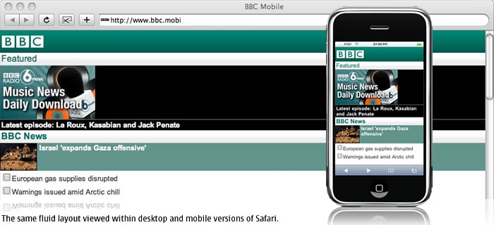
The remaining styles and content are then specifically adapted server-side to suit the device or family of devices.
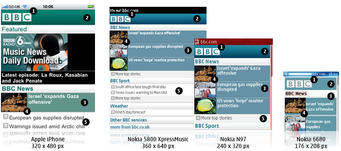
- The logo is resized or replaced to suit the device screen width.
- The masthead uses both a tiled and coloured background. Older devices like the Nokia 6680 which feature less sophisticated browsers are unable to render the tiled background but do display the background colour. Even simpler devices supporting only WAP 2.0 (XHTML-MP) may ignore both style properties altogether and simply display the logo. (Note that in the BBC’s case, this causes a problem as the white logo is then displayed on white; rendering it somewhat illegible).
- The BBC seems to have chosen to tailor the editorial to specific devices (or device groupings). While the iPhone includes a large ‘Feature’ item promoting music downloads, other devices jump striaght to the display of today’s top ‘BBC News’. This editorial decision may be due to the iPhone’s flat data and strong podcast and media support but could also simply be due to its larger screen size. Were the ‘Feature’ displayed on a Nokia 6680 for example, it would take up most of the display forcing users to scroll to see today’s top news stories. This decision is also counterbalanced by the reformatting of content further down. While all three news stories are displayed on the iPhone, only one includes a photograph. This once again enables all the top news content to be seen without scrolling.
- Images are scaled or replaced to suit the width of the display.
- On larger devices, icons are associated with each list item. While not visible in the example below, this stylistic element is removed on smaller devices ensuring a comfortable line length for the accompanying list copy.
A balanced approach
The BBC web site is an ideal example as it shows how simple it can be to combine clean markup with well conceived styles and strategic editorial decisions to achieve a great experience on a wide range of devices. Ultimately, your design, adaptation and editorial choices will be based on many factors including your budget, target audience and the functionality of the mobile web site you are designing. In the end, it’s all about striking a balance between the creation of a well optimized, fast-loading site and the delivery of great, targeted content to your users.
For an in-depth look at the what makes a truly great mobile application and the design of mobile web sites from a user interface, functionality and usability point of view; be sure to read Mobile App Design: Getting to the Point Part I and Part II.




15 Comments
Thanks Bryan and everyone for such an informative site!! Truly there is such little knowledge of the Mobile industry. When it comes to the web, telcom providers have no clue, and when it comes the mobile web providers have no clue => hence a gap in the marketplace and probably one of the reasons you all put up this site!!
I’ve just started up with Android development and i really like it. As a designer and developer its all going on the mobile sooner rather than later. Funny thing is that hardly any web guys are going that route and i wonder why – it isnt rocket science!
Well will definitely be reading the great content on your site!! This is a truly awesome design + when you look inside there is alot of great content and learning open for those who want to learn!!
Regards,
Ahad B.
[url=http://www.fluidnewmedia.com]http://www.fluidnewmedia.com[/url]
[url=http://blogspot.fluidnewmedia.com]http://blogspot.fluidnewmedia.com[/url]
Great article. If anyone wants to do image resizing at run-time (without having to use ImageMagick or LibGD), you might want to check out [url=http://tinySrc.mobi]http://tinySrc.mobi[/url]
We do it all for you and you just make a small change to the src attribute of the image.
</plug> 🙂
We’ll add device detection too soon.
Well written article. We’re in the planning stages of revamping our website. I guess we can include mobile browsers as a major step.
Really good article, just what I was looking for at the moment as I’m trying to develop my [url]http://www.eclecticunion.com[/url] website for the mobile market. However I’m having slight problems trying to retain to hover feel that I’ve developed in my gallery section so my question is does anyone know how to best implement mouseover on a mobile site?
I saw this in the code but I couldn’t fully implement it
h2 a:hover, h2 a:active
Very nice piece of article. I learnt anew how important CSS is overall web development – mobile/desktop.
I will also comment on how this author put in much time to develop such impressive article that is so educative.
Thank you Brian.
A really very informative and exhaustive article.
I have a few questions:
– if we want to make a mobile version of our website and are not sure about the most important screen sizes that people use and do not want to make pictures etc. for all sizes, is then the best way, to simply check with our web analytics about this data or is it better to go with general data from e.g. Deviceatlas Explorer?
– can you recommend some more examples like BBC (e.g. links to these examples)
Going mobile is really a more complex task than I thought.
Again, thanks for the article. Best regards, Traduttori