“The power of the Web is in its universality. Access by everyone regardless of disability is an essential aspect.” Tim Berners-Lee, W3C Director and inventor of the World Wide Web.
This mantra is as true for the mobile Web as it is for the desktop Web. Over a billion people worldwide live with some kind of disability, and 285 million have visual impairments (39 million are blind and 246 have low vision), according to World Health Organization (WHO). Given these numbers, what excuses are there for bad design practices that shut users out who are visually impaired and/or rely on assistive technologies?
Making your site more accessible is partly about design – such as avoiding color schemes that make things difficult for short-sighted or color-blind people to decipher – and partly about developing sites that can be decoded and easily navigated by screen-readers. People with more severe visual impairments rely on screen readers (on mobile and desktop devices) to read aloud the content of Websites.
Over the last 10 years we have seen much improvement in accessibility of desktop sites. Table-layouts, spacer gifs, image headers and flash-only sites – none of which worked well with screen-readers – are relatively rare these days and most Websites follow the Web standards of the W3C. Several things have contributed to this improved situation including adoption of CSS3 and HTML5; adherence to accessibility standards, including the W3C’s Web Content Accessibility Guidelines (WCAG); and adoption of the principles of Semantic Web (semantic markup describes the purpose of code and is very useful for screen readers as we will see in Tip 5).
The mobile Web needs to be accessible to all disabled people – whether it is mobile Websites, embedded Web views in apps or responsive mobile-optimized sites. While some experienced mobile developers incorporate these Web best practices into their mobile sites, others are making similar mistakes to those made by Web developers a decade ago. There’s a worrying trend towards designing sites for a particular type or brand of handset, rather than catering to all; and/or becoming too focused on emulating the snappy look and feel of native apps in mobile Web development, even if that means forsaking Web standards and principles of accessibility.
Instead of using <anchor>s and <button>s for click events – which make it obvious to screen readers what is a clickable link – events are bound to list items and
In many ways, best-practice mobile sites share many of the same strengths and goals as best-practice accessibility-enhanced Websites:
• Web design should be simple with an intuitive single-column interface, following a similar layout and navigation commonly found on other mobile sites.
• Web pages should be light-weight, avoiding large images, to ensure quick-load times.
• The content should usually short and to the point.
• Navigation should not be reliant on hover states and mouse events.
• The content should, where possible, be geographically relevant to the visitors current location.
(See W3C on similarities between accessibility and mobile Web)
There have been many advances in cell phone accessibility. Voice activation from the commonplace: “Call Dad” to the more sophisticated voice-activated search tools such as Siri or Vlingo. Increasingly we are seeing mobile applications developed that make living with disabilities easier – everything from finding the closest accessible restroom or using image recognition to read the content of image captured by your camera, to apps that aim to include many features into a single app, such as Georgie.
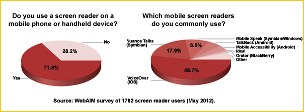
The most important application, however, from a mobile Web developer’s point of view, is the screen reader. These apps help visually impaired people access your site, by reading the text aloud. They will even tell you what you are pointing at as your finger pans across the screen – they can be used with touch-screen devices and, when combined with swipe gestures, can make touch-screen devices as accessible as those with a physical keyboard. Mobile screen readers have seen rapid adoption. A recent survey by WebAIM of 1782 screen reader users found that 71.8 percent of respondents now use a mobile screen reader, a 600 percent increase from 2009. The most commonly used were VoiceOver (iOS) 48.7 percent; Nuance Talks (Symbian) 17.9 percent; Mobile Speak (Symbian and Windows Mobile) 8.5 percent; TalkBack (Android) 5.4 percent; Mobile Accessibility (Android) 3.8 percent.

Figure 1: Use of screen readers on mobile devices.
12 simple tips to help make your site more accessible
Developing an accessible mobile site isn’t difficult when you apply best-practice guidelines and consider the needs of all the people who are visiting the site, including those who are older or have disabilities, such as visual impairments. The following tips will help you make your mobile site more accessible for visitors with visual impairments, particularly those using screen readers.
1) Make the site easy to read
 Many users, even those without any severe visual impairment struggle to read small letters and make out text on colored backgrounds (particularly on smaller devices, which you might be attempting to read while outside, in motion, in bad light etc).
Consider the font size and the contrast between the text color and the background. WCAG 2.0 provides some good guidelines on this, but as a rule of thumb, I recommend setting the default browser font size to 1em (16px) for content text and never set any font-size smaller than 0.75em (12px). (See tip 2 to find out why you should use em rather than px).
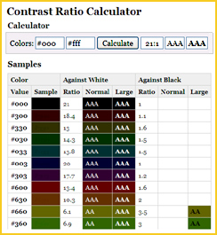
There are plenty of Web-based tools to help you choose accessible color schemes, such as this Contrast ratio calculator (pictured) from MSF&W. See W3C and Speckyboy for more tools.
2) Allow zooming
Most devices Web browsers allow you to zoom in on the content to make it bigger. Unfortunately this feature is commonly disabled on mobile sites using:
<meta name="viewport" value="initial-scale=1.0, user-scrollable=no">
Or:
<meta name="viewport" value="initial-scale=1.0, minimum-scale=1.0, maximum-scale=1.0 ">
This might ensure that the site looks good on mobile devices, but what’s the good of that if some of your visitors are unable to read it? Instead you can restrict the degree of zooming, perhaps limiting it to x2 for instance, this makes it possible to double the size of text, but stops the visitor from losing themselves by over-zooming:
<meta name="viewport" value="initial-scale=1.0, minimum-scale=1.0, maximum-scale=2.0">
Some users prefer to show bigger text, without needing to zoom in on every element. This function exists on many devices, but is only possible when sites define font-sizes in em or percentages rather than in pixels. Setting font-sizes in em is as easy as setting them in pixels, but you need to be aware that child elements will inherit the base font-size of its parent element. It’s a good recommendation only to set font-sizes to elements which varies from the default font-size set on the HTML element, and never set it to container which can mess up the font-size when nested. To calculate font-size in ems from a pixel perspective you divide your target size (in pixels) with the
parent font-size (in pixels):
html{
	font-size: 100%; /*Defaults to 16px*/
}
small{
	font-size: 0.75em; /* 12px/16px = 0.75 */
}
3) Specify language
One of the most common and annoying mistakes, I’ve found using a screen reader myself, is when developers forget to specify the language of the page using the lang attribute within the element. This will result in screen readers attempting to read the text in its default language – in my case, that would be Swedish.
Can you imagine how incomprehensible it is having an English Web page read as though it is Swedish vocabulary? All it would take to put it right would be: . To specify UK English with British pronunciation, use: and US English with US pronunciation: .
4) Content first
Before adding any style and graphics to your design make sure everything is understandable without images and CSS. No semantic elements (i.e. the ones that describe what they do, such as link and
paragraph
) should never be empty. All images should have alt attributes describing the purpose/function of the image (rather than a description of what is displayed). If the image doesn’t have any purpose the alt-attribute is allowed to be empty, but consider setting the image as a background-image in CSS instead. If your design intends to use an image asset instead of text on a menu button, always make sure you add the text content first and then hide the content and add the image using CSS.
There are two options for hiding content from sighted-visitors, while still allowing screen readers to pick up on them:
• The text-indent, moves the text-content of an element out of the way, but still holds the semantic meaning of the element. The element needs to be positioned relative or absolute. Setting a high negative value moves the text off screen to the left, for right aligned elements you will have to set a high positive value instead:
.menubutton{
	position: relative;
	text-indent: -9999px;
}
• The alternative method is to set text-content in a sub-element, moving the entire element offset. The element needs to be positioned absolute – and then moved out of sight by setting a high negative value. This approach is recommended when the image asset is set as an image element instead of background-image, for instance for logotypes.
.logotype .alt-logo{
	position: absolute;
	left: -9999px;
}
The downside of the latter approach is that it will only be recognized by screen readers when jumping between elements, but not accessed when pointing to the element.
5) Use semantic markup
HTML5 provides developers with a lot of new semantic elements, which enable developers to mark up the DOM (the Document Object Model defines the structure, style and operation of a Web page) in a more structural and comprehensible manner.
Other Products
© 2026 DeviceAtlas Limited. All rights reserved.
This is a website of DeviceAtlas Limited, a private company limited by shares, incorporated and registered in the Republic of Ireland with registered number 398040 and registered office at 6th Floor, 2 Grand Canal Square, Dublin 2, Ireland


