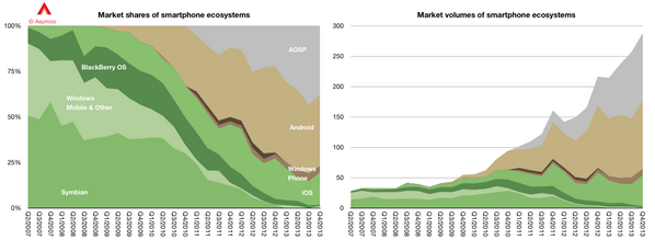
This week was an interesting one for the perennial Android vs. iOS debate. Horace Dediu kicked things off on Sunday with a few infographics depicting the dominant smartphone ecosystems:


This was picked up on by Cennydd Bowles and a sparkling debate ensued.
Android is the dominant platform of the next decade. Why aren't designers paying it more attention? (via @asymco) pic.twitter.com/ExSCCB19T6
— Cennydd Bowles (@Cennydd) March 23, 2014
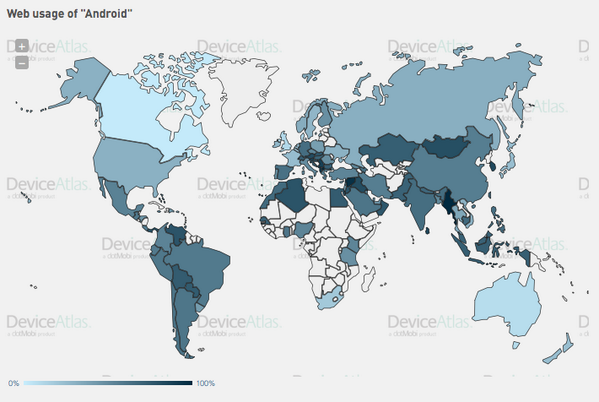
Much of the conversation centred around shipping volumes versus usage, and usage versus revenue. There is no debate that Android devices are shipping in greater volumes than iOS, but are they actually being used? As it happens, we have recently published real web usage information sourced from goMobi and analysed by DeviceAtlas. We measure web traffic across a large number of mobile websites of small businesses all around the world. For about 101 countries we have statistically meaningful traffic that lets us break down the device patterns for each country. The breakdown looks like this:

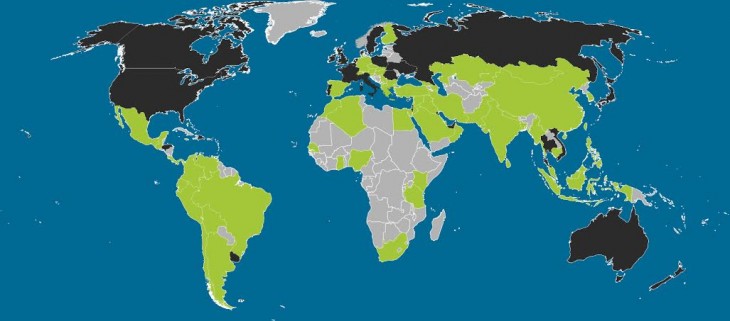
In the 101 territories for which we have data, Android browsing surpasses iOS in 67 of them. We in dotMobi can’t speak to the revenues earned for each platform but there can be no doubt at this point that Android devices are generating real user activity. That said, the countries in which Android dominates exclude lucrative territories such as the USA, Canada and much of Western Europe. We’ll see how the patterns evolve in the coming months. Anyone with a (free of charge) DeviceAtlas login can browse the full dataset and slice and dice it in numerous ways.
The Next Web picked up on this story also and did a version of our chart that makes the data clearer.

The full country breakdown looks like this:

Cult of Android then followed up with their own take on it. It will be interesting to watch this story evolve over the year.


Leave a Reply