


As World Cup fever begins to take hold (even for those of us from countries that didn’t qualify), I’ve inevitably found myself drawn into the competition, multi-screen style.
Having access to an array of fixtures, groups, stats, team line-ups and so on at my fingertips has definitely added to my experience of the event. In practice, that means that I use my phone to engage with a deeper level of information than a television screen alone can give me while commentary and match are in full flow.
As you would expect, FIFA have not spared any expense to engage people on all digital channels. In addition to the website, there are apps for Android and iOS including an iPad specific app (nothing for Windows), as well as the usual social media channels.
I haven’t downloaded the app yet. I may or may not given the short-term nature on the event, how many apps I already have on my device, and the fact that the website is accessible just as quickly via search, and provides an impressive array of information, from results to stats to match reports, great images and so on.
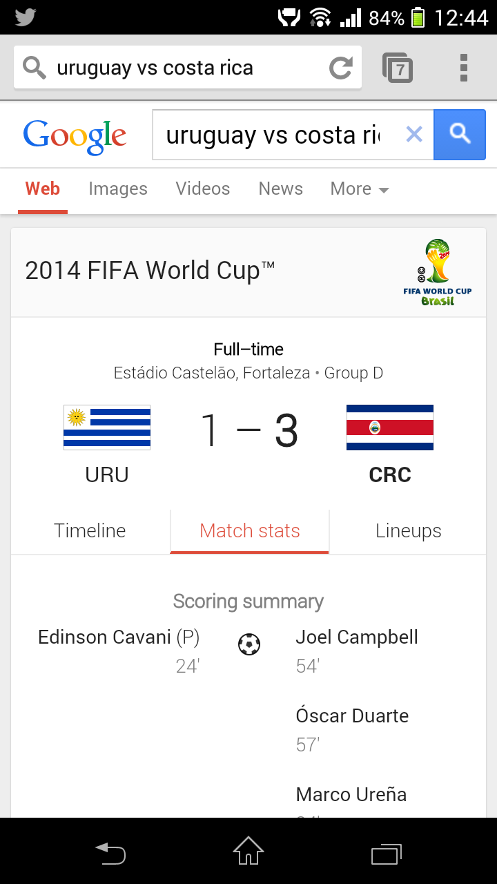
I first accessed the mobile site by searching for match results information on my phone. Helpfully, Google’s mobile search has surfaced World Cup content from FIFA’s mobile site in the search results. You can interact with this page snippet without ever clicking through to the site, which in itself is interesting aspect. I don’t know how or if that impacts on FIFA.com’s web traffic analytics.
Dedicated Mobile Site
If you are looking for more information, you can simply click through to the “More on FIFA.com” link, which brings you straight to the site. FIFA’s mobile strategy for the web is to serve a dedicated mobile site on an m-dot third-level domain. According to the Prism tool, dotMobi’s multi-device proxy and mobile site visualization tool powered by DeviceAtlas, the site uses server-side detection to serve a different experience according to which device is accessing the site.
Prism simulates the experience served to different devices by requesting content from www.fifa.com with different User Agent strings for specific devices. Prism also measures the weight of the assets used in the page including HTML, images, CSS, JavaScript and other assets. In this case, I have selected Chrome for Desktop, a Nokia 6300, and Apple’s iPhone.
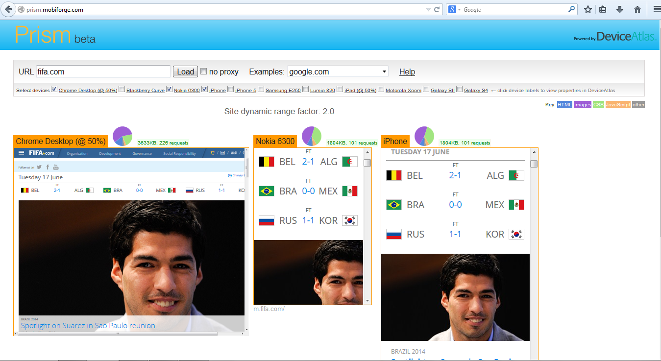
On closer inspection it appears that FIFA are simply segmenting desktop and non- desktop traffic based on the User Agent string and redirecting the traffic to the appropriate version on the site.
Site dynamic range
Prism calculates a “dynamic range factor” for the site. This a ratio between the largest page weight served to the lowest weight served. A dynamic range of 1, for example, would indicate that the same content payload is being sent to all devices, with no optimization happening for different device contexts. A low dynamic range can be an indicator of user experience problems on mobile devices where potentially network connectivity is not as reliable and devices are not as capable as a desktop scenario. FIFA has a dynamic range of 2.0, showing that the payload for the mobile version of the site is approximately half that of the desktop site.
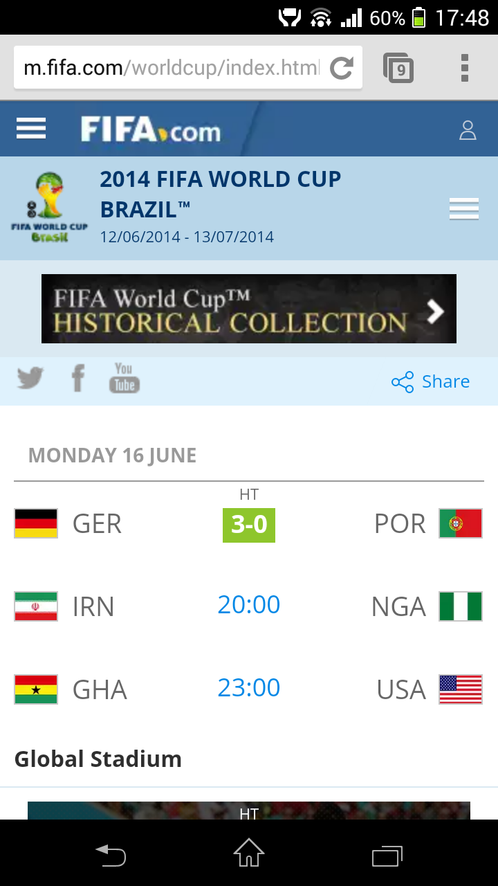
In general the mobile site is admirably easy to navigate with large touch friendly menu buttons, even though they have had to add an additional navigation menu to the top right of the page for World Cup specific content. The menu at the top left is reserved for regular FIFA content navigation.
Mobile Desktop Redirects
FIFA appear to be doing things according to Google’s advice with respect to redirection between the desktop and mobile versions; with a mobile URL that corresponds to each desktop URL. There are also links provided between mobile and desktop versions, the ‘Desktop Version’ and ‘Mobile Version’ links, which redirect the user to the correct corresponding URL on the mobile or desktop sites.
Although the the site has implemented links between the mobile and desktop pages, it hasn’t implemented in full the canonical and alternate links between them, as discussed here .
Responsive Nips and Tucks
The mobile specific site is responsive, so adapts seamlessly to different device screen sizes, and as it is built primarily for mobile from the get go, there is much less hiding of content happening anyway.
This particular strategy brings to mind an interesting conversation on twitter recently prompted by article from tech heavy hitter David Heinemeier Hansson (@dhh) which suggested that responsive design is best for minor cosmetic alterations on a device rather than a complete strategy across all devices. In specific, he said:
“There’s a point on the trade-off curve where rearranging everything, hiding half the page, and then presenting it as “the same template, just styled differently” is simply not meaningful. Nor is it simple. Nor is it efficient. A one-size-fits-all HTML base document is not a trophy-worthy accomplishment in itself, lest we forget.”
On the downside, Prism reports the same payload being sent to the high end smartphone as the low end Nokia 6300, and although I have not tested widely on lower spec devices for any further device segmentation, the mobile payload is still on the heavy side at 2723KB.
That said, if your connection speed is up to it, it is a good experience on mobile and FIFA have clearly put some thought into how they should address the needs of mobile users searching for content and accessing content on the web platform. The mobile experience is optimized, but given variable real-world connection speeds, perhaps not enough for an event as global in nature as the World Cup . On subsequent loads of the mobile web site, FIFA are pushing visitors towards native apps, and while that may improve experiences for users with capable devices in areas with good connectivity, apps are subject to the same variable speeds and diverse device distributions as the web platform.


Leave a Reply