


In case you missed it, Google just launched another tool to test the mobile-friendliness of your website. The company now has a number of testing tools aimed at promoting good mobile web best practices such as keeping page weight down and ensuring quick render times.
The other tools you might be familiar with are the PageSpeed Insights tool, and the Mobile-Friendly Test tool. We wrote previously about the Mobile Friendly Test tool here on mobiForge, and let’s just say we found the test, as a test of mobile-friendliness, to be seriously flawed.
This new tool, aimed at small business owners (it was announced on the Google for Small Business blog), appears to be a combination of the previous Mobile-Friendly test and PageSpeed Insights tools.
So, what’s in the new tool:
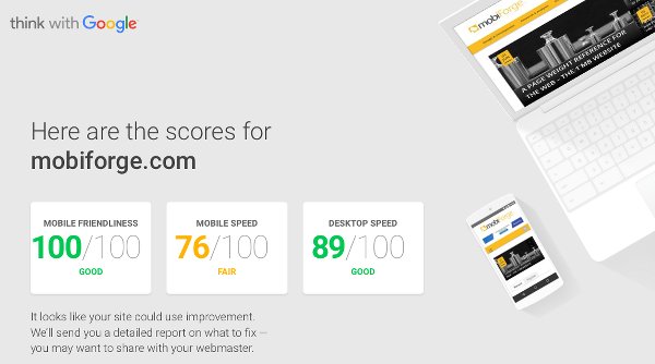
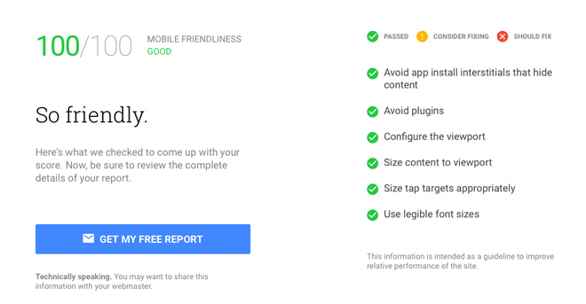
- a mobile friendliness score: This is basically a test of the UI—Will it work well on a mobile screen? Will it fit without horizontal scrolling? Are the UI elements large enough to be easily tappable—things like these. This portion of the test corresponds with the old mobile-friendly test tool, and the result is on a scale of 0-100, instead of the binary mobile-friendly/not mobile-friendly result of the old tool.
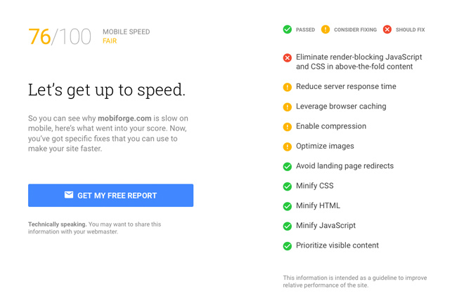
- a mobile speed score: This is basically the PageSpeed Insights mobile test. It tests for things that affect page load speed, such as page weight, compression, server configuration and all the things you should be doing to optimize your mobile pages.
- a desktop speed score: This is the PageSpeed Insights desktop test, which tests for a similar set of items as the mobile PageSpeed test, but optimized for desktop.
By combining with PageSpeed Insights, it addresses the issues we had with the old Mobile-Friendly test tool. Our main beef with the old tool was that it reduced mobile-friendliness to being just about mobile design, while ignoring very real issues that would cause problems for mobile devices, such as large page size. We found the old test to be flawed since it would declare a page with a 1KB image that was wider than 420pixels to be not mobile-friendly, and would declare a page with a 100MB image that was 420 pixels or less to be mobile friendly. By reducing “mobile-friendliness” to being just about the UI, and ignoring page size and speed issues, it was a misleading test.
Combining the design aspects and the speed aspects into a single test, as the new tool does, gives a more accurate picture of how a site will perform on mobile devices.
The new test is clearly aimed at a less technical audience than PageSpeed insights. It gives more detail than the original mobile-friendly test, but less than the PageSpeed Insights test. In terms of design, it looks more polished than either of the two tools it subsumes: it looks like something that can be easily used by non techincal users, but which can also be shared with technical users who can then dive into the details.
If you want to see our take on mobile-friendly testing, then have a look at our own mobile-friendly test tool: mobiReady which has been testing pages since 2006!


Leave a Reply