


In the previous articles in this series, we looked at how to understand page weight, and how to measure page weight, as well as its associated problems. In this final installment, we provide some pointers on how to reduce page weight.
When approaching the issue of web page weight, it’s useful to keep in mind the well known engineering maxim, “Simplify, and then add lightness“—high performance motor engineering has at least one thing in common with web development: To add speed, add lightness!
The following paragraphs give a summary of the most common techniques that will help you keep your web pages light and lean, starting with image optimization, and closing off with a brief set of guidelines for the technical and non-technical alike!
Image optimization
Images are generally the largest contributor to page bloat. There are a few things you should be doing to optimize your images.
Image compression
By far the biggest byte savings to be made in optimising your images is by choosing an appropriate compression or quality level. A higher compression level will push down the quality, but it is often possible to find an acceptable quality that significantly reduces file size.
In particular, background images, which are often the biggest single resource from a bytesize point of view, are also often of a needlessly high quality from a compression point of view. It might be possible to achieve 10x bytesize reductions on background images without users even noticing any difference in visual quality.
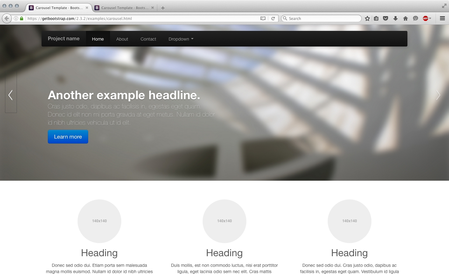
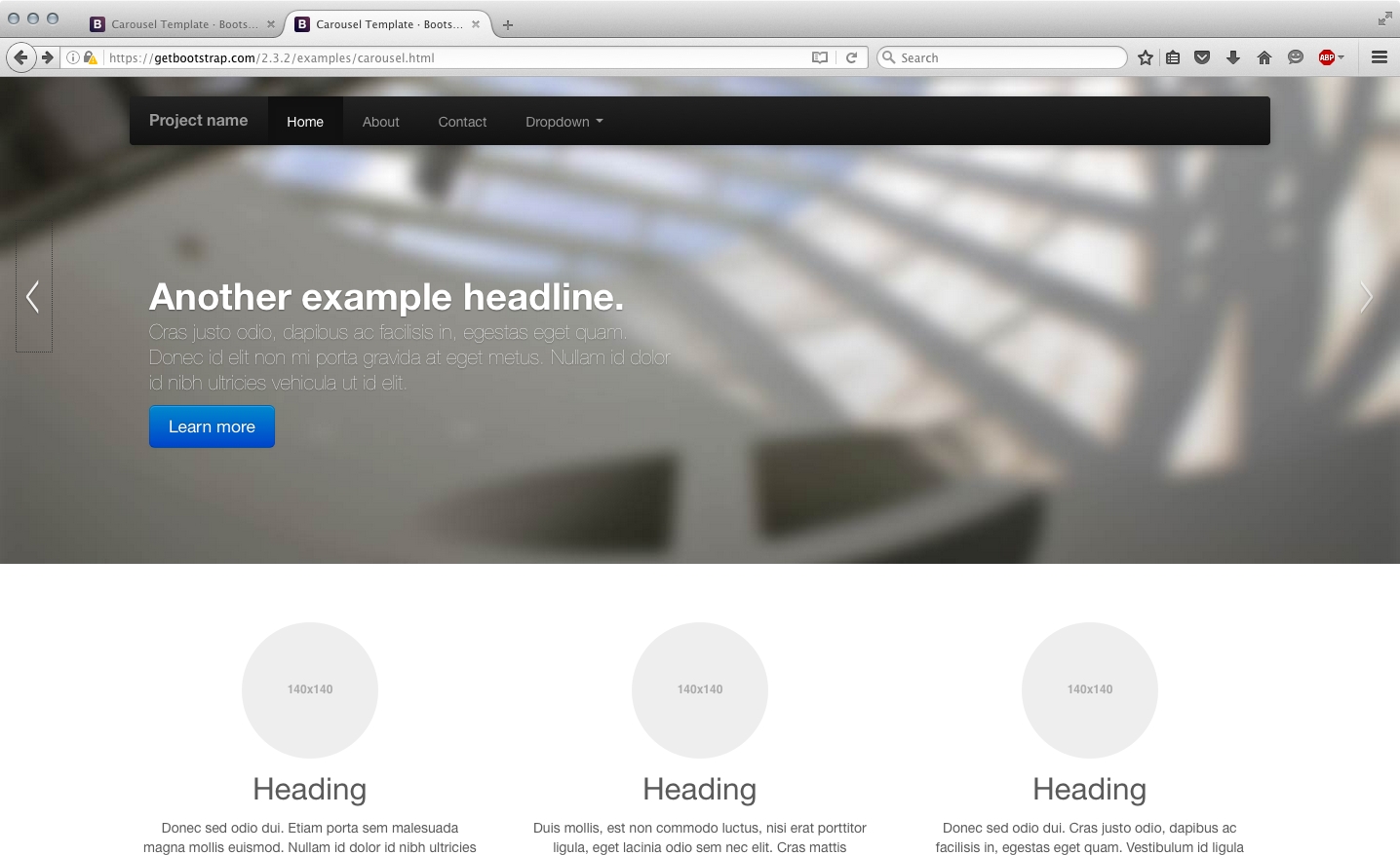
In the images below, taken from a default Bootstrap theme, the compression level has been increased so that the file size is reduced from 143KB to 24KB, i.e. to one-sixth of the size of the original. While you might be able to see some differences when placed side-to-side (click to view full sized versions)…


… when used as a web page background image the compression is even less noticable (click for full size).
Note that image compression technologies are constantly improving. It pays to use the latest tools when compressing your images. For example, in March 2017, Google released a new open source JPEG encoder called Guetzli that generates JPEG images with file sizes 35% smaller than current alternatives. The images are still regular JPEGs, so they automatically work in all browsers. Already, tools like ImageOptim include the new encoder, so you make gains simply by keeping your tools up to date.
Palette optimisation
If using a palette or indexed-colour image (e.g. PNG, GIF) choosing an optimised palette can also help reduce file size. Many image manipulation programs will allow you to choose the bit-depth or number of colours in image palette. Depending on your image, a PNG8 will often be fine instead of a PNG24, and will result in a significantly smaller file.
Strip image metadata
A further optimisation that can be performed is to strip EXIF image metadata. EXIF (Exchangeable Image File Format) metadata contains information such as date and time of image capture, camera settings, copyright information, and even geolocation information (e.g. GPS coordinates). This information is not needed to display the image, so it can be stripped from the image file without affecting the image itself.
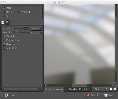
GIMP save dialog, with compression and EXIF options
This type of optimisation offers the least amount of savings, but is still worth doing if you want to push your web performance to the limit!
You can use simple free tools such as ImageOptim, PNG Gauntlet, JPEG Optimizer, and TinyPNG to quickly compress and optimise your images, as well as more comprehensive programs such as GIMP and Photoshop.
Use correct image format
Using the right format for the images on your site is important too. The most common image formats that you will encounter are listed below, along with usage guidelines.
-
WebP: A newer image format developed by Google, and so far supported on Chrome, and Opera, is on average 25%-34% smaller than equivalent JPEG images. Therefore it should be used where possible. The drawback is that WebP is not yet supported in Firefox, Safari or IE/Edge.
-
JPEG: Use this if the image is a photographic or complex scene.
-
PNG: Good for images with straight lines. Bad for photos. Also supports transparency.
-
SVG: A vector image format that is resolution independent, so it scales really well. It supports both transparency and animation. Good for logos, icons and geometric images, that will remain sharp across different screen sizes and Retina screens.
-
GIF: A relatively inefficient format that supports transparency and animation. There is no real use case for using GIF unless you need it for animation (PNG and SVG both offer transparency too).
-
BMP: Don’t use it on the web, ever!
Resize images
Images should be resized to the size that they will be displayed at. If you want to display an image at 200×200 pixels then don’t send a 400×400 pixel image and let the browser resize; send a 200×200 pixel image and save bandwidth.
It is often desirable to display an image resized to the width of the user’s device. However, in the smartphone world we live in today, with thousands of different screen sizes, resizing manually for every device is not feasible. Thankfully, there are a few workarounds:
Server side image resizing
There are several options for server side image resizing.
-
Implement your own
To implement your own, you need to know the screen size of the target device. This can be achieved with a device detection solution such as DeviceAtlas. This article shows how to optimize images for mobile using PageSpeed module and DeviceAtlas. -
Use an online service
There are many free online image resizing services to choose from. Jason Grigsby maintains a list of free and paid, online and offline image optimization services and software that might be useful. -
Responsive images (
srcset)
With theimgelement’ssrcsetattribute, a number of images at different sizes can be specified for viewports at different sizes. The browser can choose and download the most appropriate one, and can resize it to match the exact dimensions needed for display. There is still some browser resizing, but if a close match is picked by the browser, there is less of an adverse impact on page weight than without.
Learn more about responsive images and srcset here.
Image conversion tools
If you need to convert between image formats, or if you need to resize your images before you upload them to your site, there are plenty of tools (far too many to list here), both free and commercial, that will help you. The following is a very small selection:
-
GIMP: GNU Image Manipulation Program is a free Photoshop alternative, available for Windows, OSX, and Linux.
-
Potrace: A very nice tool for converting bitmap images to vector SVGs. The result is often smaller, better looking, and of course scalable.

-
Photoshop: The de-facto industry standard for image editing. This commercial software will allow you to resize and change formats, among many other things.
-
ImageMagick: For the technically minded, ImageMagick is a great set of server-side tools with many effects and transforms, and that can be used for batch processing. Can be used command-line or via a wrapper.
There are also plenty of online tools that specialize in converting between image formats, such as online-convert.com.
Check if you need to optimize your images using these free tools: mobiReady, and PageSpeed Insights.
Lazy-loading images
To lazy-load an image means that the image is not loaded until it is needed. If an image is not in the viewport, then it can’t be seen by a user, and if the user never scrolls down, then the image will never be displayed, so loading it is a waste of bandwidth.
Although lazy-loading images won’t reduce the absolute size of a page, it will reduce the number of bytes downloaded in many cases, whenever only a portion of a page is downloaded.
Lazy-loading also helps to improve the perceived performance by making the page feel snappier since the initial payload is not as large. Of course, you don’t want the user to have to wait for an image to load every time he or she scrolls the page, so lazy-loading solutions can often be configured so that an image is loaded when it is within a certain pixel distance of the viewport. You should also be careful that lazy-loading does not cause reflows.
Some tools and plugins to help with lazy-loading:
- Webserver module: PageSpeed
- WordPress: Lazy Load, BJ Lazy Load
- Drupal: Image LazyLoader
- jQuery: Unveil.js
- Pure JavaScript: bLazy
Use CSS instead of images
Consider whether you really need a background image! CSS can do a really good job if you just need a fade or simple repeating pattern. While this won’t be the right thing to do in every case—for example a small image vs a complicated CSS effect—it will save you some bytes in some cases.
GZIP server compression
All modern web servers can compress the text files that make up your website, such as HTML, JavaScript, CSS, before they are sent to the browser. This reduces the amount of data that needs to be sent to the browser, resulting in really big performance gains with no downside.
It’s likely that gzip is already enabled on your server. If not, how to activate it depends on your hosting server (e.g. Apache, NGINX), but generally involves setting a configuration option. A nice write-up of gzip compression and how to activate it on the most popular web servers is covered here.
Minification
Minification (or minimization) is the process of reducing the size of text-based files by removing unnecessary characters such as whitespace, newline characters, and comments. File size can drop by over 30%. JavaScript, CSS, HTML and SVG can all be minimized.
Many modern minifiers will also perform additional optimizations, such as substituting shorter variable and function names to further reduce file size.
You can see the before and after effects of minification below. An excerpt from the beginning of the ever popular jQuery library is shown below (scroll it to get a feel for the size of the excerpt):
/*!
 * jQuery JavaScript Library v3.0.0-beta1
 * https://jquery.com/
 *
 * Includes Sizzle.js
 * https://sizzlejs.com/
 *
 * Copyright jQuery Foundation and other contributors
 * Released under the MIT license
 * https://jquery.org/license
 *
 * Date: 2016-01-14T23:07Z
 */

(function( global, factory ) {

  if ( typeof module === "object" && typeof module.exports === "object" ) {
    // For CommonJS and CommonJS-like environments where a proper `window`
    // is present, execute the factory and get jQuery.
    // For environments that do not have a `window` with a `document`
    // (such as Node.js), expose a factory as module.exports.
    // This accentuates the need for the creation of a real `window`.
    // e.g. var jQuery = require("jquery")(window);
    // See ticket #14549 for more info.
    module.exports = global.document ?
      factory( global, true ) :
      function( w ) {
        if ( !w.document ) {
          throw new Error( "jQuery requires a window with a document" );
        }
        return factory( w );
      };
  } else {
    factory( global );
  }

// Pass this if window is not defined yet
}(typeof window !== "undefined" ? window : this, function( window, noGlobal ) {

// Support: Firefox 18+
// Can't be in strict mode, several libs including ASP.NET trace
// the stack via arguments.caller.callee and Firefox dies if
// you try to trace through "use strict" call chains. (#13335)
//"use strict";
var arr = [];

var document = window.document;

var slice = arr.slice;

var concat = arr.concat;

var push = arr.push;

var indexOf = arr.indexOf;

var class2type = {};

var toString = class2type.toString;

var hasOwn = class2type.hasOwnProperty;

var support = {};


  function DOMEval( code, doc ) {
    doc = doc || document;

    var script = doc.createElement( "script" );

    script.text = code;
    doc.head.appendChild( script ).parentNode.removeChild( script );
  }
And after minification, it’s about a third the size (84KB) of the original (256KB), and is shown below. Note the lack of white space, and subtituted variable and function names!
/*! jQuery v3.0.0-beta1 | (c) jQuery Foundation | jquery.org/license */
!function(a,b){"object"==typeof module&&"object"==typeof module.exports?module.exports=a.document?b(a,!0):function(a){if(!a.document)throw new Error("jQuery requires a window with a document");return b(a)}:b(a)}("undefined"!=typeof window?window:this,function(a,b){var c=[],d=a.document,e=c.slice,f=c.concat,g=c.push,h=c.indexOf,i={},j=i.toString,k=i.hasOwnProperty,l={};function m(a,b){b=b||d;var c=b.createElement("script");c.text=a,b.head.appendChild(c).parentNode.removeChild(c)}
(You can see the full original (256KB) and minified (84KB) versions for youself.)
Should you perform minification if your server is already compressing text-based resources? The answer is that, while gzipping is more effective than minification when performed separately, using them both together gives the best results. So, yes, you should!
A good explanation of the differences between gzip and minification can be found here.
There are many tools to choose from, for example:
- HTML: HTML Minifier (willpeavey.com) , HTML Minifier (minifycode.com)
- JavaScript: Google Closure Compiler
- CSS: CSS Compressor
- SVG: SVGO
- Universal: Refresh-sf
, SVGOMG
Build tools such as Gulp and Grunt can also automate these tasks as part of your build process.
JavaScript and CSS consolidation
In addition to minification of text resources (HTML, CSS, JS) you should also aggregate your CSS and JS into single resources. So instead of having to make a separate request for each, the browser will only need to make a single request. This will reduce page weight by removing the HTTP overhead associated with each additional request, as well as cutting out the extra time required for extra requests.
Once again, tools such as Gulp and Grunt can be used in your workflow to perform this automatically whenever changes are made to your files.
Caching
Caching reduces the number of requests made to a server. It works by downloading pages and resources only on the first request, and won’t download anything a second time unless it has changed, or until a certain amount of time has passed. By setting cache headers, you can specify how long a specific resource should remain cached. The next time the browser needs it, it can look in the cache to see if it has it already. Because the browser has less to download, pages load more quickly. You can learn more about basic browser caching here.
Caching has been around for many years, but caching techniques continue to evolve as browsers and servers become more sophisticated. The problem with basic browser caching, is that the application developer has little control over when the browser cache will be purged, so that even if a resource has been downloaded, there is no guarantee that it is still in the browser cache.
HTML5 offers a number of APIs that give the developer far more control over cached resources. AppCache and Service Workers are two APIs that give enough control over cached resources and HTTP requests that reliable caching and offline experiences can be built.
AppCache has been around for longer, but is generally considered harder to use for caching than Service Workers, and its problems are well documented. Indeed, with the arrival of Service Workers, AppCache support is being deprecated.
Service workers are, or will soon be, supported by most modern browsers, with Safari being the notable exception. But until Safari supports Service Workers, AppCache will remain relevant despite being deprecated.
Avoid JavaScript and CSS frameworks
Although you get a lot free with modern frameworks, they should not be added without due consideration. It is very easy for a developer to paste in a one-line JavaScript include, without realising that the linked JavaScript file can fetch multiple resources, such as images, and further JavaScript libraries. A byte in the editor can lead to a megabyte in the browser!
Be sure to measure page weight with a tool like ready.mobi before and after adding libraries to your pages so that you know the full impact. And you should also keep testing this after you’ve added it: by including a JavaScript library, you’re marrying yourself to any future weight gains that it undergoes. For example, a struggling media company might decide to add more tracking code, and, short of dumping the library, which may not be an option, you have no control over such future page weight increases.
Avoid unnecessary embeds and includes
In much the same way that including JavaScript libraries can bloat your web pages, so too can including seemingly innocuous embedded objects. Things like YouTube videos, embedded Twitter tweets, and social media icons can all harbour unexpected bloat. For example:
-
YouTube video embed: adds an extra 574KB. You might think that some of this is the placeholder image it shows before you play the video but, no, that image generally only a fraction of the embed itself. The unfortunate thing is that this cost is incurred whether the user hits play or not.
-
Twitter tweet embed: adds 74KB for a 140B tweet. That’s a pretty appalling ratio of content to packaging. 140bytes in a 75,766byte package, or 0.1% of transfer weight is the text payload.
This 140B tweet is 74KB embedded: 140B in a 75,766B package, or 0.1% of transfer weight is the text payload https://t.co/O6WNVrHZF9 #webperf
— Ruadhán (@rodono) May 20, 2016
-
AddThis social media buttons: adds 248KB for simple social media sharing buttons. That’s quite a payload for questionable value.
The advice here is not to exclude all of these things unconditionally—for sure there is a tradeoff between richness of experience and page size—rather, you should consider whether you need such items, and be aware of the consequences when you do add them.
Avoid custom fonts
Particularly on mobile devices, do you really need custom fonts? Most visitors won’t notice the difference between a fancy web font and the nearest standard one.
If you insist on using a web font, it might possible to get a version of the font limited to only those characters you need. Google’s font API supports this feature by allowing you to specify the characters you need in your font request.
Avoid unnecessary page clutter
Consider whether you really need all that boilerplate cruft on every page! The popularity of reading mode tools in browsers suggests that, once they’ve chosen to read something, visitors just want the core article or content—not all the side menus, headers, footers and share buttons.
Google’s AMP technology suggests the same thing—people will pick a fast-loading page over a feature-rich one every time.
CMSes such as WordPress often let you configure the sidebars and blocks on a page-by-page basis, so consider removing them where they’re not needed.
Use ads responsibly, and only use light ads
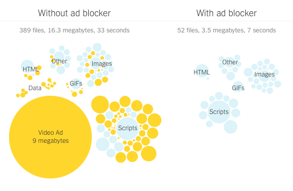
There’s a reason ad-blockers have become so popular in the past year: ads are ruining the web, often contributing severely to page bloat, especially on mobile, increasing page weight by as much as 500% in some cases.
Visualisation of Boston.com page size breakdown. Credit: nytimes.com
The advertising model keeps many websites running, so turning off ads altogether may not be an option. However, you should aim to provide non-invasive, relevant, and light ads. There are a number of responsible and acceptable ad initiatives; in choosing an ad network, you should check that it follows such guidelines.
Many ad networks will allow you to customize the types of ads you display; you should avoid video ads and only use small image ads where possible. Remember: use ads responsibly, and use light ads!
As with embeds and includes, you should measure your page weight before and after including ads up on your site, to learn the impact.
Content Adaptation
It’s worth considering having separate versions of pages for different device classes e.g. mobile vs desktop. This approach is often overlooked since it is more difficult to develop and maintain than a one-size-fits-all solution, but having a separate entry point for mobile visitors can help keep page weight down. Google does it, Twitter does it, Facebook does it! This doesn’t necessarily mean an m. site, you can serve multiple different representations at the same URL.
If your site is built using a CMS such as WordPress or Drupal, there are options for mobile plugins which will serve up a lighter page template for mobile visitors.
See this article for a review of the most common content adaptation techniques.
Simplify, then add lightness!
This well known engineering maxim, attributed to Colin Chapman of Lotus cars, is eminently applicable to the web. To add speed, add lightness! If you keep this in mind you will be well on the way to having light and fast web pages.
Even if you’re a non-technical content creator, or just have no control over the technical aspects of your site, there are still many things you can do to keep your pages light. These guidelines should help:
-
The lightest image is one that isn’t there!
Images are one of the biggest contributors to page bloat -
Compress images
Compress all images you use -
Scale/resize images
Resize images to the size that they will be used at -
Use correct image format
Use an appropriate image format -
Use image
srcset
And particularly if you use a CMS such as WordPress, confirm your theme supports it -
Lazy-load images
If using a CMS, there’s probably a plugin you can use for this -
Cache resources
Again, if you’re using a CMS, there’s probably a plugin that can help -
Remove boilerplate cruft
Simplify your web page structure where possible (simplify, then add lightness, remember?! ) -
Use CSS instead of images
Do you really need a background image? CSS can often do a really good job too -
Avoid custom fonts
Do you really need custom fonts on mobile devices? Most visitors won’t notice the difference -
Use optimized fonts
If you must use a web font but only require a few characters, try to get an optimized font -
Use ads responsibly, and only use light ads
There’s a reason ad-blockers have become so popular: ads are ruining the web -
Link, don’t embed!
A few bytes of embed code can add megabytes to your web pages
This covers some techniques you should be doing to keep your web page weight down. Even by implementing a few of them you can make great improvements to your page size, reduce page load times, and win!
Article series
1. Understanding web page weight
2. Measuring page weight
3. Reducing page weight
Main image: Wikipedia
Updated: 28/03/2017 Updated to include newer image compression methods
Published: 20/05/2016


Leave a Reply