
We’ve arrived at a new era of edge-to-edge, bezel-less phone screens. The trend toward smaller bezels has been coming for some time now, but a (perhaps unexpected) side-effect is the notch!
The Essential notch
While most people may be aware of the new iPhone X’s sensor housing, aka notch, it’s less well known that Apple wasn’t the first to herald the new notchful world we live in. The Essential PH-1 phone, a device from a new company headed by former Android lead, Andy Rubin, comes with a near bezel-less screen.
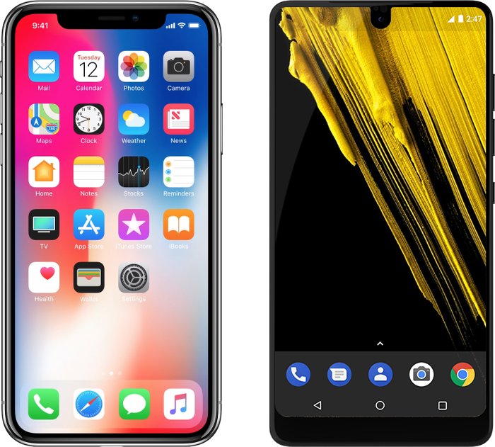 iPhone X and Essential PH-1, and their respective notches
Notches become necessary on edge-to-edge screen devices, if the device is to have any front-facing sensors. This Essential notch is a lot smaller than the iPhone X notch, since it only needs to accommodate a camera, while the iPhone’s notch houses a more complex and ultimately wider sensor array (including a Kinect-like depth-measuring sensor).
Cross-platform notch-handling
So, now that there are notches on different platforms, is there a cross-platform way for developers to handle the notch?
Apple has given this more thought than the Essential team, perhaps by necessity: Since the Apple notch is a lot wider, if it’s not treated right, then it’s more likely to become a nuisance.
How to develop for the iPhone X notch
The WebKit team has some guidelines around web development with the notch.
Do nothing, you’ll be fine!
The good news is, if, as a web developer, you do nothing, then Safari’s default behaviour is to inset web content so that neither the notch, nor the rounded corners will interfere with the layout of your webpage (yes, since the screen extends to the edges of the device, and because the device has rounded corners, the screen has rounded corners too!)
In landscape mode, the content is essentially pillarboxed (the vertical equivalent of letterboxing): Safari adds bars to the left and right of the screen.
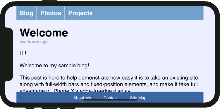 Default pillarbox behaviour
Do something, use that screen space!
You’re fine if you do nothing. But if you want to give your visitors an immersive, edge-to-edge web experience, that’s possible too. This is where Apple has put in some effort.
The viewport-fit metatag property
Apple introduced a new property called viewport-fit to the viewport metatag which is supported in iOS 11. It’s used like this:
<meta name="viewport" content="initial-scale=1, viewport-fit=cover">
The viewport-fit property takes the following values:
auto: results in the default pillarboxing described abovecover: web page will extend to full screen
So, to deliver an immersive, edge-to-edge experience, add viewport-fit=cover to the viewport metatag, as above.
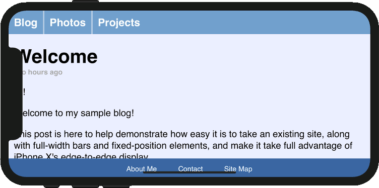 Extend edge-to-edge example image
Safe areas
If extending to the full screen, it’s possible that the notch (or rounded screen corners) might obscure some of your content. So, Apple introduced another CSS extension to deal with this: safe areas
iOS 11 supports a new CSS function: constant(). There are also four predefined constants that can be used:
safe-area-inset-left
safe-area-inset-right
safe-area-inset-top
safe-area-inset-bottom
These can be assigned to padding, margin, top, left etc. properties
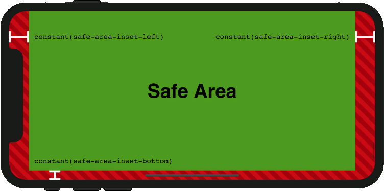 iPhone X safe areas
So, if you are using viewport="fit-cover", then to ensure that your content is not obscured, you would need to do something like applying padding to the main content area, for example like this:
.main-container {
  padding: constant(safe-area-inset-top)
           constant(safe-area-inset-right)
           constant(safe-area-inset-bottom)
           constant(safe-area-inset-left);
}
What about advice on how to handle the Essential notch?
This one is easy: there is no official advice from Essential for web developers. Not yet anyway. Most apps, including the browser extend to just below the camera, except for a few notch-aware apps. The Essential team is apparently working with selected apps to make them notch-aware. It would surprise me if the Chrome team was not one of these. In which case, we could probably expect advice similar to what Apple has give for its notch, or perhaps Chrome and other browsers will begin to support Apple’s CSS extensions. Watch this space.
Silver linings
This move by Apple has, predictably, been met with some skepticism within the developer community. Nobody likes to write device-specific code. There might be a silver-lining, however. In a world where notched devices will probably be around for a while, there’s a good chance that others will adopt Apple’s new CSS extensions. And, in a time of proliferating IOT devices, with all manner of screen shapes and sizes, there could be a wider applicability too.
There have been more exotic and creative solutions for handling the notch too. Check out this ingenious approach, implementation courtesy of @ppk:
 Scrolling around the notch (Source: quirksmode.org)
Main image: Ming-yen Hsu
iPhone X images: WebKit blog


Leave a Reply