


Content Management Systems make it easy for non-technical users to publish on the web at zero, or near zero, cost. They provide a simple write and publish interface, without the author having to worry about the technical details of HTML, web servers, caching and so on. Of course, you can get your hands dirty with the technical side of things if you want, but the most popular CMSes will cater for those among us who can’t or don’t want to. With solutions tailored for general users with no technical expertise, it begs the question whether anything has been compromised in the name of convenience. In this article we take a look at the effect your choice of CMS has on web performance.
Measuring CMS performance
To try to get a feel for how well the most popular CMSes performed we ran a number of tests on the pages produced by each. First, we obtained a baseline measurement of page size for out of the box installs of various versions of various platforms. Since page size is very much affected by the theme or template used, we performed the same measurements for the bundled themes of each, as well as some of the most popular themes.
While these data were useful to give a rough idea about how large out of the box CMS web pages were, they didn’t tell us much about real world usage. So, to look at the question from the real world usage point of view, we also collected data on the page sizes of the top 100 Alexa sites for each of the most popular CMSes (WordPress, Drupal, and Joomla).
The tools we used to make these measurements were ready.mobi and Chrome Dev Tools. (In a previous article, we reviewed various methods for measuring page size, and found that the existing tools rarely agree on page size for the same pages. As noted in the article, Chrome was found to be the most accurate in measuring page weight).
CMS performance results
First, the baseline data is presented below. The latest versions of Drupal, WordPress, and Joomla are shown in the first chart.
What can we say about this data? First, Drupal looks to have the smallest default page size by a significant margin, with sizes ranging between 60KB and 90KB, depending on the theme used. There is not such a large difference between WordPress and Joomla, but WordPress clinches second spot, with page size ranging between 129KB and 192KB. And Joomla fares the worst, with pages coming in at between 164KB and 218KB.
Why the latest versions of WordPress and Joomla, but not the latest version of Drupal in this chart? This is because despite Drupal 8 having reached stable release, Drupal 7 is still the de facto current version, with some 78% of Drupal sites still on version 7.
Since not all sites will be on the latest versions, it’s useful to take a look at the CMS page sizes across all major versions.
Drupal page size
Page size increased from Drupal 6 to Drupal 7, but in Drupal 8, the bundled themes are again back down to Drupal 6 sizes, around the 20-40KB mark. Page size jumps quickly in Drupal 8 when third party themes are added, with the Bootstrap theme pushing the page size up to 234KB.
And this is before custom images have been added, as will happen for most websites. So in most cases, the total size will be larger again than these values, and this is indeed what we see when we look at the real world data later in the article.
WordPress page size
WordPress page size has increased steadily with each successive version, starting at around 20KB for version 2, to between 130KB and 190KB for version 4. This is between two and three times the size for default installs of Drupal 7.
Joomla page size
For Joomla too, there has been an upward trend for the page size of default installs. Average page size has increased from between 45KB and 85KB in Joomla 1 to between 164KB and 213KB in Joomla 3. On average Joomla looks to have the largest page size of the three CMSes, but it depends on the installed theme of course.
Another curious and unexpected result is that the bundled WordPress themes appear to deliver a larger payload to mobile devices (shown below). The smallest device (low-tier) has the largest page weight. This warranted further investigation.
The difference between the high-tier payload and the low-tier device was about 80KB. This was traced to the inclusion of newer WOFF fonts for the higher end device, while TTF fonts were downloaded to the low-end device. So, while at first it looked like something was amiss, the inclusion of the WOFF font where it is supported makes sense, given its smaller size. It is an unfortunate side effect that this means the lower-end device ends up having a bigger payload. A possible workaround to this solution would be to simply fallback to a default browser font on low-tier devices, eliminating the need to download a font at all.
No such deviations were observed in the Drupal or Joomla base install sizes as there were no fonts included in the bundled themes.
CMS web performance: real world data
Next, we take a look at the real world data.
One thing is immediately apparent: web pages are big; ranging between 1.5MB and 2MB regardless of device. We are truly in the Doom page size territory predicted by Ronan Cremin last year.
Another thing to note is that there is no consistent variation in average page size with device tier. That is, devices with smaller screens do not get smaller pages. This might mean that mobile devices are not getting any special treatment by the major CMSes. In any case, it seems like there is plenty of room for optimization, especially for lower tier devices.
Other performance features
There are a number of other performance considerations to take into account, such as cache headers, script inlining, minification and so on. Each of the main CMSes support these things, but the recent addition of the image srcset attribute deserves special attention.
Image srcset
Images are probably the single biggest culprit when it comes to additional page size bloat on the web. A relatively recent HTML feature that helps reduce image the data cost of images on the web is the new srcset attribute of the img element. This element allows the author to supply a number of images at different sizes, for viewports at different sizes. The browser downloads the nearest match, saving the user from unnecessarily downloading an image that is too large for the viewport.
WordPress supports srcset in core, and in Drupal 8, its responsive images are also achieved via a core module, but one that is not enabled by default, so it has a slightly higher barrier to entry. The Drupal version makes use of the picture tag, as well as the srcset attribute. This means it is more capable, though perhaps a bit trickier to configure. In addition, Drupal 8 has not yet achieved widespread adoption; many common modules have not yet been ported to the newer version, and developers are holding off. So, WordPress clearly leads here!
It doesn’t look like srcset is supported in Joomla core, and no documentation indicating otherwise could be found. Some manual testing was performed, and certainly srcset was not being used in the default configuration. So Joomla trails the other two CMSes here.
The WordPress implementation is a seamless, background feature. This means, that once a site is upgraded to WordPress 4.4, images will automatically become responsive, with srcset and size attributes. WordPress chooses a set of sensible defaults for the srcset and size attributes, but this can be tweaked within a theme if necessary to ensure that the responsive images perform as expected at the breakpoints of a particular theme.
The kinds of improvements possible with this feature are shown below, where we compare size differences between non responsive and responsive page size for various viewport sizes.
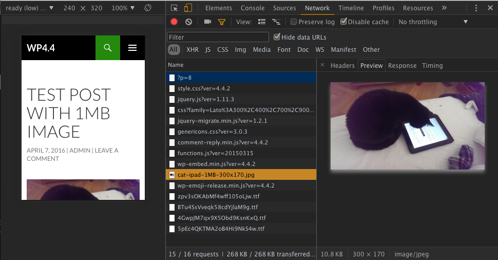
To test and demonstrate the WordPress default implementation of srcset, we set up two WordPress sites, one using version 4.3, and one using version 4.4. Both used the same theme. We then created some identical content which contained the same uploaded image of approximately 1MB in size. We then tested the two versions on a variety of differently sized viewports and measured the resulting page size.
The images below show the improvement in page weight achieved by the responsive image functionality in WordPress 4.4, with default settings. The first shows the non-responsive version. Note the page size, 1.1MB.
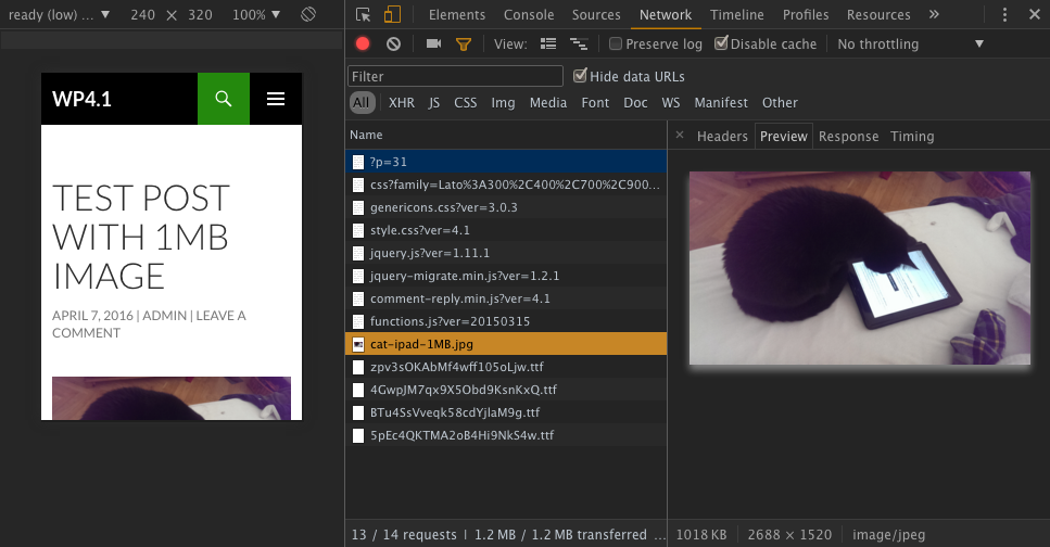
The second is the responsive version, showing page size of just 268KB. This time the cat image is nearly a whopping 100x smaller, down to 10.8KB from 1018KB:
This type of improvement is available to anyone who upgrades to WordPress 4.4, without having to do a thing. So how is it achieved? Compare the markup from the two different versions. With the pre 4.4 version, the img looks like this:
<img class="alignnone size-full wp-image-32"
          src="http://wp4.ruadhan.com/.../cat-ipad-1MB.jpg"
          alt="cat-ipad-1MB" width="2688" height="1520">
Whereas the 4.4 responsive version looks like this:
<img class="alignnone size-full wp-image-9"
          src="http://wp4.ruadhan.com/.../cat-ipad-1MB.jpg"
          alt="cat-ipad-1MB" width="2688" height="1520"
          srcset="http://wp4.ruadhan.com/.../cat-ipad-1MB-300x170.jpg 300w,
                  http://wp4.ruadhan.com/.../cat-ipad-1MB-768x434.jpg 768w,
                  http://wp4.ruadhan.com/.../cat-ipad-1MB-1024x579.jpg 1024w,
                  http://wp4.ruadhan.com/.../cat-ipad-1MB.jpg 2688w"
          sizes="(max-width: 2688px) 100vw, 2688px">
When an image is uploaded to WordPress, a number of copies are made at specific sizes, and these are advertized to the browser using the srcset attribute. The browser can then choose the most appropriate one for its viewport.
This, of course, assumes that the browser on the requesting device supports srcset. If it doesn’t then all bets are off. In fact there will be a slight penalty due to the extra markup required, but the benefits far outweigh the drawbacks here.
The results for some other viewport sizes are charted below. The resulting page weight savings are impressive! (Note that the page weight here excludes fonts, due to the WOFF vs TTF font issue mentioned above).
Mobile network operators should be thanking the WordPress devs here! WordPress reportedly powers something like 26% of the Web, and even though it won’t reach all of these sites, supporting srcset can only have a positive effect.
Conclusions
Out of the box, all of the main CMSes have acceptably low page weights, although Drupal appears to have significantly smaller page size than either WordPress or Joomla. Things are different, however, when we look at real world sites where site owners have used their own themes. In these tests there was no clear winner across the three main CMS platforms we looked at, WordPress, Drupal, and Joomla, with page size averaging 1.5 to 2MB across each CMS and all our device categories.
In addition, while there was some variation in the size of pages delivered to mobile devices, it was not consistently lower for lower tier devices, which might lead one to conclude that desktop and mobile aren’t being treated differently in any significant way by the three CMSes.
Another interesting observation was the larger out of the box WordPress payloads for lower tier devices. This is a good example of how newer technologies can offer efficiencies, and that higher end, richer experiences needn’t always be heavier than lower-end, if newer technologies are embraced.
And finally, it’s worth mentioning again, that support for srcset in the most popular CMSes, and particularly with the automatic, default implementation in WordPress, has the potential to significantly lower the page weight of a great many sites.


Leave a Reply