


April 21st! Mark the date. Circle it. Set your alarms, and put your crash helmet on. If you’re not mobile-friendly that is. Because April 21st is the day that your search engine rankings die. It’s been called the mobile-friendly apocalypse, mobile-friendly meltdown,a there’s even a hashtag, #mobilegeddon, for it, and indeed the world may end for your business. But bad things will only happen if you’re not mobile-friendly.
What’s all this April 21st mobile-friendly business then?
In an unprecedentedly frank disclosure about the inner workings of its search algorithm, Google has revealed both the precise focus and the landing date of a significant change to its operation. The meat of the announcement is here:
Starting April 21, we will be expanding our use of mobile-friendliness as a ranking signal. This change will affect mobile searches in all languages worldwide and will have a significant impact in our search results.
Why now?
It’s nearly 10 years since we were sporting internet-ready devices such as the Nokia N70 whose internals were sophisticated enough to run a browser that could consume (then) modern websites over a 2G or 3G connection. Since then, despite the explosion of mobile device usage and their comparitively constrained resources, websites have, somewhat counter-intuitively, continued to grow in size. Back in 2005, the average page size was around 200KB, whereas now, in 2015, the average page size is something in the region of 2MB. Some of this can be explained away by saying that networks have gotten faster, and devices more capable, so it’s no big deal if pages are getting bigger; devices can handle it.
However, high-speed internet is not just about bandwidth, it’s about latency too, and it’s much harder to improve the latency of a connection than it is its bandwidth. Ilya Grigorik has an excellent post covering the details, but basically even if bandwidth is increased, page load times unfortunately don’t decrease linearly. So the argument doesn’t hold that new fangled devices with high speed connections can handle these bigger pages. The trend toward larger pages and often lazy, non-optimised design can lead to page bloat and poor performance. And performance is a big, big deal right now.
And it’s not just about technology—it’s about users too. Many studies have shown that users want pages quickly, and not giving them what they want efficiently has a real and measurable effect on the balance sheet. For instance, in 2012, Walmart found that for every 1 second decrease in page load time saw a 2% conversion increase.
There have been indications that Google has been working toward this date for some time now, with some quite obvious clues within the past few months. For example, there was an update to its search results pages in November 2014 which indicated whether a result page was mobile-friendly or not, by literally spelling it out.
Previous to that Google outlined clear recommendations about faulty mobile redirection. And before this, irritating ‘Download our app’ interstitials were being penalised. These were all steps designed to improve mobile user experience, and can be viewed as a prelude to the April 21st apocalypse.
The bottom line is, you need to be compatible with mobile devices, and you need to be fast.
How do I know if my site is mobile-friendly?
So, are you worried yet? Well, if you’re not mobile-friendly, you should be. What can you do? First you need to check if your site is mobile-friendly or not. There are many tools that can help you out here. Most of them involve inputting the URL of your site into the tool, and out comes a report, telling you where you need to improve.
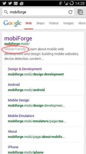
Mobile-friendly test
URL: https://www.google.com/webmasters/tools/mobile-friendly/
This tool runs a set of tests to check if your site is mobile-friendly. It’s probably a good idea to check this, since it is Google’s own tool—if you pass this test, then you can be sure that Google believes your site is mobile-friendly.
Pagespeed insights
URL: https://developers.google.com/speed/pagespeed/insights/
This tool analyses the speed of your webpages from both desktop and mobile points of view, and gives a list of improvements that can be made to speed up your website. Its suggestions include things like compressing images, caching resources, eliminating blocking resources and many more. It also provides explanations about how to make these changes.
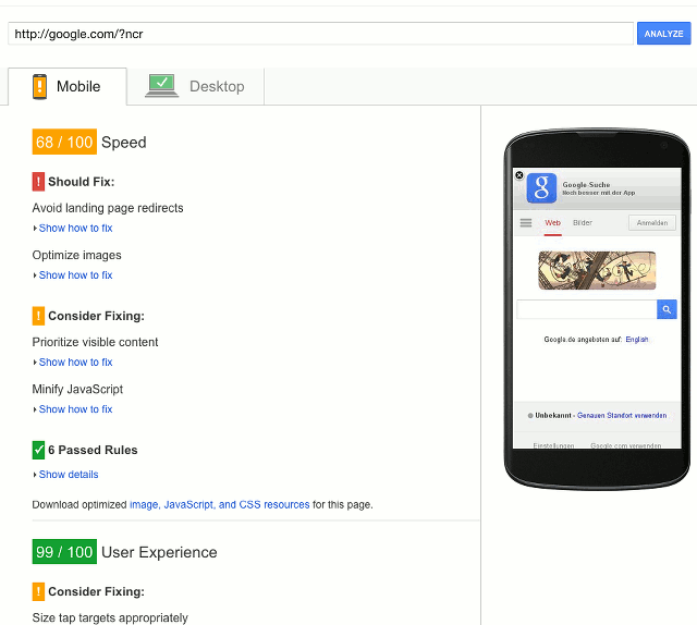
Pagespeed insights test results page for Google.com shows there’s room for improvement
My site is not mobile-friendly. What can I do?
First you need to decide what your budget and time constraints are, and whether you can manage the changes yourself, or if you need to get help. If you have the time, and the technical know-how, you can probably manage it yourself.
Google has stated that there is no preference for any particular approach to mobile-friendliness, whether it’s responsive, adaptive, or something else. Just so long as it is mobile-friendly, then you’re good. So, any solution you pick should observe Google’s mobile-friendly guidelines. Some solutions are outlined below.
Option 1: Go responsive
A start can be to make your site responsive. This should be managed carefully, as bloated responsive sites are not uncommon. The problem with these is often that the same payload is sent to all devices, from feature-phone (if it will even work on a feature phone), to smartphone, to desktop, and CSS styling is used to hide, resize, and fit content to the screen of the current device. And if the payload is the same, then the download time is the same. However, if done right, then this can be a good option.
Option 2: Use a third-party content mobilisation service
If you don’t have the budget or time for a full refresh, perhaps one of the quickest and easiest ways to optimise your site for mobile is to use a content mobilisation platform such as goMobi. This service will crawl your site, converting your pages into mobile-friendly versions, optimised for all devices, including feature phones, smartphones and tablets, and lets you tweak the result any time with a simple but capable admin interface.
Option 3: Go adaptive or RESS
Businesses that require more control over their sites can consider implementing a server-side solution, or a RESS solution. This can involve delivering optimised images and page templates depending on the device. We have previously shown a relatively painless way to implement a RESS solution, making use of server-side device detection, coupled with the open source mod_pagespeed Apache module which will optimise images, JavaScript, and CSS based on the device detected.
Whatever you decide to do, do it fast. The clock is ticking!


Leave a Reply