


Browser compatibility is hard. Especially on mobile. If you thought things were difficult 10 years ago when there were only a handful of browsers to contend with, then thinking about the situation for mobile may make you dizzy or depressed. For now we live in a world of tens of thousands of devices of wildly variable shapes and sizes and capabilities. And we have to make the web work on all of them.
But thankfully we have standards bodies, such as the W3C to step in and make our lives easier. The W3C brings together a bunch of interested parties and, sitting around a table or via teleconference, they agree a specification for a technology standard covering the issues of the day. The standards are implemented via browser vendors and that’s the end of our problems.
Well… not really.
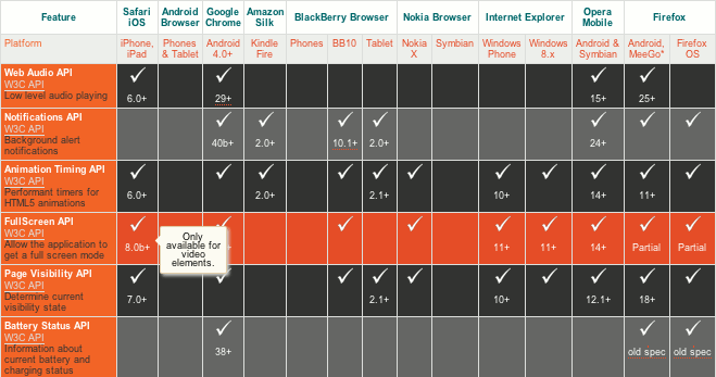
Excerpt from mobilehtml5.org. Even just tracking standards compatibility is tricky
The table above is an excerpt from mobilehtml5.org, a site which tracks “HTML5 compatibility on mobile and tablet browsers with testing on real devices”. This is just one small section of a rather large number of specifications that are being tracked by the site. Where a tick is given in the table, the feature is at least partially supported by the corresponding browser. Often there is no tick at all; or hovering over a tick will reveal a message such as “Firefox is using the old spec from the W3C”, or “Available but buggy”, or “Only available for Video elements”. The point is that this is a big matrix with a lot of variables, and when there are lots of different vendors offering lots of different browsers then we’re going to end up with lots of variations. Even just tracking browser standards compatibility is tricky, let alone managing it in our web apps.
Why are implementations different?
There’s probably no single reason for cross-browser incompatibilities, but much of it may simply come down to when different teams and companies work somewhat independently on similar problems, they will come up with different solutions. Even if they are working off a specification. And different browser vendor teams will have different priorities, so different technologies will get implemented to different schedules, even if from the same specification.
The major browsers vendors have all been quite proactive when it comes to implementing HTML5 features, even before the specifications were finalised. This approach benefits developers and users since they get a chance to enjoy new technologies and features as early as possible, but it also unfortunately opens the possibility that the specification will change and different users on different browser versions will see different behaviours. For example, WebSocket support was disabled in Firefox 4 between versions Beta 7 and Beta 8 due to discovered security vulnerabilities. To be fair, if a browser manufacturer were to wait for a specification to be finalised by the W3C, then they would be left behind, with a browser from the early 2000s, the technological equivalent of IE6 or Firefox 1.0. Waiting for a W3C specification to be completed is not an option.
Shims, polyfills, feature-detection, and browser-detection
Shims and polyfills are JavaScript browser hacks that essentially plug functionality holes and inconsistencies in older or unsupported browsers. Polyfills attempt to replicate an API seamlessly in the lacking browser. A useful list of browser polyfills can be found here.
While some things can be fixed with such JavaScript hacks, there are other things that can’t. Modernizr, a very useful JavaScript feature-detection script, lists a page of ‘undetectables’—items that must rely on User-Agent based browser-detection or some other method instead. UA based detection can happen on client or server-side, for example with tools such as DeviceAtlas.
There is also the issue of false positives, where a browser incorrectly reports that it supports a feature it doesn’t. The usual solution here is to use browser-detection to deal with these situations.
Neither approach should be discounted, both are useful and should be deployed as necessary. In many real world use-cases, it turns out that a combination of feature-detection and browser-detection approaches works best. Even in those situations when feature-detection purists desire to use only feature-detection, the final solution often employs at least some form of browser-detection to deliver the best result. Ironically, many feature-detection proponents may not even realise they are making use of device-detection in their solutions. For example, Modernizr claims that “[u]nlike with the traditional—but highly unreliable—method of doing “UA sniffing,” which is detecting a browser by its (user-configurable) navigator.userAgent property, Modernizr does actual feature detection to reliably discern what the various browsers can and cannot do.” However, browsing the github source tells a different story. See this commit for example:
@@ -1,5 +1,3 @@
-
-
 // Detects whether input type="file" is available on the platform
 // E.g. iOS < 6 and some android version don't support this

 @@ -7,6 +5,9 @@
 //  don't support it (iphone, ipad, etc).

 Modernizr.addTest('fileinput', function() {
+    if(navigator.userAgent.match(/(Android (1.0|1.1|1.5|1.6|2.0|2.1))|(Windows Phone (OS 7|8.0)|(XBLWP)|(ZuneWP)|(w(eb)?OSBrowser)|(webOS)|Pre/1.2|Kindle/(1.0|2.0|2.5|3.0))/)) {
+        return false;
+    }
     var elem = document.createElement('input');
     elem.type = 'file';
     return !elem.disabled;
And it’s not just Modernizr; take a look at other popular libraries and frameworks such as jQuery, and you’ll see a similar situation. These libraries are rightly making the best of both worlds. It’s hard to imagine a scenario where combining approaches wouldn’t deliver the best solution.
What are some of the browser compatibility problems?
So, what kinds of issues are we talking about, and how do they affect the developer and his or her workflow? The following is a quick overview of some common problems experienced by developers due to inconsistent browser implementations, and their possible workarounds.
Position-fixed
Mobile devices today enjoy enough screen real-estate that, if desired, and it often is, a portion of it can be given over to a fixed position navigation or menu bar. Many mobile sites employ this technique, and a lot of site owners want it.
The tweet below sums up the situation:
OH: I'm a mobile web developer, so I basically spend all day getting requests for content to stick to the top after some scrolling
— Daniel Wilson (@dancwilson) September 16, 2014
Although better supported today (see caniuse.com/#feat=css-fixed) than previously there are still browsers which don’t support position:fixed correctly, and developers need to watch out for them. Two possible fixes are:
- Chris Wojcik’s approach is a “UA sniffing approach to detect browser support for the css property “position:fixed”
- The solution from Filament Group takes a different approach: “Rather than testing immediately, it waits for the user to scroll, at which point it checks to see if fixed positioning is working properly. Prior to scroll, the script assumes fixed-positioning works, adding a class of fixed-supported that can be used to qualify any position:fixed CSS rules. When fixed positioning is tested and deemed unsupported, the class is removed, allowing any fixed-positioned elements to safely degrade to some other layout.”
Interestingly, both of these solutions make use of User-Agent browser-detection to determine if position:fixed is supported for a number of browsers.
As the author of the first library above states, “[t]he real best practice is to be aware of the fact that position:fixed is inconsistently supported, don’t rely on it as a must-have feature. Use it, but be aware of the limitations.”
Geolocation API
Support for the Geolocation API is pretty good across modern mobile browsers today—it’s mostly with legacy browsers that compatibility issues exist. We discuss the Geolocation API in some detail here. As we noted in that article, there are several freely (under MIT license) available scripts that have done the hard work to insulate you from the details, including this script by Stan Wiechers, and this script by Esteban Acosta Villafañe which builds on Wiechers’ script.
Where geolocation is not supported at all, perhaps on low-end devices, there are a couple of different options. One approach is to get an approximate determination of the location via IP address—this approach does exaclty that, using freegeoip.org to find out the location from the user’s IP address.
Another approach is to facilitate manual input, and to reverse-geocode this location using a service such as Google’s geocoder. We demonstrated how to achieve this previously on mobiForge.
Other geolocation workarounds can be found here.
Device Orientation
Another case in point is the Device Orientation API. With the device orientation API we can access the data from the device’s motion sensors: gyroscopes, magnetometers, and accelerometers. The main meat of the API comes in the form of two events: deviceorientation, which is fired in response to detected orientation changes, and devicemotion which fires when motion is detected.
Although becoming more aligned in modern browsers, discrepencies still exist, with different data returned via different browsers. Some of the things that developers have to contend with are:
- Reversed axis for iOS: workaround is to use browser-detection for iOS and perform a negation of the values in this case
- Angles and ranges of values: the angles and ranges of angles are handled differently across some browser
- Non-compass based initial 0 degress heading for iOS: Each time the compass is initialised, it sets the current orientation of the device to be 0 degrees, and subsequent values are reported relative to this initial bearing. A workaround for this is to use the iOS
webkitCompassOrientationproperty instead.
The ‘Ghost’ click or the 300ms click delay
Most touch-enabled browsers implement a 300ms delay between tapping the screen and triggering an action based on the tap. This is because the browser is essentially waiting to see if the tap/gesture input is complete. For instance, you might be performing a single tap, or you might be half-way through a double-tap.
Browser performance is very important, with much research effort expended on shaving off 10ms here and 20ms there. So 300ms represents quite a juicy performance prize. Various JavaScript techniques and libraries have been developed that that will remove this delay, such as FastClick from the FT Labs, the Financial Times web technology team, and Tappy from the Filament Group.
Google Chrome has led the way by removing the delay directly from the browser itself, under certain circumstances, and some of the other browsers have followed suit. In this case, the 300ms delay is disabled if the page contains the viewport meta tag to disabled zooming, with something like:
<meta name="viewport" content="width=device-width, user-scalable=no">
However, this won’t work on mobile Safari. If you want to remove the delay on browsers that are still affected by this delay then you need to implement one of the JavaScript workarounds.
Conclusion
Browser compatibility issues are a real problem that developers face. Especially on mobile, where there are thousands of screen size and capability configurations. And the problem is not made any easier when functionality specifications are implemented differently across various browsers and versions. In this article we looked at just a few of the many cross-browser issues facing mobile web developers today.
There are varying reasons why browsers have divergent implementations. Some reasons are because the specification is not complete at the time of implementation, or is at least in flux, so it may have changed over the time that various implementations are created. Other reasons are that there may simply have been a misinterpretation of the specification.
Usually some kind of workaround is required. Sometimes, a workaround can be based on feature-detection, but more often than not, some User-Agent detection is required to correctly optimise for all browsers. To ensure compatibility, developer’s must assume nothing about browser support and must have a suitable fallback in place for when it’s lacking.


Leave a Reply