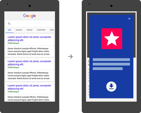
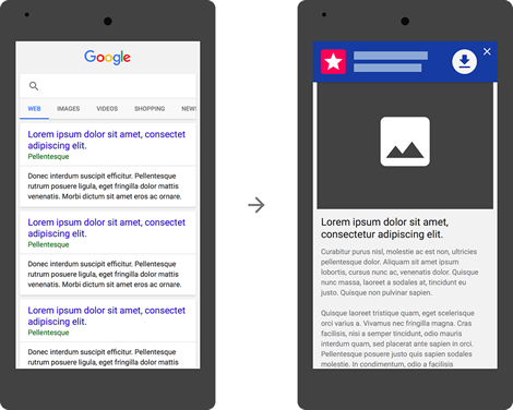
At the top of the month, Google announced the latest in a series of measures aimed at improving the mobile experience by making further changes to its mobile search ranking algorithms. This time, Google has taken aim at app install banners that obscure a significant part of webpage content on transition from the search results. From November onwards, Google will penalize this practice and offending sites risk worsening their rankings on mobile search.
It’s the latest in a series of changes following on from this year’s April 21 ‘Mobilegeddon’ affecting sites which do not have a mobile friendly site in place. This year has also seen reported sightings of a “Google slow tag” that would carry a health warning in mobile search results for heavy bloated sites that take a long time to load on mobile connections.
Penalizing App Install Interstitials
There’s no doubting that intrusive app install interstitials are annoying, forcing the user to dismiss the message to get to web content despite having clicked on a web link. This is even more infuriating on repeat loadings of a site where the interstitial becomes a barrier between the user and the content on each subsequent visit.

Google has made disapproving noises about them as far back as 2013, but it has taken until now for the search giant to take action.
Browser Implementations For App Installs
Google recommend that developers use the inbuilt app banner features of the browser (Smart Banners on Safari and Native App Install Banners on Chrome) to ensure a consistent user experience.

App Banners On iOS
iOS has had an integrated app banner implementation for the Safari browser since iOS 6.

If the user already has the app installed, the banner prompts the user to open the content in the app by calling the URI scheme of the app with the necessary deep links. If not, the link will lead users to the relevant page in the app store.
App Banners On Android
Google has also gotten its ducks in a row for native app install banners since the release of Chrome 44 in July this year. It uses the web app manifest file, covered recently by mobiForge, and allows the user to inline install a native app right from within a web page.

Outside of browser implementations, you could use a simple inline banner at the top of the page but it should link to the correct app store based on the user’s platform, which requires a knowledge of the device’s OS.
Google Slow Tag, Mobilegeddon, And More
Google have already laid down a number milestones on the road to mobile web nirvana, starting with their advisory on faulty redirects and common mistakes in smartphone sites back in 2013. Then in November 2014 Google rolled out its mobile friendly tag which indicates directly in the SERPs whether a site cuts the mustard on mobile.
Mobilegeddon descended on April 21 this year officially penalizing sites that were not mobile-friendly in mobile search rankings.
Since then there have been a number of sightings of apparent Google tests of a two variants of a ‘slow tag’ designed to warn users about sites that are likely to try their patience (and their data plan) with long load times because of their size. Both the red slow tag and the yellow warning sign with ‘slow to load’ call out sites for being slow to load on a mobile connection.

Should it come to pass this is a potentially radical change that would cause a sea change in how websites are built: it’s fair to assume that searchers would avoid sites labelled thus in their droves effectively relegating them far from the all important first page of web results.
Performance And UX Take Center Stage On Mobile
Taken together all these changes are proof, if any was needed, that Google is very serious about improving the performance of the web on mobile as experienced through its platforms. Of course the trend is not limited to Google, with similar initiatives in support of better user experience on mobile being rolled out by Apple, by Facebook’s internet.org initiative and a plethora of industry players ranging from browser makers to standards bodies.
And whilst the average web page size has swelled from 200KB in 2005 to approx 2MB in 2015, these latest changes can be seen to be part of a renewed focus on responsibility to the user and the networks they are using, in terms of bandwidth usage just as much as quality of experience.
Image credits: Top image by Daniel Zimmermann under cc, Google Webmaster Central, Google Developers, Apple Developers, K Neeraj Kayastha, Parmar Divyesh


Leave a Reply