


As a follow up to our previous article on the rising prevalence of ad blockers we thought it would be useful to review the types of ad that are likely to deliver a poor user experience, annoy your visitors, and sink your conversion rates.
Ads, even at the best of times, aren’t particularly liked by users. In a recent survey on how users felt about ads, at best, users indicated ambivalence, while most ad-types were negatively received.
On top of this, mobile ads are generally disliked more than desktop ads. This means you’re already starting out at a disadvantage when you decide to publish mobile ads—you’re facing a tough audience before you even begin. And due to limited space on mobile, it’s easier to get mobile ads wrong and alienate your users.
In this article we’ll take a look at mobile ad UX, find out what a bad ad experience is, and what you can do to avoid delivering one.
What is a bad ad experience?
The Coalition for Better Ads (CBA) is a good place to start. This group, was set up in the aftermath of the backlash against bad ads, and has Facebook and Google among its members. Through its research the CBA has identified several common ad UX anti-patterns, and has come up with what it calls the Better Ads Standard. Bad ad experiences are experiences that don’t meet this standard. These are the ad experiences that provide the worst user experience, measured across a number of dimensions.
The research itself makes for interesting reading, and is very thorough, even if its results aren’t terribly surprising: ads aren’t that popular, and the more annoying the ad, the less popular it is; and the larger and more interruptive the ad, the more annoying it will be. However, although we know these things intuitively, the strength of the CBA’s research is that it
- helps to quantify how we feel about ads, particularly on mobile, where users are less tolerant
- provides an empirically-backed ranking of ad-type preference, based on user experience
- delivers a baseline ad standard broadly accepted by a global coalition of publisher and ad-tech representative bodies.
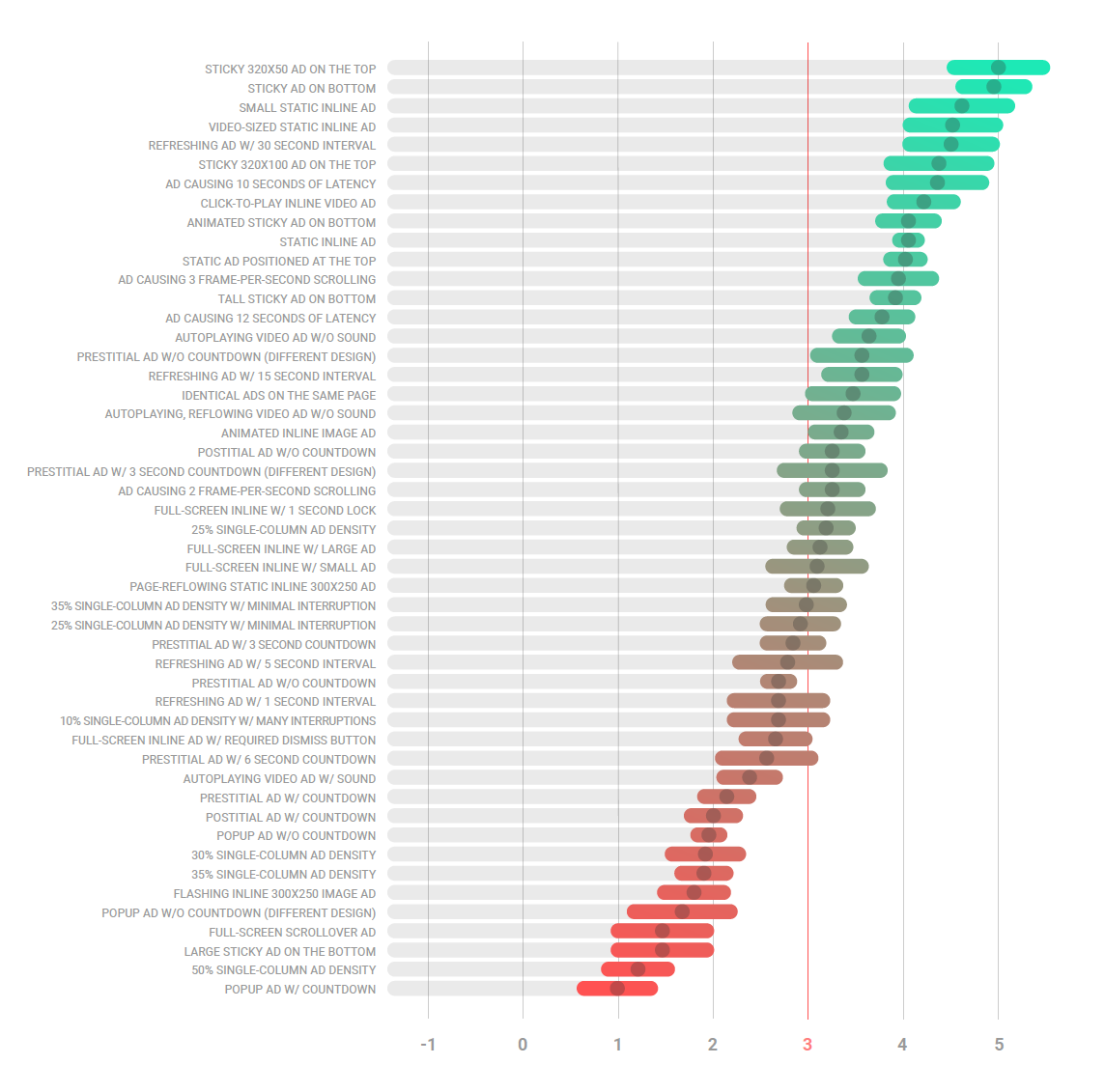 Mobile ad experience ranking. 5 is most favoured (Source: https://www.betterads.org/research/)
Many, I’m sure, will harbour a healthy skepticism, given the major stake in ad-tech that some of the members have, and the lack of any consumer groups as members. The ad industry was spurred to reform the ad experience in the face of rising ad blocker usage, not out of any altruism toward web users; before this the industry was happy to drag web performance and user experience downwards so long as the advertising dollars kept flowing.
However, accepting ads as a necessary evil—it’s the only monetisation model available for many websites—the CBA’s findings feel more or less in line what many might reasonably consider acceptable or not. These ad industry players need to make this work; they might reasonably be trusted to come up with a workable solution out of a sense of self-preservation.
Bad ad experiences: annoying, distracting, creepy…
These are some of the words used to describe and gauge bad ad experiences. Interruption and distraction are strong drivers of annoyance. Annoyance, in the CBA’s research, is described as distracting or creepy.
Distraction is anything that gets in the way of your goals, or the page’s goals. Creepy ads are those deemed too intrusive, arising from aggressive tracking of users.
Research from the Niemen Norman Group (NNG) indicates that the most “hated” annoyances haven’t change much since 2004, despite the move to mobile web. The most annoying characteristics of ads are:
- Pops up
- Slow loading time
- Covers what you are trying to see
- Moves content around
- Occupies most of the page
- Automatically plays sound
The Acceptable Ads Platform (AAP), the controversial business platform of adblocker software Adblocker Plus has a whitelist of ads that satisfy its guidelines—ads that:
- Are not annoying
- Do not disrupt or distort the page content we’re trying to read
- Are transparent with us about being an ad
- Are effective without shouting at us
- Are appropriate to the site that we are on
Effect on usability
Distraction and disruption are really about usability. Poor usability contributes to a bad user experience. Usability can be affected in a number of ways. The user’s workflow can be disrupted, whether by blocking content, preventing the user from advancing through content, or by distracting the user from the main content, or even by causing performance issues that prevent any user interaction at all.
Then there’s the false floor effect. A false floor is a danger of mid-content ad placement: if the ad appears in a place that could reasonably be considered the end of the real content, and are large enough that the user can’t see any further content. They leave not having consumed the content they came for.
Usability issues are not only limited to specific ad types. There are plenty of ways to sabotage an otherwise acceptable ad, such as making tap targets too small, or too close together, or simply resizing ad creatives from different delivery formats to the point that text is illegible, links too small, and graphics unrecognisable.
Ads in context
Interestingly, the CBA distinguishes between bad ads and bad ad experiences. Since ads are rarely shown in isolation, it makes sense to measure ads in context—how well they are received when the parent page is considered too. Measuring ad UX isn’t just about ranking how people feel about any particular ad type, but about considering how the ad contributes to the user experience of the page in which it’s embedded. This is an important dimension to consider.
The NNG reported that ads that were most well received were those that were related to the user’s primary task, or that blended in well, without being deceptive. There’s a fine-line to tread here between blending in and being deceptive.
Performance
The performance of an ad also affects the performance of the page in which it’s embedded; if an ad hogs CPU or bandwidth, it drags down the performance of the whole page.
As an extreme example, on older iOS devices, if JavaScript—whether the page’s JavaScript, or an embedded ad—is detected to be taking a long time to run, then iOS will kill the page completely. Thus an ad’s contribution to the overall UX of the page, could be, well, diabolical depending on its context. It’s worth remembering that even though it might be ads that are causing slow page loads or UI updates, users don’t know that and assume it’s the site’s fault, which it ultimately is.
In its 2017 ad guidelines, the Interactive Advertising Bureau (IAB), an organisation that develops standards and conducts research for the ad industry, follows a LEAN (Light, Encrypted, AdChoices supported, and Non-invasive) approach, and emphasises user experience and performance. In particular it places restrictions on performance, including:
- maximum ad weight on initial and subsequent loads (see chart below)
- maximum number of resources to download (10 items)
- maxiumum CPU load (30%, based on average CPU of user base)
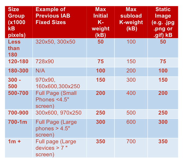 IAB ad file sizes
For 3G (1.5Mbps) or slower, the permitted ad file weights should be lowered by 30%.
Relevance
Ads in context also touches on relevance. A user is less likely to feel antagonised by an ad that is well targeted. In some cases a well targeted ad could even improve the user experience by giving something actionable at the end. On the other hand, if ad content is objectionable to a site’s target audience, then everyone—user, publisher, and advertiser—suffers.
Real Time Bidding (RTB) ad exchanges allow publishers to fine-tune audience targetting to specific sites and pages, even to target segments such as “cyclist”, or “frequent traveller”. Geo-targetting allows the advertiser to target users in particular geographical areas, sometimes even down to neighbourhood granularity.
What do bad ads look like?
So what are the types of bad ad that cause poor user experience? No matter what research you look at, the list is similar, although specifics diverge a little. In general the AAP’s guidelines are more restrictive. On ad density the CBA considers 30% to be the upper acceptable limit, while for the AAP it’s 25%. On ad placement, in-content (native) ads are acceptable to the CBA, but not to the AAP. On auto-play ads, auto-play video without sound is acceptable to the CBA, but not to AAP. The IAB guidelines, with an emphasis on non-disruption roughly overlap too, with some minor differences.
 Popup ads: the most hated of all the mobile ads—don’t use them (Source: betterads.org)
- Pop-up ads — pops up and covers some area of content. Sometimes has a countdown timer that must expire before ad can be dismissed
- Ad density higher than 25% — ads that take up more than 25% of the vertical height of the main content are disruptive, regardless of ad type. After pop-up ads, ad density higher than 50% was found to be the second least preferred ad experience
- Auto-playing video ads with sound — playing sound automatically is one of the worst user experiences, often causing users to close the page entirely, especially when the user is in a public place
- Prestitial/interstitial ads — displayed before main page content has loaded. Must be dismissed before content can be viewed. Sometimes has a countdown timer
- Flashing animated ads — animated and rapidly flashing colours are severly distracting. Animated ads without such flashing are otherwise considered acceptable
- Postitial ads — these ads pop up and obscure content as a user attempts to leave a page, for example by following a link to another page, breaking the user’s browsing flow. Can include a countdown timer that must expire before ad can be dismissed
- Full screen scrollover ads — appears over content, and forces user to scroll through before content can be seen again. Generally take up more than 25% of page
- Large sticky ads — fixed position ads that cover a portion of the main content area of a page, and remains even when user scrolls. The larger the ad, the more annoying
- Auto-expanding ads — ads that expand to cover some portion of the main content area, interrupting the user experience
- Countdown timers — force a user to wait until a certain amount of time elapses. Very disruptive
How to avoid delivering a bad ad experience
So what can you do to avoid delivering a bad ad experience? Quick answer: don’t implement anything in the bad ad list above.
Generally:
- Avoid interrupting the user flow
- Avoid distracting the user’s attention
Specifically:
- Avoid countdowns—they make any kind of ad worse
- Don’t hide content
- Use smaller, shorter, flatter banner type ads over taller square ads
Ad placement
- Remember content priority: ad small sticky ad at the bottom is better than a large ad at the top of a page that pushes content down
- In-content and native ads are worse than side or bottom placement
- Don’t create false floors—if necessary include “Continue reading below” text
Usability
- CTAs and tap targets should be large enough to quickly identify and tap
- Creative shouldn’t be simply scaled down between different formats
- Text should always be legible
- Graphics and logos should be identifiable
- Interactive elements should be large and inviting
Relevance
- Ads should be relevant to user and to site
- Ads should be geo-targeted
Testing
- Keep testing! Ads tend to grow. An ad slot that worked fine when you first added it might be killing the site now. Once you’ve opened your site up to third parties you need to keep ensuring that they’re not abusing the trust.
- Test on older devices, or lose them altogether! If ads are crashing older devices you may not even see them in your analytics, and you won’t know there is a problem
In summary
If an ad
- covers what you are trying to see,
- occupies most of the page, or
- interrupts the user
then it’s a bad ad experience!
If an ad prevents a user from viewing your site entirely on their device of choice, then it’s an inexcusably awful ad experience!
Further reading
- An Experimental Methodology to Measure Consumers’ Perception of Online Ad Experiences – Coalition for Better Ads
- The Most Hated Online Advertising Techniques – Nielsen Norman Group
- IAB New Standard Ad Portfio – Interactive Advertising Bureau [PDF]
Main image: David Evers


Leave a Reply