


Our last article on m-commerce looked at the effect of performance on conversions for e-retailers. In this second part, we take a look at how user context is used to optimise and adapt content by major e-retailers, and how this can affect conversions.
A key aspect of tailoring for specific audiences is making use of context – someone on a mobile device searching for ‘Indian food‘ at 8pm from a city centre location probably has different priorities than a person executing the same search from a laptop at home at 10am. Analytics give companies information about context – when, where and with what intent users access a site on mobile, and when, where and with what intent they access a desktop site. The different use cases will then feed into optimising for different devices. Christiaan Lustig writes that a site’s ‘top tasks’ will change depending on a user’s circumstances and that, ‘The circumstances in question aren’t the type of device the user has, but his location, his situation, and his need for certain information.’ Ravi Pratap, in making the case for server-side device detection and adaptive content delivery depending on device, writes: ‘The most important thing adaptive delivery allows you to accomplish is a highly differentiated experience that is built for the specific intent of your mobile customer.’
For a deeper look at the cases to be made for server-side and adaptive content delivery depending on device and context see these articles.
Interestingly, despite Google’s oft-mentioned ‘preference’ for RWD over separate mobile or Adaptive sites, the company’s own Mobile Playbook (2nd edition) recommends that businesses, ‘make sure to design for mobile, rather than simply taking content from your desktop website and making it fit on a mobile screen. Your mobile site will differ from your desktop site not just because of the size of the device, but because the mobile context reveals a different mindset for your consumers. Visitors to your mobile site may be at a different point in the purchase funnel.’ With that in mind: ‘The goal is to tailor and rearrange content for specific audiences rather than removing it and offering a stripped down version of your website.’
Form factor will also play a role in optimisation choices: smaller screens and touch interfaces benefit from ‘touch targets’ in the form of easily tappable buttons and links; while the more accurate (10-50m) location information on mobile devices is not usually available on laptops and desktops, and can be usefully leveraged in the mobile context. Luke Wroblewski, product director at Google, cites ‘input, posture, navigation and display’ as design considerations which determine the right user experience for a platform. He elaborates on the differences depending on device:
- User posture: Stationary, lean back, on-the-go, shared
- Input capabilities: pointer/keyboard, LRUD*/OSK**, Gesture/OSK
- Navigation style: controls & windows, panes
- Display capabilities: Hi-Res, near, far away, small, medium, large
*Left-right, Up-down. **Onscreen keyboard
All of these differences will feed into considerations about adapting both content and layout depending on how a user interacts with a given device.
Below, we run through a selection of e-commerce organisations that have made the decision that the mobile context is different enough to the desktop one to make a variety of content and layout changes for their mobile sites. Many of these examples can be found in the Google Mobile Playbook mentioned above – for their take on these sites in that book, click here.
Tripadvisor
Strategy: Dynamically served separate mobile site with device-detection, on same URL: tripadvisor.com
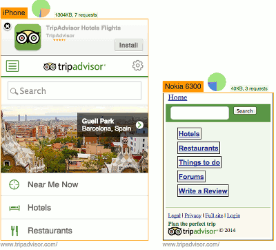
The priority hierarchy of the Tripadvisor mobile site is quite different to that of the desktop site. After ‘Search’, ‘Near Me Now’ is given top billing, and uses location information to serve up restaurants, hotels and attractions nearby, as well as a list of ‘Best Nearby’. By contrast, the company’s understanding of the different mobile and desktop user contexts is highlighted on the desktop site with top billing given to ‘Plan your perfect trip’, followed by lists of top destinations, beaches etc. Tripadvisor.com is geared toward planning and browsing, while the mobile site privileges intent to act in the current moment and aims to make the execution of that action as painless as possible.

Tripadvisor on desktop browser
In an indication of just how much can be done with device specific optimisation, the site also works well even on much lower-end phones. On the Nokia 6300, a minimal, but still functional website is rendered, showing users the input forms and links they need on a super-light page (40KB).
Tripadvisor on mobile browsers
Note how features, such as ‘Near Me Now’ have been stripped out of the page served to the Nokia; since the 6300 doesn’t have GPS, Tripadvisor has made the decision not to include a function users can’t use. Note also how much lighter the Nokia page is – 40KB as against the iPhone’s 1304KB; again, this is an optimisation based on each device’s capacity. For a longer look at designing for very different screen sizes and phone capacities, take a look at Bryan Rieger’s Effective Design for Multiple Screen Sizes.
Home Depot
Strategy: Dyanimcally served separate mobile site and URL with device-detection: homedepot.com / m.homedepot.com
Home Depot is a US retailer of home improvement, construction and appliances. The mobile site at m.homedepot.com uses location sharing to detect a customer’s nearest store, and then provides access to real-time store inventory and details on the aisle location of products in that store.
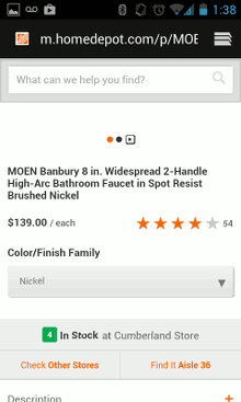
Home Depot’s mobile site allows you to see where in the store the products you’re interested in are located. This function would be incredibly useful if you’re already in-store and searching for something.
Customers can also reserve products to pick up later in their local store using their phone. The mobile redesign that made these features available doubled conversion rates and quadrupled mobile sales for the company.
Corcoran
Strategy: Dynamically served separate mobile site with device-detection, on same URL: corcoran.com
Corcoran is a New York real estate company whose website leverages location services to show potential home-buyers and renters amenities near to a house for sale or rent. It allows property hunters to share their location with its site, and will then bring up listings for the area around them, as well as information about schools, restaurants, markets, and so on.
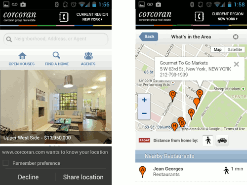
The Corcoran mobile site prompts you to share your location when you land on the homepage (left). It also shows amenities located near listings (right).
The firm also runs hyperlocal mobile ads to encourage people to make use of real-time information. Matthew Shadbolt, Director of Interactive Product and Marketing for the firm, is quoted in Google’s Mobile Playbook (2nd edition) as saying: ‘If there’s a potential client on 23rd Street getting a coffee, we want to reach out to her to tell her that there’s an open house listing three blocks away that starts in 30 minutes. In New York’s hyper-competitive real estate market, an apartment can go on and off the market in 45 minutes. This means access to real-time information is crucial.’ Making use of real-time, local information in this way is unique to mobile’s mobility, and makes a good case for mobile specific optimisations.
Intercontinental Hotels Group
Strategy: Dynamically served separate mobile site with device-detection, on different URLs: ihg.com / m.ihg.com
IHG encourages on-the-go local bookings through location services, serving up nearby hotels to customers based on GPS data from their phones. 60% of bookings on the company’s mobile channels occur within 48 hours of the hotel stay, indicating that a good percentage of its mobile site users are using the local information served up to them by the site to book a nearby hotel after they have arrived in a new town or city.
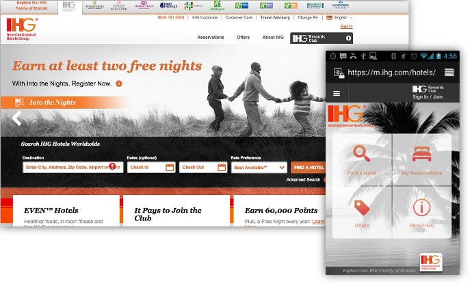
IHG desktop and mobile (inset) sites
Compare the IHG homepage on desktop and mobile. The mobile site is action-oriented, with quick-links to find a hotel nearby, review your reservations, and view current offers. The desktop site gives space to offers that might promote customer loyalty, promote other hotels in the group (in this case the ‘Even’ chain of hotels) and advertise reward points. These are all valuable to IHG’s business, but the group has decided that mobile users are focused on quickly finding and reserving a hotel, and will be happier with a site that foregrounds these uses.
IHG has been particularly clever in its implementation. For very low-end devices, it delivers a simple 24KB page containing a search form, doing away with everything peripheral, but still making its core business available to all users.
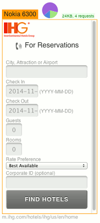
IHG low-end mobile site
Open Table
Strategy: Dynamically served separate mobile site with device-detection, on different URLs opentable.com / m.opentable.com.
The Open Table mobile site at m.opentable.com foregrounds location and contact details on mobile, while the desktop site emphasises reviews and browsing. Where users will navigate to the desktop site to choose somewhere to eat, browsing reviews before making a choice, mobile users will be seeking actionable information: a phone number to call, a link to a Google map to work out directions to a restaurant from their location, parking information and nearby locations, and a quick and seamless reservation process. While all of this information is available on the desktop site, foregrounding different things on mobile again reflects different usage and user intention across different devices.
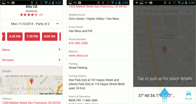
Above and below the fold on a selected restaurant on Open Table’s mobile site. Clicking on the map will bring you directly to a route guide from your current location, while the phone number above is input into your phone’s dialler when clicked
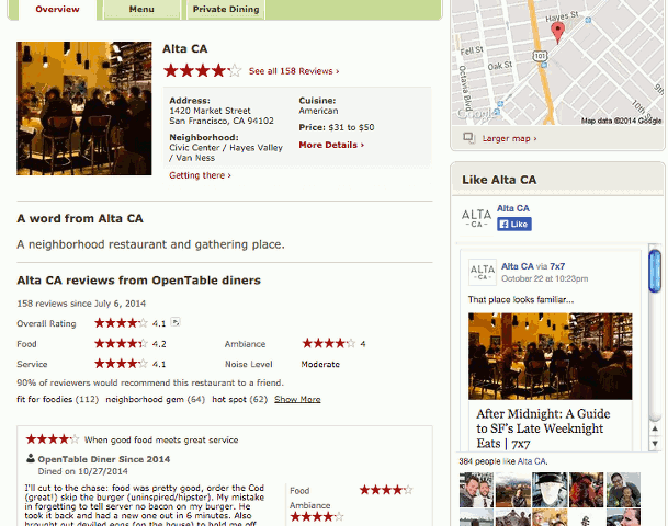
Open Table on desktop – note that reviews are given top billing
The value of optimising for mobile
In our previous article, we saw that the business case for speed on mobile is a powerful one. Do mobile specific content-based optimisations have a similar effect on conversions, and a business’s bottom line? There is compelling evidence to suggest that they do:
- Gucci launched a mobile website in December 2012 (m.gucci.com); since then, mobile conversions have increased by over 70%.
- FragranceNet built a mobile site when the company realised that a massive increase in mobile web traffic wasn’t seeing a similar increase in conversions. Touch friendly buttons and a made-for-mobile checkout flow with a reduced number of steps saw mobile sales increase by 48% within four months.
- RadioShack’s mobile site launch resulted in average mobile order value increasing by 30%; the company also reports that between 40 and 60% of people who use the store locator on their mobile website end up visiting a store.
- For Priceline, a mobile optimised site with simplified content, large buttons and a more streamlined checkout process saw average time on the mobile site increase by 45%, and the mobile site’s share of business grow by 31%.
Conclusion
In this second part of our e-retailer m-commerce review, we took a look at content optimisations employed by large e-retailers. As in our first part which looked at the effects of optimising performance on conversions, we found this time that there are many retailers that optimise content based on the user context, and there is much evidence to suggest that this too has a positive effect on conversions. In the next part, we’ll take a closer look at some individual site flows to assess the effect on user experience of various approaches.


Leave a Reply