


Much is made of the impact that speed has on conversion rates on the web. It’s a message that has become increasingly important in recent years, as mobile penetration rates have soared. Much less has been made of the effect of device-targeted UX on conversions. It’s well known that conversion rates are lower on smartphones (see table below). In this article we take a look at what online retailers and service providers are doing about this.
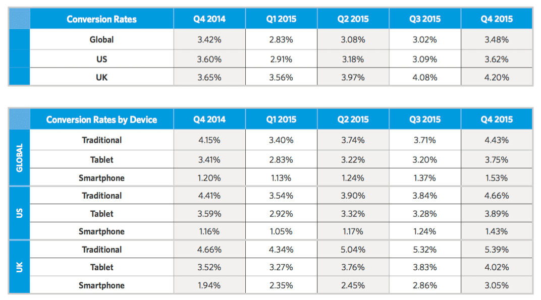
Source: Monetate
It’s clear that some retailers and publishers do realise the impact that device targeted UX can have on conversions, and we can see this in action when we visit their sites on different devices.
The right user experience is about more than just resizing content and tap targets to display on different screens; it goes beyond large touch-friendly buttons. Rather, different devices have different usage patterns, and must be understood in this context. Users on different devices have different needs and goals. For optimum conversion rates, the right content needs to be delivered to the right device. Additionally, as pointed out in a recent Forrester research paper, you should “take advantage of mobile-only capabilities from cameras to sensors to mobile payment options”.
Examples can be seen all around the web. For instance, Best Buy recently drove one million store visits by focusing on mobile as a channel to make product information and knowledge more accessible to customers. By pairing mobilised guides and video tutorials with mobile local ads on Google, they were able to boost conversion rates.

Source: think with Google
We can see online presences tweaked for different devices, with less important features and content being demoted or omitted entirely. Key to this process is the ability to identify and classify client devices. With this capability, then the site UX can be adjusted in a way that best suits the visitor’s device. While A/B testing is widely deployed to test the effect that UX tweaks can have on conversions, testing device-specific optimisations can further improve conversion rates.
Let’s take a look at some of the ways site owners are currently optimising for different devices.
Navigation
There’s not a lot of space on mobile device screens. So this limits what can be displayed in navigation menus. This gave rise to the ubiquitous hamburger menu. Although many sites will simply hide the navigation menu behind a hamburger item, you can do better. Just as important as screen size limitations, users on mobile devices have different goals, so prioritising navigation items on mobile is crucial.
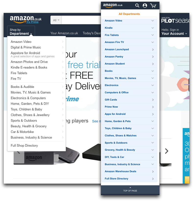
Different devices, different menu
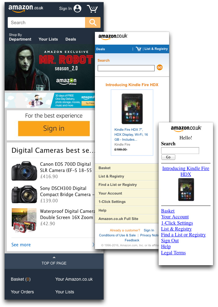
It’s interesting to look at Amazon (amazon.co.uk) on different devices. There are at least five different versions of the site that you might get, depending on your device. First off, the list of Departments on Amazon is shown below for desktop and high-end mobile. Although largely similar, some changes and reordering are visible:
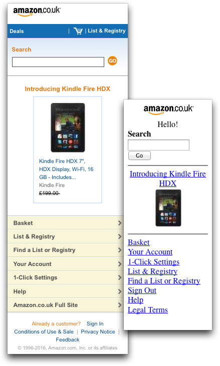
But things get more interesting on different devices. On mid-range devices, the option to view by department is not even present; there is just one nav item: Deals. And on an even lower-end device, the home page is even more focussed still.
Category and product filters
Category and product filters are standard features on most ecommerce stores. Small screens make it difficult to implement such filters on mobile devices. The challenge is to balance functionality with device capabilities and user goals.
On desktop the product filter is displayed to the left of the product listing, and is visible at all times. On high-end mobile devices, it’s accessed via Filter link, and the filter options slide in from the right.
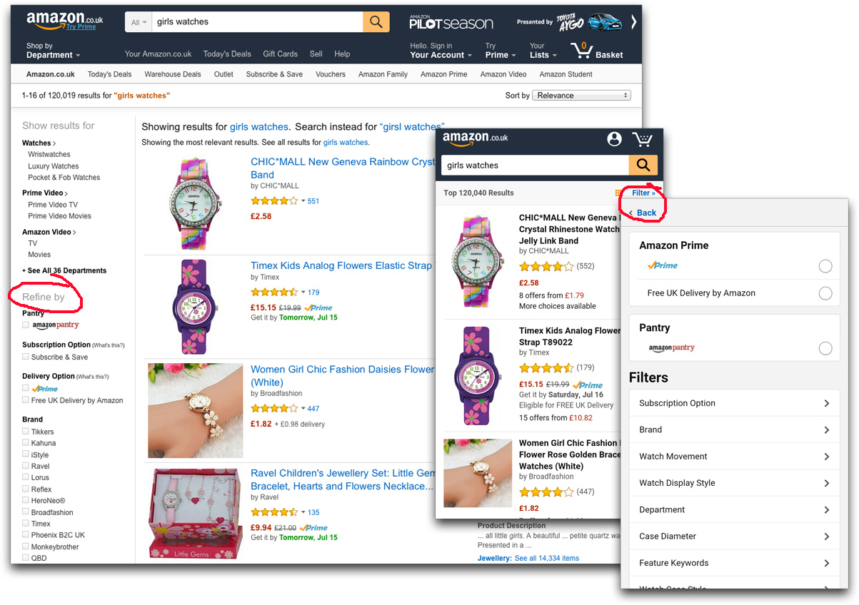
On less capable devices, Amazon approaches its product filter quite differently again. On the lowest tier device, there is no filter option, except for sorting options. On mid-tier devices, the filter options are included at the bottom of the page, and accessed via a link which scrolls the page down.
On small screens, less is more…
But more should be possible! Page load speed is a legitimate concern on mobile and desktop, so much so that page sizes should be kept to a minimum. Unqualified, however, this advice is not quite compatible with giving users all the information they might need to complete a conversion. Better advice would be to keep initial page loads to a minimum, but if a user requests more detail, such as higher resolution images, then this should be possible despite the page load impact (within reason).
This is what Amazon does for low end devices. Images are used sparsely, but, importantly, higher resolution images are available; the user just needs to request them. And even then, the user gets a choice of sizes depending on the product (e.g. Small 63×110, Medium 92×160, Large 286×500 in this case).
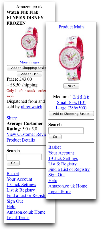
Same goes for the product details. On the desktop and high end devices, detailed product descriptions are included on the initial product page. On lower end devices, the descriptions are not initially loaded, but are available when the user requests them.
Various other content widgets and features are omitted on some devices, such as star-ratings and reviews. Once again, these things are available on request.
Different devices, different content sections
Different content sections are also included and omitted on different devices. Predictably, Amazon’s desktop version has the most content, and as we go down through the devices, the content becomes more focused. On the desktop there is block after block of promoted content categories, such as Popular media streaming players, Unique products, and Digital Cameras best sellers.

On low end devices, Kindle HDX was the only promoted content.
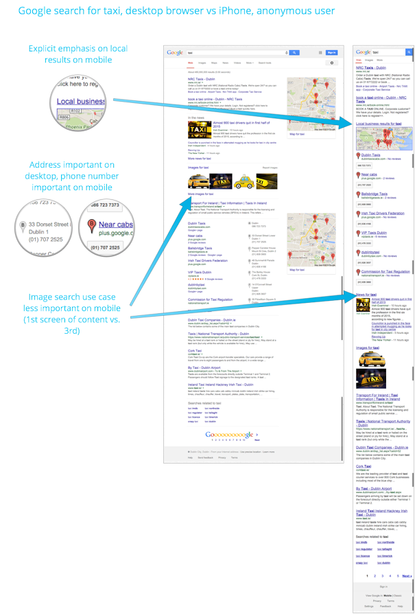
We see a similar pattern on Google’s search results page. On desktop and tablet, we see less of a focus on nearby services and click-to-call numbers, while these take the top spot on the mobile results.
On mobile, search is king!
If there’s one feature that should appear on all devices, it’s search! Search offers a shortcut past navigation menus, and often offers the quickest route to what you’re searching for. On Amazon (in the image above) we can see that search is included first and foremost across all devices.
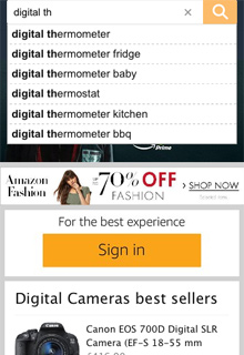
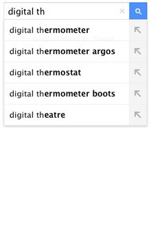
The search experience is enhanced where possible, with autocomplete functionality implemented by both Amazon and Google on devices that will support it:
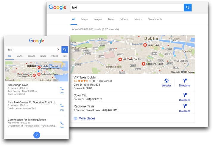
Note too how different results are prioritised for different devices, taking context into account. For a Google search for keyword “taxi”, image and news results aren’t as important on mobile, and instead taxi company results are prioritised (see image above).
Device capabilities
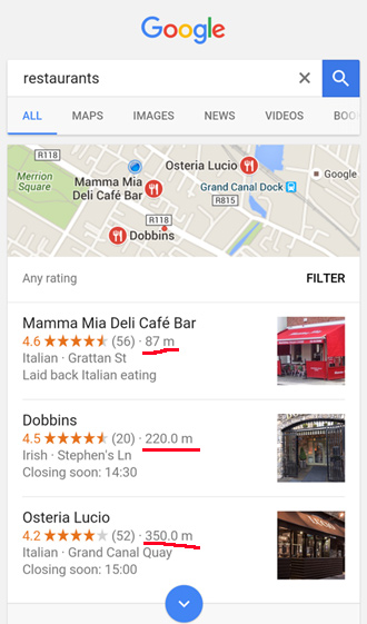
Wherever possible device capabilities and sensors should be exploited. For instance, geolocation is a no-brainer. Where it’s supported and relevant, it should be used. And results or products should be sorted based on proximity where possible. A Google search for ‘restaurants’ on a high end mobile device demonstrates this:
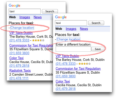
Even on older devices without GPS capabilities, Google gives the user the choice to manually set the location.
Call-to-action
Note also the different call-to-action (CTA) buttons depending on the device. On phones, a CALL link provides the quickest way for users to get what they want. On desktop a phone number is displayed, but the main CTA is a link for directions, or to visit the business website, reflecting the different needs of users on different devices.
Forms
Keep them short, and keep them simple! Use correct input types for devices. For example if you require numeric input, the use the <input type="number" /> input type (learn more about forms and input types here).
Hubspot recently published some stats which chart conversion rates and types and numbers of form fields. Generally your forms should be kept simple, and watch out for too many select fields.
Perhaps one of the most famous success stories of conversions rate improvements via form optimisation comes from Expedia. The company reportedly made $12M by removing a single form field.

Image source: conversionvoodoo.com
Once again, keep it simple, and only include fields you need.
Summing up
To make the most of conversion rate optimisation, your strategy should take into account the following:
- Device targeted UX can be used to increase conversions
- Device identification is key
- Stay focused: promote/demote content based on user goals: less is more, but more should be possible
- Make use of device capabilities where appropriate e.g. GPS for location, camera for credit card scanning and payment
- Speed is important, but speed is not everything
- Keep menu hierarchies simple
- Optimise forms
- Target products by device type
Many site owners already realise that separately optimising for mobile increases conversions. A few canny site owners realise the full potential of optimising for devices. While A/B testing is often employed to determine whether a UX change increases conversions or not, A/B testing in device segmented space offers even finer grained control and opportunity to increase conversions. If you can identify a device and its capabilities, then you can optimise for it, and if you can optimise for it, you can optimise for conversion.
To quote a recent Forrester report:
“To delight and serve your customers in their mobile moments of need, you give them exactly what they need to move forward in their immediate context.”


Leave a Reply