ronan
Ronan Cremin leads engineering efforts at DeviceAtlas. He focuses on building device intelligence applications, such as the award-winning DeviceAtlas and DeviceAssure products. Mr. Cremin also represents DeviceAtlas at the World Wide Web Consortium (W3C) and International Telecommunication Union (ITU).
Latest Articles by ronan
A week with Windows Phone 8
January 27, 2014, by ronan
Part of my job is to know what is going on in the mobile space. With this in mind, I swop phones constantly—from low-end feature phones to the flagship devices for each smartphone OS. It’s been a while since I tried a Windows Phone (most recently a Lumia 510) so I decided it was high time to look again. Having experienced the lower end of this platform this time I tried out a Lumia 1020, the current Nokia flagship... Read More
The Oxymoron of Mobile Privacy
December 3, 2013, by ronan
Introduction There could hardly be a more perfect privacy invasion machine than today's smartphone. It's with you at all times, it knows precisely where you are, it can see and hear you and it knows exactly what you are doing much of the time. If data is the pollution of the digital age then your smartphone is an overweight 1970's V8 gas guzzler with asbestos brake pads, a leaky freon-charged AC system, burning leaded fuel as it barrels down the highway: you are silently spewing out reams of potentially harmful data all day, every day... Read More
Open discussion with Mozilla on the use cases for UA strings
November 6, 2013, by ronan
Yesterday, [url=https://twitter.com/miketaylr]Mike Taylor[/url] from Mozilla kicked off a very interesting open discussion on the use cases for user agent (UA) strings on the modern web. The results of this document will ultimately end up on the [url=https://wiki.mozilla.org/UA/UseCases]Mozilla wiki[/url]... Read More
Lightening your RWD website with RESS
October 17, 2013, by ronan
This article will show you how to use a technique called RESS (Responsive design with Server Side components) to make significant performance and reach improvements to a website for both mobile and desktop alike. This technique requires just a few lines of code, some simple configuration and no ongoing maintenance. The site will change from one that works on desktops, tablets and smartphones to one that works on almost anything, anywhere and loads faster in all cases... Read More
Global reach and dynamic page weight – is there a correlation?
April 5, 2013, by ronan
Many reports on web page sizes issued in recent years point to the same conclusion: the web has a weight problem. The web seems to be gaining weight each year despite the fact that study after study has shown a strongly negative reaction from users to heavy web pages and resulting loading times... Read More
Performance is money, part 1: the end-user’s wallet
March 12, 2013, by ronan
Most web developers are familiar with the maxim that light is good: the idea that page performance matters to the end user experience is a truism at this point, backed up by a tremendous amount of real-world evidence, summarised quite nicely at [url=http://www.websiteoptimization.com/speed/tweak/psychology-web-performance/]websiteoptimization.com[/url]... Read More
Introducing Prism, a tool for testing device adaptation
November 1, 2012, by ronan
Due to the multifarious nature of the mobile web, developers tend to spend a lot of time testing their work. If your site is designed to adapt to multiple different devices this effort is multiplied because you need to ensure that your detection is working correctly across multiple devices and that your response is appropriate in each case... Read More
Anatomy of a mobile web experience: facebook.com
April 11, 2012, by ronan
This is the second article in a series about how the major internet brands deliver their mobile web experience. The previous article is available here: Anatomy of a mobile web experience: google.com... Read More
Anatomy of a mobile web experience: google.com
March 28, 2012, by ronan
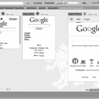
In a recent blog post that I did here on mobiForge (Server-side device detection used by 82% of Alexa top 100 sites) some people expressed surprise that a 47 byte difference in the HTML payload delivered by Google to different devices constituted a significant level of server-side adaptation. On checking my results, it turned out that this minor 47 byte file size difference actually masks an entirely different HTML document served to... Read More
Server-side device detection used by 82% of Alexa top 100 sites
January 11, 2012, by ronan
About 82% of the Alexa 100 top sites use some form of server-side device detection to serve content on their main website entry point. As you descend from the top 10 to the top 25 and top 100 sites the percentage of sites using server-side detection falls from 100% to 96% to 82%. This is an interesting fact given the all of the recent discussion in the blogosphere of responsive design using client-side techniques such as media queries... Read More


