


 Anyone involved in developing content for the mobile web is probably already aware of the huge performance challenges on mobile. There is now widespread acceptance that we should budget for performance just as much as we should for design, and functionality. Perhaps even more so. So why are many websites still failing users by serving large payloads on mobile? One of the must-see talks from the this year’s Chrome Dev summit by Alex Russell does not pull its punches on why you can’t really expect a desktop site to work well on mobile. He cites four main reasons why your content doesn’t work on mobile:
- Mobile phones are just not as powerful as laptops, despite the marketing claims
- Your pages are too big
- Mobile networks hate you
- You’re not testing properly
The web development world is in deep trouble. Terms like ‘crisis’, ‘denial’, ‘disaster’ are bandied about, and while they may seem like harsh words, Russell’s thesis lays bare the lack of understanding of just how difficult mobile is, that may be at the heart of performance problem to begin with.
The effect of poor performance need hardly be rehearsed here as it is something we have talked about widely on mobiForge here and here. Lest there be any doubt, Alex Russell gives up some fresh stats from recent research by Doubleclick:
- Users lose focus on the task they are performing if it takes over 1 second.
- 53% of users bounce from mobile sites that take more than three seconds to load.
- The average mobile site takes 19 seconds to load.
So why and how is mobile web development failing users?
Mobile phones are not equal to laptops
The significant differences between laptop class devices and mobile phones are one of the many reasons why web development is failing. Here’s why:
The full symmetric multi-core processing typical in the desktop and laptop world is just not how mobile phones are designed to work. By using what’s called big.LITTLE architecture, mobile phones are designed to quickly power up processor cores for immediate workloads and shut them down just as fast to conserve precious battery power and, critically, to stop them overheating. If the phone processing cycles overdo it, the circuit boards will simply burn out.
Mobile phones do not benefit from the heatsinks, fans and the circuit board separation that allow larger computers to dissipate heat and process faster (as evidenced by the recent Samsung Note debacle). In order to dissipate the heat from a smartphone CPU, that energy needs to travel through several densely packed layers of hardware, including other RAM chips various radios, not to mention a touchscreen and layers of casing.
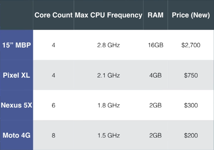
So even if the headline specifications look similar for a MacBook Pro and a Google Pixel device, the physical differences in how the hardware is put together combined with the asynchronous nature of the processing makes a huge difference in terms of processing power and speed.
Don’t trust marketing numbers from phone vendors – Alex Russell, Google
Add to that the fact that mobile phones do not have the same parallel chip architecture that laptops do. They tend to have one chip doing all the work which equates, says Russell, to the speeds of slower spinning hard drives from a decade ago.
25 times slower as it turns out when comparing a Macbook Pro and a Nexus 5. But Russell was able to significantly improve the performance of the Nexus 5 by literally putting it on ice. Placing an improvised ice pack beneath the device while running Apple’s MotionMark benchmark test improved its performance by 15 times.
Your pages are too big
Earlier this year we published a story on how the average web page size had exceeded the size of the install of Doom, the seminal first-person shooter game from the 1990s.
With many of the top sites adding hundreds of kilobytes of uncompressed JavaScript to their pages, it seems the message is not getting through. According to Russell, “if you’re using one of today’s more popular JavaScript frameworks in the most naive way, you are failing by default.” Using these frameworks is a sign of ignorance, or privilege, or both, he says.
This all adds up to a kind of perfect storm of factors at play that mitigates against good performance on mobile devices. When a device requests content from a web server, during the time it takes to fetch the (often too large) content loads, on poor networks, the processors may have shut down to save power. It is only when the content finally arrives at the device that those cores can be powered back up to process that content.
Hence Russell’s contention that web development workflows are simply not aligned with the realities of the underlying technology in phones.
Mobile networks hate you
Mobile networks speeds are notoriously unreliable and inconsistent. Many of the assumptions that the web is built on go out the window when the underlying network speeds are oscillating from one millisecond to the next.
With more and more devices contending for network bandwidth, LTE-capable networks in the US have actually gotten slower not faster. This can and does vary by market too. What may be considered 2G in one market may be 3G in another. It basically depends on many different factors, ranging from the vagaries of cellular technology, the handset switching radios between high and low power states to the Operator throttling and shaping traffic. In some cases, it can take seconds for the handshake between the phones radio and the cell network to occur before the content can be even sent through the wire.
Test it on live devices
Too many devs rely on poor testing practices when developing content for mobile, says Russell. Even though things like network and CPU throttling have their place, they can only go so far. They cannot compare with testing on real devices and networks. While DevTools sets a standardized RTT of 100 milliseconds for 3G, that will vary wildly in the real world environment for all the reasons mentioned above.
Russell stresses the need to test on real devices using chrome://inspect/ on a variety of devices, at different price points. With the ASPs for smartphones on a downward trend, the next generation of mobile web users will be buying cheaper less capable devices.
Google is pushing Progressive Web Apps and the PRPL pattern as the solution to all these problems. And following the Mobilegeddon and AMP initiatives, it seems that Google is shifting its position on mobile away from the simplistic “just go responsive” advice of yesteryear.
With over 2 billion active Chrome installs, Google is conscious that the next billion users of the web will need a paradigm shift if web content is going to work for them.
Head over to Youtube to view Alex Russell’s full talk.


Leave a Reply