


2015 was a hard act to follow. That year, we noted, was an exceedingly good year for mobile, with highlights including advances in progressive web apps, web performance, and the Physical Web.
Many of these themes have continued into 2016. From this viewpoint, 2016 was more of a year of iterative progression, than of pure innovation. That is not to say it was not interesting—on the contrary—2016 was a year that saw the web community reap many benefits of seeds sown in previous years.
Web Performance
Performance was a theme that continued right through 2016, just as it did in 2015. We saw continued emphasis on Progressive Web Apps (PWAs), and the expansion of Google’s AMP roll-out. We saw how the average web page size grew in 2016 to that of the DOOM download. And we saw how you could get an immediate 15% web performance boost with one simple trick.
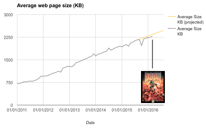
The web is Doom!
Toward the end of 2015, Ronan Cremin observed that the average web page size was fast approaching that of the classic 1990’s first-person shooter game, Doom. His projections pointed to the web hitting Doom size in April 2016. In fact it happened a couple of months later than that, but we got there in the end! This, of course, is not something to be proud of, highlighting how 2016’s web struggled to deliver a page of web content in the same size as a multi-level game that ships with an advanced 3D rendering engine and multiple levels, each comprised of maps, sprites and sound effects.
This was easily our best performing content of the year, resonating as it did with middle-aged nerds worldwide; it dwarfed our regular traffic:
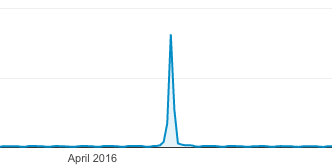
This is what happens to your traffic when you hit the sweet spot
There was no starker warning about the importance of performance in 2016 than a Google study which revealed that a whopping 53% of mobile visitors will abandon a site if it takes longer than 3s to load. Let that sink in… Over half of your visitors will bounce if your site is slow!
And if you still needed convincing about why performance is important, a recent talk by Alex Russell at the Chrome Dev Summit called Progressive Performance outlines just why today’s mobile devices are simply no match for PCs when it comes to performance, even if the specs are marketed as comparable.
This talk resonated very much with us here at mobiForge. That, counter-intuitively, despite the evolution of smartphone capabilities, they are still no match for desktop performance, and so as web developers, we should not expect them to be.
The main reasons why your content doesn’t work on mobile include the following:
- Mobile phones are just not as powerful as laptops, despite the marketing claims
- Your pages are too big
- Mobile networks hate you
- You’re not testing properly
This echoed earlier thoughts on why the performance gap between low and high-end devices is actually getting wider, not narrower.
See the whole talk here:
This talk also revealed how you can get an immediate 15% performance boost: put your device on ice, literally! The cooler environment allows the CPU to run more cores at higher frequencies.
AMP is no longer niche
Google’s AMP technology, announced in 2015 began to make a limited appearance in search results early in 2016. AMP pages were at first confined to a dedicated AMP carousel in Google’s search results pages. Towards the end of 2016 however, the AMP roll-out was notched up a gear, and AMP results are now no longer confined to the carousel; instead they are mixed in with regular search results.

While the speed and usefulness of AMP is undeniable, there are causes for concern with Google’s approach, with it’s dominant search position, and it’s wholesale ownership and favouring of one particular technology. A general feeling of uneasiness with Google’s approach begs the question of whether we’re sleeping walking into a walled garden.
Increasingly, there are signs of a growing backlash, with users trying out, and then disabling the technology. For some, the loss of the URL—AMP pages are generally server via Google’s CDN cache, so URLs always start with something like https://google.com/amp/s/amp.<your-url.com>—is too steep a price to pay for the benefits.
Indeed, others have questioned those supposed speed benefits gained by serving via the Google CDN. The best of both worlds, and certainly a better approach for the end user, would be to give publishers of AMP pages the option to opt out of the cache.
Another aspect of all this is that in pushing AMP, essentially a separate mobile page template, Google is shifting its position on mobile away from its simplistic “just go responsive” stance of previous years.
Serving AMP pages to all mobile users
On a more practical note, in November we described a method for exposing AMP pages to all mobile visitors using some server-side device detection. With this approach, all mobile visitors to your site get to benefit from AMP speed, not just those referred by Google.
Progressive Web Apps
This was another area which saw much growth in 2016. Earlier in the year in May at Google’s IO conference, we learned about the Washington Post’s use of the <amp-install-service-work> tag, which married the speed of AMP with the richness of PWAs. We followed up with a tutorial on this site on how to build your own AMP-powered Progressive Web App.
AMP and PWAs can be combined in various combinations. A good article, Progressive Web AMPs explores different combinations of AMP and PWA configuration. Three configurations covered are
- AMP as PWA: When you can live with AMP’s limitations
- AMP to PWA: When you want to smoothly transition between the two
- AMP in PWA: When you want to reuse AMPs as a data source for your PWA
It’s still early days for AMP and PWAs, so this is something to watch out for in 2017. Indeed, a very much overlooked (or at least very little commented upon) mention by Paul Kinlan in a Google talk highlighted exciting things happening in the world of PWAs on Android, that will give them full citizen status on Android.
PWAs will be compiled on-the-fly into WebAPKs and installed on the OS, with first-class citizen entries in the App task manager, permission modeling and battery-usage tracking. PWAs will in fact be indistinguishable from native apps.
Progressive Web Apps and iOS
Apple’s Safari browser still does not support service workers, and by implication, Progressive Web Apps, although many of the other requisite HTML5 technologies are supported. Although there have been positive noises coming from the Safari team, all the pieces are not currently in place for PWAs.
But… does it matter?
Well, of course it does if you want the same rich uniform experience and feature set across all platforms. However, it turns out it’s not all bad! In an article titled iOS doesn’t support Progressive Web Apps, so what?, Jason Griggs of CloudFour notes that you can still reap the benefits of PWAs even on iOS, as noted in his twitter exchange with the Washington Post (who were an early-adopter of PWA technology):
@grigs All PWA has higher engagement. Minimal differences between iOS and Android.
— Joey Marburger (@josephjames) September 22, 2016
How is this possible? It’s down to the progressive aspect of PWAs, and the emphasis PWAs place on performance. The bottom line is that PWAs are supported by most browsers, and a PWA can certainly improve performance and engagement on iOS, even if not fully supported:
It seems likely that organizations that take on the work necessary to make their site perform well as a Progressive Web App will likely see some benefits on iOS.
A standard page weight reference for the web
In measuring performance, we must be able to measure the things that affect performance. Things like network speeds and page weight. Measuring page weight is tricky, however. So tricky, that none of the tools we evaluated could agree on the size of a simple web page (see the data here). That is to say we found that nobody is measuring page weight the same way. That means that given a single web page, none of the tools agree on how big it is. And if there’s no standard way to measure pageweight, then how can we ever hope for an objective and reproducible measurement of what it means to be performant.
Moved by these results and inspired by the International Prototype Kilogram (IPK), this led us to propose a standardised page weight reference for the web, the page weight equivalent of the IPK; a web page that is exactly 1MB in size, so that the measuring performance of page-weight testing tools can be measured!

You can find the 1MB reference page here: 1mb.website/.
Reducing page weight
One of the things you can do to improve your web performance is to reduce your page weight. Many of the things we talked about during the year with respect page weight were summed up in our reducing page weight article (this was the last article in a series that covered understanding page weight, and measuring page weight). This article provides good all round insights into how to keep your web pages performant. One aspect easily overlooked is the inclusion of third-party libraries, and services, and led us to other avenues of investigation: the hidden cost of frameworks, CMSes, and third party libraries.
The impact of third-party libraries and platforms
In many ways the ease with which one can include third-party libraries in a web page is a testament to both the design of the web and extraordinarily rich and open ecosystem around it. With a few third-party services you can transform a static HTML page into a rich interactive experience with comments, media, analytics, feedback and so on. As a result, use of third-party libraries is now nearly ubiquitous—almost every website you visit today links to external libraries.
Third-party libraries, when implemented well, are a nice example of how a distributed network of loosely connected components can work well together to build something greater than the sum of the parts. However, third-party libraries are the web performance equivalent of icebergs.
This led us to run an ongoing project to measure the impact of third-party libraries.
The net effect is that any page that includes the above three services already has a page weight of 1.6 MB on desktop or 1.1 MB on mobile before any site content is included. This is borderline-unacceptable for any page, let alone an empty one.
An inexperienced developer might not notice just how much impact these included libraries are having. Yoav Weiss of Akamai recently showed that visiting The Verge required the browser to download, unzip, parse and run 7 MB of JavaScript, a startling number. Ironically the page in question was entitled “Why the Mobile Web sucks” and laid blame for this situation squarely at the browsers’ door.
One thing we learned from this effort (other than that some very common libraries are incredibly bloated) was that not all libraries are created equally. For instance, the Vimeo plugin weighs in at approximately half that of YouTube. So, shop around, there might well be a lighter alternative to suit your application.
The results are being tracked in this living document here.
CMS performance
In a similar vein, we noted how easy it is in practice to deploy a CMS framework without any technical knowledge, and began to measure the impact of using the most popular CMSes.
We measured out of the box, and real world average page sizes for each of the most popular CMS platforms, WordPress, Drupal, and Joomla. Things looked ok when we measured out of the box page weight:
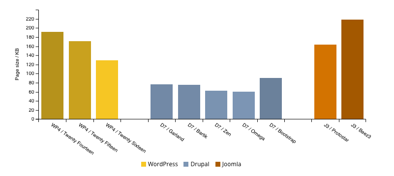
However, when we got to the real world measurements, we saw that the sizes of the web pages produced by these frameworks were in the DOOM page weight territory we mentioned earlier.
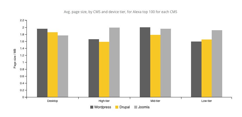
CMS theme designers are not without blame for the bloated web we find ourselves in today. The message here is to be wary of the impact of the CMS theme you use, and only include features and plugins that you need.
Ads and ad-blockers
The ad-blocking controversy that kicked off in 2015 when ad-blocking was added as feature of iOS9 continued to roll on still in 2016.
In January, Samsung launched an ad-blocking API on Android, and Google moved quickly to modify its T&Cs to ban it, and began to remove offending apps from the Play Store. On appeal, Google flip-flopped and reinstated the banned apps. The whole episode served to highlight how uncomfortable the new Android ad-blocking reality sat with it, as a company heavily reliant on ad-revenue. A further bizarre aspect of the affair was how Android was momentarily looking like the OS that didn’t let you tinker, while the traditionally locked-down iOS looked to be the more open platform.
Since then, network operators have started to flex their muscles too, several implementing network level ad-filtering, based on Shine’s ad-blocking technology. They claim to have end-users’ experience at heart, and so far this has held true, with their efforts being implemented as opt-in rather than opt-out for the user.
Ad-networks were not silent during the controversy, promising to do better. Part of the reason for all this is that ads often ruin the user experience, with full screen modals, large payloads, and power-hungry scripts. Several initiatives were announced including Google’s promise to punish UX-breaking ads by taking bad behaviour into account as a search ranking factor.
Has the situation improved? Perhaps, but two examples highlight how bad things still are.
In November, it was noticed that the bcc.co.uk/news site would not load on some devices. After some investigation it turned out that ad scripts were blocking the entire page from loading. For a site like the BBC, this was incredible.
@xbs @tmaslen @jamesdonoh Successfully replicated it. You're right — ads script blocks rendering for 30 seconds (https://t.co/hOAeilihao)
— joseph ?? (@Joseph_Wynn) November 11, 2016
It wasn’t limited the BBC either: other sites affected were NYTimes, WashingtonPost and FastCompany, all sites that were using Google ads. That this could happen to such a large ad provider, on such high profile sites, says a lot: there’s still a lot of work to be done.
More recently still, the malware threat exposed by advertising networks hit a worrying new level with the uncovering of an extremely sophisticated exploit. Vulnerable machines were infected by sneaking in malicious code disguised and encoded in slight variations in pixels of the alpha channel of the image ads delivered by the ad-server. It is thought that millions of machine were infected this way.
When these are the types of UX and security issues you have to deal with, it’s hard to expect end-users not to use ad-blockers.
Beacons and the Physical Web
At the end of 2015, we enthusiastically noted how promising Google’s bluetooth beacon-based Physical Web was looking. Bluetooth Low Energy (BLE) beacons have been around for a few years now, but Google’s beacon platform and the Physical Web offered a new, potentially frictionless and app-independent slant. With the Physical Web you can trigger notifications on devices when a user approaches a beacon. By clicking the notification, the user will be brought to the associated URL. This simple idea unlocks a surprising wealth of applications, from targeted marketing to smart vending machines and parking meters.
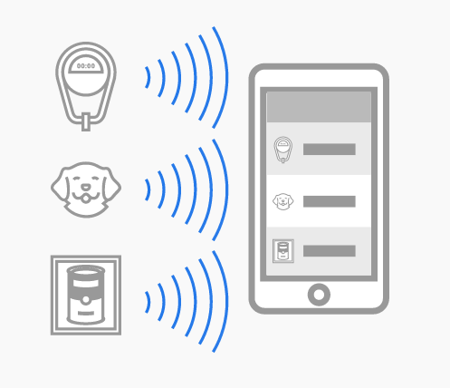
Image source: The Physical Web
2016 saw the Physical Web evolve several times. First, the integration with Chrome browser on both iOS and Android meant that a dedicated app was no longer needed on a user’s device to experience the Physical Web. Instead, any device that had Chrome installed could detect a Physical Web beacon. This was an important step to app-independence. Strictly though, Chrome browser is an app, so it wasn’t true to say that the Physical Web didn’t need an app.
Around this time Opera browser also integrated the Physical Web, and this prompted us to explore the different implementations. What resulted was a very thorough review of what you could expect in terms of differences in notification content and display, depending on your platform.
In the next major step, support for the Physical Web was added to Google’s Nearby Notifications on Android. The Nearby Notifications API is baked into Android (4.4 and higher), so now the Physical Web was truly independent of apps on Android (although it still required Chrome to function on iOS).
As we saw in recent beacon article the Physical Web is just the tip of the iceberg when it comes to Google’s Beacon Platform. When you scratch beneath the surface of the elegant simplicity of the URL-based Physical Web, a much more powerful and complex beast capable of managing and monitoring fleets of beacons remotely, reveals itself.
The iOS elephants in the room
An unfortunate theme that keeps cropping up is that of Apple’s feet-dragging when it comes to supporting new web features in iOS. It’s really holding back progress in a few areas, and it’s particularly galling since Safari used to be a leader rather than a laggard on this front. The usual Apple stance that its serving the customer looks increasingly hard to defend as service workers and PWAs are going mainstream—now Safari is preventing Apple customers from accessing superior experiences offered by many sites.
We see a similar pattern when it comes to beacons. We noted in our most recent beacon article that one of the biggest drawbacks for the Physical Web right now is the patchy iOS support. While it is possible for Eddystone beacons to trigger URL notifications on iOS, there are yet several hurdles that will prevent widespread adoption.
First it requires an app, Chrome browser, to be installed on the user’s device, and then, on top of that, it requires the user to have enabled the Chrome widget. This, while better than requiring a specific Physical Web app, is still a quite high barrier to entry, and is certainly far from the frictionless experience enjoyed by Android users.
It feels like iOS is stuck in a QR-code-like era of the Physical Web, while Android has moved on. While there are certainly use-cases for triggering apps via bluetooth beacons, requiring a user to install an app in every case, before being able to interact with beacons is clearly a sub-optimal experience.
From the outside, it’s impossible to know if all this stems from conflict of interest with the app ecosystem, or if it’s simply a lack of prioritisation. One would like to think that, given that Apple makes most of its money from hardware, its app profits are ultimately secondary to selling devices, but who knows?
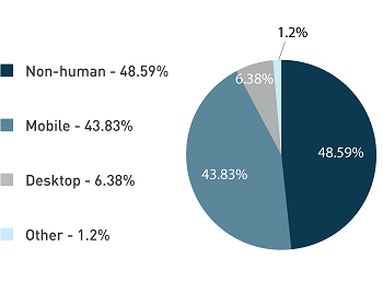
Your traffic is not human!
To round off this review, we’ll finish up with a few stats. Throughout the year, with the help of DeviceAtlas data, we are able to reveal unique insights into the device landscape and the web. One of the most surprising insights we shared in 2016 was that up to 50% of web traffic is non-human, or bot traffic.
Read the full article here. In the meantime, some other juicy stats that we revealed this year included:
- 720×1280 is the most common screen size
- Apple, Samsung, Sony, Huawei, and LG are the world’s top five phone manufacturers
We have a round up of all the stats we produced in 2016 coming soon, so keep an eye out. In the meantime you can always find our latest stats in the stats section of mobiForge.
Main image: Philip Bitnar


Leave a Reply